


亲们,第一次写技术博客,只为和大家共同分享技术,共同进步。有写得不周到、考虑不全面的地方,大家提出来,咱们一起进步。
今天跟大家分享一下带箭头的浮层提示框。效果图如下:
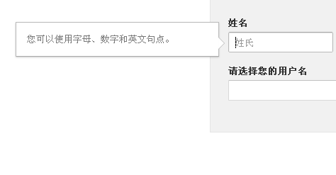
这种效果在各大网站上经常见到,比方说百度主页实时热点、谷歌注册表单提示。一般用作表单、链接、头像的弹出提示,带个小箭头,用户体验很好。
浮层的制作很简单,不过是盒子模型,有点基础都能制作出来,关键是箭头的制作。很多人用图片式的箭头。这当然可以,而且图片可以附带很多例如外阴影、半透明之类的效果,很炫。不过对于一个PV超过百万的网站,哪怕减少一次客户机与服务器的交互所带来的提速效果都是很明显的。网页中能通过计算得到的效果,尽量不要用图片代替。下面讲解下如何实现箭头。
看下面代码:
- <!DOCTYPE HTML>
- <html lang="en-US">
- <head>
- <meta charset="UTF-8">
- <title>网页测试</title>
- </head>
- <body>
- <div style="width:0px;height:0px;border-width:50px;border-color:red blue yellow black;border-style:solid;">
- </div>
- </body>
- </html>
我们得到这样一个效果:
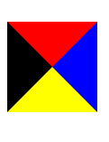
可以看到对于宽高都为0的块元素,四个边框分别是四个三角形。那么我们现在要做的就是屏蔽其它三个方向的三角,只取其中一个三角。
- <!-- 方法一 -->
- <div class="arrow"></div>
- <style>
- .arrow{
- border-width:10px;
- border-style:solid;
- border-color:transparent;
- border-left-color:#bbb;
- height:0;
- }
- </style>
- <!-- 方法二 -->
- <div class="arrow"></div>
- <style>
- .arrow{
- border-width:10px 0 10px 10px;
- border-style:solid;
- border-color:transparent #bbb;
- height:0;
- }
- </style>
方法一很明显先将border-color都设置为transparent;再将要显示的三角设置为指定颜色。方法二是谷歌注册页面采用的样式方式。原理都一样,不解释。
现在我们得到了一个颜色值为#bbb的左宽右窄的三角。但我们要做的是一个中间挖空的三角。那么若是在这个三角上面覆盖一个白色的小三角,是不是就得到了想要的效果了。当然啦。。。注:上面height:0;的设置是为了解决IE6下兼容性问题。
现在要做的是,用绝对定位将一个小的白三角覆盖到颜色值为#bbb的三角上。
代码如下:
- <div class="arrow">
- <div class="arrow-before"></div>
- <div class="arrow-after"></div>
- </div>
- <style>
- .arrow{
- position:absolute;
- }
- .arrow-before{
- position:absolute;
- border-width:10px;
- border-style:solid;
- border-color:transparent;
- border-left-color:#bbb;
- height:0;
- }
- .arrow-after{
- position:absolute;
- top:2px;
- border-width:8px;
- border-style:solid;
- border-color:transparent;
- border-left-color:#fff;
- height:0;
- }
- </style>
.arrow块做成了绝对定位,可以定位到网页中任何方向。
那么如果想要一个倾斜的三角呢?也很简单。把上下左右四个border-width设置不一样就行了,具体效果自己调节。
下面是最开始效果图的代码。
- <!DOCTYPE HTML>
- <html lang="en-US">
- <head>
- <meta charset="UTF-8">
- <title>谷歌表单验证</title>
- <script type="text/javascript" src="../common/jquery-1.7.2.min.js"></script>
- <script type="text/javascript" src="js/common.js"></script>
- <link rel="stylesheet" href="css/index.css" />
- <style type="text/css">
- html{color:#333;direction:ltr;font:81.25%/1 arial,helvetica,sans-serif;}
- </style>
- <script type="text/javascript">
- // $(function(){
- // $rl.tools.test();
- // })
- </script>
- </head>
- <body>
- <div id="rl-zc">
- <div id="rl-zc-box">
- <form action="#">
- <!-- 姓名 -->
- <div class="form-element">
- <span class="form-element-title">姓名</span>
- <div class="form-clear">
- <div class="form-div-float">
- <input type="text" />
- <span class="placeholder-text">姓氏</span>
- <div class="infomsg">
- 您可以使用字母、数字和英文句点。
- <div class="arrow">
- <div class="arrow-before"></div>
- <div class="arrow-after"></div>
- </div>
- </div>
- </div>
- <div class="form-div-margin-left">
- <input type="text" />
- <span class="placeholder-text">名字</span>
- <div class="infomsg">
- 您可以使用字母、数字和英文句点。
- <div class="arrow">
- <div class="arrow-before"></div>
- <div class="arrow-after"></div>
- </div>
- </div>
- </div>
- </div>
- <span id="rl-lastname" class="errormsg"></span>
- <span id="rl-firstname" class="errormsg"></span>
- </div>
- <!-- 用户名 -->
- <div class="form-element">
- <span class="form-element-title">请选择您的用户名</span>
- <div class="form-clear">
- <input type="text" style="width:300px;"/>
- <span class="placeholder-text" style="left:auto;right:0;">@gmail.com</span>
- <div class="infomsg">
- 您可以使用字母、数字和英文句点。
- <div class="arrow">
- <div class="arrow-before"></div>
- <div class="arrow-after"></div>
- </div>
- </div>
- </div>
- </div>
- </form>
- </div>
- </div>
- <script type="text/javascript">
- /* $("input[type='text']").bind('focus',function(){
- $(this).addClass("input-hover");
- }).bind('blur',function(){
- $(this).removeClass("input-hover");
- });
- $(".placeholder-text").click(function(){
- $(this).prev("input[type='text']").focus().addClass("input-hover");
- }).hover(function(){
- $(this).prev("input[type='text']").focus().addClass("input-hover");
- },function(){
- $(this).prev("input[type='text']").focus().removeClass("input-hover");
- });*/
- $(".infomsg").parent().find("input").focus(function(){
- var thisDom = $(this).parent().find(".infomsg");
- var width = thisDom.width();
- var height = thisDom.height();
- var height_input = $(this).height() + 2;
- thisDom.css({"left":-width-45 /*,"top": -(height-height_input)/2*/});
- thisDom.find(".arrow").css({"top":"20px"});
- thisDom.show().animate({opacity:1},100);
- }).blur(function(){
- var thisDom = $(this).parent().find(".infomsg");
- thisDom.animate({opacity:0},100,function(){
- thisDom.hide();
- });
- });
- </script>
- </body>
- </html>
index.css文件
- input,button,select,textarea{outline:none;}
- textarea{font-size:13px;resize:none;}
- #rl-zc{width:362px;margin:0 auto;}
- #rl-zc-box{background:none repeat scroll 0 0 #f1f1f1;border:1px solid #E5E5E5;margin:0;padding:25px;}
- #rl-zc-box .form-element{margin:0 0 1.5em;position:relative;}
- #rl-zc-box .form-element span.form-element-title{font-weight:bold;display:block;margin:0 0 0.6em;}
- .form-div-margin-left{margin:0 5px 0 155px;position:relative;}
- .form-div-float{float:left;width:150px;margin-right:5px;position:relative;}
- .form-clear{position:relative;}
- .form-clear:after{clear:both;content:"";height:0;display:block;}
- input[type='text']{height:27px;padding:0 8px;margin:0;border-width:1px;
- border-style:solid;border-color:#c0c0c0 #d9d9d9 #d9d9d9;width:130px;
- background:none repeat scroll 0 0 #fff;*line-height:27px;border-radius:1px;}
- input[type='text']:hover{box-shadow:0 1px 2px rgba(0,0,0,0.1) inset;border-width:1px;
- border-style:solid;border-color:#a0a0a0 #b9b9b9 #b9b9b9;
- border-radius:2px;}
- .input-hover{box-shadow:0 1px 2px rgba(0,0,0,0.1) inset;border-width:1px;
- border-style:solid;border-color:#a0a0a0 #b9b9b9 #b9b9b9;
- border-radius:2px;}
- .placeholder-text{position:absolute;top:8px;left:10px;color:#999;}
- .errormsg{color:#dd4b39;display:block;line-height:17px;margin:0.5em 0 0;}
- .infomsg{z-index:9999;position:absolute;padding:15px;background:none repeat scroll 0 0 #fff;
- color:#797979;margin:0.5em 0 0;line-height:17px;display:none;
- width:255px;border-style:solid;border-width:1px;border-color:#bbb #bbb #a8a8a8;
- box-shadow:0 1px 3px rgba(0,0,0,0.2);top:-20px;opacity:0;
- }
- .arrow{position:absolute;right:0;}
- .arrow-before{position:absolute;border-style:solid;border-color:transparent #bbb;
- border-width:9px 0 9px 9px;}
- .arrow-after{position:absolute;border-style:solid;border-color:transparent #fff;
- border-width:8px 0 8px 8px;top:1px;}
上面只是实现了简单的应用,扩展性不大,只适合特定的HTML结构和特定的网页。我会试着把它做成组件。可以很好的适应html结构的变化。
PS:前端很缺人,至少北京如此。大家加油认真学吧。新的技术如HTML5、CSS3.0也给web带来了新的用户体验。桌面应用开发已经逐渐式微,未来的互联网必然是web应用和移动终端应用开发的世界。不过,新的渲染交互技术也让前端逐渐繁琐、复杂。不过,没关系,谁让我们喜欢它呢?就让它淘气一点吧!!!
转载于:https://blog.51cto.com/qsyxhbg/934752


 扫一扫
扫一扫


 19万+
19万+

 被折叠的 条评论
为什么被折叠?
被折叠的 条评论
为什么被折叠?
 到【灌水乐园】发言


