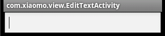
先来看看默认的EditText控件效果:

布局就是一个Activity里就放了一个EditText控件,可以看到四周有橙色的高亮区域 处理后的效果:
接下来简单描述下处理过程: 1,查看EditText这个类的源码
public EditText(Context context, AttributeSet attrs) {
        this(context, attrs, com.android.internal.R.attr.editTextStyle);
    }
在其构造方法里默认使用了系统定义的风格 com.android.internal.R.attr.editTextStyle 2,找到这个定义的属性: 在android源码的\frameworks\base\core\res\res\values路径下找到attrs.xml文件,打开找到:
<!-- Default EditText style. -->
        <attr name="editTextStyle" format="reference" />
找到了源码中引用的系统定义的风格,但这里啥都木有(一开始找到这,不知道format="reference"代表啥,在此感谢一个神奇的网站:stackoverflow) 接着找到这个<attr .... >的根节点
<!--根元素-->
<declare-styleable name="Theme">

<!-- n个attr及其他标签-->

<!-- Default EditText style. -->
        <attr name="editTextStyle" format="reference" />

......

</.....>
根节点的name为"Theme",接着就是要找到name="Theme"的style (也就是说format="reference"表示EditText控件所默认使用的com.android.internal.R.attr.editTextStyle资源定义在name="Theme"中,即后者被前者引用) 3, 找到name="Theme"的style: attrs.xml所在路径下有很多系统定义的资源,打开themes.xml, 在name="Theme"的style节点下可以看到:
<item name="editTextStyle">@android:style/Widget.EditText</item>
4,ok, 继续,打开同路径下styles.xml文件,内牛满面,引用了半天,终于找到了
<style name="Widget.EditText">
        <item name="android:focusable">true</item>
        <item name="android:focusableInTouchMode">true</item>
        <item name="android:clickable">true</item>
        <item name="android:background">@android:drawable/edit_text</item>
        <item name="android:textAppearance">?android:attr/textAppearanceMediumInverse</item>
        <item name="android:textColor">@android:color/primary_text_light</item>
        <item name="android:gravity">center_vertical</item>
    </style>
我们要去掉高亮区域,其实也就是换背景(后面就清楚的看到),与之相关的属性自然是
<item name="android:background">@android:drawable/edit_text</item>
5,回到frameworks\base\core\res\res目录,在drawable文件夹下找到edit_text.xml文件
<selector xmlns:android="http://schemas.android.com/apk/res/android">
    <item android:state_window_focused="false" android:state_enabled="true"
        android:drawable="@drawable/textfield_default" />
    <item android:state_window_focused="false" android:state_enabled="false"
        android:drawable="@drawable/textfield_disabled" />
    <item android:state_pressed="true" android:drawable="@drawable/textfield_pressed" />
    <item android:state_enabled="true" android:state_focused="true" android:drawable="@drawable/textfield_selected" />
    <item android:state_enabled="true" android:drawable="@drawable/textfield_default" />
    <item android:state_focused="true" android:drawable="@drawable/textfield_disabled_selected" />
    <item android:drawable="@drawable/textfield_disabled" />
</selector>
这下应该很清楚了,在selector中定义了N多item表示N多状态,看后面android:drawable="...."所引用的图片资源,有好几种 这里我先贴两张系统内部使用的图片: @drawable/textfield_default

@drawable/textfield_selected

@drawable/textfield_disabled_selected

之所以这么小,因为是.9图片,俗称9妹 一目了然,所以上面说橙色高亮区域是有点不准确的,因为其实就是根据状态来切换背景图片而已 哪有什么高亮,橙色本来就是图片的一部分(哎,语文太差, 描述不好) 这个东西挖到这,应该是挖到祖坟了,只要重写一个背景xxx.xml供android:background属性调用即可:
<selector xmlns:android="http://schemas.android.com/apk/res/android" >
    <item android:state_pressed="true" android:drawable="@drawable/textfield_default" />
    <item android:state_focused="true" android:drawable="@drawable/textfield_default" />
    <item android:drawable="@drawable/textfield_disabled" />
</selector>
注意上面自定义的selector用到的图片,引用的是自己应用里的,因为android系统里定义的那几张9妹图片不是public的,咋不能直接调用 所以猥琐了一下,把需要的图片直接复制过来(复制到drawable-hdpi文件夹下,因为android系统也是放在这个文件夹下的,若放在drawable文件夹下,试了一下,上下会拉伸) 在你的布局文件里加上android:background="@drawable/xxx"即可
<EditText
        android:layout_width="fill_parent"
        android:layout_height="wrap_content"
        android:id="@+id/edittext1"
        android:background="@drawable/edittext"/>
到这里就可以实现上面的效果了 扯了这么多,其实都是查找系统本身定义的资源的过程,改的并不多 希望对需要的亲们有所帮助
 解析Android默认EditText控件样式及自定义背景


 本文深入探讨了Android默认EditText控件的样式实现,通过解析其源码,揭示了如何通过修改系统定义的样式资源来实现自定义背景效果。包括查找和理解属性定义、样式层级关系以及如何利用自定义selector来替代默认的高亮显示,最终通过简单的布局调整实现场景需求。


 扫一扫
扫一扫


 被折叠的 条评论
为什么被折叠?
被折叠的 条评论
为什么被折叠?
 到【灌水乐园】发言


