


 本文详细介绍了 CSS3 的新特性及其在动画制作中的应用,通过一个具体的小黄人动画实例展示了 CSS3 的强大功能。同时,文章还深入讲解了 CSS3 中的选择器,包括基本选择器、组合选择器、属性选择器、伪类和伪元素,并探讨了它们的实际应用场景。
web前端开发者最最注的内容是三个:HTML、CSS与JavaScript,他们分别在不同方面发挥自己的作用,HTML实现页面结构,CSS完成页面的表现与风格,JavaScript实现一些客户端的功能与业务。当然内容与用户资源也是不能忽视的。尽量不要跨职责范围使用,有点“SRP单一职责”的意思,如字体大小应该是CSS控制的,就不应该使用HTML标签完成,如果CSS能解决的问题尽量不要用JavaScript完成。
一、CSS3概要
CSS(Cascading Style Sheet)是层叠样式表的意思,CSS3就是在CSS2.1的基础上升级的CSS新版本,属于HTML5的一部分。它可以有效地对页面的布局、字体、颜色、背景、动画和其它效果实现。CSS3是CSS技术的升级版本,CSS3语言开发是朝着模块化发展的。以前的规范作为一个模块实在是太庞大而且比较复杂,所以,把它分解为一些小的模块,更多新的模块也被加入进来。这些模块包括: 盒子模型、列表模块、超链接方式 、语言模块 、背景和边框 、文字特效 、多栏布局等。

1.1、特点
1.2、效果演示
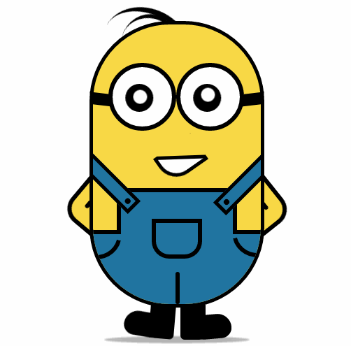
纯CSS3画出小黄人并实现动画效果
HTML页面:


<!DOCTYPE html>
<html lang="en">
<head>
    <meta charset="UTF-8">
    <title>drawLittleHuang</title>
    <link rel="stylesheet" type="text/css" href="drawLittleHuang.css">
</head>
<body>
    <div class="wrapper"><!-- 容器 -->
        <div class="littleH"><!-- 小黄人 -->
            <div class="bodyH"><!-- 身体 -->
                <div class="trousers"><!-- 裤子 -->
                    <div class="condoleBelt"><!-- 吊带 -->
                        <div class="left"></div>
                        <div class="right"></div>
                    </div>
                    <div class="trousers_top"></div><!-- 裤子突出的矩形部分 -->
                    <div class="pocket"></div><!-- 裤袋 -->
                    <!-- 三条线 -->
                    <span class="line_left"></span>
                    <span class="line_right"></span>
                    <span class="line_bottom"></span>
                </div>
            </div>
            <div class="hair"><!-- 头发 -->
                <span class="left_hair_one"></span>
                <span class="left_hair_two"></span>
            </div>
            <div class="eyes"><!-- 眼睛 -->
                <div class="leftEye"><!-- 左眼 -->
                    <div class="left_blackEye">
                        <div class="left_white"></div>
                    </div>
                </div>
                <div class="rightEye"><!-- 右眼 -->
                    <div class="right_blackEye">
                        <div class="right_white"></div>
                    </div>
                </div>
            </div>
            <div class="mouse"><!-- 嘴巴 -->
                <div class="mouse_shape"></div>
            </div>
            <div class="hands"><!-- 双手 -->
                <div class="leftHand"></div>
                <div class="rightHand"></div>
            </div>
            <div class="feet"><!-- 双脚 -->
                <div class="left_foot"></div>
                <div class="right_foot"></div>
            </div>
            <div class="groundShadow"></div><!-- 脚底阴影 -->
        </div>
    </div>
</body>
</html>
CSS样式:
@charset "utf-8";

body{
    margin: 0;
    padding:0;
}
.wrapper{
    width: 300px;
    margin:100px auto;
}
.litteH{
    position: relative;
}
.bodyH{
    position: absolute;
    width: 240px;
    height: 400px;
    border:5px solid #000;
    border-radius: 115px;
    background: rgb(249,217,70);
    overflow: hidden;
    z-index: 2;
}
.bodyH .condoleBelt{
    position: absolute;
}
.bodyH .condoleBelt .left,
.bodyH .condoleBelt .right{
    width: 100px;
    height: 16px;
    border:5px solid #000;
    background: rgb(32,116,160);
    position: absolute;
    top:-90px;
    left:-35px;
    z-index: 2;
    -webkit-transform:rotate(45deg);
}
.bodyH .condoleBelt .left{
    top:-88px;
    left:165px;
    -webkit-transform:rotate(-45deg);
}
.bodyH .condoleBelt .left:after,
.bodyH .condoleBelt .right:after{
    content: '';
    width: 8px;
    height: 8px;
    border-radius: 50%;
    background: #000;
    position: absolute;
    top:4px;
    left:88px;
}

.bodyH .condoleBelt .left:after{
    left:5px;
}
.bodyH .trousers{
    position: absolute;
    bottom: 0;
    width: 100%;
    height: 100px;
    border-top: 6px solid #000;
    background: rgb(32,116,160);
}
.trousers_top{
    width: 160px;
    height: 60px;
    border:6px solid #000;
    border-bottom: none;
    border-radius: 0 0 5px 5px;
    background: rgb(32,116,160);
    position: absolute;
    bottom: 100px;
    left:34px;
}
.pocket{
    width: 60px;
    height: 45px;
    border:6px solid #000;
    border-radius: 0px 0px 25px 25px;
    position: absolute;
    bottom:65px;
    left:84px;
}
.line_right{
    width: 30px;
    height: 30px;
    border-bottom-left-radius: 100px;
    border-bottom:6px solid #000;
    border-left:6px solid #000;
    position: absolute;
    left: 0;
    bottom:60px;
    -webkit-transform:rotate(-75deg);
}
.line_left{
    width: 30px;
    height: 30px;
    border-bottom-right-radius: 100px;
    border-bottom:6px solid #000;
    border-right:6px solid #000;
    position: absolute;
    right: 0;
    bottom:63px;
    -webkit-transform:rotate(75deg);
}
.line_bottom{
    height: 40px;
    border:3px solid #000;
    border-radius: 3px;
    position: absolute;
    left:118px;
    bottom: 0px;
}
.hair{
    position: relative;
}
.left_hair_one{
    width: 130px;
    height: 100px;
    border-radius: 50%;
    border-top:8px solid #000;
    position: absolute;
    left:17px;
    top:-17px;
    -webkit-transform:rotate(27deg);
    -webkit-animation: lefthair 2s ease-in-out infinite;
}
@-webkit-keyframes lefthair{
    0%,25%,31%,100%{
    }
    30%{
        -webkit-transform: rotate(31deg) translate3d(-3px,-1px,0);
    }
}
.left_hair_two{
    width: 80px;
    height: 80px;
    border-radius: 50%;
    border-top:6px solid #000;
    position: absolute;
    left:45px;
    top:-10px;
    -webkit-transform:rotate(15deg);
}
.eyes{
    position: relative;
    z-index: 3;
}
.eyes .leftEye,.eyes .rightEye{
    width: 85px;
    height: 85px;
    border-radius: 50%;
    border:6px solid #000;
    background: #fff;
    position: absolute;
    top:60px;
    left: 27px;
}
.eyes .leftEye{
    left: 124px;
}
.eyes .leftEye .left_blackEye,
.eyes .rightEye .right_blackEye{
    width: 40px;
    height: 40px;
    border-radius: 50%;
    background: #000;
    position: absolute;
    top:24px;
    left:22px;
    -webkit-animation: blackeye 5s ease-in infinite;
}
@-webkit-keyframes blackeye{
    0%,20%,50%,70%,100%{
        -webkit-transform: translateX(0px);
    }
    30%,40%{
        -webkit-transform: translateX(15px);
    }
    80%,90%{
        -webkit-transform: translateX(-15px);
    }
}
.eyes .leftEye .left_blackEye .left_white,
.eyes .rightEye .right_blackEye .right_white{
    width: 20px;
    height: 20px;
    border-radius: 50%;
    background: #fff;
    position: absolute;
    top:7px;
    left:17px;
    -webkit-animation: whiteeye 5s ease-in-out infinite;
}
@-webkit-keyframes whiteeye{
    0%,20%,50%,70%,100%{
        -webkit-transform: translateX(0px);
    }
    30%,40%{
        -webkit-transform: translate3d(3px,4px,0);
    }
    80%,90%{
        -webkit-transform: translate3d(-15px,4px,0);
    }
}
.eyes .leftEye .left_blackEye .left_white{
    top:4px;
    left:17px;
}
.eyes .leftEye:after,
.eyes .rightEye:after{
    content: '';
    width: 28px;
    height: 18px;
    background: #000;
    position: absolute;
    left:-30px;
    top:37px;
    -webkit-transform:skewX(20deg) rotate(7deg);
}
.eyes .leftEye:after{
    left:89px;
    top:37px;
    -webkit-transform:skewX(-20deg) rotate(-7deg);
}
.mouse{
    position: relative;
}
.mouse .mouse_shape{
    width: 55px;
    height: 35px;
    border:5px solid #000;
    border-bottom-left-radius: 30px;
    background: #fff;
    position: absolute;
    top:175px;
    left:98px;
    z-index: 3;
    -webkit-transform:rotate(-35deg);
    -webkit-animation: mouse 5s ease-in-out infinite;
}
@-webkit-keyframes mouse{
    40%,43%{
        width: 45px;
        height: 25px;
        top:180px;
    }
    0%,35%,48%,100%{
        width: 55px;
        height: 35px;
        top:175px;
        -webkit-transform:rotate(-35deg);
    }
}
.mouse .mouse_shape:after{
    content: '';
    width: 70px;
    height: 32px;
    border-bottom:5px solid #000;
    border-radius:35px 26px 5px 5px;
    background: rgb(249,217,70);
    position: absolute;
    top:-16px;
    left:3px;
    -webkit-transform:rotate(34deg);
    -webkit-animation: mouse_mask 5s ease-in-out infinite;
}
@-webkit-keyframes mouse_mask{
    40%,43%{
        width: 60.5px;
        top:-19.3px;
        left:1.5px;
    }
    0%,35%,48%,100%{
        width: 70px;
        top:-16px;
        left:3px;
        -webkit-transform:rotate(33deg);
    }
}
.hands{
    position: relative;
}
.hands .leftHand,
.hands .rightHand{
    width: 80px;
    height: 80px;
    border:6px solid #000;
    border-radius: 25px;
    background: rgb(249,217,70);
    position: absolute;
    top:220px;
    left:-23px;
    -webkit-transform:rotate(40deg);
    -webkit-animation:rightHand .8s ease-in-out infinite;
}
@-webkit-keyframes rightHand{
    0%,50%,100%{
        -webkit-transform: rotate(40deg);
    }
    30%{
        -webkit-transform: rotate(37deg) translateX(1px);
    }
}
.hands .leftHand{
    left:182px;
    top:220px;
    -webkit-transform:rotate(-40deg);
    -webkit-animation:leftHand .8s ease-in-out infinite;
}
@-webkit-keyframes leftHand{
    0%,50%,100%{
        -webkit-transform: rotate(-40deg);
    }
    80%{
        -webkit-transform: rotate(-37deg) translateX(-1px);
    }
}
.hands .leftHand:after,
.hands .rightHand:after{
    content: '';
    width: 6px;
    border:3px solid #000;
    border-radius: 3px;
    position: absolute;
    left:13px;
    top:50px;
    -webkit-transform:rotate(90deg);
}

.hands .leftHand:after{
    left:53px;
    top:50px;
    -webkit-transform:rotate(-90deg);
}
.feet{
    position: relative;
}
.feet .left_foot,
.feet .right_foot{
    width: 36px;
    height: 50px;
    border-bottom-right-radius: 6px;
    border-bottom-left-radius: 9px;
    background: #000;
    position: absolute;
    top: 406px;
    left:88px;
    -webkit-transform-origin: right top;
    -webkit-animation: rightfoot .8s ease-in-out infinite;
}
@-webkit-keyframes rightfoot{
    0%,50%,100%{
        -webkit-transform: rotate(0deg);
    }
    80%{
        -webkit-transform: rotate(10deg);
    }
}
.feet .left_foot{
    border-bottom-right-radius: 9px;
    border-bottom-left-radius: 6px;
    left:130px;
    -webkit-transform-origin: left top;
    -webkit-animation: leftfoot .8s ease-in-out infinite;
}
@-webkit-keyframes leftfoot{
    0%,50%,100%{
        -webkit-transform: rotate(0deg);
    }

    30%{
        -webkit-transform: rotate(-10deg);
    }
}
.feet .left_foot:after,
.feet .right_foot:after{
    content: '';
    width: 60px;
    height: 35px;
    border-radius: 20px 10px 21px 15px;
    background: #000;
    position: absolute;
    left:-36px;
    top:14.4px;
    -webkit-transform:rotate(5deg);
}
.feet .left_foot:after{
    border-radius: 10px 20px 15px 21px;
    left:13px;
    -webkit-transform:rotate(-5deg);
}
.groundShadow{
    width: 200px;
    height: 2px;
    border-radius: 50%;
    background: rgba(0,0,0,0.3);
    box-shadow: 0 0 2px 4px rgba(0,0,0,0.3);
    position: relative;
    top: 455px;
    left:25px;
}
相册演示的代码可以在示例中下载到。
1.3、帮助文档与学习
权威的帮助文档是最好的学习资料,CSS2的帮助,非常详细:
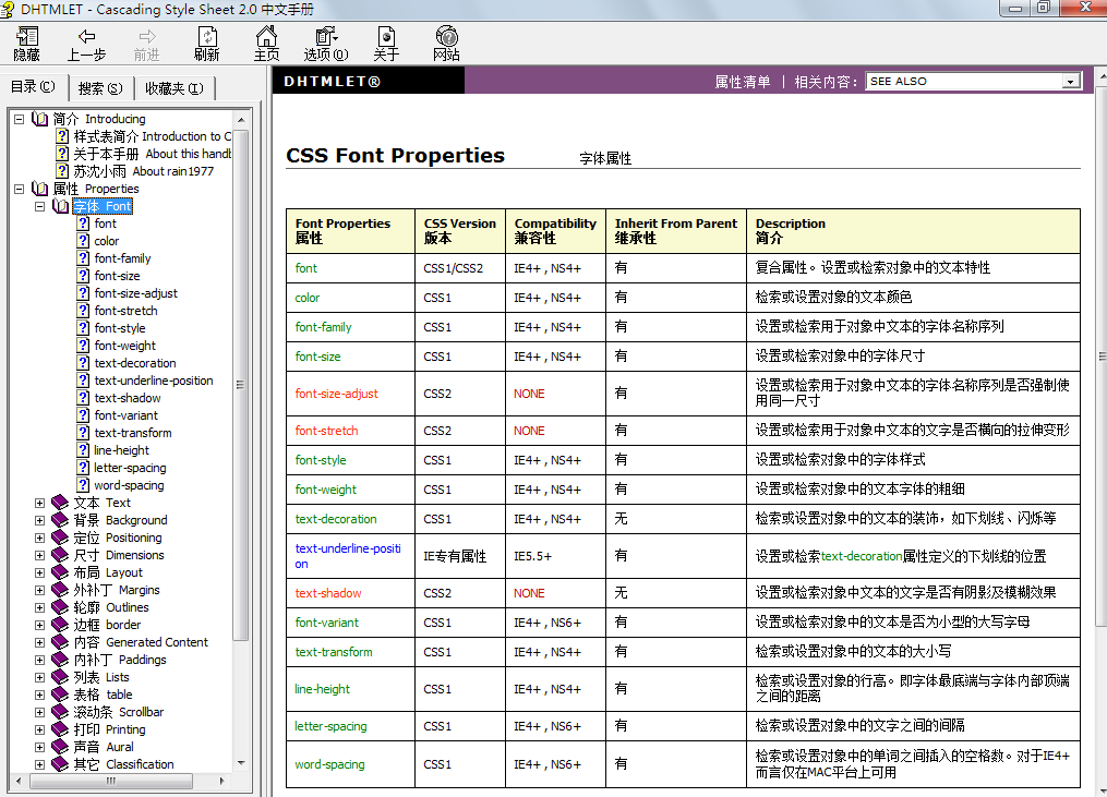
CSS3的帮助文档:
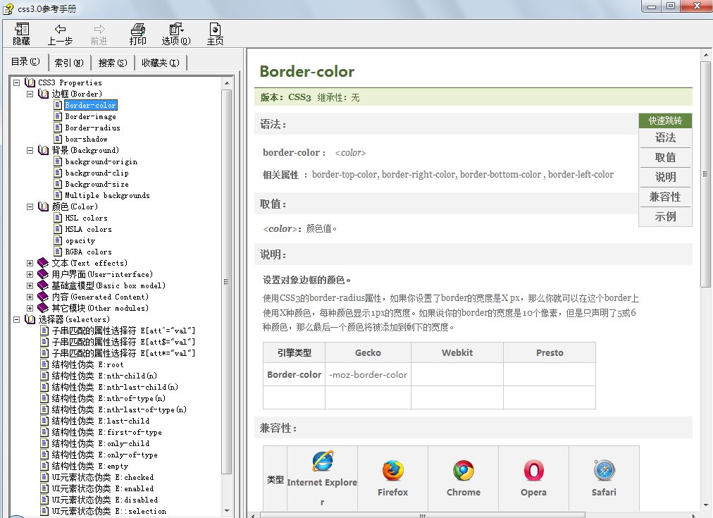
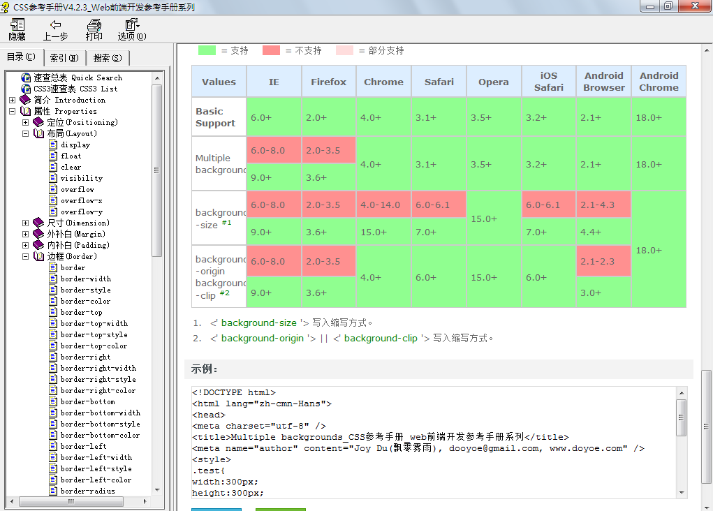
如果打开时右边全是空白,请右键->"属性"—>“解除锁定”
点击下载帮助文档,上课示例的“文档”文件夹中也包含了两个关键的CSS文档
二、选择器
在使用CSS时我们首先要做的事情是找到元素,在写相应的样式,在CSS2.1中最常使用的是三种选择器:
a)、ID选择器:以#开始,引用时使用id,如id="div1"
#div1

{

   color:red;

}
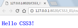
b)、类选择器:以.开始,使用class属性引用,可以有多个,如class="cls1 cls2 cls3"
.cls1

{

   background-color:#99ccff;

}
优先级不以cls1 cls2 cls3在class中出现的顺序判断,而是以定义时的先后,就近原则。
<!DOCTYPE html>
<html>

    <head>
        <meta charset="UTF-8">
        <title></title>
    </head>

    <body>
        <style type="text/css">
            .red {
                color: red;
            }

            .green {
                color: green;
            }

            .blue {
                color: blue;
            }
        </style>
        <h2 class="red blue green">Hello CSS3!</h2>
    </body>

</html>
结果:
c)、标签选择器:以标签名称开始,如p,span,div,*
div span

{

   font-size:14px;

}
当然还有如伪类选择,a:hover,a:link,a:visted,a:active。
在CSS3中新增了很多的选择器,如果大家会jQuery,jQuery中多数选择器在CSS3中都可以直接使用。
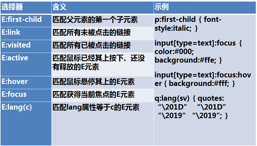
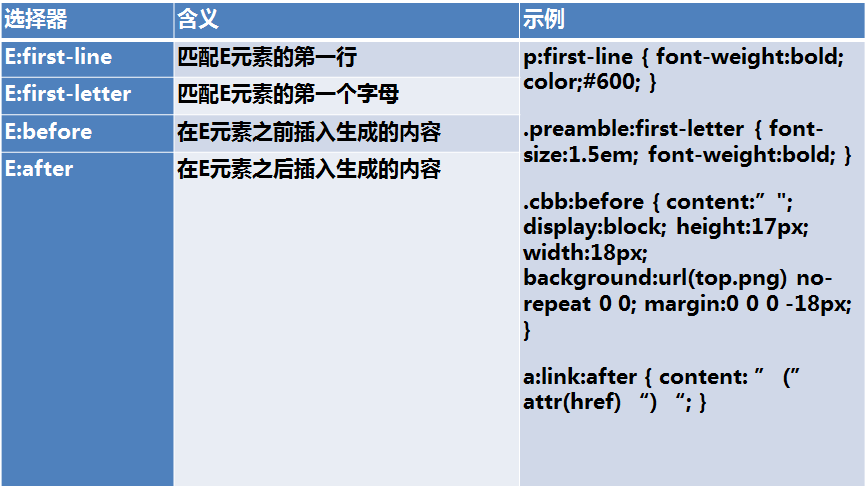
| 选择器 | 例子 | 例子描述 | CSS |
|---|---|---|---|
| .class | .intro | 选择 class="intro" 的所有元素。 | 1 |
| #id | #firstname | 选择 id="firstname" 的所有元素。 | 1 |
| * | * | 选择所有元素。 | 2 |
| element | p | 选择所有 <p> 元素。 | 1 |
| element,element | div,p | 选择所有 <div> 元素和所有 <p> 元素。 | 1 |
| element element | div p | 选择 <div> 元素内部的所有 <p> 元素。 | 1 |
| element>element | div>p | 选择父元素为 <div> 元素的所有 <p> 元素。 | 2 |
| element+element | div+p | 选择紧接在 <div> 元素之后的所有 <p> 元素。 | 2 |
| [attribute] | [target] | 选择带有 target 属性所有元素。 | 2 |
| [attribute=value] | [target=_blank] | 选择 target="_blank" 的所有元素。 | 2 |
| [attribute~=value] | [title~=flower] | 选择 title 属性包含单词 "flower" 的所有元素。 | 2 |
| [attribute|=value] | [lang|=en] | 选择 lang 属性值以 "en" 开头的所有元素。 | 2 |
| :link | a:link | 选择所有未被访问的链接。 | 1 |
| :visited | a:visited | 选择所有已被访问的链接。 | 1 |
| :active | a:active | 选择活动链接。 | 1 |
| :hover | a:hover | 选择鼠标指针位于其上的链接。 | 1 |
| :focus | input:focus | 选择获得焦点的 input 元素。 | 2 |
| :first-letter | p:first-letter | 选择每个 <p> 元素的首字母。 | 1 |
| :first-line | p:first-line | 选择每个 <p> 元素的首行。 | 1 |
| :first-child | p:first-child | 选择属于父元素的第一个子元素的每个 <p> 元素。 | 2 |
| :before | p:before | 在每个 <p> 元素的内容之前插入内容。 | 2 |
| :after | p:after | 在每个 <p> 元素的内容之后插入内容。 | 2 |
| :lang(language) | p:lang(it) | 选择带有以 "it" 开头的 lang 属性值的每个 <p> 元素。 | 2 |
| element1~element2 | p~ul | 选择前面有 <p> 元素的每个 <ul> 元素。 | 3 |
| [attribute^=value] | a[src^="https"] | 选择其 src 属性值以 "https" 开头的每个 <a> 元素。 | 3 |
| [attribute$=value] | a[src$=".pdf"] | 选择其 src 属性以 ".pdf" 结尾的所有 <a> 元素。 | 3 |
| [attribute*=value] | a[src*="abc"] | 选择其 src 属性中包含 "abc" 子串的每个 <a> 元素。 | 3 |
| :first-of-type | p:first-of-type | 选择属于其父元素的首个 <p> 元素的每个 <p> 元素。 | 3 |
| :last-of-type | p:last-of-type | 选择属于其父元素的最后 <p> 元素的每个 <p> 元素。 | 3 |
| :only-of-type | p:only-of-type | 选择属于其父元素唯一的 <p> 元素的每个 <p> 元素。 | 3 |
| :only-child | p:only-child | 选择属于其父元素的唯一子元素的每个 <p> 元素。 | 3 |
| :nth-child(n) | p:nth-child(2) | 选择属于其父元素的第二个子元素的每个 <p> 元素。 | 3 |
| :nth-last-child(n) | p:nth-last-child(2) | 同上,从最后一个子元素开始计数。 | 3 |
| :nth-of-type(n) | p:nth-of-type(2) | 选择属于其父元素第二个 <p> 元素的每个 <p> 元素。 | 3 |
| :nth-last-of-type(n) | p:nth-last-of-type(2) | 同上,但是从最后一个子元素开始计数。 | 3 |
| :last-child | p:last-child | 选择属于其父元素最后一个子元素每个 <p> 元素。 | 3 |
| :root | :root | 选择文档的根元素。 | 3 |
| :empty | p:empty | 选择没有子元素的每个 <p> 元素(包括文本节点)。 | 3 |
| :target | #news:target | 选择当前活动的 #news 元素。 | 3 |
| :enabled | input:enabled | 选择每个启用的 <input> 元素。 | 3 |
| :disabled | input:disabled | 选择每个禁用的 <input> 元素 | 3 |
| :checked | input:checked | 选择每个被选中的 <input> 元素。 | 3 |
| :not(selector) | :not(p) | 选择非 <p> 元素的每个元素。 | 3 |
| ::selection | ::selection | 选择被用户选取的元素部分。 | 3 |
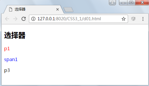
1.1、基础的选择器
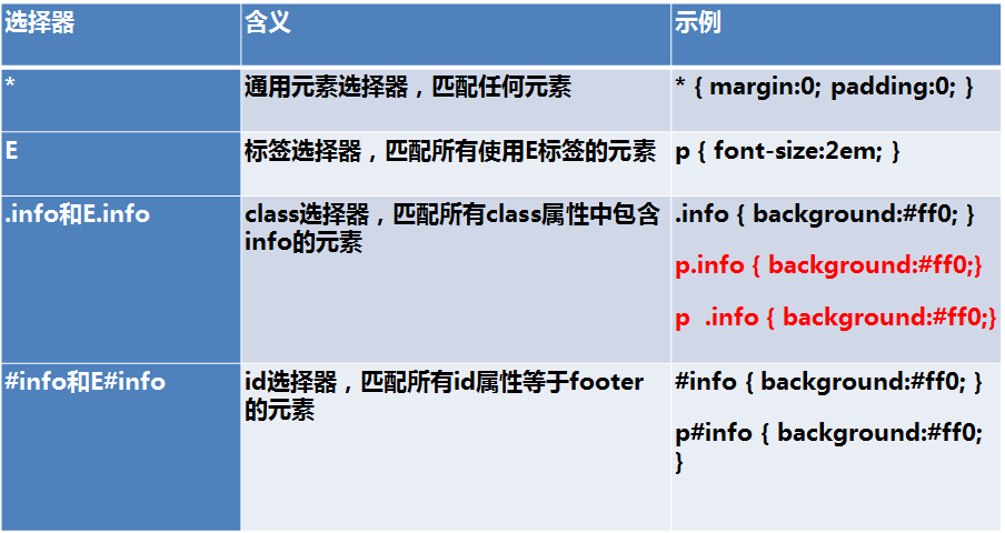
红色字体中选择器的区别是:p.info的意思是p元素中必须有class="info"属性将被选择,p .info是选择后代元素,示例:
<!DOCTYPE html>
<html>
    <head>
        <meta charset="UTF-8">
        <title>选择器</title>
        <style type="text/css">
            p.info{
                color: red;
            }
            p .info{
                color: blue;
            }
        </style>
    </head>
    <body>
        <h2>选择器</h2>
        <p class="info">p1</p>
        <p>
                <span class="info">span1</span>
                <p>p3</p>
        </p>
    </body>
</html>
运行结果:
1.2、组合选择器
示例:
<!DOCTYPE html>
<html>
    <head>
        <meta charset="UTF-8">
        <title>组合选择器</title>
        <style type="text/css">
             #div1 span
             {
                 color: red;
             }
        </style>
    </head>
    <body>
        <h2>组合选择器</h2>
        <div id="div1">
            <span>span1</span>
            <div id="div2">
                <span>span2</span>
            </div>
        </div>
        <span>span3</span>
    </body>
</html>
运行结果:

示例:
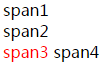
<!DOCTYPE html>
<html>
    <head>
        <meta charset="UTF-8">
        <title>组合选择器</title>
        <style type="text/css">
             #div1 > span
             {
                 color: red;
             }
        </style>
    </head>
    <body>
        <h2>组合选择器</h2>
        <div id="div1">
            <span>span1</span>
            <div id="div2">
                <span>span2</span>
            </div>
        </div>
        <span>span3</span>
    </body>
</html>

<!DOCTYPE html>
<html>
    <head>
        <meta charset="UTF-8">
        <title>组合选择器</title>
        <style type="text/css">
             #div1 + span
             {
                 color: red;
             }
        </style>
    </head>
    <body>
        <h2>组合选择器</h2>
        <div id="div1">
            <span>span1</span>
            <div id="div2">
                <span>span2</span>
            </div>
        </div>
        <span>span3</span>
        <span>span4</span>
    </body>
</html>
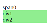
1.3、属性选择器
<!DOCTYPE html>
<html>
    <head>
        <meta charset="UTF-8">
        <title>属性选择器</title>
        <style type="text/css">
            div[id][class~=cls1] {
                background: lightgreen;
            }
        </style>
    </head>
    <body>
        <h2>组合选择器</h2>
        <span>span0</span>
        <div id="div1" class="cls1">
            div1
        </div>
        <div id="div2" class="cls1 cls2">
            div2
        </div>
    </body>

</html>
运行结果:
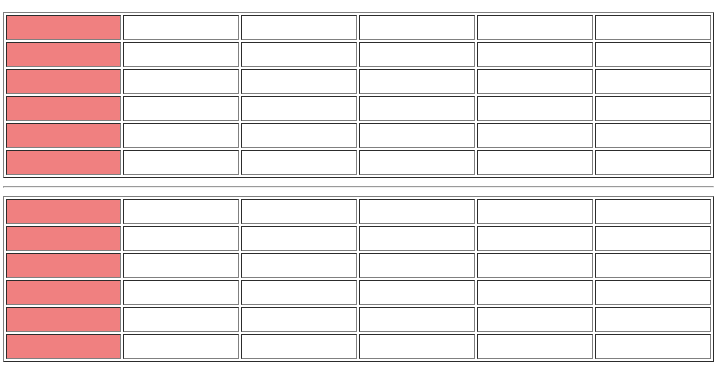
1.4、伪类
示例:
<!DOCTYPE html> <html> <head> <meta charset="UTF-8"> <title>伪类</title> <style type="text/css"> td:first-child { background: lightcoral; } </style> </head> <body> <h2>组合选择器</h2> <table border="1" width="100%"> <tr> <td> </td><td> </td><td> </td><td> </td><td> </td><td> </td> </tr> <tr> <td> </td><td> </td><td> </td><td> </td><td> </td><td> </td> </tr> <tr> <td> </td><td> </td><td> </td><td> </td><td> </td><td> </td> </tr> <tr> <td> </td><td> </td><td> </td><td> </td><td> </td><td> </td> </tr> <tr> <td> </td><td> </td><td> </td><td> </td><td> </td><td> </td> </tr> <tr> <td> </td><td> </td><td> </td><td> </td><td> </td><td> </td> </tr> </table> <hr /> <table border="1" width="100%"> <tr> <td> </td><td> </td><td> </td><td> </td><td> </td><td> </td> </tr> <tr> <td> </td><td> </td><td> </td><td> </td><td> </td><td> </td> </tr> <tr> <td> </td><td> </td><td> </td><td> </td><td> </td><td> </td> </tr> <tr> <td> </td><td> </td><td> </td><td> </td><td> </td><td> </td> </tr> <tr> <td> </td><td> </td><td> </td><td> </td><td> </td><td> </td> </tr> <tr> <td> </td><td> </td><td> </td><td> </td><td> </td><td> </td> </tr> </table> </body> </html>
运行结果:
练习:实现隔行换色,当鼠标悬停在每一行上时高亮显示为黄色,按下时高亮红色。
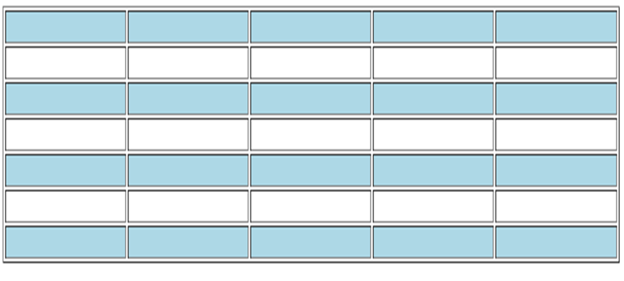
        <style type="text/css">
           tr:nth-child(2n+1){
                background:lightblue;
           }
           tr:hover{
               background: yellow;
           }
           tr:active{
               background: orangered;
           }
        </style>
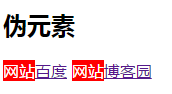
1.5、伪元素
标准的伪元素应该使用::,但单:也行,只是为了兼容。
示例:
<!DOCTYPE html>
<html>
    <head>
        <meta charset="UTF-8">
        <title>伪类</title>
        <style type="text/css">
            a::before {
                content: "网站";
                display: inline-block;
                background: red;
                color: white;
            }
        </style>
    </head>
    <body>
        <h2>伪元素</h2>
        <a href="http://www.baidu.com">百度</a>
        <a href="http://best.cnblogs.com">博客园</a>
    </body>
</html>
运行结果:
content的特殊值
none:不生成任何内容
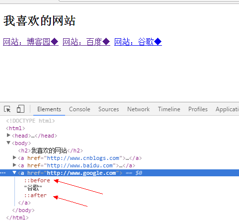
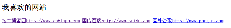
attr:插入标签属性值
<!DOCTYPE html>
<html>

    <head>
        <meta charset="UTF-8">
        <title>伪元素</title>
        <style type="text/css">
            a:before {
                content: attr(title);
            }

            a:after {
                content: attr(href);
            }
        </style>
    </head>

    <body>
        <h2>我喜欢的网站</h2>
        <a href="http://www.cnblogs.com" title="技术">博客园</a>
        <a href="http://www.baidu.com" title="国内">百度</a>
        <a href="http://www.google.com" title="国外">谷歌</a>
    </body>

</html>
结果:
url:使用指定的绝对或相对地址插入一个外部资源(图像,声频,视频或浏览器支持的其他任何资源)
<!DOCTYPE html>
<html>

    <head>
        <meta charset="UTF-8">
        <title>伪元素</title>
        <style type="text/css">
            a:before {
                content: url(../img/success.png);
            }

            a:after {
                content: url(https://ss0.bdstatic.com/5aV1bjqh_Q23odCf/static/superman/img/logo/bd_logo1_31bdc765.png);
            }
        </style>
    </head>

    <body>
        <h2>我喜欢的网站</h2>
        <a href="http://www.cnblogs.com" title="技术">博客园</a>
        <a href="http://www.baidu.com" title="国内">百度</a>
        <a href="http://www.google.com" title="国外">谷歌</a>
    </body>

</html>
string:插入字符串
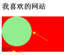
插入的伪元素可以作为一个元素使用,元素是被插入在指定元素内部,是父子关系:
<!DOCTYPE html>
<html>

    <head>
        <meta charset="UTF-8">
        <title>伪元素</title>
        <style type="text/css">
            #div1{
                background: red;
            }
            #div1:before {
                content: " ";
                display: block;
                background: lightgreen;
                border-radius: 50px;
                width: 100px;
                height: 100px;
            }

        </style>
    </head>

    <body>
        <h2>我喜欢的网站</h2>
        <div id="div1">
            Div1
        </div>
    </body>

</html>
结果:
三、特殊性(优先级)
a)、同类型,同级别的样式后者先于前者
b)、ID > 类样式 > 标签 > *
c)、内联>ID选择器>伪类>属性选择器>类选择器>标签选择器>通用选择器(*)>继承的样式


 扫一扫
扫一扫


 被折叠的 条评论
为什么被折叠?
被折叠的 条评论
为什么被折叠?
 到【灌水乐园】发言


