<!DOCTYPE HTML PUBLIC "-//W3C//DTD HTML 4.01 Transitional//EN" "http://www.w3.org/TR/html4/loose.dtd">
<html lang="en">
<head>
<meta http-equiv="Content-Type" content="text/html;charset=UTF-8">
<title>csstransiton</title>
<style type="text/css">
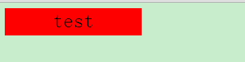
#test{
background-color:blue;
color:white;
width:100px;
height:40px;
font-family:"Mircosoft YaHei";
font-size:30px;
font-weight:10;
text-align:center;
-webkit-transition:color 1s linear,width 2s ease-out,background-color 2s linear;
-moz-transition:color 1s linear,width 2s ease,background-color 2s linear;
-o-transition:color 1s linear,width 2s ease,background-color 2s linear
}
#test:hover{
background-color:red;
color:black;
width:200px;
}
</style>
</head>
<body>
<div id="test">
<span>test</span>
</div>
</body>
</html>
<!DOCTYPE HTML PUBLIC "-//W3C//DTD HTML 4.01 Transitional//EN" "http://www.w3.org/TR/html4/loose.dtd">
<html lang="en">
<head>
<meta http-equiv="Content-Type" content="text/html;charset=UTF-8">
<title>jstransitions</title>
<style type="text/css">
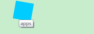
img{
position:absolute;
top:20px;
left:20px;
-webkit-transform:rotate(4deg);
-moz-transform:rotate(4deg);
-o-transform:rotate(4deg);
-webkit-transition:left 1s linear,-webkit-transform 1s linear;
-moz-transition:left 1s linear,-moz-transform 1s linear ;
-o-transiton:left 1s linear,-o-transform 1s linear;
}
#pic:hover img{
left:60px;
position:absolute;
-webkit-transform:rotate(190deg) scale(1.5);
-moz-transform:rotate(190deg) scale(1.5);
-o-transform:rotate(190deg) scale(1.5);
}
</style>
</head>
<body>
<div id="pic">
<img src="1.png" alt="*" title="apps" style="width:40px;height:40px" />
</div>
</body>
</html>
<!DOCTYPE HTML PUBLIC "-//W3C//DTD HTML 4.01 Transitional//EN" "http://www.w3.org/TR/html4/loose.dtd">
<html lang="en">
<head>
	<meta http-equiv="Content-Type" content="text/html;charset=UTF-8">
	<title>jsanimation</title>
	<style type="text/css">
	 #test{
	    background-color:gray;
		height:20px;
		width:100px;
	  }
	  @-webkit-keyframes mychange{
	    0%{
		   width:100px;
		   background-color:skyblue;
		}
		40%{
		  width:60px;
		  background-color:blue;
		}
		100%{
		  width:10px;
		  background-color:darkblue;
		}
	  }
	  #test:hover{
	    -webkit-animation:mychange 5s linear;
	  }
	</style>
</head>
<body>
	<div id="test">
	  <span>test</span>

	</div>
</body>
</html>


 扫一扫
扫一扫


 1218
1218

 被折叠的 条评论
为什么被折叠?
被折叠的 条评论
为什么被折叠?
 到【灌水乐园】发言


