


 本文介绍如何使用Weex中的Slider与Indicator组件构建引导页,并解决Indicator样式导致的页面渲染慢的问题。通过将Indicator样式改为内联样式,提高了渲染效率。
slider 和 indicator 都是 weex 的内置组件,且 indicator 是 slider 的子组件。
1.报错处理
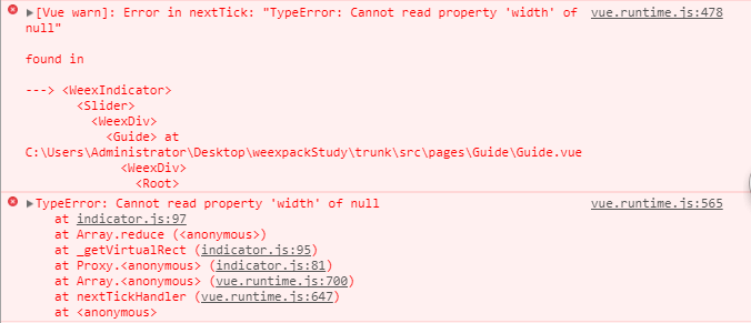
原因解析:indicator 样式页面渲染慢
解决方案:indicator 的样式写为 内联样式
2.Guide.vue
<!-- 引导页 -->
<template>
<div class="wrap">
<!-- 轮播图 -->
<slider class="slider" auto-play="true" interval="5000" >
<div class="slider-pages" v-for="item in itemList">
<image class="thumb" :src="item.pictureUrl" resize="stretch"></image>
</div>
<!-- 指示器 style="width:720px;height:30px;" -->
<indicator class="indicator"></indicator>
</slider>
<!-- 开始体验 -->
<text class='btn' @click="goStart">{{txt}}</text>
</div>
</template>
<style scoped>
.wrap{
align-items: center;
justify-content: center;
flex-direction: column;
background-color: #2B2D2F;
}
/*轮播图*/
.slider {
width: 750px;
height: 1000px;
background-color: transparent;
align-items: center;
justify-content: center;
margin-top: 0px;
margin-bottom: 0px;
margin-left: auto;
margin-right: auto;
}
/*轮播图 图片*/
.slider-pages {
flex-direction: row;
width: 720px;
height: 1000px;
align-items: center;
justify-content: center;
margin-top: 0px;
margin-bottom: 0px;
margin-left: auto;
margin-right: auto;
}
.thumb {
width: 720px;
height: 1280px;
align-items: center;
justify-content: center;
margin-top: 0px;
margin-bottom: 0px;
margin-left: auto;
margin-right: auto;
}
/*轮播图 指示器*/
.indicator {
position: absolute;
top: 970px;
width: 720px;
height: 30px;
item-color: #dddddd;
item-selected-color: rgb(40, 96, 144);
}
/*开始体验 按钮*/
.btn{
width: 300px;
height: 60px;
margin-top: 20px;
background-color:#0096FF;
font-size:25px;
height:60px;
font-weight: bold;
align-items: center;
justify-content: center;
border-radius: 50;
color:#FFFFFF;
}
</style>
<script>
export default {
data() {
return {
txt:"开始体验",
itemList: [
{title: 'A', pictureUrl: 'https://duqian291902259.github.io/dusan/oair/bg1.png'},
{title: 'B', pictureUrl: 'https://duqian291902259.github.io/dusan/oair/bg2.png'},
{title: 'C', pictureUrl: 'https://duqian291902259.github.io/dusan/oair/bg1.png'}
]
}
},
methods: {
goStart() {
// 页面跳转
this.$router.push({path:'/splash'});
}
}
}
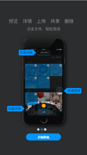
</script>3.效果图


 扫一扫
扫一扫


 3913
3913

 被折叠的 条评论
为什么被折叠?
被折叠的 条评论
为什么被折叠?
 到【灌水乐园】发言


