


 本文介绍Xamarin.Forms 2.5.0版本中引入的性能优化特性,包括布局压缩、表单嵌入以及macOS桌面支持改进等。通过布局压缩减少视图数量,提升渲染效率;表单嵌入允许将Xamarin.Forms页面嵌入到原生应用中;macOS桌面支持增强用户体验。
在过去一年中,我们一直在研究几个“大事”,使您能够在更多平台上创建更多性能更强的应用程序。 随着我们最新的稳定版本2.4.0,我们在Android上引入了性能优化的渲染器,绰号“快速渲染器”。 虽然更快的平台渲染器是一个明显的胜利,但您真正开始看到使用它们与新功能相结合的巨大收获,在2.5.0上推出,称为布局压缩。 不要被那些以性能为重点的提升黯然失色,我们也在此预览中发布表单嵌入。 我们很高兴将这些改进放在我们的公共路线图的页面上,并把它们放在你手中。 请阅读有关如何从这些梦幻般的改进开始受益的详细信息等等。
大事1:布局压缩
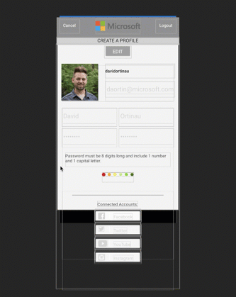
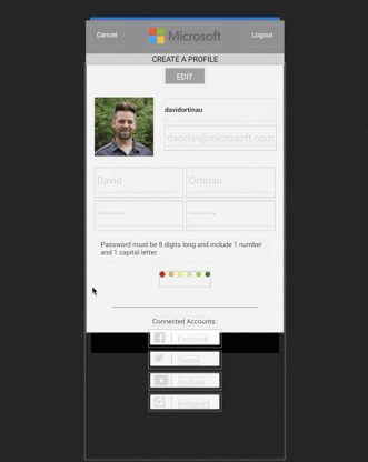
在优化性能布局时,无论是为了更平滑的动画还是渲染速度,您都可以快速了解平面视图层次结构的价值。 以此页面为例:
点击(此处)折叠或打开
- ?xml version="1.0" encoding="utf-8"?>
- ContentPage
- xmlns="http://xamarin.com/schemas/2014/forms"
- xmlns:x="http://schemas.microsoft.com/winfx/2009/xaml"
- xmlns:local="clr-namespace:ProfileLayout"
- x:Class="ProfileLayout.ProfileLayoutPage"
- xmlns:views="using:ProfileLayout.Views"
- xmlns:controls="clr-namespace:ImageCircle.Forms.Plugin.Abstractions;assembly=ImageCircle.Forms.Plugin.Abstractions"
- xmlns:converters="using:ProfileLayout.Converters;"
- Title="Profile"
- BackgroundColor="#F3F3F3">
- ContentPage.Resources>
- ResourceDictionary>
- converters:InvertedBoolConverter x:Key="InvertedBoolConverter"/>
-
- !-- Global Colors -->
- Color
- x:Key="primaryColor">#303030/Color>
- Color
- x:Key="secondaryColor">#C9AE98/Color>
- Color
- x:Key="validationColor">#FF3F56/Color>
- Color
- x:Key="callToActionColor">#4E8B4F/Color>
- Color
- x:Key="accentColor">White/Color>
- Color
- x:Key="darkAccentColor">#7c6a5c/Color>
- !-- Global Sizes -->
- x:Double
- x:Key="mediumTextSize">20/x:Double>x:Double
- x:Key="smallTextSize">14/x:Double>x:Double
- x:Key="standardPadding">10/x:Double>
-
- !-- Global Element Styles -->
- Style
- TargetType="Entry">
- Setter
- Property="HeightRequest"
- Value="44" />
- Setter
- Property="TextColor"
- Value="{StaticResource darkAccentColor}" />
- /Style>
-
- Style
- TargetType="NavigationPage">Setter
- Property="BarBackgroundColor"
- Value="{StaticResource primaryColor}" />/Style>Style
- TargetType="Frame">Setter
- Property="BackgroundColor"
- Value="{StaticResource accentColor}" />Setter
- Property="Padding"
- Value="{StaticResource standardPadding}" />Setter
- Property="HasShadow"
- Value="False" />Setter
- Property="OutlineColor"
- Value="{StaticResource secondaryColor}" />/Style>!-- Label Styles -->Style
- x:Key="switchLabel"
- TargetType="Label">Setter
- Property="TextColor"
- Value="#999999" />Setter
- Property="VerticalOptions"
- Value="Center" />Setter
- Property="HorizontalOptions"
- Value="FillAndExpand" />/Style>!-- Button Styles -->Style
- x:Key="callToActionButton"
- TargetType="Button">Setter
- Property="BackgroundColor"
- Value="{StaticResource callToActionColor}" />Setter
- Property="TextColor"
- Value="{StaticResource accentColor}" />Setter
- Property="FontSize"
- Value="{StaticResource mediumTextSize}" />/Style>
- Style
- x:Key="primaryButton"
- TargetType="Button">
- Setter
- Property="BackgroundColor"
- Value="{StaticResource primaryColor}" />
- Setter
- Property="TextColor"
- Value="{StaticResource accentColor}" />
- Setter
- Property="FontSize"
- Value="{StaticResource smallTextSize}" />/Style>
-
- Style
- x:Key="nakedButton"
- TargetType="Button">
- Setter
- Property="BackgroundColor"
- Value="Transparent" />
- Setter
- Property="TextColor"
- Value="{StaticResource accentColor}" />
- Setter
- Property="BorderColor"
- Value="Transparent"/>
- Setter
- Property="BorderWidth"
- Value="0"/>
- Setter
- Property="FontSize"
- Value="{StaticResource mediumTextSize}" />/Style>
-
- Style
- x:Key="whiteClearButton"
- TargetType="Button">
- Setter
- Property="BackgroundColor"
- Value="Transparent" />
- Setter
- Property="BorderColor"
- Value="{StaticResource accentColor}" />
- Setter
- Property="BorderWidth"
- Value="1" />
- Setter
- Property="TextColor"
- Value="{StaticResource accentColor}" />
- Setter
- Property="FontSize"
- Value="{StaticResource smallTextSize}" />
- /Style>
-
- Style
- x:Key="secondaryButton"
- TargetType="Button">Setter
- Property="BackgroundColor"
- Value="{StaticResource secondaryColor}" />Setter
- Property="TextColor"
- Value="{StaticResource accentColor}" />Setter
- Property="FontSize"
- Value="{StaticResource smallTextSize}" />Setter
- Property="FontAttributes"
- Value="Bold" />/Style>Style
- x:Key="footerButton"
- TargetType="Button">Setter
- Property="BackgroundColor"
- Value="{StaticResource secondaryColor}" />Setter
- Property="TextColor"
- Value="{StaticResource accentColor}" />Setter
- Property="FontSize"
- Value="{StaticResource smallTextSize}" />Setter
- Property="FontAttributes"
- Value="Bold" />Setter
- Property="HorizontalOptions"
- Value="FillAndExpand" />/Style>
- /ResourceDictionary>
- /ContentPage.Resources>
- ContentPage.Padding>
- OnPlatform x:TypeArguments="Thickness" iOS="0,0,0,0" Android="0,0,0,0" />
- /ContentPage.Padding>
-
- ContentPage.Content>
-
- StackLayout
- Spacing="0"
- VerticalOptions="FillAndExpand"
- HorizontalOptions="FillAndExpand">
- AbsoluteLayout
- BackgroundColor="#909090"
- HorizontalOptions="FillAndExpand"
- HeightRequest="60">
- AbsoluteLayout.Padding>
- OnPlatform x:TypeArguments="Thickness" iOS="0,20,0,0" Android="0,0,0,0" />
- /AbsoluteLayout.Padding>
- Button
- Margin="10,10"
- FontSize="12"
- Text="Cancel"
- BackgroundColor="Transparent"
- Command="{Binding CancelCommand}"
- Style="{StaticResource nakedButton}"/>
- Image
- AbsoluteLayout.LayoutBounds="0.5, 0.5, 0.36, 0.7"
- AbsoluteLayout.LayoutFlags="All"
- BackgroundColor="Transparent"
- HeightRequest="36"
- Source="microsoft_gray.png" />
- Button
- IsVisible="{Binding IsLoggedIn}"
- Margin="10,10"
- BackgroundColor="Transparent"
- AbsoluteLayout.LayoutBounds="1, 0, AutoSize, AutoSize"
- AbsoluteLayout.LayoutFlags="PositionProportional"
- FontSize="12"
- Text="Logout"
- Command="{Binding LogoutCommand}"
- Style="{StaticResource nakedButton}"/>
- /AbsoluteLayout>
-
- Label
- HorizontalOptions="FillAndExpand"
- BackgroundColor="#D1D1D1"
- HeightRequest="22"
- TextColor="#000000"
- FontSize="14"
- HorizontalTextAlignment="Center"
- Text="{Binding Title}"/>
-
- ScrollView HorizontalOptions="FillAndExpand" VerticalOptions="FillAndExpand">
-
- StackLayout
- Spacing="0"
- VerticalOptions="FillAndExpand"
- HorizontalOptions="FillAndExpand">
-
- Button
- Margin="0,10,0,0"
- IsVisible="{Binding CanEdit}"
- Text=" EDIT "
- Style="{StaticResource primaryButton}"
- BackgroundColor="#9B9B9B"
- HeightRequest="35"
- HorizontalOptions="Center"
- Command="{Binding ToggleEditModeCommand}"
- />
-
- Button
- Margin="0,10,0,0"
- IsVisible="{Binding IsEditing}"
- Text=" EDITING "
- BackgroundColor="#9B9B9B"
- Style="{StaticResource primaryButton}"
- HeightRequest="35"
- HorizontalOptions="Center"
- Command="{Binding ToggleEditModeCommand}"
- />
-
- StackLayout
- Margin="20"
- Spacing="20"
- HorizontalOptions="FillAndExpand"
- Orientation="Horizontal">
-
- StackLayout
- Spacing="10"
- Orientation="Vertical">
-
- controls:CircleImage
- x:Name="ProfilePic"
- Source="david.jpg"
- BorderThickness="3"
- BorderColor="#9B9B9B"
- Aspect="AspectFill">
- controls:CircleImage.WidthRequest>
- OnPlatform x:TypeArguments="x:Double"
- iOS="104"
- Android="104"
- WinPhone="104"/>
- /controls:CircleImage.WidthRequest>
- controls:CircleImage.HeightRequest>
- OnPlatform x:TypeArguments="x:Double"
- iOS="104"
- Android="104"
- WinPhone="104"/>
- /controls:CircleImage.HeightRequest>
- /controls:CircleImage>
-
- Button
- IsVisible="{Binding CanSave}"
- Text="Change Photo"
- Style="{StaticResource nakedButton}"
- FontSize="12"
- BorderColor="Transparent"
- BorderWidth="0"
- BackgroundColor="Transparent"
- TextColor="#303030"
- >
- /Button>
- /StackLayout>
-
- StackLayout
- Spacing="10"
- HorizontalOptions="FillAndExpand"
- Orientation="Vertical">
-
-
- Entry
- IsVisible="{Binding IsLoggedIn, Converter={StaticResource InvertedBoolConverter}}"
- HorizontalOptions="FillAndExpand"
- Placeholder="Username"
- Text="{Binding Username}"
- x:Name="UsernameEntry" />
-
- Label
- IsVisible="{Binding IsLoggedIn}"
- Text="{Binding Username}"
- TextColor="#303030"
- FontSize="12"
- FontAttributes="Bold"
- HeightRequest="40"
- VerticalTextAlignment="Center"
- />
-
- Entry
- IsEnabled="{Binding CanSave}"
- x:Name="EmailEntry"
- HorizontalOptions="FillAndExpand"
- Placeholder="Email"
- Text="{Binding UserEmail}" />
-
- /StackLayout>
- /StackLayout>
-
- Grid Margin="20, 0, 20, 0">
- Grid.RowDefinitions>
- RowDefinition Height="53" />
- RowDefinition Height="53" />
- RowDefinition Height="60" />
- RowDefinition Height="28" />
- RowDefinition Height="*" />
- RowDefinition Height="45" />
- /Grid.RowDefinitions>
-
- Grid.ColumnDefinitions>
- ColumnDefinition Width="1*"/>
- ColumnDefinition Width="1*"/>
- /Grid.ColumnDefinitions>
-
- Entry
- Grid.Row="0" Grid.Column="0"
- IsEnabled="{Binding CanSave}"
- x:Name="FirstNameEntry"
- HorizontalOptions="FillAndExpand"
- Placeholder="First Name"
- Text="{Binding FirstName}" />
-
- Entry
- Grid.Row="0" Grid.Column="1"
- IsEnabled="{Binding CanSave}"
- x:Name="LastNameEntry"
- HorizontalOptions="FillAndExpand"
- Placeholder="Last Name"
- Text="{Binding LastName}" />
-
- Entry
- Grid.Row="1" Grid.Column="0"
- IsEnabled="{Binding CanSave}"
- x:Name="PasswordEntry"
- IsPassword="true"
- HorizontalOptions="FillAndExpand"
- Placeholder="Password"
- Text="{Binding UserPassword}" />
-
- Entry
- Grid.Row="1" Grid.Column="1"
- IsEnabled="{Binding CanSave}"
- x:Name="ConfirmPasswordEntry"
- IsPassword="true"
- HorizontalOptions="FillAndExpand"
- Placeholder="Confirm Password"
- Text="{Binding ConfirmUserPassword, Mode=TwoWay}" />
-
-
- Label
- Grid.Row="2" Grid.ColumnSpan="2"
- IsEnabled="{Binding CanSave}"
- Margin="10"
- Text="Password must be 8 digits long and include 1 number and 1 capital letter."
- TextColor="#303030"
- FontSize="12"
- HorizontalOptions="FillAndExpand"
- />
-
- views:StrengthIndicators
- IsEnabled="{Binding CanSave}"
- Strength="{Binding PasswordStrength}"
- HorizontalOptions="Center"
- Grid.Row="3" Grid.ColumnSpan="2" />
-
- StackLayout
- Margin="0,20,0,40"
- Grid.Row="4" Grid.ColumnSpan="2"
- IsVisible="{Binding IsLoggedIn}">
-
- BoxView
- Margin="30,10"
- BackgroundColor="#9B9B9B"
- HorizontalOptions="FillAndExpand"
- HeightRequest="1"
- />
-
- Label
- Text="Connected Accounts:"
- HorizontalOptions="Center"
- TextColor="#303030"
- FontSize="12"/>
-
- views:ConnectSocialButtonView
- HorizontalOptions="Center"
- BindingContext="{Binding FacebookVM}" />
-
- views:ConnectSocialButtonView
- HorizontalOptions="Center" BindingContext="{Binding TwitterVM}" />
-
- views:ConnectSocialButtonView
- HorizontalOptions="Center" BindingContext="{Binding YouTubeVM}" />
-
- views:ConnectSocialButtonView
-
- HorizontalOptions="Center" BindingContext="{Binding InstagramVM}" />
-
- /StackLayout>
-
- Button
- Grid.Row="5" Grid.ColumnSpan="2"
- IsVisible="{Binding CanSave}"
- HeightRequest="45"
- x:Name="SaveButton"
- Style="{StaticResource primaryButton}"
- Text=" Submit "
- HorizontalOptions="Center"
- Command="{Binding SaveCommand}">
- /Button>
- /Grid>
- /StackLayout>
- /ScrollView>
-
- /StackLayout>
- /ContentPage.Content>
- /ContentPage>
源码: https://github.com/davidortinau/ProfileLayout
注意:此页面根本没有优化。 事实上,你可能会指出许多应该改变的事情。
复合这个平均布局,需要为平台渲染器创建额外的容器渲染器和包装器,并且在视图树中产生比所需的更多视图,大约130个此示例。
考虑到执行布局需要用于测量和布局的子对象递归。 UI越深(视图中的视图),需要的迭代越多。 布局压缩允许您指定不必要的嵌套,并允许Xamarin.Forms选择不创建该布局视图。
使用Xamarin Inspector,我们可以查看此页面的UI分层,无需布局压缩或启用快速渲染器:
现在在MainActivity.cs中启用快速渲染器:
点击(此处)折叠或打开
- public class MainActivity : global::Xamarin.Forms.Platform.Android.FormsAppCompatActivity
- {
- protected override void OnCreate(Bundle bundle)
- {
- ...
-
- global::Xamarin.Forms.Forms.SetFlags("FastRenderers_Experimental");
- global::Xamarin.Forms.Forms.Init(this, bundle);
-
- ...
- }
- }
点击(此处)折叠或打开
- StackLayout
- Spacing="0"
- CompressedLayout.IsHeadless="true"
- VerticalOptions="FillAndExpand"
- HorizontalOptions="FillAndExpand">
- ...
- /StackLayout>
这些视觉效果的改善是显而易见的。 我会保存一些计数,看看我们能够平铺UI。
- 默认值:130渲染器
- 布局压缩:111渲染
- 布局压缩+快速渲染器:70个渲染器
这个问题自然就成了,“这使得我的应用程序能加快多少?”这取决于您的视图的复杂性,所使用的操作系统的版本以及运行的设备而有所不同。 虽然每个人都受益,但我们预计会看到旧设备的最大差异。
因为布局压缩消除了布局的渲染器,请注意,您以前希望成为该渲染器一部分的任何内容将不再存在:
- 背景颜色
- 手势
- 转换
- 等等
版式压缩可在iOS和Android上使用。
大事2:表单嵌入
在2017年,我们展示了采用Xamarin.Forms ContentPage并将其嵌入到Xamarin.iOS,Xamarin.Android和UWP应用程序中。即使这是一个非常早期的预览,它并没有阻止许多人探索可能性。从那时起,我们一直在清理实施,解决我们早期测试中发现的问题(谢谢早期采用者!),并验证我们的新功能的用例。
你可能想要做什么?
- 使用现有的Xamarin.Forms页面,并将其用于不使用Xamarin.Forms的另一个Xamarin iOS,Android或UWP应用程序。
- 使用Xamarin.Forms启动项目,以提供原型的速度和轻松性,然后逐页迁移到Xamarin本机。
- 将共享页面添加到任何现有的改变整个架构的Xamarin应用程序。
这只是开始。现在,是否从Xamarin.Forms开始是毫无疑问的。使用Xamarin.Forms到处都适用于您的应用程序!
大事3:改进了macOS桌面支持
Xamarin.Forms在移动领域长大,扩展到桌面模式是一个过程。 在Xamarin.Forms 2.4.0中,我们介绍了macOS支持的预览,我已经看到一些令人印象深刻的应用程序。 您的反馈有助于确定我们最需要增加支持的地方,所以在2.5.0中你会得到:
应用程式退出
从应用程序的任何地方,您可以调用Application.Current.Quit()退出。
菜单
桌面应用程序可以处理与触摸或移动应用程序不同的菜单 在此预览中,您可以在右键单击添加上下文菜单,并将菜单附加到应用程序的顶层,以便它们显示在macOS的顶部栏中。
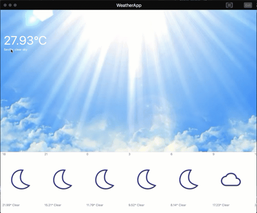
例如,下面我们在C#中构建一个菜单,并将其附加到我们视图中的Label。 右键单击标签将打开上下文菜单。
点击(此处)折叠或打开
- var mainMenu = new Menu();
- var locationMenu = new Menu { Text = “Location” };
- var changeItem = new MenuItem
- {
- Text = “Change”,
- Command = new Command((obj) =>
- {
- Navigation.PushModalAsync(new LocationEntryPage());
- })
- };
- locationMenu.Items.Add(changeItem);
-
- var refreshItem = new MenuItem { Text = "Refresh", Command = _vm.ReloadCommand }; MenuItem.SetAccelerator(refreshItem, Accelerator.FromString("cmd+r")); locationMenu.Items.Add(refreshItem); mainMenu.Add(locationMenu);
源码: https://github.com/davidortinau/weather-app/tree/macos-and-location
加速器
加速器,也称为关键修饰符,允许您添加键盘快捷键来激活菜单项。 在这个例子中,我们将cmd + R加速器添加到刷新菜单项。
|
|
|
点击(此处)折叠或打开
- MenuItem.SetAccelerator(refreshItem, Accelerator.FromString("cmd+r"));
然后将加速器添加到顶级菜单项,并可从应用程序的任何位置使用。
今天预览!
Xamarin.Forms 2.5.0.19271现在在NuGet上可用。 要更新,请打开NuGet软件包管理器,启用预发布选项,并更新所有项目引用。
新版本号码是什么?
Our builds are now being generated from Visual Studio Team Services which simply generates a different build number.我们的构建现在是从Visual Studio Team Services生成的,它只生成不同的版本号。


 扫一扫
扫一扫


 1075
1075

 被折叠的 条评论
为什么被折叠?
被折叠的 条评论
为什么被折叠?
 到【灌水乐园】发言


