


 本文介绍了如何使用HTML和CSS创建四个不同方向的三角形图标,包括箭头向上、向下、向左和向右。
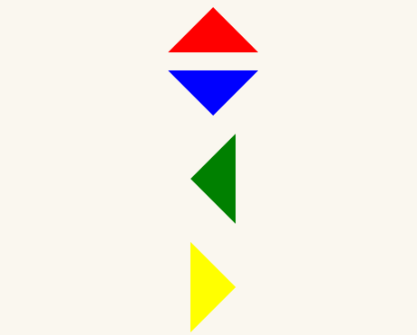
实现如图所示的三角形图标:
html代码如下:
<div class="arrow-up"></div>
<div class="arrow-down"></div>
<div class="arrow-left"></div>
<div class="arrow-right"></div>
css样式:
body{background:#faf7ef;}
div{margin:20px auto}
div.arrow-up {
  width:0px;
  height:0px;
  border-left:50px solid transparent;
  border-right:50px solid transparent;
  border-bottom:50px solid #ff0000;
  font-size:0px;
  line-height:0px;
}


div.arrow-down {
  width:0px;
  height:0px;
  border-left:50px solid transparent;
  border-right:50px solid transparent;
  border-top:50px solid #0000ff;
  font-size:0px;
  line-height:0px;
}


div.arrow-left {
  width:0px;
  height:0px;
  border-bottom:50px solid transparent;
  border-top:50px solid transparent;
  border-right:50px solid #008000;
  font-size:0px;
  line-height:0px;
}


div.arrow-right {
  width:0px;
  height:0px;
  border-bottom:50px solid transparent;
  border-top:50px solid transparent;
  border-left:50px solid #ffff00;
  font-size:0px;
  line-height:0px;
}


 扫一扫
扫一扫


 被折叠的 条评论
为什么被折叠?
被折叠的 条评论
为什么被折叠?
 到【灌水乐园】发言


