


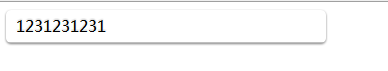
 本文介绍了一个使用CSS样式的实战案例,展示了如何通过设置宽度、内边距、阴影等属性实现特定的效果。
<!DOCTYPE html PUBLIC "-//W3C//DTD XHTML 1.0 Transitional//EN" "http://www.w3.org/TR/xhtml1/DTD/xhtml1-transitional.dtd">
<html xmlns="http://www.w3.org/1999/xhtml">
<head>
<meta http-equiv="Content-Type" content="text/html; charset=utf-8" />
<title> 无标题文档</title>
<style type="text/css">
<!--
.test {
width:300px;
display: inline-block;
padding: 5px 10px 6px;
text-decoration: none;
border-radius: 5px;
-moz-border-radius: 5px;
-webkit-border-radius: 5px;
-moz-box-shadow: 0 1px 2px rgba(0,0,0,0.5);
-webkit-box-shadow: 0 1px 2px rgba(0,0,0,0.5);
text-shadow: 0 -1px 1px rgba(0,0,0,0.25);
border-bottom: 1px solid rgba(0,0,0,0.25);
position: relative;
cursor: pointer;
}
-->
</style>
</head>
<body >
<div class="test">1231231231</div>
</body>
</html>

效果如下图所示:
本文转自黄聪博客园博客,原文链接:http://www.cnblogs.com/huangcong/archive/2010/04/15/1712767.html,如需转载请自行联系原作者


 扫一扫
扫一扫


 被折叠的 条评论
为什么被折叠?
被折叠的 条评论
为什么被折叠?
 到【灌水乐园】发言


