


 本文详细介绍了使用CSS实现元素居中的多种方法,包括水平居中、垂直居中以及同时水平垂直居中的技巧,并覆盖了不同元素类型(如行内元素、块级元素)的处理方式。
居中
水平居中
- 对于子元素是行内元素(或者inline-block)时使用
text-aling: center;,父元素宽度无论确定不确定,均可实现相对于父元素水平居中。
  <style>
    .box {
      border:1px solid #aaa;
      text-align: center;
     /*  text-align定义行内内容相对于父元素如何对齐 */
    }
    img {
      width:100px;
    }
  </style>
</head>
<body>
<div class="box">
  <img src="http://static.jsbin.com/images/dave.min.svg" alt="">
</div>
</body>
- 对于子元素时块级元素时,使用外边距设置进行水平居中
  <style>
    .box {
      border:1px solid #aaa;
      width:300px;
    }

    .son {
      height: 200px;
      width:100px;
      border: 1px solid;
      margin: 0 auto;
   /*  子元素进行外边距设置   */
    }
  </style>
</head>
<body>
<div class="box">
  <div class="son"></div>
</div>
</body>
效果和上图一样
垂直居中
- 块级元素里的文字垂直居中
对于块级元素来说,它的高度在没有显示设置的情况下,是由子元素高度撑开的,所以对于子元素是内联元素的可以采取对父元素进行设置padding来进行垂直居中
 <style>
    .box {
      border:1px solid #aaa;
      width:100px;
      font-size: 14px;
      word-break:break-all;
      /* line-height: 2em; */
      padding: 14px;
    }

  </style>
</head>
<body>
<div class="box">
  <span>aaaaaaaaaaaaaaaaaafaddadfadfadfadfdfadfadfadfdfadafadfagadgadfadferew</span>
</div>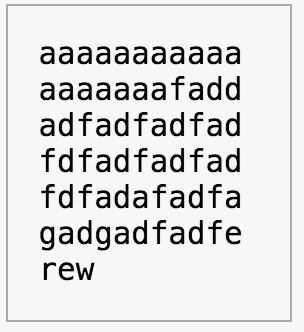
水平垂直居中
-
子元素宽高确定
-
使用子元素margin进行居中
  <style>
    .box {
      border:1px solid #aaa;
      width:400px;
      height: 400px;

    }
    .son {
      height: 100px;
      width: 100px;
      border: 1px solid;

      /* 代码如下 */
      margin-left: calc(50% - 50px);
      margin-top: calc(50% - 50px);
    }
  </style>
</head>
<body>
<div class="box">
  <div class="son"></div>
</div>
-
子元素宽高不确定
-
使用定位加margin 居中
 <style>
.box {
  border:1px solid #aaa;
  width:400px;
  height: 400px;

  position: relative;
}
.son {
  height: 100px;
  width: 100px;
  border: 1px solid;

  /* 代码如下 */
  position: absolute;
  top: 0; bottom: 0; left: 0; right: 0;
  margin: auto;
}
</style>
</head>
<body>
<div class="box">
<div class="son"></div>
</div>
-
使用transform 来实现居中
<style> .box { border:1px solid #aaa; width:400px; height: 400px; position: relative; } .son { height: 100px; width: 100px; border: 1px solid; /* x、y 轴 平移50% */ position: absolute; top: 50%; left: 50%; transform: translate(-50%,-50%); } </style> </head> <body> <div class="box"> <div class="son"></div> </div> -
当子元素是一个图片时,父元素使用text-align:center; 子元素设置vertical-align: middle;,且用父元素的伪元素等同父元素高度后设置为vertical-align:middle;
<style> .box { border:1px solid #aaa; width:400px; height: 400px; text-align: center; } .box::after {content:''; display: inline-block; height:100%; vertical-align:middle; } img { height: 100px; vertical-align:middle; } </style> </head> <body> <div class="box"> <img src="http://static.jsbin.com/images/dave.min.svg" alt=''> </div> -
对父元素设置为table-cell来实现居中,需要设置宽高
<style> .box { border:1px solid #aaa; width:400px; height: 400px; display: table-cell; vertical-align:middle; text-align:center; } img { height: 100px; } </style> </head> <body> <div class="box"> <img src="http://static.jsbin.com/images/dave.min.svg" alt=''> </div> -
flex 布局,使用主轴和侧轴的对齐方式来实现居中
<style>
.box {
  border:1px solid #aaa;
  width:400px;
  height: 400px;
  display: flex;
  justify-content: center;
 /*  主轴对齐方式 */
  align-items: center;
 /*  交叉轴对齐方式 */
}
img {
  height: 100px;
}
 </style>
</head>
<body>
<div class="box">
  <img src="http://static.jsbin.com/images/dave.min.svg" alt=''>
</div>
</body>
-
如有错漏,欢迎指正。


 扫一扫
扫一扫


 被折叠的 条评论
为什么被折叠?
被折叠的 条评论
为什么被折叠?
 到【灌水乐园】发言


