


 本文详细介绍Bootstrap框架中的按钮组使用方法,包括按钮样式调整、不同大小的按钮组设置、嵌套分组实现导航菜单效果以及等分按钮的布局技巧。
<div class="btn-group">
    <button type="button" class="btn btn-default"><span class="glyphicon glyphicon-step-backward"></span></button>
    <button type="button" class="btn btn-default"><span class="glyphicon glyphicon-fast-backward"></span></button>
    <button type="button" class="btn btn-default"><span class="glyphicon glyphicon-backward"></span></button>
    <button type="button" class="btn btn-default"><span class="glyphicon glyphicon-play"></span></button>
    <button type="button" class="btn btn-default"><span class="glyphicon glyphicon-pause"></span></button>
    <button type="button" class="btn btn-default"><span class="glyphicon glyphicon-stop"></span></button>
    <button type="button" class="btn btn-default"><span class="glyphicon glyphicon-forward "></span></button>
    <button type="button" class="btn btn-default"><span class="glyphicon glyphicon-fast-forward"></span></button>
    <button type="button" class="btn btn-default"><span class="glyphicon glyphicon-step-forward"></span></button>
</div>
<br><br><br>
<div class="btn-group">
    <button type="button" class="btn btn-default"><span class="glyphicon glyphicon-search"></span></button>
    <button type="button" class="btn btn-default"><span class="glyphicon glyphicon-zoom-in"></span></button>
    <button type="button" class="btn btn-default"><span class="glyphicon glyphicon-zoom-out"></span></button>
    <button type="button" class="btn btn-default"><span class="glyphicon glyphicon-download"></span></button>
       <button type="button" class="btn btn-default"><span class="glyphicon glyphicon-upload"></span></button>
</div>
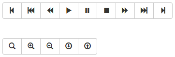
1、默认所有按钮都有圆角
2、除第一个按钮和最后一个按钮(下拉按钮除外),其他的按钮都取消圆角效果
3、第一个按钮只留左上角和左下角是圆角
4、最后一个按钮只留右上角和右下角是圆角
按钮工具栏
<div class="btn-toolbar">
  <div class="btn-group">
    <button type="button" class="btn btn-default"><span class="glyphicon glyphicon-align-left"></span></button>
    <button type="button" class="btn btn-default"><span class="glyphicon glyphicon-align-center"></span></button>
    <button type="button" class="btn btn-default"><span class="glyphicon glyphicon-align-right"></span></button>
    <button type="button" class="btn btn-default"><span class="glyphicon glyphicon-align-justify"></span></button>
  </div>
  <div class="btn-group">
    <button type="button" class="btn btn-default"><span class="glyphicon glyphicon-indent-left"></span></button>
    <button type="button" class="btn btn-default"><span class="glyphicon glyphicon-indent-right"></span></button>
  </div>
  <div class="btn-group">
    <button type="button" class="btn btn-default"><span class="glyphicon glyphicon-font"></span></button>
    <button type="button" class="btn btn-default"><span class="glyphicon glyphicon-bold"></span></button>
    <button type="button" class="btn btn-default"><span class="glyphicon glyphicon-italic"></span></button>
  </div>
  <div class="btn-group">
    <button type="button" class="btn btn-default"><span class="glyphicon glyphicon-text-height"></span></button>
    <button type="button" class="btn btn-default"><span class="glyphicon glyphicon-text-width"></span></button>
  </div>
</div>
<br />
<br />
<div class="btn-toolbar">
  <div class="btn-group btn-group-lg">
    <button type="button" class="btn btn-default"><span class="glyphicon glyphicon-align-left"></span></button>
    <button type="button" class="btn btn-default"><span class="glyphicon glyphicon-align-center"></span></button>
    <button type="button" class="btn btn-default"><span class="glyphicon glyphicon-align-right"></span></button>
    <button type="button" class="btn btn-default"><span class="glyphicon glyphicon-align-justify"></span></button>
  </div>
  <div class="btn-group">
    <button type="button" class="btn btn-default"><span class="glyphicon glyphicon-indent-left"></span></button>
    <button type="button" class="btn btn-default"><span class="glyphicon glyphicon-indent-right"></span></button>
  </div>
  <div class="btn-group btn-group-sm">
    <button type="button" class="btn btn-default"><span class="glyphicon glyphicon-font"></span></button>
    <button type="button" class="btn btn-default"><span class="glyphicon glyphicon-bold"></span></button>
    <button type="button" class="btn btn-default"><span class="glyphicon glyphicon-italic"></span></button>
  </div>
  <div class="btn-group btn-group-xs">
    <button type="button" class="btn btn-default"><span class="glyphicon glyphicon-text-height"></span></button>
    <button type="button" class="btn btn-default"><span class="glyphicon glyphicon-text-width"></span></button>
  </div>
</div>
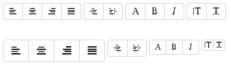
按钮组大小设置
在介绍按钮一节中,我们知道按钮是通过btn-lg、btn-sm和btn-xs三个类名来调整padding、font-size、line-height和border-radius属性值来改变按钮大小。那么按钮组的大小,我们也可以通过类似的方法:
☑ .btn-group-lg:大按钮组
☑ .btn-group-sm:小按钮组
☑ .btn-group-xs:超小按钮组
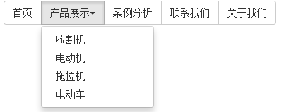
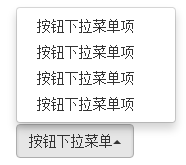
嵌套分组(实现类似于导航菜单的效果)
<div class="btn-group">
  <button class="btn btn-default" type="button">首页</button>
  <div class="btn-group">
    <button class="btn btn-default dropdown-toggle" data-toggle="dropdown" type="button">产品展示<span class="caret"></span></button>
    <ul class="dropdown-menu">
        <li><a href="##">收割机</a></li>
        <li><a href="##">电动机</a></li>
        <li><a href="##">拖拉机</a></li>
        <li><a href="##">电动车</a></li>
    </ul>
  </div>
  <button class="btn btn-default" type="button">案例分析</button>
  <button class="btn btn-default" type="button">联系我们</button>
  <button class="btn btn-default" type="button">关于我们</button>
</div>
按钮组都是水平显示的。但在实际运用当中,总会碰到垂直显示的效果。在Bootstrap框架中也提供了这样的风格。我们只需要把水平分组的“btn-group”类名换成“btn-group-vertical”即可。
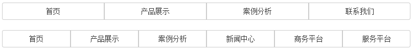
等分按钮
<div class="btn-wrap">
    <div class="btn-group btn-group-justified">
    <a class="btn btn-default" href="#">首页</a>
    <a class="btn btn-default" href="#">产品展示</a>
    <a class="btn btn-default" href="#">案例分析</a>
    <a class="btn btn-default" href="#">联系我们</a>
  </div>
</div>
<br />
<div class="btn-wrap">
    <div class="btn-group btn-group-justified">
    <a class="btn btn-default" href="#">首页</a>
    <a class="btn btn-default" href="#">产品展示</a>
    <a class="btn btn-default" href="#">案例分析</a>
    <a class="btn btn-default" href="#">新闻中心</a>
    <a class="btn btn-default" href="#">商务平台</a>
    <a class="btn btn-default" href="#">服务平台</a>
  </div>
</div>
上三角形:有的时候我们的下拉菜单会向上弹起,这个时候我们的三角方向需要朝上显示,实现方法:需要在“.btn-group”类上追加“dropup”类名(这也是做向上弹起下拉菜单要用的类名)。


 扫一扫
扫一扫


 1万+
1万+

 被折叠的 条评论
为什么被折叠?
被折叠的 条评论
为什么被折叠?
 到【灌水乐园】发言


