[01:26:52] 系统启动完成!优先使用「设备状态数据分析」功能,AI功能为辅
[01:26:54] 选择文件:D:/秘密基地/工作/工匠杯20250821/测试过程文件/变化开关量表(测试用例).xlsx
[01:26:54] 进度[10%]: 正在读取文件...
[01:26:54] 进度[10%]: 成功读取文件:变化开关量表(测试用例).xlsx(481行数据)
[01:26:54] 进度[20%]: 数据预处理完成,可开始分析或AI训练
[01:26:54] 数据概览:481条记录,25台设备,2种类型
[01:26:57] 进度[85%]: 开始异常检测:规则+AI辅助...
[01:26:57] 进度[85%]: 异常检测:共25台设备,按3条规则判断...
[01:26:57] 设备XESBJ-临顿路站:规则③触发异常(变化次数=1次)
[01:26:57] 进度[85%]: 异常检测:处理设备 XESBJ-临顿路站(1/25)
[01:26:57] 进度[85%]: 异常检测:处理设备 SGMJ-临顿路站(2/25)
[01:26:57] 进度[85%]: 异常检测:处理设备 SGMJ-悬桥巷站(3/25)
[01:26:57] 进度[86%]: 异常检测:处理设备 SGMJ-拙政园苏博站(4/25)
[01:26:57] 进度[86%]: 异常检测:处理设备 SGMJ-梅巷站(5/25)
[01:26:57] 进度[87%]: 异常检测:处理设备 SKMJ-临顿路站(6/25)
[01:26:57] 进度[87%]: 异常检测:处理设备 SKMJ-悬桥巷站(7/25)
[01:26:57] 进度[87%]: 异常检测:处理设备 SKMJ-拙政园苏博站(8/25)
[01:26:57] 进度[88%]: 异常检测:处理设备 SKMJ-梅巷站(9/25)
[01:26:57] 进度[88%]: 异常检测:处理设备 SMGJ-临顿路站(10/25)
[01:26:57] 进度[89%]: 异常检测:处理设备 SMGJ-悬桥巷站(11/25)
[01:26:57] 进度[89%]: 异常检测:处理设备 SMGJ-拙政园苏博站(12/25)
[01:26:57] 进度[89%]: 异常检测:处理设备 SMGJ-梅巷站(13/25)
[01:26:57] 进度[90%]: 异常检测:处理设备 XGMJ-临顿路站(14/25)
[01:26:57] 进度[90%]: 异常检测:处理设备 XGMJ-悬桥巷站(15/25)
[01:26:57] 进度[91%]: 异常检测:处理设备 XGMJ-拙政园苏博站(16/25)
[01:26:57] 进度[91%]: 异常检测:处理设备 XGMJ-梅巷站(17/25)
[01:26:57] 进度[91%]: 异常检测:处理设备 XKMJ-临顿路站(18/25)
[01:26:57] 进度[92%]: 异常检测:处理设备 XKMJ-悬桥巷站(19/25)
[01:26:57] 进度[92%]: 异常检测:处理设备 XKMJ-拙政园苏博站(20/25)
[01:26:57] 进度[93%]: 异常检测:处理设备 XKMJ-梅巷站(21/25)
[01:26:57] 进度[93%]: 异常检测:处理设备 XMGJ-临顿路站(22/25)
[01:26:57] 进度[93%]: 异常检测:处理设备 XMGJ-悬桥巷站(23/25)
[01:26:57] 进度[94%]: 异常检测:处理设备 XMGJ-拙政园苏博站(24/25)
[01:26:57] 进度[94%]: 异常检测:处理设备 XMGJ-梅巷站(25/25)
[01:26:57] 异常检测失败:Invalid property specified for object of type plotly.graph_objs.Layout: 'paper'
Did you mean "map"?
Valid properties:
activeselection
:class:`plotly.graph_objects.layout.Activeselection`
instance or dict with compatible properties
activeshape
:class:`plotly.graph_objects.layout.Activeshape`
instance or dict with compatible properties
annotations
A tuple of
:class:`plotly.graph_objects.layout.Annotation`
instances or dicts with compatible properties
annotationdefaults
When used in a template (as
layout.template.layout.annotationdefaults), sets the
default property values to use for elements of
layout.annotations
autosize
Determines whether or not a layout width or height that
has been left undefined by the user is initialized on
each relayout. Note that, regardless of this attribute,
an undefined layout width or height is always
initialized on the first call to plot.
autotypenumbers
Using "strict" a numeric string in trace data is not
converted to a number. Using *convert types* a numeric
string in trace data may be treated as a number during
automatic axis `type` detection. This is the default
value; however it could be overridden for individual
axes.
barcornerradius
Sets the rounding of bar corners. May be an integer
number of pixels, or a percentage of bar width (as a
string ending in %).
bargap
Sets the gap (in plot fraction) between bars of
adjacent location coordinates.
bargroupgap
Sets the gap (in plot fraction) between bars of the
same location coordinate.
barmode
Determines how bars at the same location coordinate are
displayed on the graph. With "stack", the bars are
stacked on top of one another With "relative", the bars
are stacked on top of one another, with negative values
below the axis, positive values above With "group", the
bars are plotted next to one another centered around
the shared location. With "overlay", the bars are
plotted over one another, you might need to reduce
"opacity" to see multiple bars.
barnorm
Sets the normalization for bar traces on the graph.
With "fraction", the value of each bar is divided by
the sum of all values at that location coordinate.
"percent" is the same but multiplied by 100 to show
percentages.
boxgap
Sets the gap (in plot fraction) between boxes of
adjacent location coordinates. Has no effect on traces
that have "width" set.
boxgroupgap
Sets the gap (in plot fraction) between boxes of the
same location coordinate. Has no effect on traces that
have "width" set.
boxmode
Determines how boxes at the same location coordinate
are displayed on the graph. If "group", the boxes are
plotted next to one another centered around the shared
location. If "overlay", the boxes are plotted over one
another, you might need to set "opacity" to see them
multiple boxes. Has no effect on traces that have
"width" set.
calendar
Sets the default calendar system to use for
interpreting and displaying dates throughout the plot.
clickmode
Determines the mode of single click interactions.
"event" is the default value and emits the
`plotly_click` event. In addition this mode emits the
`plotly_selected` event in drag modes "lasso" and
"select", but with no event data attached (kept for
compatibility reasons). The "select" flag enables
selecting single data points via click. This mode also
supports persistent selections, meaning that pressing
Shift while clicking, adds to / subtracts from an
existing selection. "select" with `hovermode`: "x" can
be confusing, consider explicitly setting `hovermode`:
"closest" when using this feature. Selection events are
sent accordingly as long as "event" flag is set as
well. When the "event" flag is missing, `plotly_click`
and `plotly_selected` events are not fired.
coloraxis
:class:`plotly.graph_objects.layout.Coloraxis` instance
or dict with compatible properties
colorscale
:class:`plotly.graph_objects.layout.Colorscale`
instance or dict with compatible properties
colorway
Sets the default trace colors.
computed
Placeholder for exporting automargin-impacting values
namely `margin.t`, `margin.b`, `margin.l` and
`margin.r` in "full-json" mode.
datarevision
If provided, a changed value tells `Plotly.react` that
one or more data arrays has changed. This way you can
modify arrays in-place rather than making a complete
new copy for an incremental change. If NOT provided,
`Plotly.react` assumes that data arrays are being
treated as immutable, thus any data array with a
different identity from its predecessor contains new
data.
dragmode
Determines the mode of drag interactions. "select" and
"lasso" apply only to scatter traces with markers or
text. "orbit" and "turntable" apply only to 3D scenes.
editrevision
Controls persistence of user-driven changes in
`editable: true` configuration, other than trace names
and axis titles. Defaults to `layout.uirevision`.
extendfunnelareacolors
If `true`, the funnelarea slice colors (whether given
by `funnelareacolorway` or inherited from `colorway`)
will be extended to three times its original length by
first repeating every color 20% lighter then each color
20% darker. This is intended to reduce the likelihood
of reusing the same color when you have many slices,
but you can set `false` to disable. Colors provided in
the trace, using `marker.colors`, are never extended.
extendiciclecolors
If `true`, the icicle slice colors (whether given by
`iciclecolorway` or inherited from `colorway`) will be
extended to three times its original length by first
repeating every color 20% lighter then each color 20%
darker. This is intended to reduce the likelihood of
reusing the same color when you have many slices, but
you can set `false` to disable. Colors provided in the
trace, using `marker.colors`, are never extended.
extendpiecolors
If `true`, the pie slice colors (whether given by
`piecolorway` or inherited from `colorway`) will be
extended to three times its original length by first
repeating every color 20% lighter then each color 20%
darker. This is intended to reduce the likelihood of
reusing the same color when you have many slices, but
you can set `false` to disable. Colors provided in the
trace, using `marker.colors`, are never extended.
extendsunburstcolors
If `true`, the sunburst slice colors (whether given by
`sunburstcolorway` or inherited from `colorway`) will
be extended to three times its original length by first
repeating every color 20% lighter then each color 20%
darker. This is intended to reduce the likelihood of
reusing the same color when you have many slices, but
you can set `false` to disable. Colors provided in the
trace, using `marker.colors`, are never extended.
extendtreemapcolors
If `true`, the treemap slice colors (whether given by
`treemapcolorway` or inherited from `colorway`) will be
extended to three times its original length by first
repeating every color 20% lighter then each color 20%
darker. This is intended to reduce the likelihood of
reusing the same color when you have many slices, but
you can set `false` to disable. Colors provided in the
trace, using `marker.colors`, are never extended.
font
Sets the global font. Note that fonts used in traces
and other layout components inherit from the global
font.
funnelareacolorway
Sets the default funnelarea slice colors. Defaults to
the main `colorway` used for trace colors. If you
specify a new list here it can still be extended with
lighter and darker colors, see
`extendfunnelareacolors`.
funnelgap
Sets the gap (in plot fraction) between bars of
adjacent location coordinates.
funnelgroupgap
Sets the gap (in plot fraction) between bars of the
same location coordinate.
funnelmode
Determines how bars at the same location coordinate are
displayed on the graph. With "stack", the bars are
stacked on top of one another With "group", the bars
are plotted next to one another centered around the
shared location. With "overlay", the bars are plotted
over one another, you might need to reduce "opacity" to
see multiple bars.
geo
:class:`plotly.graph_objects.layout.Geo` instance or
dict with compatible properties
grid
:class:`plotly.graph_objects.layout.Grid` instance or
dict with compatible properties
height
Sets the plot's height (in px).
hiddenlabels
hiddenlabels is the funnelarea & pie chart analog of
visible:'legendonly' but it can contain many labels,
and can simultaneously hide slices from several
pies/funnelarea charts
hiddenlabelssrc
Sets the source reference on Chart Studio Cloud for
`hiddenlabels`.
hidesources
Determines whether or not a text link citing the data
source is placed at the bottom-right cored of the
figure. Has only an effect only on graphs that have
been generated via forked graphs from the Chart Studio
Cloud (at https://chart-studio.plotly.com or on-
premise).
hoverdistance
Sets the default distance (in pixels) to look for data
to add hover labels (-1 means no cutoff, 0 means no
looking for data). This is only a real distance for
hovering on point-like objects, like scatter points.
For area-like objects (bars, scatter fills, etc)
hovering is on inside the area and off outside, but
these objects will not supersede hover on point-like
objects in case of conflict.
hoverlabel
:class:`plotly.graph_objects.layout.Hoverlabel`
instance or dict with compatible properties
hovermode
Determines the mode of hover interactions. If
"closest", a single hoverlabel will appear for the
"closest" point within the `hoverdistance`. If "x" (or
"y"), multiple hoverlabels will appear for multiple
points at the "closest" x- (or y-) coordinate within
the `hoverdistance`, with the caveat that no more than
one hoverlabel will appear per trace. If *x unified*
(or *y unified*), a single hoverlabel will appear
multiple points at the closest x- (or y-) coordinate
within the `hoverdistance` with the caveat that no more
than one hoverlabel will appear per trace. In this
mode, spikelines are enabled by default perpendicular
to the specified axis. If false, hover interactions are
disabled.
hoversubplots
Determines expansion of hover effects to other subplots
If "single" just the axis pair of the primary point is
included without overlaying subplots. If "overlaying"
all subplots using the main axis and occupying the same
space are included. If "axis", also include stacked
subplots using the same axis when `hovermode` is set to
"x", *x unified*, "y" or *y unified*.
iciclecolorway
Sets the default icicle slice colors. Defaults to the
main `colorway` used for trace colors. If you specify a
new list here it can still be extended with lighter and
darker colors, see `extendiciclecolors`.
images
A tuple of :class:`plotly.graph_objects.layout.Image`
instances or dicts with compatible properties
imagedefaults
When used in a template (as
layout.template.layout.imagedefaults), sets the default
property values to use for elements of layout.images
legend
:class:`plotly.graph_objects.layout.Legend` instance or
dict with compatible properties
map
:class:`plotly.graph_objects.layout.Map` instance or
dict with compatible properties
mapbox
:class:`plotly.graph_objects.layout.Mapbox` instance or
dict with compatible properties
margin
:class:`plotly.graph_objects.layout.Margin` instance or
dict with compatible properties
meta
Assigns extra meta information that can be used in
various `text` attributes. Attributes such as the
graph, axis and colorbar `title.text`, annotation
`text` `trace.name` in legend items, `rangeselector`,
`updatemenus` and `sliders` `label` text all support
`meta`. One can access `meta` fields using template
strings: `%{meta[i]}` where `i` is the index of the
`meta` item in question. `meta` can also be an object
for example `{key: value}` which can be accessed
%{meta[key]}.
metasrc
Sets the source reference on Chart Studio Cloud for
`meta`.
minreducedheight
Minimum height of the plot with margin.automargin
applied (in px)
minreducedwidth
Minimum width of the plot with margin.automargin
applied (in px)
modebar
:class:`plotly.graph_objects.layout.Modebar` instance
or dict with compatible properties
newselection
:class:`plotly.graph_objects.layout.Newselection`
instance or dict with compatible properties
newshape
:class:`plotly.graph_objects.layout.Newshape` instance
or dict with compatible properties
paper_bgcolor
Sets the background color of the paper where the graph
is drawn.
piecolorway
Sets the default pie slice colors. Defaults to the main
`colorway` used for trace colors. If you specify a new
list here it can still be extended with lighter and
darker colors, see `extendpiecolors`.
plot_bgcolor
Sets the background color of the plotting area in-
between x and y axes.
polar
:class:`plotly.graph_objects.layout.Polar` instance or
dict with compatible properties
scattergap
Sets the gap (in plot fraction) between scatter points
of adjacent location coordinates. Defaults to `bargap`.
scattermode
Determines how scatter points at the same location
coordinate are displayed on the graph. With "group",
the scatter points are plotted next to one another
centered around the shared location. With "overlay",
the scatter points are plotted over one another, you
might need to reduce "opacity" to see multiple scatter
points.
scene
:class:`plotly.graph_objects.layout.Scene` instance or
dict with compatible properties
selectdirection
When `dragmode` is set to "select", this limits the
selection of the drag to horizontal, vertical or
diagonal. "h" only allows horizontal selection, "v"
only vertical, "d" only diagonal and "any" sets no
limit.
selectionrevision
Controls persistence of user-driven changes in selected
points from all traces.
selections
A tuple of
:class:`plotly.graph_objects.layout.Selection`
instances or dicts with compatible properties
selectiondefaults
When used in a template (as
layout.template.layout.selectiondefaults), sets the
default property values to use for elements of
layout.selections
separators
Sets the decimal and thousand separators. For example,
*. * puts a '.' before decimals and a space between
thousands. In English locales, dflt is ".," but other
locales may alter this default.
shapes
A tuple of :class:`plotly.graph_objects.layout.Shape`
instances or dicts with compatible properties
shapedefaults
When used in a template (as
layout.template.layout.shapedefaults), sets the default
property values to use for elements of layout.shapes
showlegend
Determines whether or not a legend is drawn. Default is
`true` if there is a trace to show and any of these: a)
Two or more traces would by default be shown in the
legend. b) One pie trace is shown in the legend. c) One
trace is explicitly given with `showlegend: true`.
sliders
A tuple of :class:`plotly.graph_objects.layout.Slider`
instances or dicts with compatible properties
sliderdefaults
When used in a template (as
layout.template.layout.sliderdefaults), sets the
default property values to use for elements of
layout.sliders
smith
:class:`plotly.graph_objects.layout.Smith` instance or
dict with compatible properties
spikedistance
Sets the default distance (in pixels) to look for data
to draw spikelines to (-1 means no cutoff, 0 means no
looking for data). As with hoverdistance, distance does
not apply to area-like objects. In addition, some
objects can be hovered on but will not generate
spikelines, such as scatter fills.
sunburstcolorway
Sets the default sunburst slice colors. Defaults to the
main `colorway` used for trace colors. If you specify a
new list here it can still be extended with lighter and
darker colors, see `extendsunburstcolors`.
template
Default attributes to be applied to the plot. This
should be a dict with format: `{'layout':
layoutTemplate, 'data': {trace_type: [traceTemplate,
...], ...}}` where `layoutTemplate` is a dict matching
the structure of `figure.layout` and `traceTemplate` is
a dict matching the structure of the trace with type
`trace_type` (e.g. 'scatter'). Alternatively, this may
be specified as an instance of
plotly.graph_objs.layout.Template. Trace templates are
applied cyclically to traces of each type. Container
arrays (eg `annotations`) have special handling: An
object ending in `defaults` (eg `annotationdefaults`)
is applied to each array item. But if an item has a
`templateitemname` key we look in the template array
for an item with matching `name` and apply that
instead. If no matching `name` is found we mark the
item invisible. Any named template item not referenced
is appended to the end of the array, so this can be
used to add a watermark annotation or a logo image, for
example. To omit one of these items on the plot, make
an item with matching `templateitemname` and `visible:
false`.
ternary
:class:`plotly.graph_objects.layout.Ternary` instance
or dict with compatible properties
title
:class:`plotly.graph_objects.layout.Title` instance or
dict with compatible properties
transition
Sets transition options used during Plotly.react
updates.
treemapcolorway
Sets the default treemap slice colors. Defaults to the
main `colorway` used for trace colors. If you specify a
new list here it can still be extended with lighter and
darker colors, see `extendtreemapcolors`.
uirevision
Used to allow user interactions with the plot to
persist after `Plotly.react` calls that are unaware of
these interactions. If `uirevision` is omitted, or if
it is given and it changed from the previous
`Plotly.react` call, the exact new figure is used. If
`uirevision` is truthy and did NOT change, any
attribute that has been affected by user interactions
and did not receive a different value in the new figure
will keep the interaction value. `layout.uirevision`
attribute serves as the default for `uirevision`
attributes in various sub-containers. For finer control
you can set these sub-attributes directly. For example,
if your app separately controls the data on the x and y
axes you might set `xaxis.uirevision=*time*` and
`yaxis.uirevision=*cost*`. Then if only the y data is
changed, you can update `yaxis.uirevision=*quantity*`
and the y axis range will reset but the x axis range
will retain any user-driven zoom.
uniformtext
:class:`plotly.graph_objects.layout.Uniformtext`
instance or dict with compatible properties
updatemenus
A tuple of
:class:`plotly.graph_objects.layout.Updatemenu`
instances or dicts with compatible properties
updatemenudefaults
When used in a template (as
layout.template.layout.updatemenudefaults), sets the
default property values to use for elements of
layout.updatemenus
violingap
Sets the gap (in plot fraction) between violins of
adjacent location coordinates. Has no effect on traces
that have "width" set.
violingroupgap
Sets the gap (in plot fraction) between violins of the
same location coordinate. Has no effect on traces that
have "width" set.
violinmode
Determines how violins at the same location coordinate
are displayed on the graph. If "group", the violins are
plotted next to one another centered around the shared
location. If "overlay", the violins are plotted over
one another, you might need to set "opacity" to see
them multiple violins. Has no effect on traces that
have "width" set.
waterfallgap
Sets the gap (in plot fraction) between bars of
adjacent location coordinates.
waterfallgroupgap
Sets the gap (in plot fraction) between bars of the
same location coordinate.
waterfallmode
Determines how bars at the same location coordinate are
displayed on the graph. With "group", the bars are
plotted next to one another centered around the shared
location. With "overlay", the bars are plotted over one
another, you might need to reduce "opacity" to see
multiple bars.
width
Sets the plot's width (in px).
xaxis
:class:`plotly.graph_objects.layout.XAxis` instance or
dict with compatible properties
yaxis
:class:`plotly.graph_objects.layout.YAxis` instance or
dict with compatible properties
Did you mean "map"?
Bad property path:
paper_b极值点color
^^^^^
[01:26:57] Traceback (most recent call last):
File "D:\秘密基地\工作\工匠杯20250821\AI.py", line 1925, in _detect_abnormal_core
html_path = self._generate_abnormal_html_report(device_summary_df)
File "D:\秘密基地\工作\工匠杯20250821\AI.py", line 1613, in _generate_abnormal_html_report
fig2.update_layout(
~~~~~~~~~~~~~~~~~~^
font=dict(family=PLOTLY_FONT, size=12),
^^^^^^^^^^^^^^^^^^^^^^^^^^^^^^^^^^^^^^^
...<2 lines>...
paper_b极值点color='rgba(248,249,250,1)'
^^^^^^^^^^^^^^^^^^^^^^^^^^^^^^^^^^^^^^^^
)
^
File "D:\Python\Lib\site-packages\plotly\graph_objs\_figure.py", line 787, in update_layout
return super(Figure, self).update_layout(dict1, overwrite, **kwargs)
~~~~~~~~~~~~~~~~~~~~~~~~~~~~~~~~~^^^^^^^^^^^^^^^^^^^^^^^^^^^^
File "D:\Python\Lib\site-packages\plotly\basedatatypes.py", line 1392, in update_layout
self.layout.update(dict1, overwrite=overwrite, **kwargs)
~~~~~~~~~~~~~~~~~~^^^^^^^^^^^^^^^^^^^^^^^^^^^^^^^^^^^^^^
File "D:\Python\Lib\site-packages\plotly\basedatatypes.py", line 5123, in update
BaseFigure._perform_update(self, kwargs, overwrite=overwrite)
~~~~~~~~~~~~~~~~~~~~~~~~~~^^^^^^^^^^^^^^^^^^^^^^^^^^^^^^^^^^^
File "D:\Python\Lib\site-packages\plotly\basedatatypes.py", line 3882, in _perform_update
raise err
ValueError: Invalid property specified for object of type plotly.graph_objs.Layout: 'paper'
Did you mean "map"?
Valid properties:
activeselection
:class:`plotly.graph_objects.layout.Activeselection`
instance or dict with compatible properties
activeshape
:class:`plotly.graph_objects.layout.Activeshape`
instance or dict with compatible properties
annotations
A tuple of
:class:`plotly.graph_objects.layout.Annotation`
instances or dicts with compatible properties
annotationdefaults
When used in a template (as
layout.template.layout.annotationdefaults), sets the
default property values to use for elements of
layout.annotations
autosize
Determines whether or not a layout width or height that
has been left undefined by the user is initialized on
each relayout. Note that, regardless of this attribute,
an undefined layout width or height is always
initialized on the first call to plot.
autotypenumbers
Using "strict" a numeric string in trace data is not
converted to a number. Using *convert types* a numeric
string in trace data may be treated as a number during
automatic axis `type` detection. This is the default
value; however it could be overridden for individual
axes.
barcornerradius
Sets the rounding of bar corners. May be an integer
number of pixels, or a percentage of bar width (as a
string ending in %).
bargap
Sets the gap (in plot fraction) between bars of
adjacent location coordinates.
bargroupgap
Sets the gap (in plot fraction) between bars of the
same location coordinate.
barmode
Determines how bars at the same location coordinate are
displayed on the graph. With "stack", the bars are
stacked on top of one another With "relative", the bars
are stacked on top of one another, with negative values
below the axis, positive values above With "group", the
bars are plotted next to one another centered around
the shared location. With "overlay", the bars are
plotted over one another, you might need to reduce
"opacity" to see multiple bars.
barnorm
Sets the normalization for bar traces on the graph.
With "fraction", the value of each bar is divided by
the sum of all values at that location coordinate.
"percent" is the same but multiplied by 100 to show
percentages.
boxgap
Sets the gap (in plot fraction) between boxes of
adjacent location coordinates. Has no effect on traces
that have "width" set.
boxgroupgap
Sets the gap (in plot fraction) between boxes of the
same location coordinate. Has no effect on traces that
have "width" set.
boxmode
Determines how boxes at the same location coordinate
are displayed on the graph. If "group", the boxes are
plotted next to one another centered around the shared
location. If "overlay", the boxes are plotted over one
another, you might need to set "opacity" to see them
multiple boxes. Has no effect on traces that have
"width" set.
calendar
Sets the default calendar system to use for
interpreting and displaying dates throughout the plot.
clickmode
Determines the mode of single click interactions.
"event" is the default value and emits the
`plotly_click` event. In addition this mode emits the
`plotly_selected` event in drag modes "lasso" and
"select", but with no event data attached (kept for
compatibility reasons). The "select" flag enables
selecting single data points via click. This mode also
supports persistent selections, meaning that pressing
Shift while clicking, adds to / subtracts from an
existing selection. "select" with `hovermode`: "x" can
be confusing, consider explicitly setting `hovermode`:
"closest" when using this feature. Selection events are
sent accordingly as long as "event" flag is set as
well. When the "event" flag is missing, `plotly_click`
and `plotly_selected` events are not fired.
coloraxis
:class:`plotly.graph_objects.layout.Coloraxis` instance
or dict with compatible properties
colorscale
:class:`plotly.graph_objects.layout.Colorscale`
instance or dict with compatible properties
colorway
Sets the default trace colors.
computed
Placeholder for exporting automargin-impacting values
namely `margin.t`, `margin.b`, `margin.l` and
`margin.r` in "full-json" mode.
datarevision
If provided, a changed value tells `Plotly.react` that
one or more data arrays has changed. This way you can
modify arrays in-place rather than making a complete
new copy for an incremental change. If NOT provided,
`Plotly.react` assumes that data arrays are being
treated as immutable, thus any data array with a
different identity from its predecessor contains new
data.
dragmode
Determines the mode of drag interactions. "select" and
"lasso" apply only to scatter traces with markers or
text. "orbit" and "turntable" apply only to 3D scenes.
editrevision
Controls persistence of user-driven changes in
`editable: true` configuration, other than trace names
and axis titles. Defaults to `layout.uirevision`.
extendfunnelareacolors
If `true`, the funnelarea slice colors (whether given
by `funnelareacolorway` or inherited from `colorway`)
will be extended to three times its original length by
first repeating every color 20% lighter then each color
20% darker. This is intended to reduce the likelihood
of reusing the same color when you have many slices,
but you can set `false` to disable. Colors provided in
the trace, using `marker.colors`, are never extended.
extendiciclecolors
If `true`, the icicle slice colors (whether given by
`iciclecolorway` or inherited from `colorway`) will be
extended to three times its original length by first
repeating every color 20% lighter then each color 20%
darker. This is intended to reduce the likelihood of
reusing the same color when you have many slices, but
you can set `false` to disable. Colors provided in the
trace, using `marker.colors`, are never extended.
extendpiecolors
If `true`, the pie slice colors (whether given by
`piecolorway` or inherited from `colorway`) will be
extended to three times its original length by first
repeating every color 20% lighter then each color 20%
darker. This is intended to reduce the likelihood of
reusing the same color when you have many slices, but
you can set `false` to disable. Colors provided in the
trace, using `marker.colors`, are never extended.
extendsunburstcolors
If `true`, the sunburst slice colors (whether given by
`sunburstcolorway` or inherited from `colorway`) will
be extended to three times its original length by first
repeating every color 20% lighter then each color 20%
darker. This is intended to reduce the likelihood of
reusing the same color when you have many slices, but
you can set `false` to disable. Colors provided in the
trace, using `marker.colors`, are never extended.
extendtreemapcolors
If `true`, the treemap slice colors (whether given by
`treemapcolorway` or inherited from `colorway`) will be
extended to three times its original length by first
repeating every color 20% lighter then each color 20%
darker. This is intended to reduce the likelihood of
reusing the same color when you have many slices, but
you can set `false` to disable. Colors provided in the
trace, using `marker.colors`, are never extended.
font
Sets the global font. Note that fonts used in traces
and other layout components inherit from the global
font.
funnelareacolorway
Sets the default funnelarea slice colors. Defaults to
the main `colorway` used for trace colors. If you
specify a new list here it can still be extended with
lighter and darker colors, see
`extendfunnelareacolors`.
funnelgap
Sets the gap (in plot fraction) between bars of
adjacent location coordinates.
funnelgroupgap
Sets the gap (in plot fraction) between bars of the
same location coordinate.
funnelmode
Determines how bars at the same location coordinate are
displayed on the graph. With "stack", the bars are
stacked on top of one another With "group", the bars
are plotted next to one another centered around the
shared location. With "overlay", the bars are plotted
over one another, you might need to reduce "opacity" to
see multiple bars.
geo
:class:`plotly.graph_objects.layout.Geo` instance or
dict with compatible properties
grid
:class:`plotly.graph_objects.layout.Grid` instance or
dict with compatible properties
height
Sets the plot's height (in px).
hiddenlabels
hiddenlabels is the funnelarea & pie chart analog of
visible:'legendonly' but it can contain many labels,
and can simultaneously hide slices from several
pies/funnelarea charts
hiddenlabelssrc
Sets the source reference on Chart Studio Cloud for
`hiddenlabels`.
hidesources
Determines whether or not a text link citing the data
source is placed at the bottom-right cored of the
figure. Has only an effect only on graphs that have
been generated via forked graphs from the Chart Studio
Cloud (at https://chart-studio.plotly.com or on-
premise).
hoverdistance
Sets the default distance (in pixels) to look for data
to add hover labels (-1 means no cutoff, 0 means no
looking for data). This is only a real distance for
hovering on point-like objects, like scatter points.
For area-like objects (bars, scatter fills, etc)
hovering is on inside the area and off outside, but
these objects will not supersede hover on point-like
objects in case of conflict.
hoverlabel
:class:`plotly.graph_objects.layout.Hoverlabel`
instance or dict with compatible properties
hovermode
Determines the mode of hover interactions. If
"closest", a single hoverlabel will appear for the
"closest" point within the `hoverdistance`. If "x" (or
"y"), multiple hoverlabels will appear for multiple
points at the "closest" x- (or y-) coordinate within
the `hoverdistance`, with the caveat that no more than
one hoverlabel will appear per trace. If *x unified*
(or *y unified*), a single hoverlabel will appear
multiple points at the closest x- (or y-) coordinate
within the `hoverdistance` with the caveat that no more
than one hoverlabel will appear per trace. In this
mode, spikelines are enabled by default perpendicular
to the specified axis. If false, hover interactions are
disabled.
hoversubplots
Determines expansion of hover effects to other subplots
If "single" just the axis pair of the primary point is
included without overlaying subplots. If "overlaying"
all subplots using the main axis and occupying the same
space are included. If "axis", also include stacked
subplots using the same axis when `hovermode` is set to
"x", *x unified*, "y" or *y unified*.
iciclecolorway
Sets the default icicle slice colors. Defaults to the
main `colorway` used for trace colors. If you specify a
new list here it can still be extended with lighter and
darker colors, see `extendiciclecolors`.
images
A tuple of :class:`plotly.graph_objects.layout.Image`
instances or dicts with compatible properties
imagedefaults
When used in a template (as
layout.template.layout.imagedefaults), sets the default
property values to use for elements of layout.images
legend
:class:`plotly.graph_objects.layout.Legend` instance or
dict with compatible properties
map
:class:`plotly.graph_objects.layout.Map` instance or
dict with compatible properties
mapbox
:class:`plotly.graph_objects.layout.Mapbox` instance or
dict with compatible properties
margin
:class:`plotly.graph_objects.layout.Margin` instance or
dict with compatible properties
meta
Assigns extra meta information that can be used in
various `text` attributes. Attributes such as the
graph, axis and colorbar `title.text`, annotation
`text` `trace.name` in legend items, `rangeselector`,
`updatemenus` and `sliders` `label` text all support
`meta`. One can access `meta` fields using template
strings: `%{meta[i]}` where `i` is the index of the
`meta` item in question. `meta` can also be an object
for example `{key: value}` which can be accessed
%{meta[key]}.
metasrc
Sets the source reference on Chart Studio Cloud for
`meta`.
minreducedheight
Minimum height of the plot with margin.automargin
applied (in px)
minreducedwidth
Minimum width of the plot with margin.automargin
applied (in px)
modebar
:class:`plotly.graph_objects.layout.Modebar` instance
or dict with compatible properties
newselection
:class:`plotly.graph_objects.layout.Newselection`
instance or dict with compatible properties
newshape
:class:`plotly.graph_objects.layout.Newshape` instance
or dict with compatible properties
paper_bgcolor
Sets the background color of the paper where the graph
is drawn.
piecolorway
Sets the default pie slice colors. Defaults to the main
`colorway` used for trace colors. If you specify a new
list here it can still be extended with lighter and
darker colors, see `extendpiecolors`.
plot_bgcolor
Sets the background color of the plotting area in-
between x and y axes.
polar
:class:`plotly.graph_objects.layout.Polar` instance or
dict with compatible properties
scattergap
Sets the gap (in plot fraction) between scatter points
of adjacent location coordinates. Defaults to `bargap`.
scattermode
Determines how scatter points at the same location
coordinate are displayed on the graph. With "group",
the scatter points are plotted next to one another
centered around the shared location. With "overlay",
the scatter points are plotted over one another, you
might need to reduce "opacity" to see multiple scatter
points.
scene
:class:`plotly.graph_objects.layout.Scene` instance or
dict with compatible properties
selectdirection
When `dragmode` is set to "select", this limits the
selection of the drag to horizontal, vertical or
diagonal. "h" only allows horizontal selection, "v"
only vertical, "d" only diagonal and "any" sets no
limit.
selectionrevision
Controls persistence of user-driven changes in selected
points from all traces.
selections
A tuple of
:class:`plotly.graph_objects.layout.Selection`
instances or dicts with compatible properties
selectiondefaults
When used in a template (as
layout.template.layout.selectiondefaults), sets the
default property values to use for elements of
layout.selections
separators
Sets the decimal and thousand separators. For example,
*. * puts a '.' before decimals and a space between
thousands. In English locales, dflt is ".," but other
locales may alter this default.
shapes
A tuple of :class:`plotly.graph_objects.layout.Shape`
instances or dicts with compatible properties
shapedefaults
When used in a template (as
layout.template.layout.shapedefaults), sets the default
property values to use for elements of layout.shapes
showlegend
Determines whether or not a legend is drawn. Default is
`true` if there is a trace to show and any of these: a)
Two or more traces would by default be shown in the
legend. b) One pie trace is shown in the legend. c) One
trace is explicitly given with `showlegend: true`.
sliders
A tuple of :class:`plotly.graph_objects.layout.Slider`
instances or dicts with compatible properties
sliderdefaults
When used in a template (as
layout.template.layout.sliderdefaults), sets the
default property values to use for elements of
layout.sliders
smith
:class:`plotly.graph_objects.layout.Smith` instance or
dict with compatible properties
spikedistance
Sets the default distance (in pixels) to look for data
to draw spikelines to (-1 means no cutoff, 0 means no
looking for data). As with hoverdistance, distance does
not apply to area-like objects. In addition, some
objects can be hovered on but will not generate
spikelines, such as scatter fills.
sunburstcolorway
Sets the default sunburst slice colors. Defaults to the
main `colorway` used for trace colors. If you specify a
new list here it can still be extended with lighter and
darker colors, see `extendsunburstcolors`.
template
Default attributes to be applied to the plot. This
should be a dict with format: `{'layout':
layoutTemplate, 'data': {trace_type: [traceTemplate,
...], ...}}` where `layoutTemplate` is a dict matching
the structure of `figure.layout` and `traceTemplate` is
a dict matching the structure of the trace with type
`trace_type` (e.g. 'scatter'). Alternatively, this may
be specified as an instance of
plotly.graph_objs.layout.Template. Trace templates are
applied cyclically to traces of each type. Container
arrays (eg `annotations`) have special handling: An
object ending in `defaults` (eg `annotationdefaults`)
is applied to each array item. But if an item has a
`templateitemname` key we look in the template array
for an item with matching `name` and apply that
instead. If no matching `name` is found we mark the
item invisible. Any named template item not referenced
is appended to the end of the array, so this can be
used to add a watermark annotation or a logo image, for
example. To omit one of these items on the plot, make
an item with matching `templateitemname` and `visible:
false`.
ternary
:class:`plotly.graph_objects.layout.Ternary` instance
or dict with compatible properties
title
:class:`plotly.graph_objects.layout.Title` instance or
dict with compatible properties
transition
Sets transition options used during Plotly.react
updates.
treemapcolorway
Sets the default treemap slice colors. Defaults to the
main `colorway` used for trace colors. If you specify a
new list here it can still be extended with lighter and
darker colors, see `extendtreemapcolors`.
uirevision
Used to allow user interactions with the plot to
persist after `Plotly.react` calls that are unaware of
these interactions. If `uirevision` is omitted, or if
it is given and it changed from the previous
`Plotly.react` call, the exact new figure is used. If
`uirevision` is truthy and did NOT change, any
attribute that has been affected by user interactions
and did not receive a different value in the new figure
will keep the interaction value. `layout.uirevision`
attribute serves as the default for `uirevision`
attributes in various sub-containers. For finer control
you can set these sub-attributes directly. For example,
if your app separately controls the data on the x and y
axes you might set `xaxis.uirevision=*time*` and
`yaxis.uirevision=*cost*`. Then if only the y data is
changed, you can update `yaxis.uirevision=*quantity*`
and the y axis range will reset but the x axis range
will retain any user-driven zoom.
uniformtext
:class:`plotly.graph_objects.layout.Uniformtext`
instance or dict with compatible properties
updatemenus
A tuple of
:class:`plotly.graph_objects.layout.Updatemenu`
instances or dicts with compatible properties
updatemenudefaults
When used in a template (as
layout.template.layout.updatemenudefaults), sets the
default property values to use for elements of
layout.updatemenus
violingap
Sets the gap (in plot fraction) between violins of
adjacent location coordinates. Has no effect on traces
that have "width" set.
violingroupgap
Sets the gap (in plot fraction) between violins of the
same location coordinate. Has no effect on traces that
have "width" set.
violinmode
Determines how violins at the same location coordinate
are displayed on the graph. If "group", the violins are
plotted next to one another centered around the shared
location. If "overlay", the violins are plotted over
one another, you might need to set "opacity" to see
them multiple violins. Has no effect on traces that
have "width" set.
waterfallgap
Sets the gap (in plot fraction) between bars of
adjacent location coordinates.
waterfallgroupgap
Sets the gap (in plot fraction) between bars of the
same location coordinate.
waterfallmode
Determines how bars at the same location coordinate are
displayed on the graph. With "group", the bars are
plotted next to one another centered around the shared
location. With "overlay", the bars are plotted over one
another, you might need to reduce "opacity" to see
multiple bars.
width
Sets the plot's width (in px).
xaxis
:class:`plotly.graph_objects.layout.XAxis` instance or
dict with compatible properties
yaxis
:class:`plotly.graph_objects.layout.YAxis` instance or
dict with compatible properties
Did you mean "map"?
Bad property path:
paper_b极值点color
^^^^^
最新发布


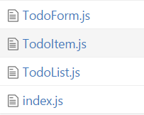
 本文介绍了一种在React应用中通过使用index.js文件来简化组件导入的方法。这种方法可以减少代码量并提高开发效率,只需在一个index.js文件中集中进行组件的导出,在其他地方使用时直接从该文件导入所需的组件。


 441
441

 被折叠的 条评论
为什么被折叠?
被折叠的 条评论
为什么被折叠?
 到【灌水乐园】发言


