


 本文介绍了几种使用CSS实现圆角效果的方法,并通过具体的HTML代码示例展示了如何利用不同边框属性来创建独特的视觉效果。适用于对CSS布局有一定了解的前端开发者。
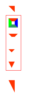
<!DOCTYPE html PUBLIC "-//W3C//DTD XHTML 1.0 Strict//EN" "http://www.w3.org/TR/xhtml1/DTD/xhtml1-strict.dtd">
<html xmlns="http://www.w3.org/1999/xhtml">
<head>
<meta http-equiv="Content-Type" content="text/html; charset=utf-8" />
<title>无标题文档</title>
<style>
div{ margin:20px 0 20px 20px;}

.a{width:0; height:0; line-height:0; border-width:10px 10px; border-style:solid; border-color:#ff3300 #ff3300 #ffffff #ffffff;}

.b{width:10px; height:10px; border:10px solid; border-color:#ff3300 #0000ff #339966 #00ff00;}

.c{width:10px; height:10px; border:10px solid; border-color:#ff3300 #ffffff #ffffff #ffffff;}

.d{width:0; height:0; border:10px solid; border-color:#ff3300 #ffffff #ffffff #ffffff;}

.e{width:0; height:0; border-width:20px 10px; border-style:solid; border-color:#ff3300 #ffffff #ffffff #ffffff;}

.f{width:0; height:0; line-height:0; border-width:20px 10px; border-style:solid; border-color:#ff3300 #ff3300 #ffffff #ffffff;}

</style>

</head>

<body>
<div class="a"></div>
<div class="b"></div>
<div class="c"></div>
<div class="d"></div>
<div class="e"></div>
<div class="f"></div>

</div>

</body>
</html>
效果图:矩形框中依次渐变演示了最上面的那个图形的形成过程
css模拟圆角(适合边框和背景一样的圆角,对精密程度要求不高的)
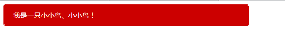
<!DOCTYPE html PUBLIC "-//W3C//DTD XHTML 1.0 Strict//EN" "http://www.w3.org/TR/xhtml1/DTD/xhtml1-strict.dtd">
<html xmlns="http://www.w3.org/1999/xhtml">
<head>
<meta http-equiv="Content-Type" content="text/html; charset=utf-8" />
<title>无标题文档</title>
<style>
/*div{ margin:20px 0 20px 20px;}*/

.box{width:500px;}
.top{border-bottom:3px solid; border-top-color:#cc0000; border-bottom-color:#cc0000; border-left:3px dotted transparent; border-right:3px dotted transparent;}
.center{padding:10px 20px; color:white; font-size:14px; background:#cc0000;}
.bot{border-top:3px solid; border-top-color:#cc0000; border-bottom-color:#cccccc; border-left:3px dotted transparent; border-right:3px dotted transparent;}

</style>

</head>

<body>

<div class="box">
    <div class="top"></div>
    <div class="center">我是一只小小鸟、小小鸟!</div>
    <div class="bot"></div>
</div>

</div>

</body>
</html>
效果图:
把div的边距拉大后会看的更清楚哦
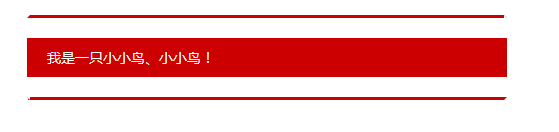
改进:
<!DOCTYPE html PUBLIC "-//W3C//DTD XHTML 1.0 Strict//EN" "http://www.w3.org/TR/xhtml1/DTD/xhtml1-strict.dtd">
<html xmlns="http://www.w3.org/1999/xhtml">
<head>
<meta http-equiv="Content-Type" content="text/html; charset=utf-8" />
<title>无标题文档</title>
<style>
.fl{ float:left;}

.box{width:400px; margin:200px auto;}
.box .right .top{border-bottom:3px solid; border-top-color:#cc0000; border-bottom-color:#cc0000; border-left:3px dotted transparent; border-right:3px dotted transparent;}
.box .right .center{padding:100px 20px; color:white; font-size:14px; background:#cc0000;}
.box .right .bot{border-top:3px solid; border-top-color:#cc0000; border-bottom-color:#cccccc; border-left:3px dotted transparent; border-right:3px dotted transparent;}

.box .left{ width:0; height:0; line-height:0; margin-top:20px;  border-top:10px solid white; border-right:20px solid #cc0000; border-bottom:10px solid white;  border-left:10px solid white;}

</style>

</head>

<body>

<div class="box">
    <div class="left fl"></div>
    <div class="right fl">
        <div class="top"></div>
            <div class="center">我是一只小小鸟、小小鸟!</div>
        <div class="bot"></div>
    </div>
    <div style="clear:both;"></div>
</div>

</div>

</body>
</html>
效果图:
原文地址:http://www.zhangxinxu.com/wordpress/?p=794


 扫一扫
扫一扫


 402
402

 被折叠的 条评论
为什么被折叠?
被折叠的 条评论
为什么被折叠?
 到【灌水乐园】发言


