


 本文介绍了多种CSS技巧,包括裁剪、圆角、背景裁剪、颜色设置、边框技巧、文字空隙调整、文字强制不换行、内容插入及文字排版等,展示了如何运用这些属性实现各种视觉效果。

1.裁剪clip属性-删除其他区域变为透明
<!DOCTYPE html PUBLIC "-//W3C//DTD XHTML 1.0 Transitional//EN" "http://www.w3.org/TR/xhtml1/DTD/xhtml1-transitional.dtd">
<html xmlns="http://www.w3.org/1999/xhtml">
<head>
<meta http-equiv="Content-Type" content="text/html; charset=utf-8" />
<title>css</title>
<style>
.clip{ width:200px; height:200px; background:#09F; position:relative;}
.clip div{ position:absolute; left:0px; top:0px;width:200px; height:200px; background:#0F0;clip:rect(10px 190px 190px 10px);}
</style>
</head>
<body>
<h2>clip属性</h2>
<div class="clip">
 <div>必须将position的值设为absolute或者fixed,此属性方可使用。 </div>
</div>
</body>
</html>
显示效果:

我们的裁剪值顺序是上右下左,那么实现的裁剪就是
上:0-10px (纵坐标)
右:200px-190px(横坐标)
下:200px-190px(纵坐标)
左:0-10px(横坐标)
最后就是我们看见的绿色区域,说明上使用此属性必须是有absolute或者fixed的设置。
针对ie6 7的兼容写法:
*clip:rect(10px,190px,190px,10px);用逗号分隔。
2.圆角border-radius属性-水平垂直分别定义
<!DOCTYPE html PUBLIC "-//W3C//DTD XHTML 1.0 Transitional//EN" "http://www.w3.org/TR/xhtml1/DTD/xhtml1-transitional.dtd">
<html xmlns="http://www.w3.org/1999/xhtml">
<head>
<meta http-equiv="Content-Type" content="text/html; charset=utf-8" />
<title>css</title>
<style>
.clip{ width:200px; height:200px; background:#09F; position:relative;}
.clip div{ position:absolute; left:0px; top:0px;width:200px; height:200px; background:#0F0; border-radius:20px;}
</style>
</head>
<body>
<h2>圆角border-radius属性</h2>
<div class="clip">
 <div></div>
</div>
</body>
</html>
复合属性,可以同时对4个定义,也可以分开处理。
效果:
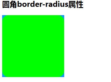
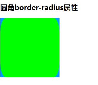
我们每个角用一个值代表水平和垂直半径相同,我们可以对一个角定义不同的水平垂直半径。写法是在值之间/分开:
<!DOCTYPE html PUBLIC "-//W3C//DTD XHTML 1.0 Transitional//EN" "http://www.w3.org/TR/xhtml1/DTD/xhtml1-transitional.dtd">
<html xmlns="http://www.w3.org/1999/xhtml">
<head>
<meta http-equiv="Content-Type" content="text/html; charset=utf-8" />
<title>css</title>
<style>
.clip{ width:200px; height:200px; background:#09F; position:relative;}
.clip div{ position:absolute; left:0px; top:0px;width:200px; height:200px; background:#0F0; border-radius:20px/50px;}
</style>
</head>
<body>
<h2>圆角border-radius属性</h2>
<div class="clip">
 <div></div>
</div>
</body>
</html>
效果:
3.背景裁剪background-clip属性-字体以外被裁剪
<!DOCTYPE html PUBLIC "-//W3C//DTD XHTML 1.0 Transitional//EN" "http://www.w3.org/TR/xhtml1/DTD/xhtml1-transitional.dtd">
<html xmlns="http://www.w3.org/1999/xhtml">
<head>
<meta http-equiv="Content-Type" content="text/html; charset=utf-8" />
<title>css</title>
<style>
.clip{ width:200px; height:200px; background:#09F; position:relative;}
.clip div{ position:absolute; left:0px; top:0px;width:200px; height:200px; background:#0F0; font-size:50px;-webkit-background-clip:text;}
</style>
</head>
<body>
<h2>背景裁剪background-clip属性</h2>
<div class="clip">
 <div>我是字体</div>
</div>
</body>
</html>
效果:
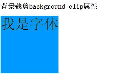
这个属性在谷歌有效,需要写前缀,我们发现除了字体,绿色背景全被裁剪了,
我们如果把字体设置为透明,背景改为渐变色,我们就做出渐变字体了。http://www.oschina.net/code/snippet_2352644_49816
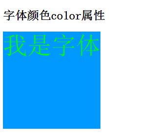
4.字体颜色color 属性-字体颜色设置为透明看见背景色
<!DOCTYPE html PUBLIC "-//W3C//DTD XHTML 1.0 Transitional//EN" "http://www.w3.org/TR/xhtml1/DTD/xhtml1-transitional.dtd">
<html xmlns="http://www.w3.org/1999/xhtml">
<head>
<meta http-equiv="Content-Type" content="text/html; charset=utf-8" />
<title>css</title>
<style>
.clip{ width:200px; height:200px; background:#09F; position:relative;}
.clip div{ position:absolute; left:0px; top:0px;width:200px; height:200px; background:#0F0; font-size:50px;;-webkit-background-clip:text; color:transparent;}
</style>
</head>
<body>
<h2>字体颜色color属性</h2>
<div class="clip">
 <div>我是字体</div>
</div>
</body>
</html>
效果:
5.边框border属性-设置为透明实现三角形
<!DOCTYPE html PUBLIC "-//W3C//DTD XHTML 1.0 Transitional//EN" "http://www.w3.org/TR/xhtml1/DTD/xhtml1-transitional.dtd">
<html xmlns="http://www.w3.org/1999/xhtml">
<head>
<meta http-equiv="Content-Type" content="text/html; charset=utf-8" />
<title>css</title>
<style>
.clip{ width:200px; height:200px; background:#09F; position:relative;}
.clip div{ position:absolute; left:0px; top:0px;width:0px; height:0px; background:#0F0; font-size:50px; border-top:100px solid #000;border-right:100px solid transparent;border-bottom:100px solid transparent;border-left:100px solid #000;}
</style>
</head>
<body>
<h2>边框border属性-设置为透明实现三角形</h2>
<div class="clip">
 <div>三角</div>
</div>
</body>
</html>
效果:
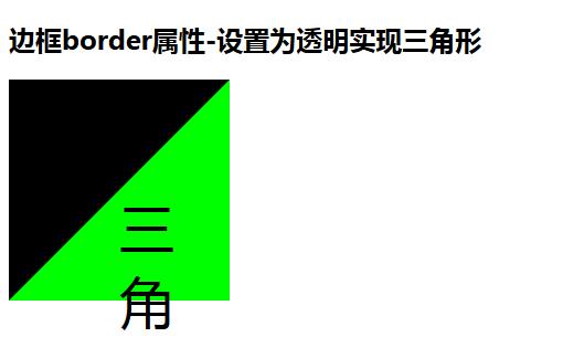
我们把宽高设置为0;然后对边框的颜色右,下设置为透明,这样就出现的如图的黑色三角形,还可以其他设置方式。
总结一次,针对颜色设置为透明,可以实现很多的小效果!
6.文字空隙letter-spacing属性和单词空隙word-spacing属性
<!DOCTYPE html PUBLIC "-//W3C//DTD XHTML 1.0 Transitional//EN" "http://www.w3.org/TR/xhtml1/DTD/xhtml1-transitional.dtd">
<html xmlns="http://www.w3.org/1999/xhtml">
<head>
<meta http-equiv="Content-Type" content="text/html; charset=utf-8" />
<title>css</title>
<style>
.clip{ width:200px; height:200px; background:#09F; position:relative;}
.clip div{ position:absolute; left:0px; top:0px;width:200px; height:200px; background:#0F0; font-size:14px; }
.clip div .n1{}
.clip div .n2{ letter-spacing:10px;}
.clip div .n3{}
.clip div .n4{ word-spacing:10px;}
</style>
</head>
<body>
<h2>文字空隙letter-spacing属性和单词空隙word-spacing属性</h2>
<div class="clip">
 <div>
     <p class="n1">我是你</p>
        <p class="n2">我是你</p>
        <p class="n3">i love you</p>
        <p class="n4">i love you</p>
    </div>
</div>
</body>
</html>
效果:
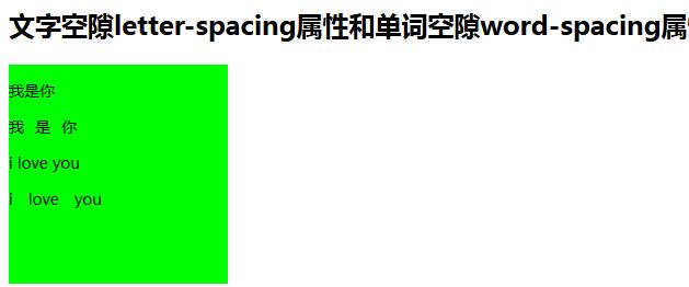
对比非常明显!
7.white-space属性-实现文字强制不换行
<!DOCTYPE html PUBLIC "-//W3C//DTD XHTML 1.0 Transitional//EN" "http://www.w3.org/TR/xhtml1/DTD/xhtml1-transitional.dtd">
<html xmlns="http://www.w3.org/1999/xhtml">
<head>
<meta http-equiv="Content-Type" content="text/html; charset=utf-8" />
<title>css</title>
<style>
.clip{ width:200px; height:200px; background:#09F; position:relative;}
.clip div{ position:absolute; left:0px; top:0px;width:200px; height:200px; background:#0F0; font-size:20px; line-height:200px; white-space:nowrap; overflow:hidden; text-overflow:ellipsis; }
</style>
</head>
<body>
<h2>white-space属性-实现文字强制不换行</h2>
<div class="clip">
 <div>
     white-space属性-实现文字强制不换行
    </div>
</div>
</body>
</html>
效果:
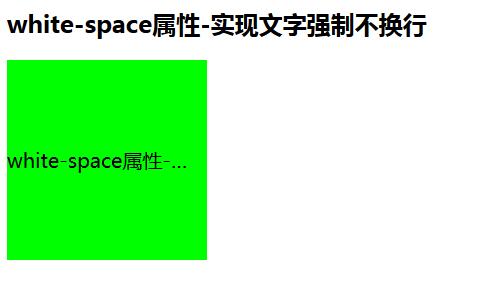
height:200px; line-height:200px; white-space:nowrap; overflow:hidden; text-overflow:ellipsis;
这些可以为这个效果实现都要写的属性。
7.content属性-实现内容插入
<!DOCTYPE html PUBLIC "-//W3C//DTD XHTML 1.0 Transitional//EN" "http://www.w3.org/TR/xhtml1/DTD/xhtml1-transitional.dtd">
<html xmlns="http://www.w3.org/1999/xhtml">
<head>
<meta http-equiv="Content-Type" content="text/html; charset=utf-8" />
<title>css</title>
<style>
.clip{ width:200px; height:200px; background:#09F; position:relative;}
.clip div{ position:absolute; left:0px; top:0px;width:200px; background:#0F0; height:200px; }
.clip div:after{content:"我是插入的"; position:absolute; right:-50px; top:0px; width:50px; height:50px;}
</style>
</head>
<body>
<h2>content属性-实现内容插入</h2>
<div class="clip">
 <div>

    </div>
</div>
</body>
</html>
效果:

这个属性一般结合::beforeh和::after为对象处理,插入了内容和定义样式。
我们在预设清除浮动也利用了为对象的处理,在最后插入内容去clear。
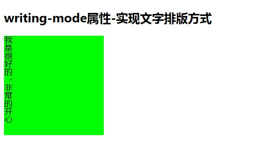
8.writing-mode属性-实现文字排版方式
<!DOCTYPE html PUBLIC "-//W3C//DTD XHTML 1.0 Transitional//EN" "http://www.w3.org/TR/xhtml1/DTD/xhtml1-transitional.dtd">
<html xmlns="http://www.w3.org/1999/xhtml">
<head>
<meta http-equiv="Content-Type" content="text/html; charset=utf-8" />
<title>css</title>
<style>
.clip{ width:200px; height:200px; background:#09F; position:relative;}
.clip div{ position:absolute; left:0px; top:0px;width:200px; background:#0F0; height:200px;
-webkit-writing-mode:vertical-rl;writing-mode:tb-rl;writing-mode:vertical-rl;}
</style>
</head>
<body>
<h2>writing-mode属性-实现文字排版方式</h2>
<div class="clip">
 <div>
     我是很好的,非常的开心
    </div>
</div>
</body>
</html>
效果:
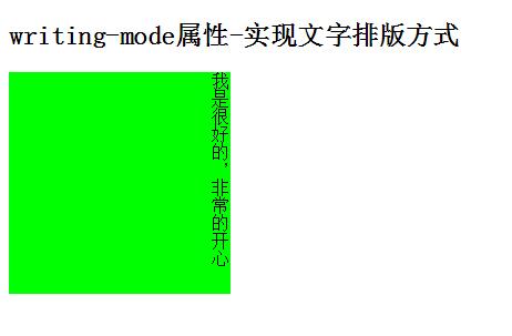
垂直排列,右侧起始。
<!DOCTYPE html PUBLIC "-//W3C//DTD XHTML 1.0 Transitional//EN" "http://www.w3.org/TR/xhtml1/DTD/xhtml1-transitional.dtd">
<html xmlns="http://www.w3.org/1999/xhtml">
<head>
<meta http-equiv="Content-Type" content="text/html; charset=utf-8" />
<title>css</title>
<style>
.clip{ width:200px; height:200px; background:#09F; position:relative;}
.clip div{ position:absolute; left:0px; top:0px;width:200px; background:#0F0; height:200px;
-webkit-writing-mode:vertical-lr;writing-mode:tb-rl;writing-mode:vertical-lr;}
</style>
</head>
<body>
<h2>writing-mode属性-实现文字排版方式</h2>
<div class="clip">
 <div>
     我是很好的,非常的开心
    </div>
</div>
</body>
</html>
效果:
垂直左侧起始,默认水平不做演示。


 扫一扫
扫一扫


 被折叠的 条评论
为什么被折叠?
被折叠的 条评论
为什么被折叠?
 到【灌水乐园】发言


