


 本文介绍了两种网页设计中常见的高清图片适配方法:利用CSS的image-set属性和媒体查询(@media)。前者通过提供不同分辨率的图片供浏览器自行选择,更加灵活;后者则直接指定不同设备像素比下使用的图片,但可能影响用户体验。
<!DOCTYPE html>
<html lang="en">
<head>
<meta charset="UTF-8">
<title>Document</title>
<style>
.back{
height:51px;
width:51px;
background:-webkit-image-set(url('wechat.png') 1x,url("wechat@2x.png") 2x) center;
}
</style>
</head>
<body>
<!--
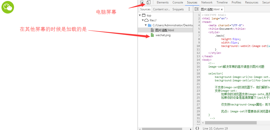
image-set解决苹果的高平请显示图片问题
selector{
background-image:url(no-image-set.png);
background:image-set(url(foo-lowres.png) 1x,url(foo-highres.png) 2x) center;
不支持image-set的浏览器下,他们解析background-image中的背景图像;
支持image-set:
如果你的浏览器支持image-set,而是普通屏下,此时浏览器选择image-set中1x背景图像
如果你的设备是高清屏幕下(ppi大于320时)时浏览器会选择image-set中@2x背景图像。
仅支持background-image属性,而不能使用在'<img>'标签中,老的安卓4.4以下的不支持
优点:image-set不需要告诉浏览器使用什么图像,而是直接提供了图像让浏览器选择
}
-->
<div class="back"></div>
</body>
</html>
@media标签
<!DOCTYPE html>
<html lang="en">
<head>
<meta charset="UTF-8">
<title>Document</title>
<style>
.back{
height:51px;
width:51px;
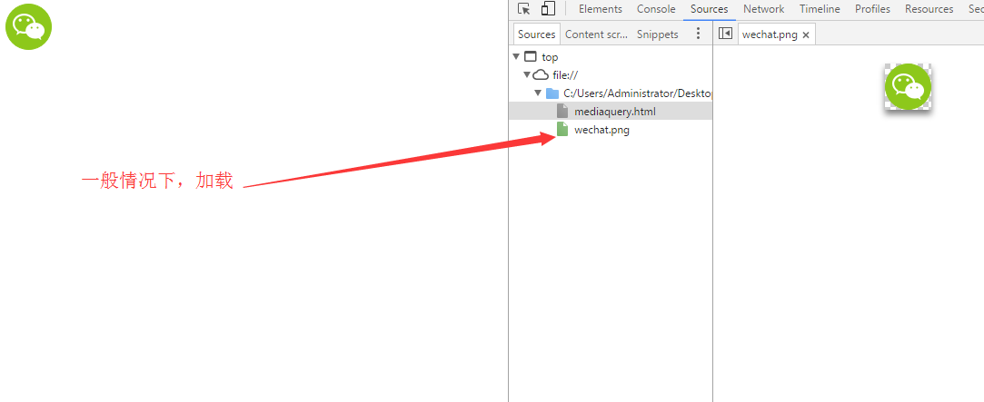
background:url('wechat.png') no-repeat center;
background-size:100%;
}
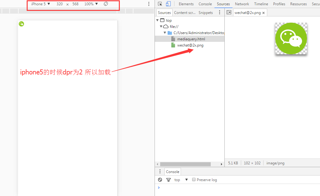
@media only screen and (-webkit-min-device-pixel-ratio:2){
.back{
background:url('wechat@2x.png') no-repeat;
background-size:100%;
}
}
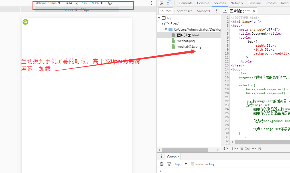
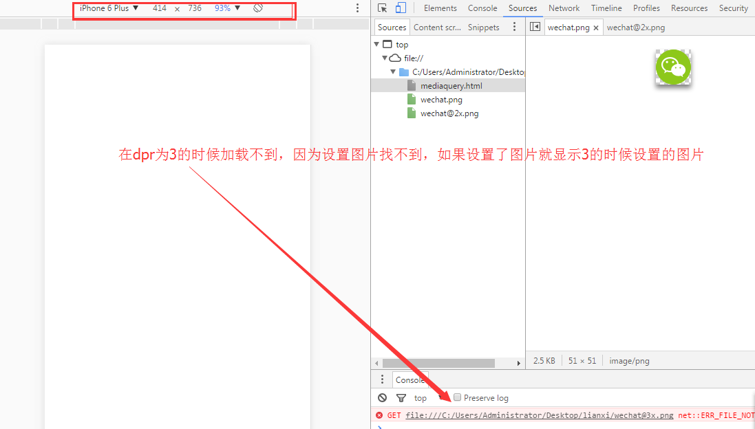
/* 当dpr为3时候也就是iphone6plus 是的时候加载这个图片 */
@media only screen and (-webkit-min-device-pixel-ratio:3){
.back{
background:url('wechat@3x.png') no-repeat;
background-size:100%;
}
}
</style>
</head>
<body>
<!-- 缺点 直接给浏览器显示特定的图片,不灵活,假设在网速不好的情况下,体验不好 -->
<div class="back"></div>
</body>
</html>


 扫一扫
扫一扫


 8万+
8万+

 被折叠的 条评论
为什么被折叠?
被折叠的 条评论
为什么被折叠?
 到【灌水乐园】发言


