


 本文深入解析Android中的三种布局:LinearLayout、RelativeLayout和TableLayout,详细阐述了它们的基本属性、用途及实现效果,帮助开发者更好地理解和运用Android布局系统。
一个Android视图有很多控件,那么怎么来控制它们的位置排列呢?我们需要容器来存放这些控件并控制它们的位置排列,就像HTML中div, table一样,Android布局也起到同样的作用。如果对应到Delphi中,感觉就像panel,主要是可以把控件摆在上面。
Android布局主要有以下几种: LinearLayout, RelativeLayout,TableLayout,AbsoluteLayout. 最后一种AbsoluteLayout是通过指定控件的x/y坐标来定位的,不太灵活所以已经不推荐使用了。
(1) LinearLayout
LinearLayout线性布局,包含在LinearLayout里面的控件按顺序排列成一行或者一列。
主要属性:
Orientation--方向,即指定LinearLayout是代表一行还是一列,可以为horizontal或vertical,如android:orientation="vertical",当然也在可以在代码里通过setOrientation()方法来设置。
Fill Mode--填充方式,所有在LinearLayout的控件都必须指定它的填充方式, 即设置android:layout_width和android:layout_height,可选值:(1)具体的像素值,如20px (2) wrap_content, 表示按控件文本实际长度显示 (3) fill_parent, 表示填充剩下的所有可用空间。
Weight--权重,如果你想让一行或一列的控件按比例显示,这时候权重就起到作用了,如想让一行里面两控件其中一控件占两倍于另一控件的空间,可以把其中一控件的android:layout_weight设置为1, 另一个为2 即可。
下面是Android的官方Demo:
< LinearLayout xmlns:android ="http://schemas.android.com/apk/res/android"
android:orientation ="vertical" android:layout_width ="fill_parent"
android:layout_height ="fill_parent" >
< LinearLayout android:orientation ="horizontal"
android:layout_width ="fill_parent" android:layout_height ="fill_parent"
android:layout_weight ="1" >
< TextView android:text ="red" android:gravity ="center_horizontal"
android:background ="#aa0000" android:layout_width ="wrap_content"
android:layout_height ="fill_parent" android:layout_weight ="1" />
< TextView android:text ="green" android:gravity ="center_horizontal"
android:background ="#00aa00" android:layout_width ="wrap_content"
android:layout_height ="fill_parent" android:layout_weight ="1" />
< TextView android:text ="blue" android:gravity ="center_horizontal"
android:background ="#0000aa" android:layout_width ="wrap_content"
android:layout_height ="fill_parent" android:layout_weight ="1" />
< TextView android:text ="yellow" android:gravity ="center_horizontal"
android:background ="#aaaa00" android:layout_width ="wrap_content"
android:layout_height ="fill_parent" android:layout_weight ="1" />
</ LinearLayout >
< LinearLayout android:orientation ="vertical"
android:layout_width ="fill_parent" android:layout_height ="fill_parent"
android:layout_weight ="1" >
< TextView android:text ="row one" android:textSize ="15pt"
android:layout_width ="fill_parent" android:layout_height ="wrap_content"
android:layout_weight ="1" />
< TextView android:text ="row two" android:textSize ="15pt"
android:layout_width ="fill_parent" android:layout_height ="wrap_content"
android:layout_weight ="1" />
< TextView android:text ="row three" android:textSize ="15pt"
android:layout_width ="fill_parent" android:layout_height ="wrap_content"
android:layout_weight ="1" />
< TextView android:text ="row four" android:textSize ="15pt"
android:layout_width ="fill_parent" android:layout_height ="wrap_content"
android:layout_weight ="1" />
</ LinearLayout >
</ LinearLayout >
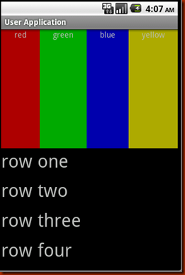
可以看到父类LinearLayout包含了一个水平布局的LinearLayout和一个垂直布局的LinearLayout,它们分别包含了四个平分宽度和高度的TextView,运行效果如下:
(2) RelativeLayout
相对布局,它是依靠与父容器或者同一容器中其它控件的相对位置来排列显示的。主要常用的属性如下:
相对父容器的属性:
android:layout_alignParentTop: 控件的顶部与父容器的顶部对齐,类似的几个属性从名字可以看出它们的作用:android:layout_alignParentBottom, android:layout_alignParentLeft, android:layout_alignParentRight.
相对同一容器中其它控件的属性:
android:layout_above: 表示此控件在另一控件的上面,类似的还有android:layout_below, android:layout_toLeftOf, android:layout_toRightOf.
android:layout_alignTop: 表示此控件与另一控件顶部对齐,类似的还有android:layout_alignBottom, android:layout_alignLeft, android:layout_alignRight.
既然是相对于另一个控件,就必须在定义这控件时候指定是哪个控件,如控件A的ID为@+id/widget_a, 控件B若要在控件A下面可以这样设置android:layout_below="@id/widget_a"。
来看一下官方的一个Demo:
android:layout_width ="fill_parent" android:layout_height ="fill_parent" >
< TextView android:id ="@+id/label" android:layout_width ="fill_parent"
android:layout_height ="wrap_content" android:text ="Type here:" />
< EditText android:id ="@+id/entry" android:layout_width ="fill_parent"
android:layout_height ="wrap_content" android:background ="@android:drawable/editbox_background"
android:layout_below ="@id/label" />
< Button android:id ="@+id/ok" android:layout_width ="wrap_content"
android:layout_height ="wrap_content" android:layout_below ="@id/entry"
android:layout_alignParentRight ="true" android:layout_marginLeft ="10dip"
android:text ="OK" />
< Button android:layout_width ="wrap_content"
android:layout_height ="wrap_content" android:layout_toLeftOf ="@id/ok"
android:layout_alignTop ="@id/ok" android:text ="Cancel" />
</ RelativeLayout >
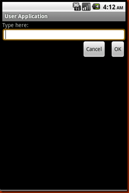
运行效果如下:
(3) TableLayout
表格布局,类似于HTML的Table,可以把控件按表格整齐摆放。通过TableRow来定义一行,如果一个控件占用多列可以设置android:layout_span, 类似于ViewGrid的MergID。默认情况下一个控件是按顺序放置在每一列的(column 0, column 1….), 也可以通过android:layout_column指定放在哪一列。android:stretchColumns和android:shrinkColumns就相当于Delphi中的自动列宽和自动行高。
来看一下我做的一个Demo:
android:layout_width ="fill_parent" android:layout_height ="fill_parent"
android:stretchColumns ="1" >
< TableRow >
< TextView android:layout_column ="0" android:text ="Open..."
android:padding ="3dip" android:layout_span ="3" />
< TextView android:text ="Ctrl-O" android:gravity ="right"
android:padding ="3dip" />
</ TableRow >
< TableRow >
< TextView android:layout_column ="1" android:text ="Save..."
android:padding ="3dip" />
< TextView android:text ="Ctrl-S" android:gravity ="right"
android:padding ="3dip" />
</ TableRow >
< TableRow >
< TextView android:layout_column ="1" android:text ="Save As..."
android:padding ="3dip" />
< TextView android:text ="Ctrl-Shift-S" android:gravity ="right"
android:padding ="3dip" />
</ TableRow >
< View android:layout_height ="2dip" android:background ="#FF909090" />
< TableRow >
< TextView android:text ="X" android:padding ="3dip" />
< TextView android:text ="Import..." android:padding ="3dip" />
</ TableRow >
< TableRow >
< TextView android:text ="X" android:padding ="3dip" />
< TextView android:text ="Export..." android:padding ="3dip" />
< TextView android:text ="Ctrl-E" android:gravity ="right"
android:padding ="3dip" />
</ TableRow >
< View android:layout_height ="2dip" android:background ="#FF909090" />
< TableRow >
< TextView android:layout_column ="3" android:text ="Quit"
android:padding ="3dip" />
</ TableRow >
</ TableLayout >
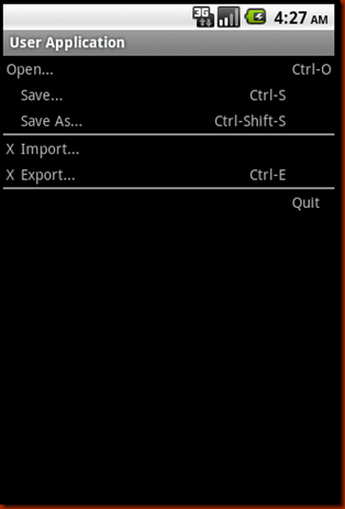
这个表格有四列,通过设置android:stretchColumns="1"来设置了第二列的自动列宽,通过android:layout_span="3"把Ctrl-O挤到了第四列。运行效果如下:
总结:
整体上Android的布局和控件和我们平时熟悉的Win32相比要简单很多,这个应该是跟Android应用的特点有关,手机屏幕就这么大,不可能摆的太复杂。


 被折叠的 条评论
为什么被折叠?
被折叠的 条评论
为什么被折叠?
 到【灌水乐园】发言


