 Taro多端导航栏TabBar实践


 本文介绍如何使用Taro实现自定义导航栏和TabBar,支持H5、小程序及React Native多端适配,包括样式调整、事件处理等细节。
运用taro实现多端导航栏/tabbar实例 (h5 + 小程序 + react native)
最近一直在捣鼓taro开发,虽说官网介绍支持编译到多端,但是网上大多数实例都是h5、小程序,很少有支持rn端。恰好taro是基于react技术,想着之前也做过一些react项目,如是抱着好奇深究了一番,采坑了不少,尤其是编译到rn时样式问题。
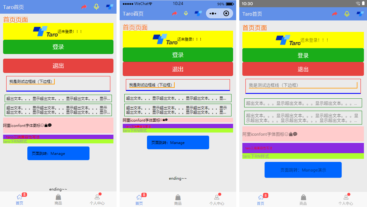
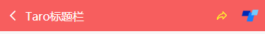
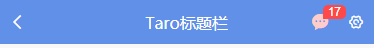
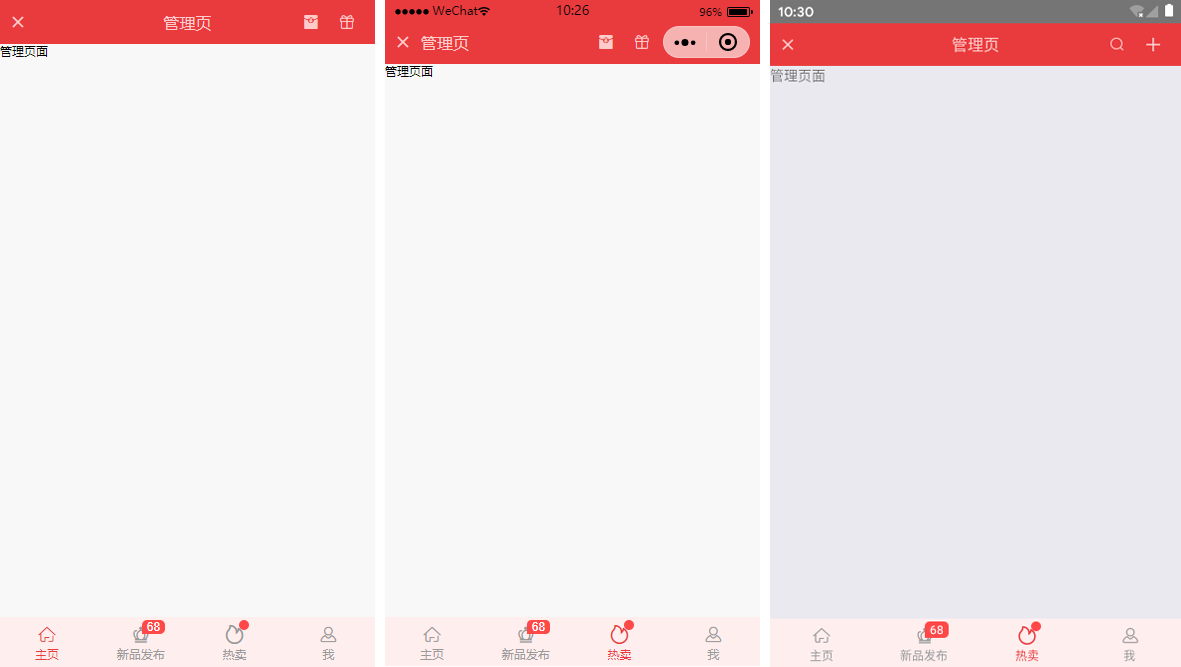
如上图:分别在h5、小程序、rn端运行效果
◆taro引入阿里字体图标iconfont
在进行下文介绍之前,先简单介绍下taro字体图标的使用,如果你项目中有引入taro-ui,直接使用taro-ui图标即可
详情看
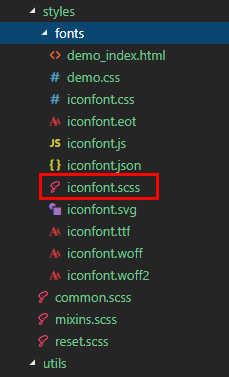
下载好阿里字体图标后,复制fonts文件夹到项目下,如下图放在:styles目录下,并将iconfont.css复制一份改为iconfont.scss
引入:import './styles/fonts/iconfont.scss'
在h5、小程序下 这种写法即可: ,
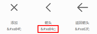
不过为了兼容rn,只能通过unicode方式这样写:
如果是通过变量传递:let back = '\ue84c' {back}
◆自定义导航栏navbar
在项目根目录app.js里面 配置navigationstyle,将其设置为custom,此时就进入自定义导航栏模式
class app extends component {
config = {
pages:
'pages/index/index',
...
],
window: {
backgroundtextstyle: 'light',
navigationbarbackgroundcolor: '#fff',
navigationbartitletext: 'taro',
navigationbartextstyle: 'black',
navigationstyle: 'custom'
},
...
}
...
}
在components目录下新建导航栏navbar组件
import taro from '@tarojs/taro'
import { view, text, input, image } from '@tarojs/components'
import classnames from "classnames";
import './index.scss'
export default class navbar extends taro.component {
// 默认配置
static defaultprops = {
isback: false,
lefticon: '\ue84c',
title: ' ',
background: '#6190e8',
color: '#fff',
center: false,
search: false,
searchstyle: '',
fixed: false,
headerright: [],
}
constructor(props) {
super(props)
this.state = {
searchtext: '',
}
}
...
render() {
const { isback, lefticon, title, background, color, center, search, searchstyle, fixed, height, headerright } = this.props
const { searchtext } = this.state
let weapp = false
if (process.env.taro_env === 'weapp') {
weapp = true
}
return (
{/* 返回 */}
{isback &&
{lefticon}
}
{/* 标题 */}
{!search && center && !weapp ? : null}
{search ?
(
)
:
(
{title && {title}}
)
}
{/* 右侧 */}
{headerright.map((item, index) => (
item.onclick && item.onclick(searchtext)}>
{item.icon && {item.icon}}
{item.text && {item.text}}
{item.img && }
{/* 圆点 */}
{!!item.badge && {item.badge}}
{!!item.dot && }
))
}
);
}
}
在页面引入组件即可:import navbar from '@components/navbar'
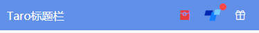
支持自定义背景、颜色、左侧图标、标题居中、搜索框,右侧按钮支持图标/文字/图片,还可以设置样式,红点提示、事件处理
headerright={[
{icon: '\ue614', style: {color: '#e93b3d'}},
{img: require('../../assets/taro.png'), dot: true, onclick: this.handlecallback},
{icon: '\ue600', style: {marginright: 10}},
]}
/>
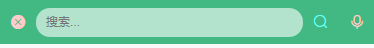
searchstyle={{
backgroundcolor:'rgba(255,255,255,.6)', borderradius: taro.pxtransform(50), color: '#333'
}}
headerright={[
{icon: '\ue622', style: {color: '#6afff9'}},
{icon: '\ue63a'},
]}
/>
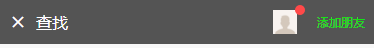
headerright={[
{img: require('../../assets/default-avatar.png'), dot: true},
{text: '添加朋友', style: {color: '#15e413'}},
]}
/>
◆自定义底部tabbar菜单
如果在app.js里面没有配置tabbar,则可以自定义底部,如下图在三端下效果
同样在components目录下新建tabbar组件
import taro from '@tarojs/taro'
import { view, text } from '@tarojs/components'
import classnames from 'classnames'
import './index.scss'
export default class tabbar extends taro.component {
// 默认参数配置
static defaultprops = {
current: 0,
background: '#fff',
color: '#999',
tintcolor: '#6190e8',
fixed: false,
onclick: () => {},
tablist: []
}
constructor(props) {
super(props)
this.state = {
updatecurrent: props.current
}
}
...
render() {
const { background, color, tintcolor, fixed } = this.props
const { updatecurrent } = this.state
return (
{this.props.tablist.map((item, index) => (
{item.icon}
{/* 圆点 */}
{!!item.badge && {item.badge}}
{!!item.dot && }
{item.title}
))}
);
}
}
自定义tabbar也支持自定义背景、颜色、图标,点击选项事件返回索引值
tablist={[
{icon: '\ue627', title: '首页', badge: 8},
{icon: '\ue61e', title: '商品'},
{icon: '\ue605', title: '个人中心', dot: true},
]}
/>
// tabbar事件
handletabbar = (index) => {this.setstate({currenttabindex: index})}
emmmm~~~,到这里就介绍差不多了,后续会考虑使用taro技术开发个h5/小程序/rn端实战项目。


 扫一扫
扫一扫


 4358
4358

 被折叠的 条评论
为什么被折叠?
被折叠的 条评论
为什么被折叠?
 到【灌水乐园】发言


