


下面我们将使用纯css实现滑动菜单效果,使用 css3 转换和重新创建一般同级连结符选择器。下面我们将讨论三个简单的例子。
第一步:写在前面的
我们使用了一个叫unicaone的google web字体,在“星形和箭头”示例中我们使用了下面的图片组合

第二步:html
三个例子的每个 html 是相同的。我们将只是切换名为ph-line-nav的class到ph-dot-nav和ph-heart-nav.
复制代码代码如下:
复制代码代码如下:
.nav {
overflow: hidden;
position: relative;
width: 480px; }
.nav a {
display: block;
position: relative;
float: left;
padding: 1em 0 2em;
width: 25%;
text-decoration: none;
color: #393939;
transition: .7s; }
.nav a:hover {
color: #c6342e; }
关键的部分lavalamp-like效应发生在这里:
复制代码代码如下:
.effect {
position: absolute;
left: -12.5%;
transition: 0.7s ease-in-out; }
.nav a:nth-child(1):hover ~ .effect {
left: 12.5%; /* the middle of the first */}
.nav a:nth-child(2):hover ~ .effect {
left: 37.5%; /* the middle of the second */ }
.nav a:nth-child(3):hover ~ .effect {
left: 62.5%; /* the middle of the third */}
.nav a:nth-child(4):hover ~ .effect {
left: 87.5%; /* the middle of the forth */}
复制代码代码如下:
width: 90px;
height: 2px;
bottom: 36px;
background: #c6342e;
box-shadow: 0 1px 0 white;
margin-left:-45px;
}
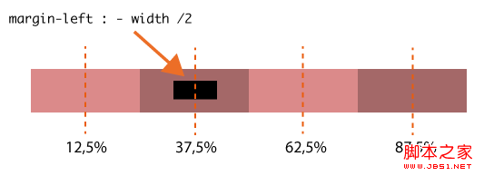
在每个情况下,我们将设置左边距为元素的一半长度,它总是在链接居中悬停,请参阅下面的图像:
第三步:深入细节2现在,让我们讨论一下带点效果。使用“:after”我们将 1px 的水平高度线添加到 div.nav。我们还使用“:after”添加了小点点,定位在每个菜单项下面的一行上。Div.effect 现在是一个 10px 的圆,其属性类似于前面的示例中的那些。
复制代码代码如下:
.ph-dot-nav:after {
content: "";
display: block;
position: absolute;
width: 100%;
height: 1px;
background: #c6342e;
bottom: 40px; }
.ph-dot-nav a:after {
content: "";
position: absolute;
width: 4px;
height: 4px;
bottom: 38px;
left: 50%;
margin-left: -2px;
background: #c6342e;
border-radius: 100%; }
.ph-dot-nav .effect {
width: 10px;
height: 10px;
bottom: 36px;
margin-left: -5px;
background: #c6342e;
border-radius: 100%; }
第四步:深入细节3
最后,让我们看一看”心和箭“的示例。”心“由两个元素组成”:before“(心的左半部分) 和”:after“,”after“的z-index设置为1所以星形在箭头之上,这样就形成了一个穿过心的效果:
复制代码代码如下:
left: 50%;
bottom: 20px;
background-position: -62px 0;
height: 20px;
width: 11px;
margin-left: -11px; }
.ph-heart-nav a:after {
z-index: 1;
background-position: -73px 0; }


 扫一扫
扫一扫


 3万+
3万+

 被折叠的 条评论
为什么被折叠?
被折叠的 条评论
为什么被折叠?
 到【灌水乐园】发言


