


 本文介绍了一种使用CSS3实现的彩虹按钮样式,包括多种不同视觉效果的按钮,如填充、脉冲、关闭、抬起等,并提供了详细的代码示例。
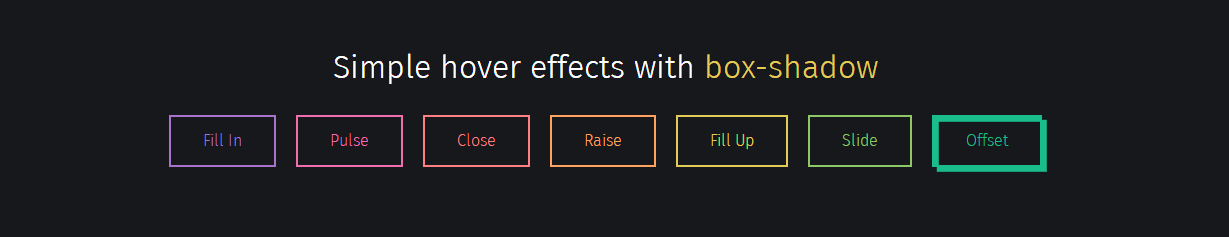
实现效果:
实现代码:
html
CSS
/*
https://developer.mozilla.org/en/docs/Web/CSS/box-shadow
box-shadow: [inset?] [top] [left] [blur] [size] [color];
Tips:
- We're setting all the blurs to 0 since we want a solid fill.
- Add the inset keyword so the box-shadow is on the inside of the element
- Animating the inset shadow on hover looks like the element is filling in from whatever side you specify ([top] and [left] accept negative values to become [bottom] and [right])
- Multiple shadows can be stacked
- If you're animating multiple shadows, be sure to keep the same number of shadows so the animation is smooth. Otherwise, you'll get something choppy.
*/
.fill:hover,
.fill:focus {
box-shadow: inset 0 0 0 2em var(--hover);
}
.pulse:hover,
.pulse:focus {
-webkit-animation: pulse 1s;
animation: pulse 1s;
box-shadow: 0 0 0 2em rgba(255, 255, 255, 0);
}
@-webkit-keyframes pulse {
0% {
box-shadow: 0 0 0 0 var(--hover);
}
}
@keyframes pulse {
0% {
box-shadow: 0 0 0 0 var(--hover);
}
}
.close:hover,
.close:focus {
box-shadow: inset -3.5em 0 0 0 var(--hover), inset 3.5em 0 0 0 var(--hover);
}
.raise:hover,
.raise:focus {
box-shadow: 0 0.5em 0.5em -0.4em var(--hover);
transform: translateY(-0.25em);
}
.up:hover,
.up:focus {
box-shadow: inset 0 -3.25em 0 0 var(--hover);
}
.slide:hover,
.slide:focus {
box-shadow: inset 6.5em 0 0 0 var(--hover);
}
.offset {
box-shadow: 0.3em 0.3em 0 0 var(--color), inset 0.3em 0.3em 0 0 var(--color);
}
.offset:hover, .offset:focus {
box-shadow: 0 0 0 0 var(--hover), inset 6em 3.5em 0 0 var(--hover);
}
.fill {
--color: #a972cb;
--hover: #cb72aa;
}
.pulse {
--color: #ef6eae;
--hover: #ef8f6e;
}
.close {
--color: #ff7f82;
--hover: #ffdc7f;
}
.raise {
--color: #ffa260;
--hover: #e5ff60;
}
.up {
--color: #e4cb58;
--hover: #94e458;
}
.slide {
--color: #8fc866;
--hover: #66c887;
}
.offset {
--color: #19bc8b;
--hover: #1973bc;
}
button {
color: var(--color);
transition: 0.25s;
}
button:hover, button:focus {
border-color: var(--hover);
color: #fff;
}
body {
color: #fff;
background: #17181c;
font: 300 1em "Fira Sans", sans-serif;
justify-content: center;
align-content: center;
align-items: center;
text-align: center;
min-height: 100vh;
display: flex;
}
button {
background: none;
border: 2px solid;
font: inherit;
line-height: 1;
margin: 0.5em;
padding: 1em 2em;
}
h1 {
font-weight: 400;
}
code {
color: #e4cb58;
font: inherit;
}
以上就是CSS3 制作的彩虹按钮样式的详细内容,更多关于CSS3 按钮样式的资料请关注脚本之家其它相关文章!


 扫一扫
扫一扫


 1393
1393

 被折叠的 条评论
为什么被折叠?
被折叠的 条评论
为什么被折叠?
 到【灌水乐园】发言


