


 这篇教程介绍了如何利用CSS3为Web项目创建具有颜色动画效果的搜索框。通过应用特定的样式和过渡效果,可以实现输入框在鼠标悬停和聚焦时宽度变化的平滑动画。代码示例包括了输入框和提交按钮的样式定义,以及在不同状态下的样式调整。
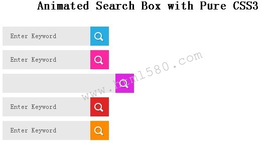
在这篇文章告诉你如何用CSS3创建各种颜色动画搜索框。你可以简单地将代码复制,并用它在您的Web项目。
#searchform { float:left; margin-left:20px; margin:9px 0px 0px; padding:0px; }
#searchform fieldset { padding:0px; border:none; margin:0px; }
#searchform input[type="text"] {
background:#e8e8e8;
border:none;
float:left;
padding:0px 10px 0px 15px;
margin:0px;
width:150px;
height:38px;
line-height:38px;
transition:all 300ms cubic-bezier(0.215, 0.61, 0.355, 1) 0s;
-moz-transition:all 300ms cubic-bezier(0.215, 0.61, 0.355, 1) 0s;
-webkit-transition:all 300ms cubic-bezier(0.215, 0.61, 0.355, 1) 0s;
-o-transition:all 300ms cubic-bezier(0.215, 0.61, 0.355, 1) 0s;
color:#585858;
}
#searchform input[type="text"]:hover, #searchform input[type="text"]:focus { width:200px; }
#searchform input[type="submit"] { background:url(icon-search.png) center 11px no-repeat; cursor:pointer; margin:0px; padding:0px; width:37px; height:38px; line-height:38px; }
input[type="submit"] { padding:4px 17px; color:#ffffcolor:#585858; ff; text-transform:uppercase; border:none; font-size:20px; background:url(gradient.png) bottom repeat-x; cursor:pointer; margin-top:10px; float:left; overflow:visible; transition: all .3s linear; -moz-transition: all .3s linear; -o-transition: all .3s linear; -webkit-transition: all .3s linear; }
#searchform input[type="submit"]:hover { background-color:#333232; }
#searchform input[type='submit'] { background-color:#25ade4; }
value="Enter Keyword" class="text_input"
οnblur="if(this.value==''){this.value='Enter Keyword';}"
οnfοcus="if(this.value =='Enter Keyword') {this.value=''; }" />
相关链接


 扫一扫
扫一扫


 被折叠的 条评论
为什么被折叠?
被折叠的 条评论
为什么被折叠?
 到【灌水乐园】发言


