


 本文介绍了一种使用CSS伪元素:before和:after来创建可旋转箭头的方法。通过设置content为空,宽高为零,边框和颜色,生成两个等边三角形,一个是红色的三角,其边长稍大,一个是白色的三角。当点击箭头时,箭头会旋转180度。
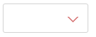
有时候,项目中或多或少需要一些箭头,如果用图片来做,感觉就有点 low 了,而上面这两个选择器是最好的选择。效果如下:
Html代码如下:
<div class="test"></div>;
Css代码如下:
.test {
    position: relative;
    width: 120px;
    height: 40px;
    border: 1px solid #d2d2d2;
    border-radius: 3px;
}
.test:after {
    position: absolute;
    right: 15px;
    top: 18px;
    width: 0;
    height: 0;
    content: "";
    border-width: 6px 6px 0 6px;
    border-style: solid;
    border-color: #fff transparent;
    -webkit-transition: all .25s;
       -moz-transition: all .25s;
        -ms-transition: all .25s;
         -o-transition: all .25s;
            transition: all .25s;
}

.test:before {
    position: absolute;
    right: 13px;
    top: 18px;
    width: 0;
    height: 0;
    content: "";
    border-width: 8px 8px 0 8px;
    border-style: solid;
    border-color: #d36969 transparent;
    -webkit-transition: transform .25s;
       -moz-transition: transform .25s;
        -ms-transition: transform .25s;
         -o-transition: transform .25s;
            transition: transform .25s;
}
.test.active:after{
    top: 20px;
    -webkit-transform: rotate(180deg);
       -moz-transform: rotate(180deg);
        -ms-transform: rotate(180deg);
         -o-transform: rotate(180deg);
            transform: rotate(180deg);
}
.test.active:before{
    -webkit-transform: rotate(180deg);
       -moz-transform: rotate(180deg);
        -ms-transform: rotate(180deg);
         -o-transform: rotate(180deg);
            transform: rotate(180deg);
}
通过 :before 和 :after 两个伪元素,设置 content 为空,宽高为零,边框和颜色,生成两个等边三角形,一个是红色的三角,其边长稍大,一个是白色的三角。会有人问为什么白色三角是通过 :after 生成的,因为 :after 生成的白色三角才能覆盖在 :before 生成的红色三角,而形成一个箭头(一定要设置好定位的 top 值,使两个三角的底边重合)。
JS代码如下:
$('.test').on('click',function(){
      $(this).toggleClass('active');
})//这里还没弄明白这段JS代码,为什么这么写
点击的时候箭头会旋转180度,效果如下:

转自 http://www.cnblogs.com/LY-leo/p/5756367.html
还有 http://blog.youkuaiyun.com/zerlinda_c/article/details/50207969


 扫一扫
扫一扫


 1567
1567

 被折叠的 条评论
为什么被折叠?
被折叠的 条评论
为什么被折叠?
 到【灌水乐园】发言


