


布局时发现CSS居然能进行计算,cale()函数用于动态计算长度值
html,body的height为100%,黑框浮动width为200px,橙框处标准流,由于浮动最初目的是为了实现文字环绕,所以文字不会被浮动的黑框遮挡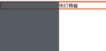
为了不让橙框被遮挡只需设置margin-left为200px,因为没有设置橙框width,默认auto,所以margin-left后也不会产生横向滚动条。这样就形成了左栏固定,右栏随窗口伸缩的布局
html
<div class="left"></div>
<div class="right">街灯晚餐</div>
css
 *{
        margin:0;
        padding:0;
   }
html,body{
        height:100%;
   }
.left{
        width:200px;
        height:100%;
        background: #2c323b;
        float:left;
        opacity:0.8;
   }
.right{
        border:3px solid #ff4200;
        margin-left:200px;
        box-sizing: border-box;
        height:100%;
   }
另一种方式是使用定位
若黑橙框都固定定位(橙框内的元素可能想以橙框作为定位基准,所以让橙框也定位),由于橙框width为auto,定位后变为了行内元素,则宽度由内容决定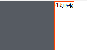
为了让橙框宽度占满右边窗口,此时就要使用C3的calc()函数进行计算
 *{
        margin:0;
        padding:0;
   }
html,body{
        height:100%;
   }
.left{
        width:200px;
        height:100%;
        position: fixed;
        top:0;
        left:0;
        background: #2c323b;
        opacity:0.8;
   }
.right{
        position: fixed;
        top:0;
        left:200px;
        width: calc(100% - 200px);
        height:100%;
        border:3px solid #ff4200;
        box-sizing: border-box;
   }
注意事项
运算符前后都需要保留一个空格,例如:width: calc(100% - 10px)
任何长度值都可以使用calc()函数进行计算
calc()函数支持 "+", "-", "*", "/" 运算
calc()函数使用标准的数学运算优先级规则
至少IE9支持,并且需要使用标准模式,声明 !doctype
attr()
attr() 函数返回选择元素的属性值
.right::after{
            content:""attr(class)"";
}获取橙框class值作为伪元素的内容,attr()要用双引号括起来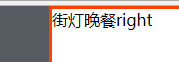
至少IE8支持,需声明!doctype


 扫一扫
扫一扫


 857
857

 被折叠的 条评论
为什么被折叠?
被折叠的 条评论
为什么被折叠?
 到【灌水乐园】发言


