


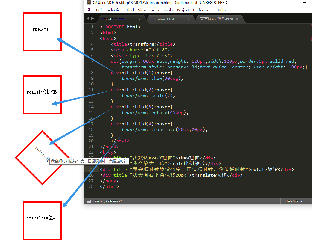
transform属性:变换,一般使用4个值,分别是skew扭曲,translate位移,rotate比旋转,scale比例缩放
练习代码如下:
<!DOCTYPE html>
<html>
<head>
<title>transform</title>
<meta charset="utf-8">
<style type="text/css">
div{margin: 80px auto;height: 120px;width:120px;border:5px solid red;transform-style: preserve-3d;text-align: center; line-height: 100px;}
div:nth-child(1):hover{
transform: skew(30deg);
}
div:nth-child(2):hover{
transform: scale(2);
}
div:nth-child(3):hover{
transform: rotate(45deg);
}
div:nth-child(4):hover{
transform: translate(20px,20px);
}
</style>
</head>
<body>
<div title="我默认skewX扭曲">skew扭曲</div>
<div title="我会放大一倍">scale比例缩放</div>
<div title="我会顺时针旋转45度,正值顺时针,负值逆时针">rotate旋转</div>
<div title="我会向右下角位移20px">translate位移</div>
</body>
</html>


 扫一扫
扫一扫


 1819
1819

 被折叠的 条评论
为什么被折叠?
被折叠的 条评论
为什么被折叠?
 到【灌水乐园】发言


