


 本文介绍了如何使用CSS中的float和clear属性来实现网页布局。通过不同场景的示例代码,展示了float属性使元素浮动脱离正常文档流的功能,以及clear属性为浮动元素腾出空间的方法。
要实现页面的布局,可以使用table,但是有其局限性,不太灵活。使用CSS的float和clear能够轻松完成布局,CSS的优势是内容和布局分离,说到解耦,程序员懂的。
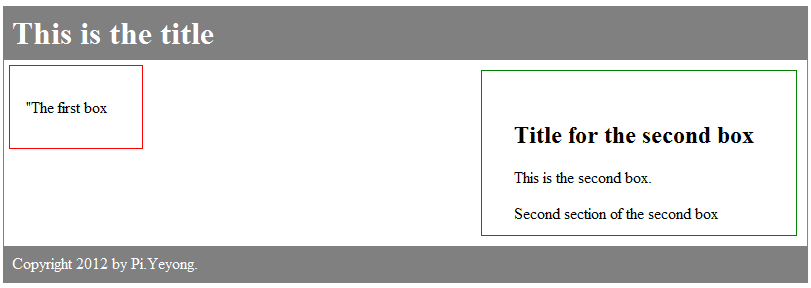
1.没有使用float

 View Code
<!DOCTYPE html>
<html>
<head>
<style type="text/css">
div.container
{
width:100%;
margin:0px;
border:1px solid gray;
}
div.header,div.footer
{
padding:0.5em;
color:white;
background-color:gray;
clear:left;
}
h1.header
{
padding:0;
margin:0;
}
div.left
{
width:100px;
height:50px;
border-left:1px solid red;
border-right:1px solid red;
border-bottom:1px solid red;
border-top:1px solid red;
margin:5px;
padding:1em;
}
div.content
{
width:250px;
height:100px;
border-left:1px solid green;
border-bottom:1px solid green;
border-top:1px solid green;
border-right:1px solid green;
margin:10px;
padding:2em;
}
</style>
</head>
<body>

<div class="container">
<div class="header"><h1 class="header">This is the title</h1></div>
<div class="left"><p>"The first box</p></div>
<div class="content">
<h2>Title for the second box</h2>
<p>This is the second box.</p>
<p>Second section of the second box</p></div>
<div class="footer">Copyright 2012 by Pi.Yeyong.</div>
</div>

</body>
</html>
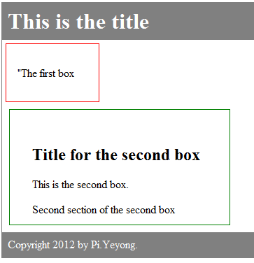
这个是没有使用float的,可以看出所有内容从上到下排列。
2.使用float:left
float
<!DOCTYPE html>
<html>
<head>
<style type="text/css">
div.container
{
width:100%;
margin:0px;
border:1px solid gray;
}
div.header,div.footer
{
padding:0.5em;
color:white;
background-color:gray;
clear:left;
}
h1.header
{
padding:0;
margin:0;
}
div.left
{
float:left;
width:100px;
height:50px;
border-left:1px solid red;
border-right:1px solid red;
border-bottom:1px solid red;
border-top:1px solid red;
margin:5px;
padding:1em;
}
div.content
{
width:250px;
height:100px;
border-left:1px solid green;
border-bottom:1px solid green;
border-top:1px solid green;
border-right:1px solid green;
margin:10px;
padding:2em;
}
</style>
</head>
<body>

<div class="container">
<div class="header"><h1 class="header">This is the title</h1></div>
<div class="left"><p>"The first box</p></div>
<div class="content">
<h2>Title for the second box</h2>
<p>This is the second box.</p>
<p>Second section of the second box</p></div>
<div class="footer">Copyright 2012 by Pi.Yeyong.</div>
</div>

</body>
</html>
预览效果:
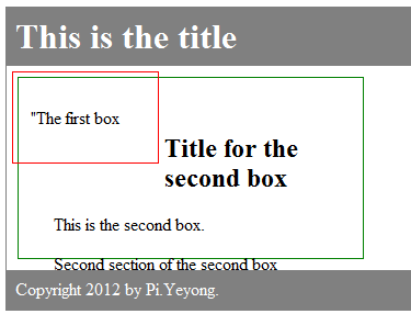
第一个框float了,它就脱离了原来的文档流(flow),可以看出,剩下的3部分(head,footer,content)还是从上到下flow的。float的框会重叠,看上去是浮动的效果。
3.两者都float:left
View Code
<!DOCTYPE html>
<html>
<head>
<style type="text/css">
div.container
{
width:100%;
margin:0px;
border:1px solid gray;
}
div.header,div.footer
{
padding:0.5em;
color:white;
background-color:gray;
clear:left;
}
h1.header
{
padding:0;
margin:0;
}
div.left
{
float:left;
width:100px;
height:50px;
border-left:1px solid red;
border-right:1px solid red;
border-bottom:1px solid red;
border-top:1px solid red;
margin:5px;
padding:1em;
}
div.content
{
float:left;
width:250px;
height:100px;
border-left:1px solid green;
border-bottom:1px solid green;
border-top:1px solid green;
border-right:1px solid green;
margin:10px;
padding:2em;
}
</style>
</head>
<body>

<div class="container">
<div class="header"><h1 class="header">This is the title</h1></div>
<div class="left"><p>"The first box</p></div>
<div class="content">
<h2>Title for the second box</h2>
<p>This is the second box.</p>
<p>Second section of the second box</p></div>
<div class="footer">Copyright 2012 by Pi.Yeyong.</div>
</div>

</body>
</html>
预览
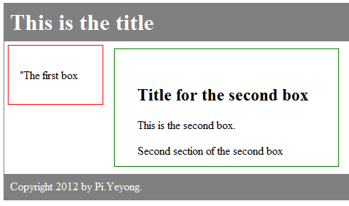
float遇上float会从左至右排列
4.float:left+float:right
View Code
预览:
float:right会浮动到右边
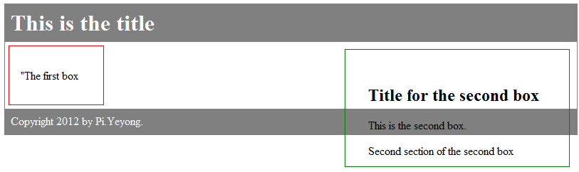
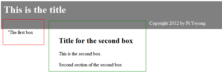
5.clear:left
上图中两个框都是float的,footer和header应该按照顺序排列,这样footer就应该与两个框重叠了,为什么没有重叠呢?因为footer使用了clear。
clear的作用是给float腾出空间,让其显示。clear可以有left,right,both和none,上图是用的clear:left,所以只给左边的框足够空间,而右边的框还是会重叠。
6.clear:both
clear both
使用clear:both,可以看到,左右两边的框都有足够的空间显示了。
7.clear:none
clear none
<!DOCTYPE html>
<html>
<head>
<style type="text/css">
div.container
{
width:100%;
margin:0px;
border:1px solid gray;
}
div.header,div.footer
{
padding:0.5em;
color:white;
background-color:gray;
clear:none;
}
h1.header
{
padding:0;
margin:0;
}
div.left
{
float:left;
width:100px;
height:50px;
border-left:1px solid red;
border-right:1px solid red;
border-bottom:1px solid red;
border-top:1px solid red;
margin:5px;
padding:1em;
}
div.content
{
float:left;
width:250px;
height:100px;
border-left:1px solid green;
border-bottom:1px solid green;
border-top:1px solid green;
border-right:1px solid green;
margin:10px;
padding:2em;
}
</style>
</head>
<body>

<div class="container">
<div class="header"><h1 class="header">This is the title</h1></div>
<div class="left"><p>"The first box</p></div>
<div class="content">
<h2>Title for the second box</h2>
<p>This is the second box.</p>
<p>Second section of the second box</p></div>
<div class="footer">Copyright 2012 by Pi.Yeyong.</div>
</div>

</body>
</html>
如果clear:none,那么footer不会给float的框显示空间,它会和前面的header按顺序显示,float的框就让她自己浮动去吧。


 扫一扫
扫一扫


 565
565

 被折叠的 条评论
为什么被折叠?
被折叠的 条评论
为什么被折叠?
 到【灌水乐园】发言


