


 本文介绍了一种使用CSS实现的星形动画效果,通过关键帧动画改变星星的位置和透明度,营造出流星划过的效果。该效果利用了CSS的transform属性进行缩放和平移,并通过after伪元素增加流星轨迹。
@keyframes star-ani-data-v-1790cda7e {
    from {
        opacity: 1;
        transform: scale(0) rotate(0) translate3d(0,0,0)
    }

    to {
        opacity: 0;
        transform: scale(1.3) rotate(0) translate3d(-20vh,20vh,0vh)
    }
}

.star{
    animation: star-ani-data-v-1790cda7e 5s infinite linear;
    background: #59e8cf;
    border-radius: 50%;
    display: block;
    height: 0;
    left: 90%;
    opacity: 0;
    position: relative;
    top: 150px;
    transform-origin: 100% 0;
    width: 5px;
    z-index: 2
}

.star:after {
    animation: shooting-ane 5.1s infinite ease-out;
    border: 0 solid #8674c2;
    border-width: 0 90px 2px;
    border-color: transparent transparent transparent #8674c2;
    content: "";
    display: block;
    left: 4px;
    top: 0;
    transform: rotate(-45deg) translate3d(1px,3px,0);
    transform-origin: 0 100%
}
效果展示: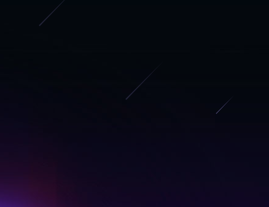


 扫一扫
扫一扫


 437
437

 被折叠的 条评论
为什么被折叠?
被折叠的 条评论
为什么被折叠?
 到【灌水乐园】发言


