


 本文介绍如何使用CSS3新特性如clip-path和shape-outside生成多种几何图形,包括三角形、五角星、椭圆等,并演示如何创建动画效果。
http://www.cnblogs.com/coco1s/p/6992177.html
<!DOCTYPE html>
<html>
<head>
<meta charset="UTF-8">
<title></title>
<style type="text/css">
.container {
width: 1200px;
margin: 0 auto;
position: relative;
padding-bottom: 10px;
}
.container>div {
margin: 40px auto;
display: inline-block;
}
.traingle {
width: 0;
height: 0;
border-left: 50px solid transparent;
border-right: 50px solid transparent;
border-bottom: 100px solid yellowgreen;
}
.notching {
width: 40px;
height: 40px;
padding: 40px;
background: -webkit-linear-gradient(315deg, transparent 15px, yellowgreen 0) top left, -webkit-linear-gradient(225deg, transparent 15px, yellowgreen 0) top right, -webkit-linear-gradient(135deg, transparent 15px, yellowgreen 0) bottom right, -webkit-linear-gradient(45deg, transparent 15px, yellowgreen 0) bottom left;
background: linear-gradient(135deg, transparent 15px, yellowgreen 0) top left, linear-gradient(-135deg, transparent 15px, yellowgreen 0) top right, linear-gradient(-45deg, transparent 15px, yellowgreen 0) bottom right, linear-gradient(45deg, transparent 15px, yellowgreen 0) bottom left;
background-size: 50% 50%;
background-repeat: no-repeat;
}
.trapezoid {
position: relative;
width: 60px;
padding: 60px;
}
.trapezoid::before {
content: "";
position: absolute;
top: 0;
right: 0;
bottom: 0;
left: 0;
-webkit-transform: perspective(20px) scaleY(1.3) rotateX(5deg);
transform: perspective(20px) scaleY(1.3) rotateX(5deg);
-webkit-transform-origin: bottom;
transform-origin: bottom;
background: yellowgreen;
}
.pentagon {
position: relative;
width: 60px;
margin-bottom: 100px !important;
border-bottom: 60px solid yellowgreen;
border-left: 40px solid transparent;
border-right: 40px solid transparent;
}
.pentagon::before {
content: "";
position: absolute;
border-top: 60px solid yellowgreen;
border-left: 70px solid transparent;
border-right: 70px solid transparent;
top: 60px;
left: -40px;
}
.hexagon {
position: relative;
width: 60px;
margin-bottom: 120px !important;
border-bottom: 60px solid yellowgreen;
border-left: 40px solid transparent;
border-right: 40px solid transparent;
}
.hexagon::before {
content: "";
position: absolute;
width: 60px;
height: 0px;
top: 60px;
left: -40px;
border-top: 60px solid yellowgreen;
border-left: 40px solid transparent;
border-right: 40px solid transparent;
}
.octagon {
position: relative;
width: 40px;
height: 100px;
background: yellowgreen;
}
.octagon::before {
content: "";
height: 60px;
position: absolute;
top: 0;
left: 40px;
border-left: 30px solid yellowgreen;
border-top: 20px solid transparent;
border-bottom: 20px solid transparent;
}
.octagon::after {
content: "";
height: 60px;
position: absolute;
top: 0;
left: -30px;
border-right: 30px solid yellowgreen;
border-top: 20px solid transparent;
border-bottom: 20px solid transparent;
}
.star {
margin: 50px 0;
position: relative;
width: 0;
border-right: 100px solid transparent;
border-bottom: 70px solid yellowgreen;
border-left: 100px solid transparent;
-webkit-transform: rotate(35deg) scale(0.6);
transform: rotate(35deg) scale(0.6);
}
.star:before {
content: '';
position: absolute;
border-bottom: 80px solid yellowgreen;
border-left: 30px solid transparent;
border-right: 30px solid transparent;
top: -45px;
left: -65px;
-webkit-transform: rotate(-35deg);
transform: rotate(-35deg);
}
.star:after {
content: '';
position: absolute;
color: yellowgreen;
top: 3px;
left: -105px;
border-right: 100px solid transparent;
border-bottom: 70px solid yellowgreen;
border-left: 100px solid transparent;
-webkit-transform: rotate(-70deg);
transform: rotate(-70deg);
}
.sixstar {
position: relative;
width: 0;
margin-bottom: 100px !important;
border-left: 50px solid transparent;
border-right: 50px solid transparent;
border-bottom: 100px solid yellowgreen;
}
.sixstar:after {
content: "";
position: absolute;
border-left: 50px solid transparent;
border-right: 50px solid transparent;
border-top: 100px solid yellowgreen;
top: 30px;
left: -50px;
}
.eightstar {
position: relative;
width: 100px;
height: 100px;
margin-bottom: 100px !important;
background-color: yellowgreen;
-webkit-transform: rotate(30deg);
transform: rotate(30deg);
}
.eightstar::before {
content: "";
position: absolute;
top: 0;
left: 0;
width: 100px;
height: 100px;
-webkit-transform: rotate(45deg);
transform: rotate(45deg);
background-color: yellowgreen;
}
.twelvestar {
position: relative;
width: 100px;
height: 100px;
margin-bottom: 100px !important;
background-color: yellowgreen;
-webkit-transform: rotate(30deg);
transform: rotate(30deg);
}
.twelvestar::before {
content: "";
position: absolute;
top: 0;
left: 0;
width: 100px;
height: 100px;
-webkit-transform: rotate(30deg);
transform: rotate(30deg);
background-color: yellowgreen;
}
.twelvestar::after {
content: "";
position: absolute;
top: 0;
left: 0;
width: 100px;
height: 100px;
-webkit-transform: rotate(60deg);
transform: rotate(60deg);
background-color: yellowgreen;
}
.ellipse {
width: 120px;
height: 160px;
background-color: yellowgreen;
border-radius: 50% 50% 50% 50% / 60% 60% 40% 40%;
}
/* 圆形 */
.circle {
width: 100px;
height: 100px;
background-color: yellowgreen;
clip-path: circle(50px at 50px 50px);
}
/* 十边形 */
.polygon {
width: 100px;
height: 100px;
background-color: yellowgreen;
clip-path: polygon(50% 0%, 80% 10%, 100% 35%, 100% 70%, 80% 90%, 50% 100%, 20% 90%, 0% 70%, 0% 35%, 20% 10%);
}
/*Clip-path 多边形过渡动画*/
.polygon-animate {
position: absolute;
width: 200px;
height: 200px;
top: 50%;
left: 50%;
transform: translate(-50%, -50%);
background-color: crimson;
transition: .3s;
clip-path: polygon( 50% 0%, 0% 100%, 100% 100%, 100% 100%, 100% 100%, 100% 100%, 100% 100%, 100% 100%, 100% 100%);
animation: polygon-ani 5s linear infinite;
}
@keyframes polygon-ani {
10% {
background-color: darkorange;
clip-path: polygon( 50% 0%, 100% 50%, 50% 100%, 0% 50%, 0% 50%, 0% 50%, 0% 50%, 0% 50%, 0% 50%);
}
14% {
clip-path: polygon( 50% 0%, 100% 50%, 50% 100%, 0% 50%, 0% 50%, 0% 50%, 0% 50%, 0% 50%, 0% 50%);
}
24% {
background-color: lemonchiffon;
clip-path: polygon( 100% 38%, 82% 100%, 82% 100%, 18% 100%, 0% 38%, 0% 38%, 0% 38%, 0% 38%, 50% 0%);
}
28% {
clip-path: polygon( 100% 38%, 82% 100%, 82% 100%, 18% 100%, 0% 38%, 0% 38%, 0% 38%, 0% 38%, 50% 0%);
}
38% {
background-color: darkturquoise;
clip-path: polygon( 50% 0%, 100% 25%, 100% 75%, 100% 75%, 50% 100%, 0% 75%, 0% 75%, 0% 25%, 0% 25%);
}
42% {
clip-path: polygon( 50% 0%, 100% 25%, 100% 75%, 100% 75%, 50% 100%, 0% 75%, 0% 75%, 0% 25%, 0% 25%);
}
52% {
background-color: darkcyan;
clip-path: polygon( 50% 0%, 90% 20%, 100% 60%, 75% 100%, 25% 100%, 25% 100%, 0% 60%, 10% 20%, 50% 0%);
}
56% {
clip-path: polygon( 50% 0%, 90% 20%, 100% 60%, 75% 100%, 25% 100%, 25% 100%, 0% 60%, 10% 20%, 50% 0%);
}
66% {
background-color: deepskyblue;
clip-path: polygon( 30% 0%, 70% 0%, 70% 0%, 100% 30%, 100% 70%, 70% 100%, 30% 100%, 0% 70%, 0% 30%);
}
70% {
clip-path: polygon( 30% 0%, 70% 0%, 70% 0%, 100% 30%, 100% 70%, 70% 100%, 30% 100%, 0% 70%, 0% 30%);
}
80% {
background-color: indigo;
clip-path: polygon( 83% 12%, 100% 43%, 94% 78%, 68% 100%, 32% 100%, 6% 78%, 0% 43%, 17% 12%, 50% 0%);
}
84% {
clip-path: polygon( 83% 12%, 100% 43%, 94% 78%, 68% 100%, 32% 100%, 6% 78%, 0% 43%, 17% 12%, 50% 0%);
}
94% {
background-color: crimson;
clip-path: polygon( 50% 0%, 0% 100%, 100% 100%, 100% 100%, 100% 100%, 100% 100%, 100% 100%, 100% 100%, 100% 100%);
}
}
/*图形变换动画*/
.triangle2rect {
position: absolute;
width: 100px;
height: 100px;
top: 50%;
left: 50%;
transform: translate(-50%, -50%);
animation: aniContainer 2s infinite alternate;
}
.triangle2rect div {
position: absolute;
top: 0;
left: 0;
width: 100%;
height: 100%;
}
.a {
background: deeppink;
clip-path: polygon(0% 0%, 0% 100%, 50% 50%);
animation: a 2s infinite alternate;
}
.b {
background: deeppink;
clip-path: polygon(0% 0%, 100% 0%, 50% 50%);
animation: b 2s infinite alternate;
}
.c {
background: deeppink;
clip-path: polygon(100% 0%, 100% 100%, 50% 50%);
animation: c 2s infinite alternate;
}
.d {
background: deeppink;
clip-path: polygon(100% 100%, 0% 100%, 50% 50%);
animation: d 2s infinite alternate;
}
@keyframes a {
0%,
10% {
background: deeppink;
clip-path: polygon(0% 0%, 0% 100%, 50% 50%);
}
90%,
100% {
background: #000;
clip-path: polygon(0% 100%, 25% 100%, 12.5% 0%);
}
}
@keyframes b {
0%,
10% {
background: deeppink;
clip-path: polygon(0% 0%, 100% 0%, 50% 50%);
}
90%,
100% {
background: #000;
clip-path: polygon(25% 0%, 50% 0%, 37.5% 100%);
}
}
@keyframes c {
0%,
10% {
background: deeppink;
clip-path: polygon(100% 0%, 100% 100%, 50% 50%);
}
90%,
100% {
background: #000;
clip-path: polygon(62.5% 0%, 75% 100%, 50% 100%);
}
}
@keyframes d {
0%,
10% {
background: deeppink;
clip-path: polygon(100% 100%, 0% 100%, 50% 50%);
}
90%,
100% {
background: #000;
clip-path: polygon(100% 0%, 87.5% 100%, 75% 0%);
}
}
@keyframes aniContainer {
0%,
10% {
width: 100px;
height: 100px;
}
90%,
100% {
width: 250px;
height: 60px;
}
}
</style>
</head>
<body>
<div class="container">
<!-- 三角形 -->
<div class="traingle"></div>
<!-- 切角 -->
<div class="notching"></div>
<!-- 梯形 -->
<div class="trapezoid"></div>
<!-- 五边形 -->
<div class="pentagon"></div>
<!-- 六边形 -->
<div class="hexagon"></div>
<!-- 八边形 -->
<div class="octagon"></div>
<!-- star -->
<div class="star"></div>
<!-- 六角星 -->
<div class="sixstar"></div>
<!-- 八角星 -->
<div class="eightstar"></div>
<!-- 十二角星 -->
<div class="twelvestar"></div>
<!-- 椭圆 -->
<div class="ellipse"></div>
<!-- 圆形 -->
<div class="circle"></div>
<!-- 十边形 -->
<div class="polygon"></div>
<!--Clip-path 多边形过渡动画-->
<div class="polygon-animate"></div>
<!--图形变换动画-->
<hgroup class="triangle2rect">
<div class="a"></div>
<div class="b"></div>
<div class="c"></div>
<div class="d"></div>
</hgroup>
</div>
<style type="text/css">
.text-section {
width: 400px;
height: 400px;
margin: 0 auto;
border: 1px solid red;
}
p,
h1 {
font-family: "lucida grande", "lucida sans unicode", lucida, helvetica, "Hiragino Sans GB", "Microsoft YaHei", "WenQuanYi Micro Hei", sans-serif;
text-align: justify;
}
.wrap-before {
shape-outside: polygon(0 0, 0 100%, 100% 100%, 0 50%, 100% 0);
float: left;
width: 50%;
height: 100%;
}
.wrap-after {
shape-outside: polygon(100% 0, 100% 100%, 0% 100%, 100% 50%, 0% 0);
float: right;
width: 50%;
height: 100%;
}
</style>
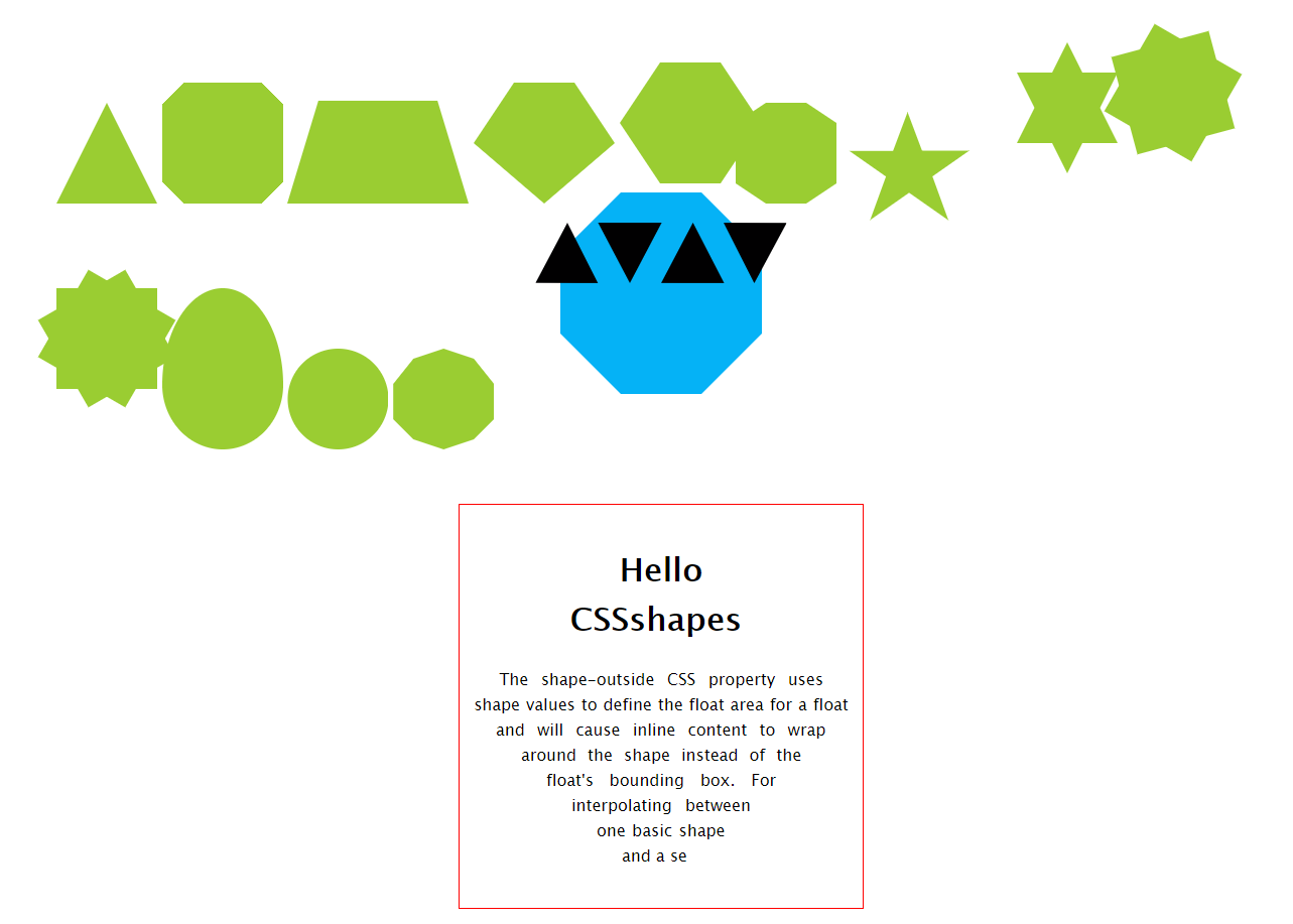
<div class="text-section">
<div class="wrap-before"></div>
<div class="wrap-after"></div>
<h1>Hello CSSshapes</h1>
<p>
The shape-outside CSS property uses shape values to define the float area for a float and will cause inline content to wrap around the shape instead of the float's bounding box. For interpolating between one basic shape and a se
</p>
</div>
</body>
</html>
CSS 发展到今天已经越来越强大了。其语法的日新月异,让很多以前完成不了的事情,现在可以非常轻松的做到。今天就向大家介绍几个比较新的强大的 CSS 功能:
- clip-path
- shape-outside
shape 的意思是图形,CSS shapes 也就是 CSS 图形的意思,也就是使用 CSS 生成各种图形(圆形、矩形、椭圆、多边形等几何图形)。
CSS3之前,我们能做的只有矩形,四四方方,条条框框。
CSS3
CSS3出来后,我们有了更广阔的施展空间,通过
border-radiusbordertransform- 伪元素配合
- gradient 渐变
我们能够作出非常多的几何图形。
除去最常见的矩形,圆形(border-radius),下面稍微列举一些其他几何图形:
三角形
通常会使用透明的border模拟出一个三角形:
|
1
2
3
4
5
6
7
|
.traingle {
width
:
0
;
height
:
0
;
border-left
:
50px
solid
transparent
;
border-right
:
50px
solid
transparent
;
border-bottom
:
100px
solid
yellowgreen;
}
|
切角
《CSS Secret》里面的方法,采用多重线性渐变实现切角。
|
1
2
3
4
5
6
7
8
9
10
11
|
.notching {
width
:
40px
;
height
:
40px
;
padding
:
40px
;
background
: linear-gradient(
135
deg,
transparent
15px
, yellowgreen
0
)
top
left
,
linear-gradient(
-135
deg,
transparent
15px
, yellowgreen
0
)
top
right
,
linear-gradient(
-45
deg,
transparent
15px
, yellowgreen
0
)
bottom
right
,
linear-gradient(
45
deg,
transparent
15px
, yellowgreen
0
)
bottom
left
;
background-
size
:
50%
50%
;
background-repeat
:
no-repeat
;
}
|
梯形
利用伪元素加旋转透视实现梯形:
|
1
2
3
4
5
6
7
8
9
10
11
12
13
14
|
.trapezoid{
position
:
relative
;
width
:
60px
;
padding
:
60px
;
}
.trapezoid::before{
content
:
""
;
position
:
absolute
;
top
:
0
;
right
:
0
;
bottom
:
0
;
left
:
0
;
transform: perspective(
20px
) scaleY(
1.3
) rotateX(
5
deg);
transform-origin:
bottom
;
background
: yellowgreen;
}
|
当然,还有另一种更简单的方法是利用border实现,借助上面的构造三角形的方法,在矩形两侧构造两个透明的三角形:
|
1
2
3
4
5
6
7
|
.trapezoid {
position
:
relative
;
width
:
60px
;
border-top
:
60px
solid
yellowgreen;
border-left
:
40px
solid
transparent
;
border-right
:
40px
solid
transparent
;
}
|
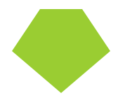
五边形
梯形加上三角形,很容易就组合成一个五边形,这里需要借助一个伪元素实现:
|
1
2
3
4
5
6
7
8
9
10
11
12
13
14
15
16
17
|
.pentagon {
position
:
relative
;
width
:
60px
;
border-bottom
:
60px
solid
yellowgreen;
border-left
:
40px
solid
transparent
;
border-right
:
40px
solid
transparent
;
}
.pentagon::before {
content
:
""
;
position
:
absolute
;
top
:
60px
;
left
:
-40px
;
border-top
:
60px
solid
yellowgreen;
border-left
:
70px
solid
transparent
;
border-right
:
70px
solid
transparent
;
}
|
六边形
看看上面的梯形,如果两个反方向且底边同样大小的梯形,叠加在一起,是不是就能得到一个六边形呢?
|
1
2
3
4
5
6
7
8
9
10
11
12
13
14
15
16
17
18
|
.pentagon {
position
:
relative
;
width
:
60px
;
border-bottom
:
60px
solid
yellowgreen;
border-left
:
40px
solid
transparent
;
border-right
:
40px
solid
transparent
;
}
.pentagon::before {
content
:
""
;
position
:
absolute
;
width
:
60px
;
height
:
0px
;
top
:
60px
;
left
:
-40px
;
border-top
:
60px
solid
yellowgreen;
border-left
:
40px
solid
transparent
;
border-right
:
40px
solid
transparent
;
}
|
八边形
六边形都解决了,八边形也不在话下,一个矩形加上两个梯形,可以合成一个八边形。
|
1
2
3
4
5
6
7
8
9
10
11
12
13
14
15
16
17
18
19
20
21
22
23
24
25
26
|
.octagon {
position
:
relative
;
width
:
40px
;
height
:
100px
;
background
: yellowgreen;
}
.octagon::before {
content
:
""
;
height
:
60px
;
position
:
absolute
;
top
:
0
;
left
:
40px
;
border-left
:
30px
solid
yellowgreen;
border-top
:
20px
solid
transparent
;
border-bottom
:
20px
solid
transparent
;
}
.octagon::after {
content
:
""
;
height
:
60px
;
position
:
absolute
;
top
:
0
;
left
:
-30px
;
border-right
:
30px
solid
yellowgreen;
border-top
:
20px
solid
transparent
;
border-bottom
:
20px
solid
transparent
;
}
|
五角星
好的,探索完多边形,我们继续探索X角星。
先来看看五角星,要怎么实现呢?当然是直接打出来啦 -- ★☆
开个玩笑,这里使用 3 个三角形叠加旋转在一起实现。
|
1
2
3
4
5
6
7
8
9
10
11
12
13
14
15
16
17
18
19
20
21
22
23
24
25
26
27
28
29
|
.star {
margin
:
50px
0
;
position
:
relative
;
width
:
0
;
border-right
:
100px
solid
transparent
;
border-bottom
:
70px
solid
yellowgreen;
border-left
:
100px
solid
transparent
;
transform: rotate(
35
deg) scale(.
6
);
}
.star:before {
content
:
''
;
position
:
absolute
;
border-bottom
:
80px
solid
yellowgreen;
border-left
:
30px
solid
transparent
;
border-right
:
30px
solid
transparent
;
top
:
-45px
;
left
:
-65px
;
transform: rotate(
-35
deg);
}
.star:after {
content
:
''
;
position
:
absolute
;
top
:
3px
;
left
:
-105px
;
border-right
:
100px
solid
transparent
;
border-bottom
:
70px
solid
yellowgreen;
border-left
:
100px
solid
transparent
;
transform: rotate(
-70
deg);
}
|
六角星
六角星呢?想象一下,一个向上的三角形 ▲,叠加上一个向下的三角形 ▼,就可以得到一个六边形:
|
1
2
3
4
5
6
7
8
9
10
11
12
13
14
15
16
|
.sixstar {
position
:
relative
;
width
:
0
;
border-left
:
50px
solid
transparent
;
border-right
:
50px
solid
transparent
;
border-bottom
:
100px
solid
yellowgreen;
}
.sixstar:after {
content
:
""
;
position
:
absolute
;
border-left
:
50px
solid
transparent
;
border-right
:
50px
solid
transparent
;
border-top
:
100px
solid
yellowgreen;
top
:
30px
;
left
:
-50px
;
}
|
八角星
八角星呢?八个角那么多呢。其实使用两个矩形进行旋转拼接就可以了。
|
1
2
3
4
5
6
7
8
9
10
11
12
13
14
15
16
17
18
|
.eightstar {
position
:
relative
;
width
:
100px
;
height
:
100px
;
background-color
: yellowgreen;
transform: rotate(
30
deg);
}
.eightstar::before {
content
:
""
;
position
:
absolute
;
top
:
0
;
left
:
0
;
width
:
100px
;
height
:
100px
;
transform: rotate(
45
deg);
background-color
: yellowgreen;
}
|
十二角星
好。最后多角星再来一个十二级角星。在八角星的基础上,再增加一个矩形,就能得到十二角啦。也就是要过第一个伪元素。
|
1
2
3
4
5
6
7
8
9
10
11
12
13
14
15
16
17
18
19
20
21
22
23
24
25
26
27
28
29
30
|
.twelvestar {
position
:
relative
;
width
:
100px
;
height
:
100px
;
margin-bottom
:
100px
!important
;
background-color
: yellowgreen;
transform: rotate(
30
deg);
}
.twelvestar::before {
content
:
""
;
position
:
absolute
;
top
:
0
;
left
:
0
;
width
:
100px
;
height
:
100px
;
transform: rotate(
30
deg);
background-color
: yellowgreen;
}
.twelvestar::after {
content
:
""
;
position
:
absolute
;
top
:
0
;
left
:
0
;
width
:
100px
;
height
:
100px
;
transform: rotate(
60
deg);
background-color
: yellowgreen;
}
|
椭圆
最后,再来使用传统的方法画一个椭圆,过去 CSS3 画椭圆,基本上只能借助 border 实现。
这里使用 border 画一个蛋的形状:
|
1
2
3
4
5
6
|
.ellipse {
width
:
120px
;
height
:
160px
;
background-color
: yellowgreen;
border-radius:
50%
50%
50%
50%
/
60%
60%
40%
40%
;
}
|
CodePen -- CSS Shapes(CSS 几何图形)
clip-path
CSS 新属性 clip-path,意味裁剪路径的意思,让我们可以很便捷的生成各种几何图形。
clip-path 通过定义特殊的路径,实现我们想要的图形。而这个路径,正是 SVG 中的 path 。
看看它的 API:
|
1
2
3
4
5
6
7
8
9
10
11
12
13
14
15
16
17
18
19
20
21
22
23
24
25
26
27
28
29
|
{
/* Keyword values */
clip-path:
none
;
/* Image values */
clip-path:
url
(resources.svg#c
1
);
/* Box values
clip-path: fill-box;
clip-path: stroke-box;
clip-path: view-box;
clip-path: margin-box
clip-path: border-box
clip-path: padding-box
clip-path: content-box
/* Geometry values */
clip-path:
inset
(
100px
50px
);
clip-path:
circle
(
50px
at
0
100px
);
clip-path: polygon(
50%
0%
,
100%
50%
,
50%
100%
,
0%
50%
);
/* Box and geometry values combined */
clip-path: padding-box
circle
(
50px
at
0
100px
);
/* Global values */
clip-path: inherit;
clip-path: initial;
clip-path: unset;
}
|
看上去很多,其实很好理解,如果接触过 SVG 的 path,其实就是照搬 SVG 的 path 的一些定义。换言之,如果没有接触过 SVG,看完本文后再去学习 SVG 路径 ,也会十分容易上手。
根据不同的语法,我们可以生成不同的图形。
例如 clip-path: circle(50px at 50px 50px) 表示在元素的 (50px, 50px)处,裁剪生成一个半径为 50px 的圆。
以元素的左上角为坐标起点
而整个 clip-path 属性,最为重要的当属 polygon,可以利用 polygon 生成任意多边形。
clip-path 示例
下面分别列举使用 clip-path 生成一个圆形和一个十边形。
|
1
2
3
4
5
6
7
8
9
10
11
12
13
14
15
|
/* 圆形 */
.
circle
{
width
:
100px
;
height
:
100px
;
background-color
: yellowgreen;
clip-path:
circle
(
50px
at
50px
50px
);
}
/* 十边形 */
.polygon {
width
:
100px
;
height
:
100px
;
background-color
: yellowgreen;
clip-path: polygon(
50%
0%
,
80%
10%
,
100%
35%
,
100%
70%
,
80%
90%
,
50%
100%
,
20%
90%
,
0%
70%
,
0%
35%
,
20%
10%
);
}
|
clip-path: circle(50px at 50px 50px) 上文也讲了,表示在元素的 (50px, 50px)处,裁剪生成一个半径为 50px 的圆。
而在 clip-path: polygon(50% 0%, 80% 10%, 100% 35%, 100% 70%, 80% 90%, 50% 100%, 20% 90%, 0% 70%, 0% 35%, 20% 10%) 中,依次列出了 10 个坐标点。我们的图形就是依次连接这 10 个坐标点形成一个裁切图形。
当然,这里采用的是百分比,也可以使用具体的数值。
clip-path 动画
clip-path 另外一个强大之处在于可以进行 CSS transtion 与 CSS animation,也就是过渡和动画。
看一个多边形的过渡切换动画。
CodePen Demo -- Clip-path 多边形过渡动画
图形变换动画
除此之外,我们还可以尝试,将一个完整的图形,分割成多个小图形,这也是 clip-path 的魅力所在,纯 CSS 的图形变换:
CodePen Demo -- Clip-path triangle2rect
clip-path 动画的局限
clip-path 动画虽然美好,但是存在一定的局限性,那就是进行过渡的两个状态,坐标顶点的数量必须一致。
也就是如果我希望从三角形过渡到矩形。假设三角形和矩形的 clip-path 分别为:
- 三角形:
clip-path: polygon(50% 0, 0 100%, 100% 0) - 矩形:
clip-path: polygon(0 0, 100% 0, 100% 100%, 0 100%)
进行过渡动画时候,直接从 polygon(50% 0, 0 100%, 100% 0) --> polygon(0 0, 100% 0, 100% 100%, 0 100%) 是不行的,因为是从 3 个坐标点变换到 4 个坐标点。
因此这里需要这用一个讨巧的办法,在三角形的表示方法中,使用四个坐标点表示,其中两个坐标点进行重合即可。也就是:
- 三角形:
clip-path: polygon(50% 0, 0 100%, 100% 0)->clip-path: polygon(50% 0, 50% 0, 0 100%, 100% 0)
N边形过渡动画
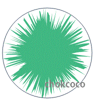
如果脑洞够大,随机生成 N(N>=1000)边形,进行变换,会是什么效果呢?
see one see:
变换的瞬间很有爆炸的感觉。不过这里有个很大的问题,只是随机生成了 2000 个坐标点,然后使用 clip-path 将这些坐标点连接起来,并不是符合要求的多边形。
在 VUE官网,有下面这样一个例子,一个规则的多边形进行不断的过渡动画,非常酷炫:
VUE官网使用的是 SVG 实现的,这里我稍微改变了下,使用 CSS clip-path 实现:
CodePen Demo -- clip-path N polygon ,感兴趣可以看看。
shape-outside
最后再来看看 shape-outside,另外一个有趣的有能力生成几何图形的属性。
shape-outside 是啥?它也有制造各种几何图形的能力,但是它只能和浮动 float 一起使用。
虽然使用上有所限制,但是它赋予了我们一种更为自由的图文混排的能力。
先看看它的 API,看上去貌似很复杂:
|
1
2
3
4
5
6
7
8
9
10
11
12
13
14
15
16
17
18
19
20
21
22
23
24
25
|
{
/* Keyword values */
shape-outside:
none
;
shape-outside: margin-box;
shape-outside: content-box;
shape-outside: border-box;
shape-outside: padding-box;
/* Function values */
shape-outside:
circle
();
shape-outside: ellipse();
shape-outside:
inset
(
10px
10px
10px
10px
);
shape-outside: polygon(
10px
10px
,
20px
20px
,
30px
30px
);
/* <url> value */
shape-outside:
url
(image.png);
/* Gradient value */
shape-outside: linear-gradient(
45
deg, rgba(
255
,
255
,
255
,
0
)
150px
,
red
150px
);
/* Global values */
shape-outside: initial;
shape-outside: inherit;
shape-outside: unset;
}
|
但是,其实它和 clip-path 的语法非常类似,很容易触类旁通。看看实例,更易理解:
大家自行去熟悉下 API,接着假设我们有下面这样的结构存在:
|
1
2
3
4
5
6
7
8
9
10
11
12
13
14
|
<
div
class="container">
<
div
class="shape-outside">
<
img
src="image.png">
</
div
>
xxxxxxxxxxx,文字描述,xxxxxxxxx
</
div
>
定义如下 CSS:
.shape-outside {
width: 160px;
height: 160px;
shape-outside: circle(80px at 80px 80px);
float: left;
}
|
注意,上面 .shape-outside 使用了浮动,并且定义了 shape-outside: circle(80px at 80px 80px) ,表示在元素的 (80px, 80px) 坐标处,生成一个 80px 半径的圆。
如此,将会产生一种图文混排的效果:
CodePen Demo -- 图文混排 shape-outside
嗯?好像没什么了不起啊?这不就是 float 的效果吗?
不,不是的,看看 float 和 加上shape-outside 后的对比:
看出区别了吗?使用了 shape-outside ,真正的实现了文字根据图形的轮廓,在其周围排列。
上图是使用开发者工具选取了作用了 shape-outside 的元素,可以看到,使用了特殊的蓝色去标记几何图形的轮廓。在这个蓝色区域之外,文字都将可以进行排列。
shape-outside 的本质
划重点,划重点,划重点。
所以,shape-outside 的本质其实是生成几何图形,并且裁剪掉其几何图形之外周围的区域,让文字能排列在这些被裁剪区域之内。
所以,了解了这个本质之后,我们再看看一些更复杂的图文混排。
平行四边形
CodePen Demo -- 图文混排 shape-outside
心形、菱形
CodePen Demo -- 图文混排 shape-outside
clip-path 与 shape-outside 的兼容性
额,比较遗憾,这两个属性的兼容性目前仍处于比较尴尬的境地。感兴趣的可以看看 CANIUSE 。全面兼容使用仍需努力。
所以本文所展示的 Demo 都是在 -webkit- 内核浏览器下完成的。
最后
系列 CSS 文章汇总在我的 Github 。
到此本文结束,如果还有什么疑问或者建议,可以多多交流,原创文章,文笔有限,才疏学浅,文中若有不正之处,万望告知。


 扫一扫
扫一扫


 1832
1832

 被折叠的 条评论
为什么被折叠?
被折叠的 条评论
为什么被折叠?
 到【灌水乐园】发言


