


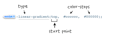
.example1 {
       width: 150px;
       height: 80px;
       background: -moz-linear-gradient( top,#ccc,#000);
background: -o-linear-gradient( top,#ccc,#000);
filter: progid:DXImageTransform.Microsoft.gradient(GradientType=0, startColorstr=#ccc, endColorstr=#000);//ie-ms-filter:"progid:DXImageTransform.Microsoft.gradient (GradientType=0,startColorstr=#ccc,endColorstr=#000)";
}效果如下:
")
老式写法
background: -webkit-gradient(linear,center top,center bottom,from(#ccc), to(#000));
参考:http://www.cnblogs.com/lhb25/archive/2013/01/30/css3-linear-gradient.html


 扫一扫
扫一扫


 472
472

 被折叠的 条评论
为什么被折叠?
被折叠的 条评论
为什么被折叠?
 到【灌水乐园】发言


