 CSS3绘制旋转八卦图


<!DOCTYPE html>
<html>
<head>
<meta charset=utf-8>
<title>CSS3绘制旋转八卦样式</title>
<style>
.square{
width:400px;
height:400px;
position:relative;
transform:rotate(45deg);
-webkit-transform:rotate(45deg);
-moz-transform:rotate(45deg);
animation:rotate infinite linear 5s;
margin:10% auto;
-webkit-animation:rotate infinite linear 5s;
margin:10% auto;
-moz-animation:rotate infinite linear 5s;
margin:10% auto;
}
.rect{
width:400px;
height:200px;
position:relative;
border:1px #d2d2d2 solid;
border-bottom:none;
}
.inner_circle{
width:200px;
height:200px;
border-radius:200px;
position:absolute;
z-index:1;
}
.dot{
width:50px;
height:50px;
position:absolute;
left:0;
right:0;
top:0;bottom:0;
margin:auto;
border-radius:50%;
}
.rect1{
border-radius:200px 200px 0 0;
background:white;
}
.rect11{
bottom:-100px;
left:0;
background:black;
}
.rect12{
background:white;
}
.rect2{
border-radius:0 0 200px 200px;
background:black;
}
.rect21{
bottom:100px;
right:0;
background:white;
}
.rect22{
background:black;
}
@keyframes rotate{
from{
transform:rotate(0deg);
-webkit-transform:rotate(0deg);
}to{
transform:rotate(360deg);
-webkit-transform:rotate(360deg);
}}
</style>
</head>
<body>
<div class="square">
<div class="rect rect1">
<div class="inner_circle rect11">
<div class="dot rect12"></div>
</div>
</div>
<div class="rect rect2">
<div class="inner_circle rect21">
<div class="dot rect22"></div>
</div>
</div>
</div>
</body>
</html>
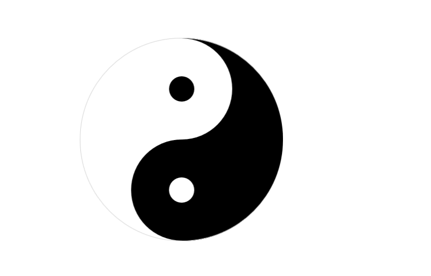
完成以后的效果就是这样的了:


 扫一扫
扫一扫


 614
614

 被折叠的 条评论
为什么被折叠?
被折叠的 条评论
为什么被折叠?
 到【灌水乐园】发言


