


Overview
The HTML5/JavaScript AutoComplete is a textbox control that provides a list of suggestions to select from as the user types. It has several out-of-the-box features such as data binding, filtering, grouping, UI customization, accessibility, and more.
Data binding
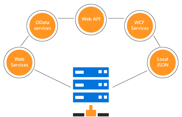
You can bind data from a variety of data sources, such as an array of primitive data, JSON data collections, or remote data sources using different kinds of adaptors such as OData, OData V4, URL, JSON, and Web API. Data binding uses our data manager to manage data and also has customization options for data requests and processing.
Filtering
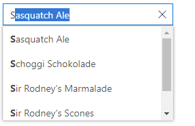
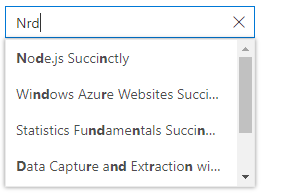
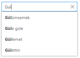
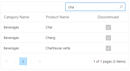
Built-in filtering support includes a rich set of filtering options that is available to meet all your application needs.
Filter type
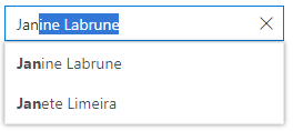
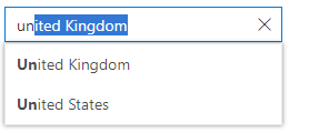
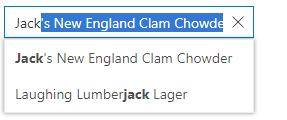
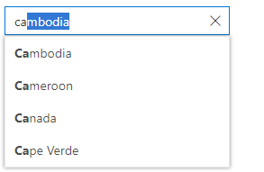
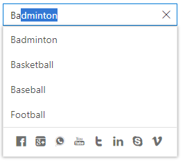
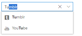
Filter data based on starts with, ends with, and contains predicates.
Custom filtering
You can customize the built-in filter query or use your own custom filter libraries to populate the data.
Diacritic-sensitive search
The AutoComplete supports diacritic character-sensitive searching. This behavior can be turned on or off.
Limit suggestion items
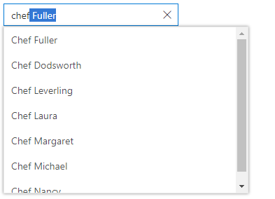
Limit the number of suggestions to be displayed in the filtered data list.
Ignore filter text casing
You can filter data with or without using case sensitivity for typed characters.
Minimum filter characters
Set a number of characters required to begin filtering and populating the data.
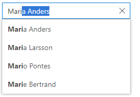
Highlight matched text
You can configure different visual appearances for the matching text of each suggestion.
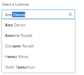
Autofill search
The JavaScript AutoComplete control has an autofill search option that predicts and completes the word that the user types based on the suggestion text in the dropdown, allowing the end user to search for items easily.
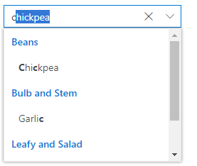
Grouping
Group the suggestions based on logically grouped categories with individual headers.
UI customization
Customize the appearance of each item displayed in the suggestion list with templating.
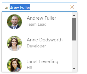
Item template
Define a custom appearance for each suggestion item by using item templates.
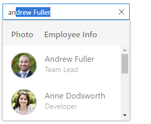
Header template
Design a header for the suggestion list using a header template.
Footer template
Design a custom footer for the suggestion list using a footer template.
Icons
Add icons to each suggestion item, like countries with flag icons.
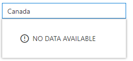
Empty record
Provide an option with a custom appearance if there are no search suggestions to display.
Suggestion list
Generate a suggestion list for users as they type in the input textbox.
Dimension customization
The width and height of the suggestion list is adjustable.
Hide or avoid suggestion list
It is possible to hide the default suggestion list and bind the search result onto some other control, such as a data grid.
Floating label
Developer can control whether the placeholder should float.
Forms support
Seamlessly supports HTML5 forms, Angular template-driven forms, and Angular reactive forms.
Mobile-friendly, responsive UI
Provides a responsive mode that displays an adaptive redesigned UI for mobile devices that recognizes touch gestures.
Other supported frameworks
The AutoComplete component is also available in Blazor, React, Angular, and Vue frameworks. Check out the different AutoComplete platforms from the links below,
Web accessibility
Fully supports WAI-ARIA accessibility standards that make the AutoComplete control accessible to screen readers and assistive devices.
Follows WAI-ARIA best practices for implementing keyboard interaction.
Designs the UI element visuals such as foreground color, background color, line spacing, text, and images based on the WCAG 2.0 standard.
Supports right-to-left (RTL) direction for users working in right-to-left languages like Hebrew, Arabic, or Persian.
Developer-friendly APIs
Developers can customize all UI elements and control their behaviors according to the end user’s requirements using the rich set of client-side APIs.


 扫一扫
扫一扫


 被折叠的 条评论
为什么被折叠?
被折叠的 条评论
为什么被折叠?
 到【灌水乐园】发言


