


 本文详细介绍了CSS中border-radius属性的不同写法及其应用效果,包括如何使用百分比和像素值来创建圆形和椭圆形的边角。
border-radius
border-radius 几种写法:
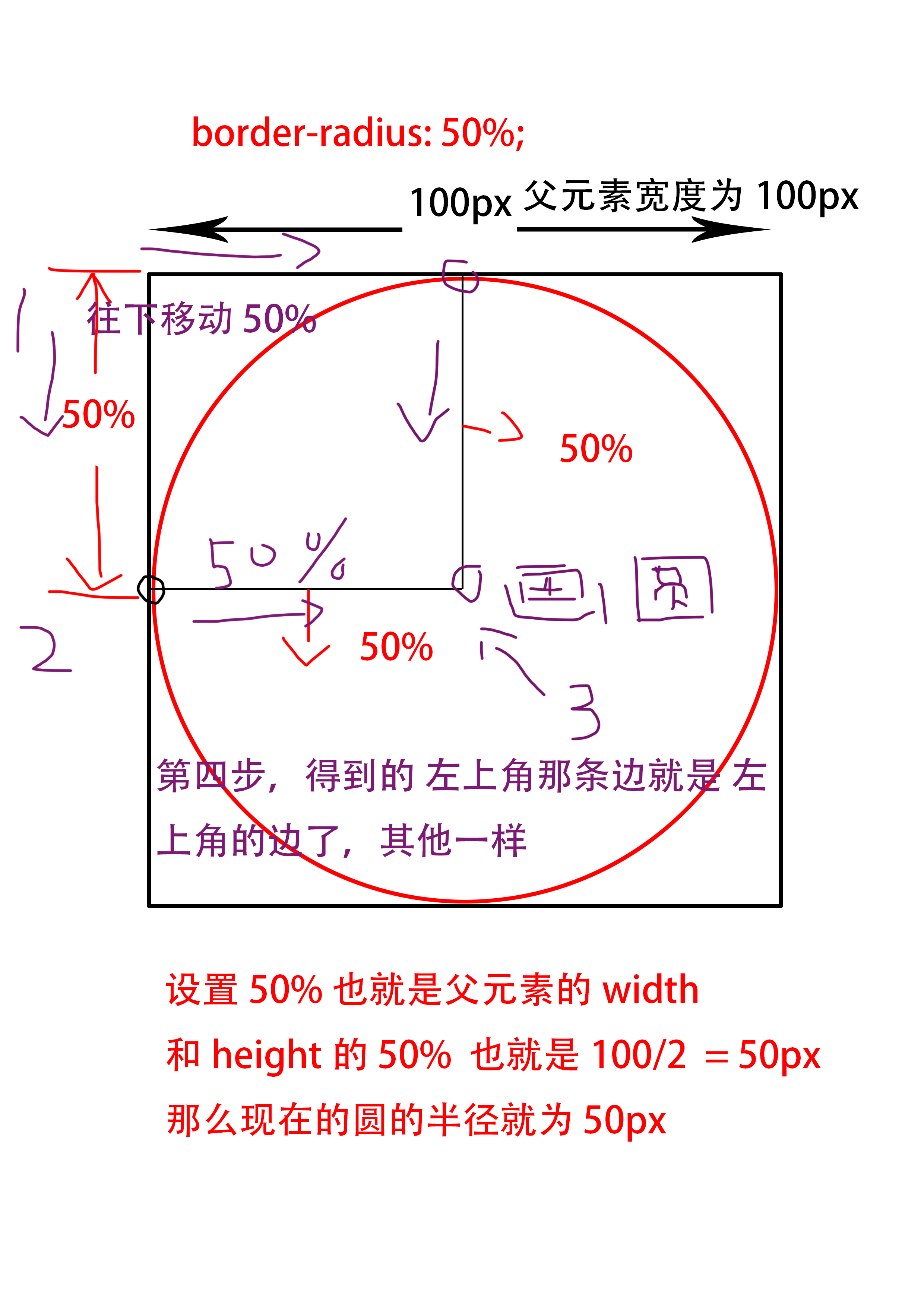
1.border-radius: 50%;
以正方形为例子, 这样写就是设置 4个角 为50%。
2.border-radius: 50% 50%;
这样是设置, 左上角 和 右下角 为50%。 右上角 和 左下角为50%
3.border-radius: 10px 20px 30px 40px / 10px 20px 30px 40px;
这四个值代表的位置是 左上 右上 右下 左下 / 左上 右上 右下 左下
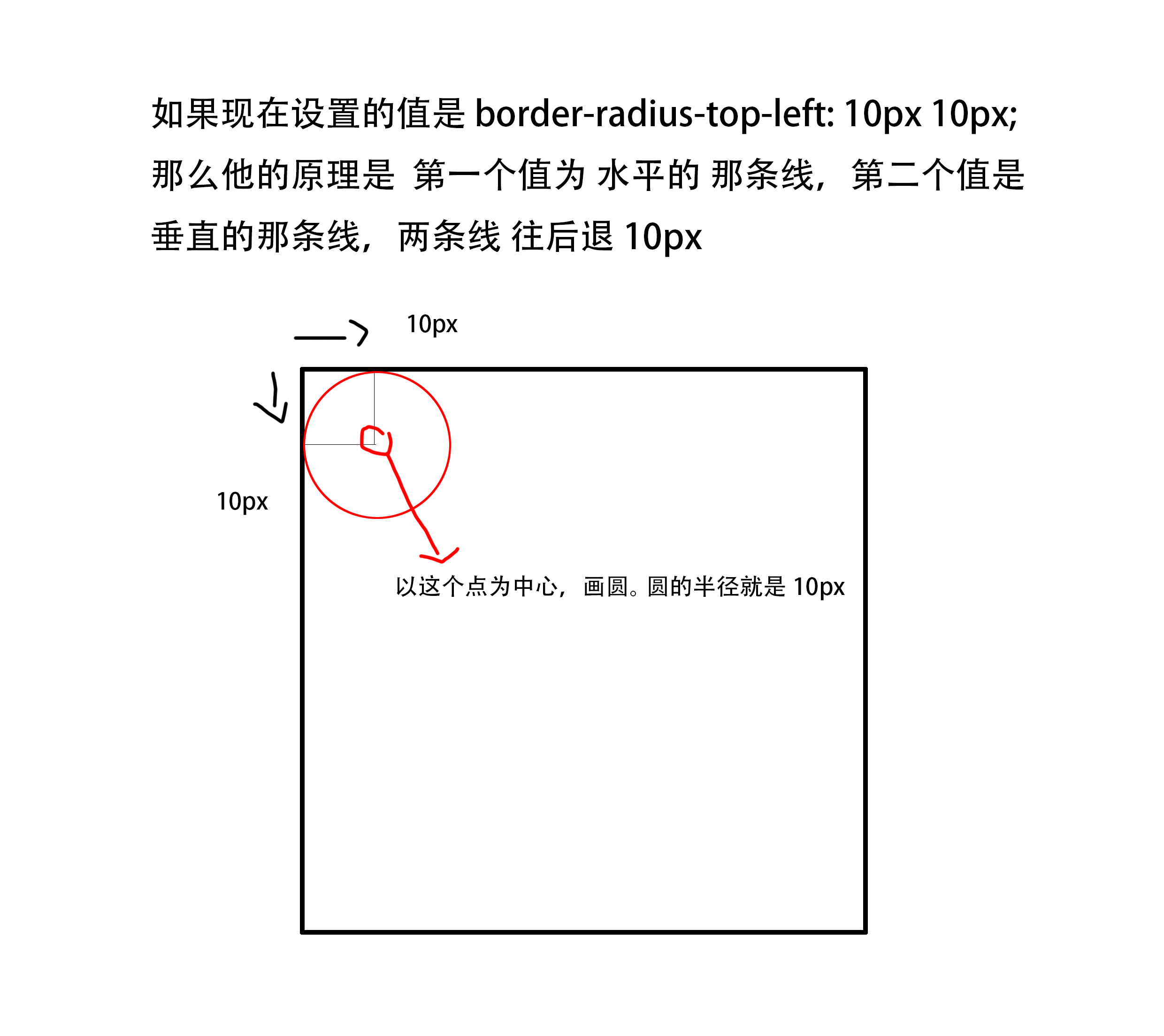
4.border-radius-top-left: 10px; == border-radius-top-left: 10px 10px; 左上
border-radius-top-right: 10px; == border-radius-top-right: 10px 10px; 右上
border-radius-bottom-right: 10px; == border-radius-bottom-right: 10px 10px; 右下
border-radius-bottom-left: 10px; == border-radius-bottom-left: 10px 10px; 左下
这些值,为什么这么设置的,请看下面讲解:
接下来来看看,圆是怎么实现的。(哈哈哈,灵魂画手)
所以说,需要8个值来设置, 只是平常我们把它缩写了。
border-radius-top-left: 10px 10px; 第一个参数为 水平线,第二个参数为垂直线 ;
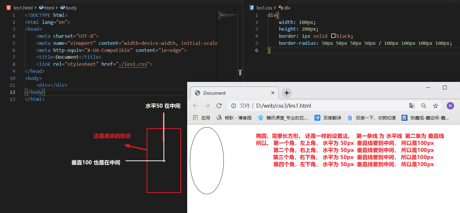
利用所学到的,画个椭圆吧。正方形肯定不能画椭圆,要用长方形


 扫一扫
扫一扫


 3万+
3万+

 被折叠的 条评论
为什么被折叠?
被折叠的 条评论
为什么被折叠?
 到【灌水乐园】发言


