


 本文介绍如何使用Bootstrap快速构建网页布局,通过将页面划分为12列的网格系统,实现响应式设计。文中详细展示了如何利用'col-md-x'类创建不同列数的内容区块,并通过'row'类组织代码结构。
Usually when desgin a web page, we think building the page in grid.
Bootstrap can help us to do that.
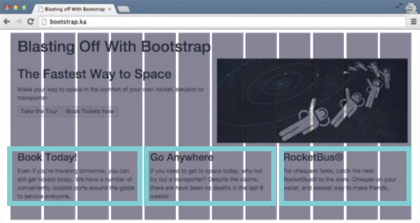
It divides the page into 12 cols. In the picture, there are three rows, on the top is header (it takes 12 cols), in the middle there is two cols, in the bottom, there are three cols.
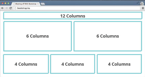
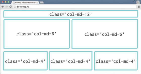
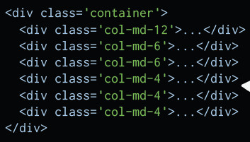
You can finish this work quickly by using 'col-md-x' class: it should sum up to 12 for each row.
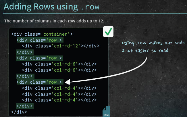
To organize the code structure better, you can but add 'row' class:
If one row exceeds 12 cols, the page layout would broken.
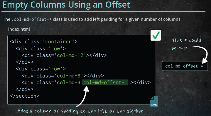
If you want to add more padding:
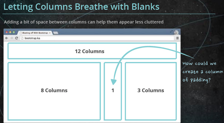
You can use 'col-md-offest-x' class:
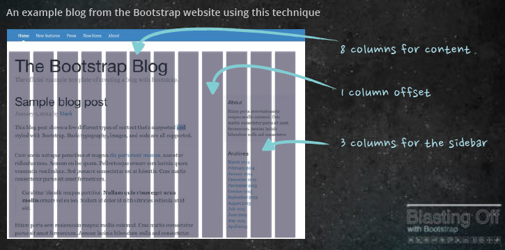
Result:


 扫一扫
扫一扫


 1934
1934

 被折叠的 条评论
为什么被折叠?
被折叠的 条评论
为什么被折叠?
 到【灌水乐园】发言


