


1、给input的placeholder设置颜色
 1 .phColor::-webkit-input-placeholder { /* WebKit, Blink, Edge */
 2     color:maroon;
 3 }
 4 .phColor:-moz-placeholder { /* Mozilla Firefox 4 to 18 */
 5    color:maroon;opacity:  1;
 6 }
 7 .phColor::-moz-placeholder { /* Mozilla Firefox 19+ */
 8    color:maroon;opacity:  1;
 9 }
10 .phColor:-ms-input-placeholder { /* Internet Explorer 10-11 */
11    color:maroon;
12 }
2、透明度
.demo{
    width:100%;height:25px;background:orange;
    /*兼容IE6+,Chrome,Firefox--注意不要更改下面三条属性的次序*/
    opacity: 0.3;
    -ms-filter:"progid:DXImageTransform.Microsoft.Alpha(Opacity=0)";
    filter: alpha(opacity=30);
}
<p class="demo">hello world</p>
3、超出长度显示省略号
width:300px;height:100px;overflow:hidden;white-space:nowrap;text-overflow:ellipsis;
其他文本类属性有:
(1)word-wrap: normal|break-word;
(2)word-break: normal|break-all|keep-all;
normal 使用浏览器默认的换行规则;break-all 允许在单词内换行。
(3)white-space: normal|pre|nowrap|pre-wrap|pre-line;
normal 默认 - 空白会被浏览器忽略;nowrap 文本不会换行,文本会在在同一行上继续,直到遇到 <br> 标签为止。(常用)
4、textarea禁止拖动
resize: none | both | horizontal | vertical
none:用户不能操纵机制调节元素的尺寸;both:用户可以调节元素的宽度和高度;
horizontal:用户可以调节元素的宽度;vertical:让用户可以调节元素的高度;
5、按钮-鼠标悬浮-背景色过渡变化(transtion)
1 a{padding:8px 16px;border-radius:5px;background-color:#396;color:#fff;text-decoration:none;
2   transition:background-color .3s ease-in-out .1s;
3   -webkit-transition:background-color .3s ease-in-out .1s;  /*Safari 需要前缀 -webkit-*/
4 }
5 a:hover{background-color:#063;}
6 <a href="#">hello</a>
6、列表-鼠标悬浮-缩进过渡变化(transtion)
<style>
.box .list{width:300px;border:1px solid #ccc;border-radius:5px;overflow:hidden;padding:5px 16px;list-style:none;}
.box .list li{padding:6px 0 6px 0;overflow:hidden;text-overflow:ellipsis;white-space:nowrap;transition:all 0.25s ease-in-out 0s;}
.box .list li:hover{margin-left:8px;}
.box .list li a{color:#333;text-decoration:none;}
.box .list li span{color:aqua;font-size:20px;padding-right:6px;}
/*text-overflow:ellipsis;显示省略符号来代表被修剪的文本.
  white-space:nowrap;文本不会换行,文本会在在同一行上继续,直到遇到br标签为止.*/
</style>
<div class="box">
    <ul class="list">
        <li class=""><span>•</span><a href="#">list1 list1 list1 list1 list1 list1 list1 </a></li>
        <li class=""><span>•</span><a href="#">list2 list2 list2 list2 list2 list2 list2</a></li>
        <li class=""><span>•</span><a href="#">list3 list3 list3 list3 list3 list3 list3</a></li>
    </ul>
</div>
7、横线-文字-横线
ul{padding:0;margin:30px auto;list-style:none;}
ul .list1{border-bottom:1px solid #666;margin-bottom:-15px;}
ul li a{width:100%;display:block;box-sizing:border-box;padding:5px;text-align:center;text-decoration:none;color:orange;}
ul li a span{background:#fff;padding:0 10px;}
<ul>
    <li class="list1"></li>
    <li class="list2"><a href="javascript:;"><span>Hello world</span></a></li>
</ul>
8、table-border


 1 <!DOCTYPE html>
 2 <html>
 3 <head lang="en">
 4 <meta charset="utf-8" />
 5 <style type="text/css">
 6 /*table-1*/
 7 #table1{border-collapse:collapse;}
 8 #table1, #table1 td, #table1 th{border:1px solid black;}
 9 /*table-3*/
10 #table3{border-collapse:separate;border-spacing:10px 10px;}
11 #table3, #table3 td, #table3 th{border:1px solid black;}
12 /**
13 * border-collapse 属性设置表格的边框是否被合并为一个单一的边框,还是象在标准的 HTML 中那样分开显示。
14 * 可能的值:
15 * separate--默认值。边框会被分开。不会忽略 border-spacing 和 empty-cells 属性。
16 * collapse--如果可能,边框会合并为一个单一的边框。会忽略 border-spacing 和 empty-cells 属性。
17 * inherit--规定应该从父元素继承 border-collapse 属性的值。
18 **/
19 /**
20 * border-spacing--属性设置相邻单元格的边框间的距离,在指定的两个长度值中,第一个是水平间隔,第二个是垂直间隔。除非 border-collapse 被设置为 separate,否则将忽略这个属性。
21 **/
22 </style>
23 </head>
24
25 <body>
26 <h2>table-1:</h2>
27 <table id="table1">
28     <tr><th>Firstname</th><th>Lastname</th></tr>
29     <tr><td>Bill</td><td>Gates</td></tr>
30     <tr><td>Steven</td><td>Jobs</td></tr>
31 </table>
32 <p><b>注释:</b>如果没有规定 !DOCTYPE,border-collapse 属性可能会引起意想不到的错误。</p>
33 <hr>
34 <h2>table-2:</h2>
35 <table border='1' cellspacing='0'>
36     <tr><th>Firstname</th><th>Lastname</th></tr>
37     <tr><td>Bill</td><td>Gates</td></tr>
38     <tr><td>Steven</td><td>Jobs</td></tr>
39 </table>
40 <hr>
41 <h2>table-3:</h2>
42 <table id="table3">
43     <tr><th>Firstname</th><th>Lastname</th></tr>
44     <tr><td>Bill</td><td>Gates</td></tr>
45     <tr><td>Steven</td><td>Jobs</td></tr>
46 </table>
47 </body>
48 </html>
9、css-图片铺满屏幕
html,body{height:100%;overflow:hidden;padding:0;margin:0;}
.box{height:100%;background:url(bg.png) no-repeat;background-size:cover;background-position:50% 50%;}
注意:
(1)、全屏的元素及其父元素都要设置height:100%。
(2)、将html、body标签设置height:100%; 或者 min-height:100%;
注:height:100%;是跟随其父元素高度变化而变化的。PC端的图片尺寸一般使用1920*1080。
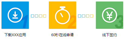
10、图片文字列表 (2016-01-25)
实现效果图如下:
html:( 代码十分优雅哦! )
1 <ul>
2     <li class="step1">下载XXX应用</li>
3     <li class="step2">60秒在线申请</li>
4     <li class="step3">线下签约</li>
5 </ul>
css:
 1 /*reset-style*/
 2 html,body,div,span,iframe,h1,h2,h3,h4,h5,h6,p,
 3 a,em,img,strong,sub,sup,i,dl,dt,dd,ol,ul,li,fieldset,
 4 form,label,table,caption,tbody,tfoot,thead,tr,th,td {
 5     margin: 0;
 6     padding: 0;
 7 }
 8 body {
 9   font-family: "Microsoft yahei", Helvetica, Arial, sans-serif;
10   font-size: 14px;
11   line-height: 1.42857143;
12   background-color: #fff;
13 }
14 ol,ul {
15     list-style: none;
16 }
17
18 /*本页面的样式*/
19 ul li{display:inline-block;position:relative;text-align:center;margin:10px 60px;font-size:18px;}
20 ul li:before{width:184px;height:185px;display:block;margin-bottom:20px;}
21 ul .step1:before{content:url(ico1-c.jpg);}
22 ul .step2:before{content:url(ico2-c.jpg);}
23 ul .step3:before{content:url(ico3-c.jpg);}
24 ul li:after{content:url(threeStep.jpg);position:absolute;top:82px;left:195px;}
25 ul .step3:after{content:'';}
11、进度条效果 (2016-04-16)
效果图:
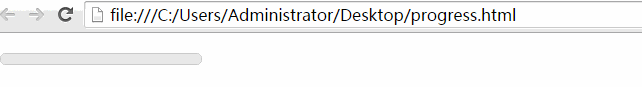
实现方法1:
html:
1 <div class="box">
2     <div class="progress">
3         <div style="width:60%">
4             <div class="percent"></div>
5         </div>
6     </div>
7 </div>
css:
 1 *{padding:0;margin:0;}
 2 .box{margin:20px 10px;}
 3 .progress{width:200px;height:10px;border:1px solid #ccc;background:#eee;border-radius:5px;}
 4 .percent{height:10px;background:maroon;border-radius:5px;animation:line 2s;-webkit-animation:line 2s;}
 5 @keyframes line{
 6     from{ width : 0; }
 7     to{ width : 100%; }
 8 }
 9 @-webkit-keyframes line{
10     from{ width : 0; }
11     to{ width : 100%; }
12 }
实现方法2:
html:
1 <div id="process-box">
2     <div id="process-bar"></div>
3     <div id="process-txt">0%</div>
4 </div>
css:
1 body{margin:0;padding:0;}
2 #process-box{width:200px;height:15px;position:relative;border:1px solid #333;margin:20px;border-radius:20px;}
3 #process-box #process-bar{width:200px;height:15px;position:absolute;left:0;top:0;background:maroon;clip:rect(0px,0px,60px,0px);border-radius:20px;}
4 #process-box #process-txt{width:200px;height:15px;position:absolute;left:0;top:0;line-height:15px;text-align:center;color:#999;}
javascript:
 1 var Obar = document.getElementById('process-bar'),
 2     Otxt = document.getElementById('process-txt');
 3 var process_txt = 0,
 4     process_num = 0;
 5 setInterval(function(){
 6     if(process_num <= 200){
 7         Obar.style.clip = 'rect(0px,' + process_num + 'px,60px,0px)';
 8         Otxt.innerHTML = parseInt(process_num/200*100) + '%';
 9         process_num ++;
10     }
11     return;
12 }, 10);
12、css实现简单的幻灯片效果 (2016-04-26)
html:
<div class="banner"></div>
css:
 1 .banner{
 2     width:400px;
 3     height:250px;
 4     margin:50px auto;
 5     overflow:hidden;
 6     box-shadow:0 0 5px rgba(0,0,0,1);
 7     background-size:100% 100%;
 8     -webkit-animation:loops 12s infinite;
 9 }
10 @-webkit-keyframes loops{
11     0% {
12         background:url(banner1.jpg) no-repeat;
13     }
14     50% {
15         background:url(banner2.jpg) no-repeat;
16     }
17     100% {
18         background:url(banner3.jpg) no-repeat;
19     }
20 }
13、reset.css (2016-04-28)
 1 html,body,div,span,iframe,h1,h2,h3,h4,h5,h6,p,
 2 a,em,img,strong,sub,sup,i,dl,dt,dd,ol,ul,li,fieldset,
 3 form,label,table,caption,tbody,tfoot,thead,tr,th,td {
 4     margin: 0;
 5     padding: 0;
 6 }
 7 body {
 8   font-family: "Microsoft yahei", Helvetica, Arial, sans-serif;
 9   font-size: 12px;
10   line-height: 1.42857143;
11   background-color: #fff;
12 }
13 ol,ul {
14     list-style: none;
15 }
16 table {
17     border-collapse: collapse;
18     border-spacing: 0;
19 }
20 caption,th,td {
21     text-align: left;
22     font-weight: normal;
23     vertical-align: middle;
24 }
25 a{
26   text-decoration:none;
27 }
28 a img {
29     border: none;
30 }
31 article,aside,footer,header,menu,nav,section,summary {
32     display: block;
33 }
其他:
1、css-hack
css hack技巧大全[转]:http://www.duitang.com/static/csshack.html
常用: color:red\9; /* all ie */ || color:yellow\0; /* ie8 */ || +color:pink; /* ie7 */ || _color:orange; /* ie6 */
2、css插件--animate.css
Swiper Animate使用方法:http://www.swiper.com.cn/usage/animate/index.html
3、CSS 代码风格规范
$1:不要轻易改动全站级CSS和通用CSS库。改动后,要经过全面测试。
$2:css的id,class 名称:语义化, 以 - 相连, 命名少用缩写(除一些所有人一看便知的缩写);
[其他参考]:
nec更好的css方案:http://nec.netease.com/standard
前端 HTML-CSS 规范:http://www.runoob.com/w3cnote/html-css-guide.html
豆瓣的CSS和JS代码风格规范:http://www1.w3cfuns.com/article-5595055-1-1.html
4、css伪类|伪元素
参考:MDN - Pseudo-classes;Pseudo-elements
tips:伪元素使用了两个冒号 (::) 而不是一个冒号 (:). 这是 CSS3 规范中的一部分要求,目的是为了区分伪类和伪元素。
5、sass学习
(1)sass十分钟入门
变量 || 嵌套 || 导入 || mixin || 扩展/继承 || 运算 || 颜色
(2)一个简单demo:
 1 @charset "UTF-8";
 2 @import 'base.scss'; // 注意此处的分号不可少。
 3
 4 $baseColor:orange;
 5 $baseWidth:200px;
 6
 7 @mixin box-sizing($sizing){
 8     -webkit-box-sizing : $sizing;
 9        -moz-box-sizing : $sizing;
10             box-sizing : $sizing;
11 }
12 .border{
13     border:1px solid #ccc;
14     border-radius:5px;
15 }
16 .box{
17     width:$baseWidth;
18     height:100px;
19     @include box-sizing(border-box);
20     @extend .border;
21 }
22 a{
23     color:$baseColor;
24 }
(3)网上参考:
w3cplus-sass系列教程:http://www.w3cplus.com/sassguide/
sass用法指南:http://www.ruanyifeng.com/blog/2012/06/sass.html
龙恩-sass教程:http://www.cnblogs.com/tugenhua0707/p/3959942.html


 扫一扫
扫一扫


 2692
2692

 被折叠的 条评论
为什么被折叠?
被折叠的 条评论
为什么被折叠?
 到【灌水乐园】发言


