


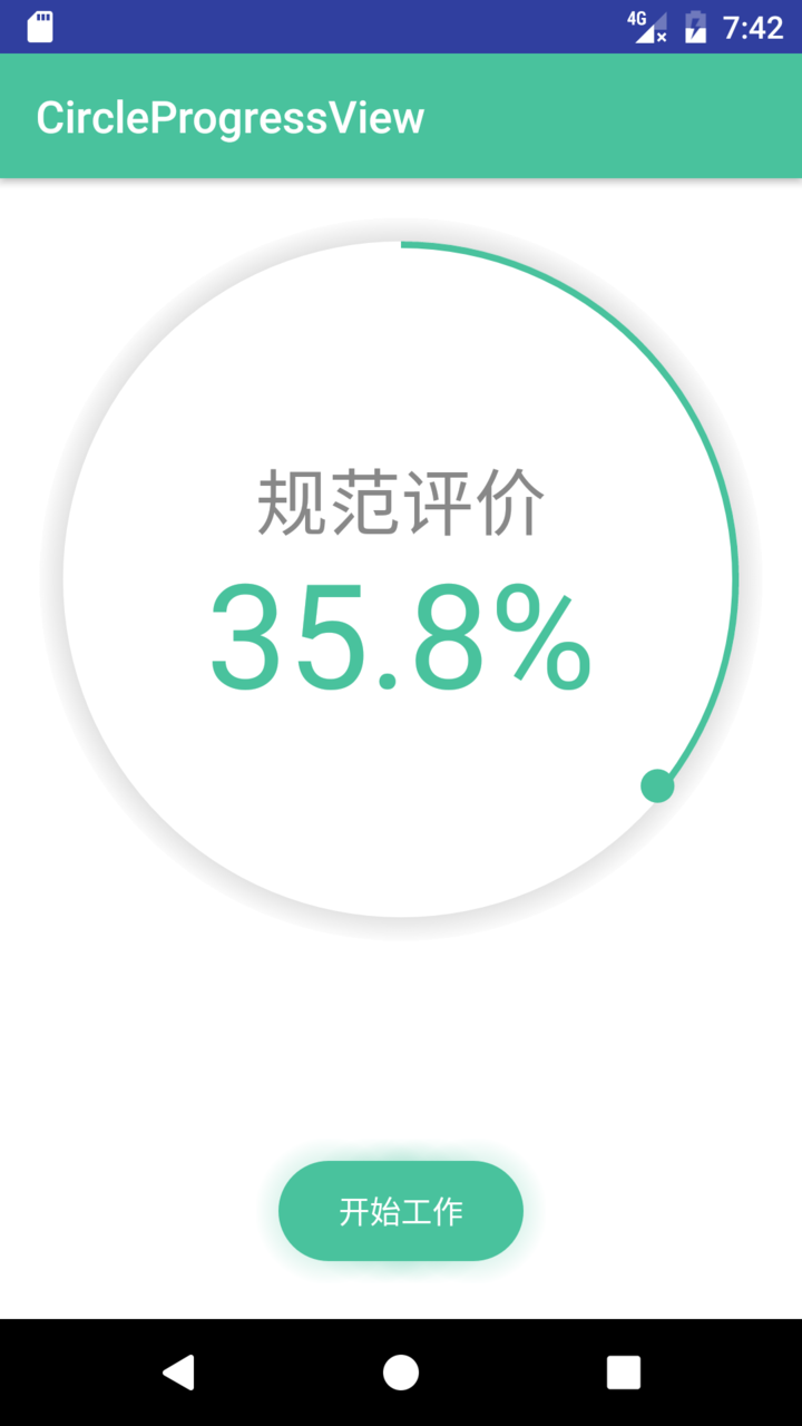
分享一个最近在项目中用到的一个视图,具体的效果如下图:
打包赠送一个带光晕的按钮效果。
但是因为时间比较紧,这两个控件封装的不是很好,使用的时候需要修改一些代码中的参数(代码中有详细的comment,改起来还是很方便的……)
首先是上面的大圈圈。
package top.greendami.circleprogressview;
import android.content.Context;
import android.graphics.Canvas;
import android.graphics.Color;
import android.graphics.Paint;
import android.graphics.RadialGradient;
import android.graphics.RectF;
import android.graphics.Shader;
import android.util.AttributeSet;
import android.view.View;
/**
* Created by zhaopy on 2017/2/23.
*/
public class CircleProgressView extends View{
private String title = "规范评价";//显示的文字
private float progress = 0; //显示的进度
private int mLayoutSize = 100;//整个控件的尺寸(方形)
public int mColor;//主要颜色
public int mColorBackground;
public int mColorShadow;
private float now = 0; //当前的进度
public CircleProgressView(Context context){
super(context);
}
public CircleProgressView(Context context, AttributeSet attrs){
super(context, attrs);
mColor = context.getResources().getColor(R.color.colorPrimary);
mColorBackground = context.getResources().getColor(R.color.white);
mColorShadow = context.getResources().getColor(R.color.shadow);
}
public CircleProgressView(Context context, AttributeSet attrs, int defStyleAttr){
super(context, attrs, defStyleAttr);
}
@Override
protected void onMeasure(int widthMeasureSpec, int heightMeasureSpec){
super.onMeasure(widthMeasureSpec, heightMeasureSpec);
int widthSpecSize = MeasureSpec.getSize(widthMeasureSpec);
int heightSpecSize = MeasureSpec.getSize(heightMeasureSpec);
mLayoutSize = Math.min(widthSpecSize,heightSpecSize);
setMeasuredDimension(mLayoutSize, mLayoutSize);
}
@Override
protected void onDraw(Canvas canvas){
super.onDraw(canvas);
Shader mShader = new RadialGradient(mLayoutSize/2 , mLayoutSize/2, mLayoutSize/2,new int[]{Color.BLACK ,Color.DKGRAY , Color.GRAY ,Color.WHITE }
,null,
Shader.TileMode.REPEAT);
//画阴影
Paint paint3 = new Paint();
paint3.setShader(mShader);
canvas.drawCircle(mLayoutSize/2, mLayoutSize/2, mLayoutSize/2 * 0.99f, paint3);
int centre = getWidth()/2; //获取圆心的x坐标
float radius = mLayoutSize/2 * 0.95f; //圆环的半径
//画白圆
Paint paint = new Paint();
paint.setAntiAlias(true);
paint.setColor(Color.WHITE);
paint.setStyle(Paint.Style.FILL); //设置空心
radius = mLayoutSize/2 * 0.925f; //圆环的半径
canvas.drawCircle(centre, centre, radius, paint); //画出圆环
//画第一个扇形
paint = new Paint();
paint.setAntiAlias(true);
paint.setColor(mColor);
paint.setStyle(Paint.Style.FILL); //
float boder = mLayoutSize/2 - radius;
RectF rectF = new RectF(boder, boder ,
mLayoutSize - boder, mLayoutSize - boder);
canvas.drawArc(rectF,-90,360 * (now / 100),true,paint);
//画第二个内心圆,如果想让线粗一点,把0.98f改小一点
boder = boder * 1.2f;
rectF = new RectF(boder, boder ,
mLayoutSize - boder, mLayoutSize - boder);
paint.setColor(Color.WHITE);
canvas.drawCircle(centre, centre, radius * 0.98f, paint); //画出圆
//画顶头的小球,0.05f是小球的半径
paint.setColor(mColor);
float r = radius * 0.98f;
canvas.drawCircle(r + (float)(r * Math.sin(Math.toRadians(360 * (now / 100)))) + boder,
r + boder - (float)(r * Math.cos(Math.toRadians(360 * (now / 100)))) ,
radius * 0.05f , paint);
String per = now + "%";
//写文字,1.1f控制百分比字的Y轴位置
//写百分比
paint.measureText(per);
paint.setColor(mColor);
paint.setTextSize(mLayoutSize/5);//控制文字大小
canvas.drawText(per,centre - paint.measureText(per)/2,centre - (paint.ascent()+ paint.descent()) * 1.1f ,paint);
//写标题
paint.setColor(Color.GRAY);
paint.setTextSize(mLayoutSize/10);//控制文字大小
canvas.drawText(title,centre - paint.measureText(title)/2,centre + (paint.ascent()+ paint.descent()) ,paint);
if(now < progress - 1){
now = now + 1 ;
postInvalidate();
}else if(now < progress){
now = progress;
postInvalidate();
}
}
//外部回掉
public void setProgress(float progress,boolean isAnim){
this.progress = progress;
if(!isAnim){
now = progress;
}
postInvalidate();
}
}
复制代码
下面是按钮的drawable,这个按钮就是用一个drawable实现的,然后当作按钮的背景,实现的思路是画几个连续的圆形广韵,然后给按钮的主体背景(圆角矩形)加上padding。
>
android:endColor="#00fffaf0"
android:startColor="#8049c29d"
android:type="radial"
android:gradientRadius="100"/>
android:endColor="#00fffaf0"
android:startColor="#8049c29d"
android:type="radial"
android:gradientRadius="100"/>
android:endColor="#00fffaf0"
android:startColor="#8049c29d"
android:type="radial"
android:gradientRadius="100"/>
android:endColor="#00fffaf0"
android:startColor="#8049c29d"
android:type="radial"
android:gradientRadius="100"/>
android:endColor="#00fffaf0"
android:startColor="#8049c29d"
android:type="radial"
android:gradientRadius="100"/>
android:shape="rectangle"
android:useLevel="false">
复制代码
使用方法,我这里固定的按钮的大小,如果需要调整按钮大小的话,需要改变drawable中光晕的位置()和光晕的大小(android:gradientRadius="100")
xmlns:tools="http://schemas.android.com/tools" android:id="@+id/activity_main"
android:layout_width="match_parent" android:layout_height="match_parent"
android:paddingBottom="@dimen/activity_vertical_margin"
android:paddingLeft="@dimen/activity_horizontal_margin"
android:paddingRight="@dimen/activity_horizontal_margin"
android:paddingTop="@dimen/activity_vertical_margin"
android:background="@color/white"
tools:context="top.greendami.circleprogressview.MainActivity">
android:id="@+id/cv"
android:background="@color/white"
android:layout_width="400dp"
android:layout_height="400dp" />
android:layout_centerHorizontal="true"
android:layout_alignParentBottom="true"
style="?android:attr/borderlessButtonStyle"
android:textColor="@color/white"
android:background="@drawable/green_button_normal"
android:text="开始工作"
android:layout_width="130dp"
android:layout_height="65dp" />
复制代码
在Activity中设置进度
CircleProgressView CV = (CircleProgressView)findViewById(R.id.cv);
CV.setProgress(35.8f);
复制代码


 扫一扫
扫一扫


 710
710

 被折叠的 条评论
为什么被折叠?
被折叠的 条评论
为什么被折叠?
 到【灌水乐园】发言


