


 本文介绍如何使用jQuery实现图标在鼠标悬停时的平滑动画效果,包括阴影变化及按钮位移,以此提升用户体验。
运用jQuery在配合漂亮的UI,就可以做出让用户赏心悦目的体验。
下面这个小例子,灵感来源于百度有啊的应用(现在好像没有了),就是当鼠标移上去和移除,图标会有缓动的效果。
效果不比flash的差。
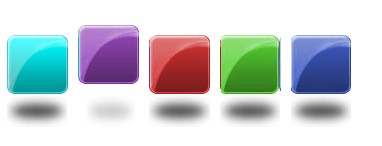
下面是的效果图:
图标很好设计,在这里就不教大家怎么设计了。
下面是JQ的代码部分:
1
$(
function
(){
2 // append img to LI
3 $( " #nav-shadow li " ).append( ' <img class="shadow" src="images/reflaction_pic.jpg" width="60" height="32" alt="" /> ' ); // 这是阴影的图片
4 // append hover event
5 $( " #nav-shadow li " ).hover( function (){
6 // define e for tihs
7 var $e = this ;
8 $($e).find( " a " ).stop().animate({marginTop: ' -14px ' }, 250 , function (){ // 回调函数控制
9 $($e).find( " a " ).animate({marginTop: ' -10px ' }, 250 );
10
11 });
12 $($e).find( " img.shadow " ).stop().animate({width: " 80% " ,opacity: " 0.3 " ,marginLeft: " 8px " }, 250 );
13
14 }, function (){
15 var $e = this ;
16 $($e).find( " a " ).stop().animate({marginTop: " 4px " }, 250 , function (){
17 $($e).find( " a " ).animate({marginTop: " 0px " }, 250 );
18 });
19 $($e).find( " img.shadow " ).stop().animate({width: " 100% " ,opacity: " 1 " ,marginLeft: " 0px " }, 250 );
20 }
21 )
22 })
分析:
首先增加倒影:
1
$(
"
#nav-shadow li
"
).append(
'
<img class="shadow" src="images/reflaction_pic.jpg" width="60" height="32" alt="" />
'
)
然后注册,hover事件,用回调函数控制弹回去时候的效果。阴影的距离感是通过透明度控制的。
下面是HTML代码:

 View Code
1
<!
DOCTYPE HTML PUBLIC "-//W3C//DTD HTML 4.01//EN" "http://www.w3.org/TR/html4/strict.dtd"
>
2 < html >
3 < head >
4 < meta http-equiv ="Content-Type" content ="text/html; charset=utf-8" >
5 < title > button_effect </ title >
6 < script type ="text/javascript" src ="jquery-1.4.2.min.js" ></ script >
7 < script type ="text/javascript" src ="action.js" ></ script >
8 < style type ="text/css" >
9 * { margin : 0 ; padding : 0 ; }
10 div { width : 500px ; height : 500px ; margin : 100px 0 auto ; }
11 ul,ol { list-style : none ; list-style-type : none ; }
12 a,a:visited,a:hover { display : block ; text-decoration : none ; color : #ccc ; text-indent : -9999px ; outline : 0 none ; width : 61px ; height : 60px ; z-index : 2 ; overflow : hidden ; position : relative ; }
13 li { float : left ; width : 61px ; height : 92px ; margin-left : 10px ; position : relative ; }
14 #nav-shadow li.chang-one a { background : url(images/button_pic.jpg) no-repeat left top ; }
15 #nav-shadow li.chang-two a { background : url(images/button_pic.jpg) no-repeat -60px top ; }
16 #nav-shadow li.chang-three a { background : url(images/button_pic.jpg) no-repeat -120px top ; }
17 #nav-shadow li.chang-four a { background : url(images/button_pic.jpg) no-repeat -180px top ; }
18 #nav-shadow li.chang-five a { background : url(images/button_pic.jpg) no-repeat -240px top ; }
19 #nav-shadow li img.shadow { margin : 0 auto ; position : absolute ; bottom : 0px ; left : 0px ; z-index : 1 ; }
20 </ style >
21 </ head >
22 < body >
23 < div id ="content" >
24 < ul id ="nav-shadow" >
25 < li class ="chang-one" >< a href ="#" title ="reflaction_one" > click me </ a ></ li >
26 < li class ="chang-two" >< a href ="#" title ="reflaction_two" > click me </ a ></ li >
27 < li class ="chang-three" >< a href ="#" title ="reflaction_three" > click me </ a ></ li >
28 < li class ="chang-four" >< a href ="#" title ="reflaction_four" > click me </ a ></ li >
29 < li class ="chang-five" >< a href ="#" title ="reflaction_five" > click me </ a ></ li >
30 </ ul >
31 </ div >
32 </ body >
33 </ html >
大家在用的时候,只需要设计出好看的图标就可以了。
新加了源码下载:下载


 扫一扫
扫一扫


 683
683

 被折叠的 条评论
为什么被折叠?
被折叠的 条评论
为什么被折叠?
 到【灌水乐园】发言


