


 本文介绍了一个使用HTML和CSS实现的骨折效果动画案例。通过精心设计的CSS伪元素和动画属性,实现了文字在输入时产生类似断裂的效果。此案例适用于前端开发者学习CSS动画技巧。
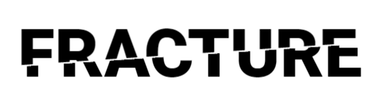
<h1 contenteditable data-heading="Fracture">Fracture</h1>
html{height: 100%;}
body{font-family: 'Roboto', sans-serif; height: 100%;}
h1{color: black; text-align: center; font-size: 10vw; font-weight: 900; text-transform: uppercase; top: 50%; left: 50%; transform: translate(-50%, -50%); position: absolute; margin: 0;}
h1:before,
h1:after{content: attr(data-heading); position: absolute; left: 0; width: 100%; text-align: center;}
h1:before{clip-path: polygon(0 0, 100% 0%, 100% 39%, 0 67%); color: white; text-shadow: 3px -2px 5px white, -3px 3px 4px white; background: white;}
h1:after{clip-path: polygon(0 0, 100% 0%, 100% 37%, 0 65%); color: black; animation: fracture 5s infinite ease;}
@keyframes fracture{0%{transform: translateX(0);} 50%{transform: translate(-20px, 2%);}}
@-webkit-keyframes fracture{0%{transform: translateX(0);} 50%{transform: translate(-20px, 2%);}}
window.onload=function(){
  var h1 = document.querySelector("h1");

  h1.addEventListener("input", function() {
    this.setAttribute("data-heading", this.innerText);
  });
}


 扫一扫
扫一扫


 被折叠的 条评论
为什么被折叠?
被折叠的 条评论
为什么被折叠?
 到【灌水乐园】发言


