


 本文介绍如何使用CSS媒体查询创建响应式网站布局,通过不同屏幕尺寸下的样式调整,实现从多栏到单栏的自适应变化。
1.CSS 来实现响应式
CSS实现响应式网站的布局要用到的就是CSS中的媒体查询接下来来简单介绍一下:
@media 类型 and (条件1) and (条件二){css样式}
我们只需用到width衍生出的max-width这个属性,定义输出设备中的页面可见区域宽度来控制该改变的样式即可。
html代码如下:
响应式头部
demo01.css样式如下:
body{
margin:0;
text-align:center;
}
.header{
height:100px;
background-color:red;
}
.container{
height:400px;
background-color:pink;
}
.clearfix:after{
display:block;
content:"";
visibility:hidden;
height:0;
clear:both;
}
.footer{
height:100px;
background-color:blue;
}
.left{
width:20%;
background-color:orange;
float:left;
height:300px;
}
.center{
width:55%;
background-color:gray;
float:left;
height:300px;
margin:0 2.5%;
}
.right{
width:20%;
background-color:yellow;
float:left;
height:300px;
}
demo02的样式如下:
body{
margin:0;
text-align:center;
}
.header{
height:100px;
background-color:red;
}
.container{
height:400px;
background-color:pink;
}
.clearfix:after{
display:block;
content:"";
visibility:hidden;
height:0;
clear:both;
}
.footer{
height:100px;
background-color:blue;
}
.left{
width:30%;
background-color:orange;
float:left;
height:300px;
}
.center{
width:70%;
background-color:gray;
float:left;
height:300px;
}
.right{
width:100%;
background-color:yellow;
height:300px;
}
demo03的样式:
body{
margin:0;
text-align:center;
}
.header{
height:100px;
background-color:red;
}
.container{
background-color:pink;
}
.clearfix:after{
display:block;
content:"";
visibility:hidden;
height:0;
clear:both;
}
.footer{
height:100px;
background-color:blue;
}
.left{
width:100%;
background-color:orange;
height:300px;
}
.center{
width:100%;
background-color:gray;
height:300px;
}
.right{
width:100%;
background-color:yellow;
height:300px;
}
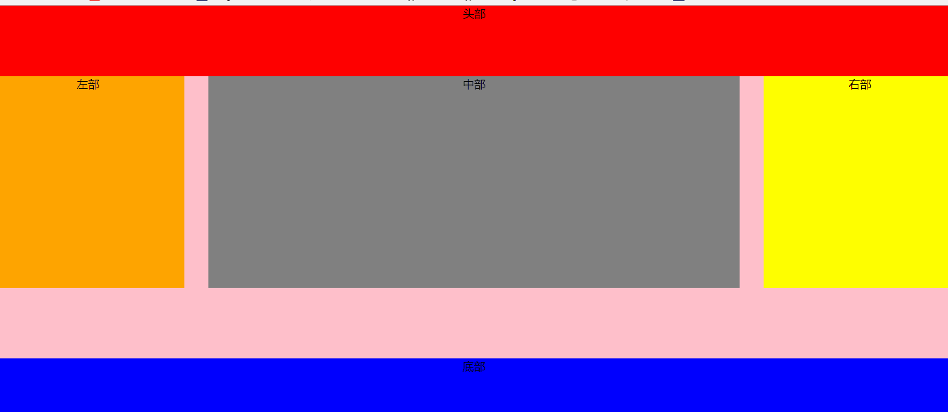
效果图:
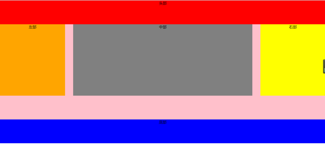
窗口大于1024px时显示的样子
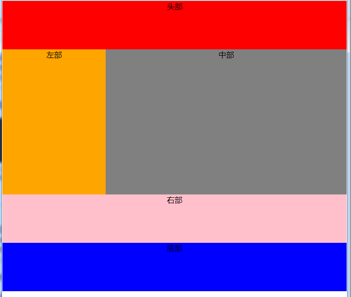
当大于640小于980时,右侧栏在底部
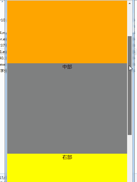
当小于480时,导航栏折叠,body三部分竖直排列显示,若窗口持续缩小,不在发生变化,区域被压缩
效果总图:
持续更新,欢迎大家!


 扫一扫
扫一扫


 2622
2622

 被折叠的 条评论
为什么被折叠?
被折叠的 条评论
为什么被折叠?
 到【灌水乐园】发言


