


 本文深入探讨了网页自适应布局与rem单位在响应式设计中的应用,包括rem单位的基本概念、如何通过JavaScript调整字体大小以适应不同屏幕尺寸,以及如何确保布局在各种设备上保持一致性和美观。此外,还介绍了Flexible框架和Adaptive框架,这些框架帮助开发者轻松实现跨设备的自适应设计。
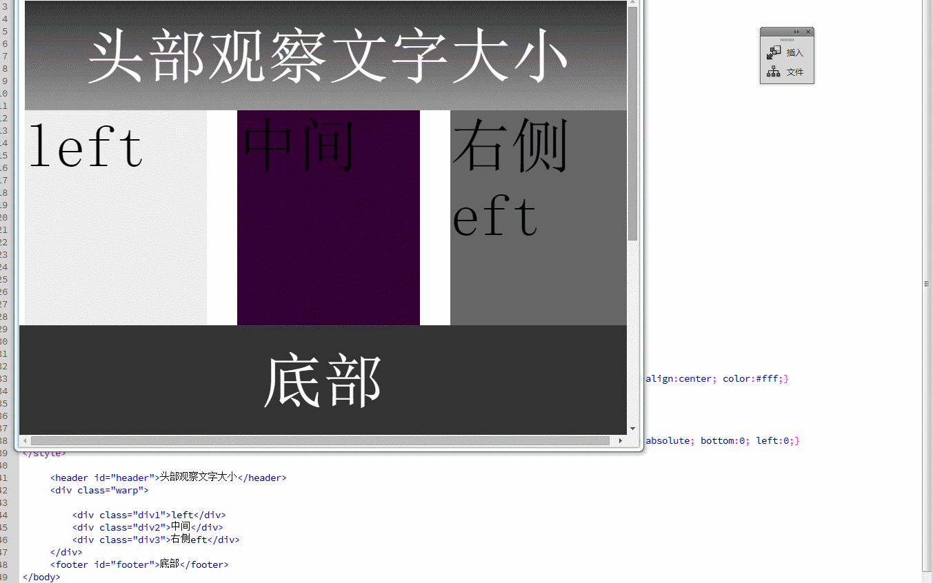
<!doctype html>
<html>
<head>
<meta charset="utf-8">
<title>无标题文档</title>
<meta name="viewport" content="initial-scale=1.0,user-scalable=no,maximum-scale=1,width=device-width" />
</head>

<body>
<script>
var throttle = function(fn,timeout ){
var timer;
return function(){
var self = this,
args = arguments;
clearTimeout( timer );
timer = setTimeout(function(){
fn.apply( self, args );
}, timeout );
};
};

var doc=document;
screenWd=doc.documentElement.clientWidth;
doc.getElementsByTagName("html")[0].style.fontSize=screenWd/10+'px';
// console.log(document.getElementsByTagName("html")[0].style.fontSize);
window.addEventListener("resize", throttle(function(){ //监听绑定
document.getElementsByTagName("html")[0].style.fontSize=document.documentElement.clientWidth/10+'px';
},150),false);

</script>
<style>
*{ margin:0; padding:0;}
html{ min-width:320px; font-size:62.5%;}

#header{ width:10rem; height:1.8rem; line-height:1.8rem;background:-webkit-linear-gradient(top,#333,#999); text-align:center; color:#fff;}
.warp{ width:10rem; margin:0 auto; height:300px;} /* 总共分20分 左边 10 间隙1 2隔间系2*/
.div1{ width:3rem;float:left;height:10rem;background:#eee}
.div2{ width:3rem; margin-left:0.5rem;float:left;height:11rem; background:#303}
.div3{ width:3rem; margin-left:0.5rem;float:left;height:8rem;background:#666}
#footer{ width:100%; height:1.8rem; line-height:1.8rem; background:#333; text-align:center; color:#fff; position:absolute; bottom:0; left:0;}
</style>

<header id="header">头部观察文字大小</header>
<div class="warp">

<div class="div1">left</div>
<div class="div2">中间</div>
<div class="div3">右侧eft</div>
</div>
<footer id="footer">底部</footer>
</body>
</html>
rem两个比较好的框架
淘宝Flexible https://github.com/amfe/lib-flexible
使用Flexible实现手淘H5页面的终端适配 https://github.com/amfe/article/issues/17
adaptive https://github.com/finance-sh/adaptive
网易的rem函数
 <script type="text/javascript">
        var Dpr = 1, uAgent = window.navigator.userAgent;
        var isIOS = uAgent.match(/iphone/i);
        var isYIXIN = uAgent.match(/yixin/i);
        var is2345 = uAgent.match(/Mb2345/i);
        var ishaosou = uAgent.match(/mso_app/i);
        var isSogou = uAgent.match(/sogoumobilebrowser/ig);
        var isLiebao = uAgent.match(/liebaofast/i);
        var isGnbr = uAgent.match(/GNBR/i);
        function resizeRoot(){
            var wWidth = (screen.width > 0) ? (window.innerWidth >= screen.width || window.innerWidth == 0) ? screen.width : window.innerWidth : window.innerWidth, wDpr, wFsize;
            var wHeight = (screen.height > 0) ? (window.innerHeight >= screen.height || window.innerHeight == 0) ? screen.height : window.innerHeight : window.innerHeight;
            if (window.devicePixelRatio) {
                wDpr = window.devicePixelRatio;
            } else {
                wDpr = isIOS ? wWidth > 818 ? 3 : wWidth > 480 ? 2 : 1 : 1;
            }
            if(isIOS) {
                wWidth = screen.width;
                wHeight = screen.height;
            }
            // if(window.orientation==90||window.orientation==-90){
            //     wWidth = wHeight;
            // }else if((window.orientation==180||window.orientation==0)){
            // }
            if(wWidth > wHeight){
                wWidth = wHeight;
            }
            wFsize = wWidth > 1080 ? 144 : wWidth / 7.5;
            wFsize = wFsize > 32 ? wFsize : 32;
            window.screenWidth_ = wWidth;
            if(isYIXIN || is2345 || ishaosou || isSogou || isLiebao || isGnbr){//YIXIN 和 2345 这里有个刚调用系统浏览器时候的bug,需要一点延迟来获取
                setTimeout(function(){
                    wWidth = (screen.width > 0) ? (window.innerWidth >= screen.width || window.innerWidth == 0) ? screen.width : window.innerWidth : window.innerWidth;
                    wHeight = (screen.height > 0) ? (window.innerHeight >= screen.height || window.innerHeight == 0) ? screen.height : window.innerHeight : window.innerHeight;
                    wFsize = wWidth > 1080 ? 144 : wWidth / 7.5;
                    wFsize = wFsize > 32 ? wFsize : 32;
                    // document.getElementsByTagName('html')[0].dataset.dpr = wDpr;
                    document.getElementsByTagName('html')[0].style.fontSize = wFsize + 'px';
                    document.getElementById("fixed").style.display="none";
                },500);
            }else{
                // document.getElementsByTagName('html')[0].dataset.dpr = wDpr;
                document.getElementsByTagName('html')[0].style.fontSize = wFsize + 'px';
                document.getElementById("fixed").style.display="none";
            }
            // alert("fz="+wFsize+";dpr="+window.devicePixelRatio+";UA="+uAgent+";width="+wWidth+";sw="+screen.width+";wiw="+window.innerWidth+";wsw="+window.screen.width+window.screen.availWidth);
        }
        resizeRoot();
    </script>
var adaptive = {};
(function (win, lib) {
    var doc = win.document;
    var docEl = doc.documentElement;
    // 设备像素比
    var devicePixelRatio = win.devicePixelRatio;
    // 我们设置的布局视口与理想视口的像素比
    var dpr = 1;
    // viewport缩放值
    var scale = 1;
    // 设置viewport
    function setViewport() {
        // 判断IOS
        var isIPhone = /iphone/gi.test(win.navigator.appVersion);
        if (lib.scaleType === 2 && isIPhone || lib.scaleType === 3) {
            dpr = devicePixelRatio;
        }
        // window对象上增加一个属性,提供对外的布局视口与理想视口的值
        win.devicePixelRatioValue = dpr;
        // viewport缩放值,布局视口缩放后刚好显示成理想视口的宽度,页面就不会过长或过短了
        scale = 1 / dpr;
        // 获取已有的viewport
        var hasMetaEl = doc.querySelector('meta[name="viewport"]');
        var metaStr = 'initial-scale=' + scale + ', maximum-scale=' + scale + ', minimum-scale=' + scale + ', user-scalable=no';
        if (dpr === 1) {
            metaStr = 'width=device-width, '.concat(metaStr);
        }
        if (!isIPhone && dpr !== 1) {
            metaStr = metaStr.concat(', target-densitydpi=device-dpi');
        }
        // 如果有,改变之
        if (hasMetaEl) {
            hasMetaEl.setAttribute('content', metaStr);
        }
        // 如果没有,添加之
        else {
            var metaEl = doc.createElement('meta');
            metaEl.setAttribute('name', 'viewport');
            metaEl.setAttribute('content', metaStr);

            if (docEl.firstElementChild) {
                docEl.firstElementChild.appendChild(metaEl);
            }
            else {
                var containDiv = doc.createElement('div');
                containDiv.appendChild(metaEl);
                docEl.appendChild(containDiv);
            }
        }
    }

    var newBase = 100;
    lib.errDpr = 1;

    function setRem() {
        // 布局视口
        // var layoutView = docEl.clientWidth; 也可以 获取布局视口的宽度
        var layoutView;
        if (lib.maxWidth) {
            layoutView = Math.min(docEl.getBoundingClientRect().width, lib.maxWidth * dpr);
        }
        else {
            layoutView = docEl.getBoundingClientRect().width;
        }
        // 为了计算方便,我们规定 1rem === 100px设计图像素,我们切图的时候就能快速转换
        // 有人问,为什么不让1rem === 1px设计像素呢?
        // 设计图一般是640或者750px
        // 布局视口一般是320到1440
        // 计算一个值,使layout的总宽度为 (desinWidth/100) rem
        // 那么有计算公式:layoutView / newBase = desinWidth / 100
        // newBase = 100 * layoutView / desinWidth
        // newBase = 介于50到200之间
        // 如果 1rem === 1px 设计像素,newBase就介于0.5到2之间,由于很多浏览器有最小12px限制,这个时候就不能自适应了
        newBase = 100 * layoutView / lib.desinWidth * (lib.errDpr || 1);
        docEl.style.fontSize = newBase + 'px';
        // rem基准值改变后,手动reflow一下,避免旋转手机后页面自适应问题
        doc.body&&(doc.body.style.fontSize = lib.baseFont / 100 + 'rem');
        // 重新设置rem后的回调方法
        lib.setRemCallback&&lib.setRemCallback();
        lib.newBase = newBase;
    }
    var tid;
    lib.desinWidth = 750;
    lib.baseFont = 28;
    // 局部刷新的时候部分chrome版本字体过大的问题
    lib.reflow = function() {
        docEl.clientWidth;
    };
    // 检查安卓下rem值是否显示正确
    function checkRem() {
        if (/android/ig.test(win.navigator.appVersion)) {
            var hideDiv = document.createElement('p');
            hideDiv.style.height = '1px';
            hideDiv.style.width = '2.5rem';
            hideDiv.style.visibility = 'hidden';
            document.body.appendChild(hideDiv);
            var now = hideDiv.offsetWidth;
            var right = lib.newBase * 2.5;
            if (Math.abs(right / now - 1) > 0.05) {
                lib.errDpr = right / now;
                setRem();
            }
            document.body.removeChild(hideDiv);
        }
    }
    lib.init = function () {
        // resize的时候重新设置rem基准值
        // 触发orientationchange 事件时也会触发resize,故不需要再添加此事件了
        win.addEventListener('resize', function () {
            clearTimeout(tid);
            tid = setTimeout(setRem, 300);
        }, false);
        // 浏览器缓存中读取时也需要重新设置rem基准值
        win.addEventListener('pageshow', function (e) {
            if (e.persisted) {
                clearTimeout(tid);
                tid = setTimeout(setRem, 300);
            }
        }, false);
        // 设置body上的字体大小
        if (doc.readyState === 'complete') {
            doc.body.style.fontSize = lib.baseFont / 100 + 'rem';
            checkRem();
        }
        else {
            doc.addEventListener('DOMContentLoaded', function (e) {
                doc.body.style.fontSize = lib.baseFont / 100 + 'rem';
                checkRem();
            }, false);
        }
        setViewport();
        // 设置rem值
        setRem();
        // html节点设置布局视口与理想视口的像素比
        docEl.setAttribute('data-dpr', dpr);
    };
    // 有些html元素只能以px为单位,所以需要提供一个接口,把rem单位换算成px
    lib.remToPx = function (remValue) {
        return remValue * newBase;
    };
})(window, adaptive);
if (typeof module != 'undefined' && module.exports) {
    module.exports = adaptive;
} else if (typeof define == 'function' && define.amd) {
    define(function() {
        return adaptive;
    });
} else {
    window.adaptive = adaptive;
}
<script>
    // 设计图宽度
    window['adaptive'].desinWidth = 640;
    // body 字体大小 会将body字体大小设置为 baseFont / 100 + 'rem'  750的设计图一般设置为28,640的设计图一般设置为24
    window['adaptive'].baseFont = 24;
    /*
    // 显示最大宽度 可选
    window['adaptive'].maxWidth = 480;
    // rem值改变后执行方法 可选
    window['adaptive'].setRemCallback = function () {
        alert(1)
    }
    // scaleType 1:iphone andriod下viewport均无缩放 2:iphone下viewport有缩放,andriod没有 3:iphone andriod下viewport均有缩放; 默认值为1
    window['adaptive'].scaleType = 1;
    */
    // 初始化
    window['adaptive'].init();
</script>


 扫一扫
扫一扫


 6249
6249

 被折叠的 条评论
为什么被折叠?
被折叠的 条评论
为什么被折叠?
 到【灌水乐园】发言


