


 本文介绍了一种使用jQuery和Bootstrap实现的创意选项卡特效方法。通过简单的CSS代码即可为原生Bootstrap选项卡添加炫酷的视觉效果。

插件描述:基于jquery和bootstrap实现的创意Tabs选项卡特效。通过简单的十几行CSS代码,将原生的bootstrap选项卡进行美化,效果非常炫酷。
使用方法
在页面中引入jquery和bootstrap相关文件。
HTML结构
该tabs选项卡的基本HTML结构如下::
- Section 1
- Section 2
- Section 3
Section 1
.......
Section 2
......
Section 3
.......
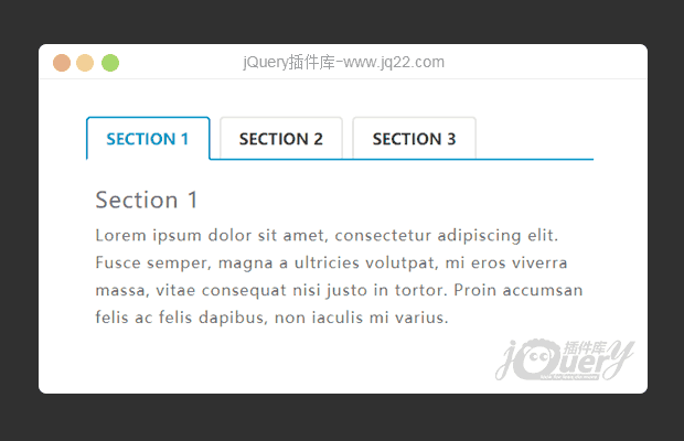
tabs选项卡美化效果
CSS样式
然后通过下面的CSS代码来对tabs选项卡进行美化。a:hover,a:focus{
text-decoration: none;
outline: none;
}
.tab .nav-tabs{
border: none;
border-bottom: 2px solid #079fc9;
margin: 0;
}
.tab .nav-tabs li a{
padding: 10px 20px;
margin: 0 10px -1px 0;
font-size: 17px;
font-weight: 600;
color: #293241;
text-transform: uppercase;
border: 2px solid #e6e5e1;
border-bottom: none;
border-radius: 5px 5px 0 0;
z-index: 1;
position: relative;
transition: all 0.3s ease 0s;
}
.tab .nav-tabs li a:hover,
.tab .nav-tabs li.active a{
background: #fff;
color: #079fc9;
border: 2px solid #079fc9;
border-bottom-color: transparent;
}
.tab .nav-tabs li a:before{
content: "";
display: block;
height: 2px;
background: #fff;
position: absolute;
bottom: -2px;
left: 0;
right: 0;
transform: scaleX(0);
transition: all 0.3s ease-in-out 0s;
}
.tab .nav-tabs li.active a:before,
.tab .nav-tabs li a:hover:before{ transform: scaleX(1); }
.tab .tab-content{
padding: 10px;
font-size: 17px;
color: #6f6f6f;
line-height: 30px;
letter-spacing: 1px;
position: relative;
}
@media only screen and (max-width: 479px){
.tab .nav-tabs{ border: none; }
.tab .nav-tabs li{
width: 100%;
text-align: center;
margin-bottom: 15px;
}
.tab .nav-tabs li a{
margin: 0;
border-bottom: 2px solid transparent;
}
.tab .nav-tabs li a:before{
content: "";
width: 100%;
height: 2px;
background: #079fc9;
position: absolute;
bottom: -2px;
left: 0;
}
}


 扫一扫
扫一扫


 1883
1883

 被折叠的 条评论
为什么被折叠?
被折叠的 条评论
为什么被折叠?
 到【灌水乐园】发言


