


aem科技
As many of you probably know, CoralUI provides a number of icons to chose from when using Granite components or when making tweaks to the TouchUI. But what if you can’t find the right icon in that selection?
如您中许多人所知,在使用Granite组件或对TouchUI进行调整时,CoralUI提供了许多图标供您选择。 但是,如果您在该选择中找不到正确的图标怎么办?
In this tutorial, I will show you how you can add your own icons to the TouchUI, to be used anywhere including component edit dialogs, toolbars or even the Home screen.
在本教程中,我将向您展示如何将自己的图标添加到TouchUI,以在包括组件编辑对话框,工具栏甚至主屏幕的任何地方使用。
建立 (Setup)
Let’s first take a look at a simple component. Here is the HTL:
首先让我们看一个简单的组件。 这是HTL:
And here is the cq:dialog XML:
这是cq:dialog XML:
As you can see, it is a very simple component which simply allows users to select a playing card suit:
如您所见,这是一个非常简单的组件,仅允许用户选择纸牌套装:
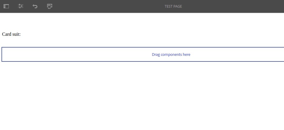
If you’re a native English speaker, you’ll know exactly what these suits correspond to. However in other languages, the terms are completely different (in French for example, “spades” is called “piques” or “spikes”), so let’s add an icon to each option of the drop-down select to help our bilingual friends choose the right suit.
如果您是说英语的人,那么您会确切知道这些西服的含义。 但是,在其他语言中,术语完全不同(例如,在法语中,“锹”称为“ piques ”或“ spikes”),因此让我们在下拉选择的每个选项中添加一个图标,以帮助双语朋友选择合适的西装。
Of course, Adobe does not provide OOTB CoralUI icons for card suits, so in order to do this we will have to create our own!
当然,Adobe不提供用于西装套装的OOTB CoralUI图标,因此,为此,我们必须创建自己的图标!
创建图标字体 (Creating the icon font)
What we will need moving forward is an icon font, which is a font that maps non-standard Unicode characters to special glyphs (the icons). CoralUI uses this system (for example the Home icon corresponds to the F261 Unicode character, or \f261), and we’re going to hijack that system for our own purposes 😈
我们将需要向前移动的是图标字体,它是一种将非标准Unicode字符映射到特殊字形(图标)的字体。 CoralUI使用此系统(例如,Home图标对应于F261 Unicode字符或\f261 ),我们将出于自己的目的劫持该系统😈
There are a number of ways to create icon fonts. Many tools online will let you upload SVG files and will compile them into icon fonts. One such tool is icomoon.io, which is what I will be using for this tutorial.
有多种创建图标字体的方法。 许多在线工具可让您上传SVG文件并将其编译为图标字体。 icomoon.io就是这样一种工具,我将在本教程中使用它。
If you want to create an icon font from a proprietary icon collection and don’t feel comfortable uploading them to an online platform, there is an alternative. FontCustom is a command-line tool for Mac and Linux which will generate icon fonts from vector files, but it does require some installation work (especially on Linux).
如果您想通过专有图标集创建图标字体,而又不愿意将它们上传到在线平台,则可以选择其他方法。 FontCustom是Mac和Linux的命令行工具,它将从矢量文件生成图标字体,但确实需要一些安装工作(尤其是在Linux上)。
Whether you use icomoon.io, another online tool, FontCustom or a script of your own making, I suggest you keep reading to make sure that whatever you do, you end up with the right resources 🙂
无论您使用icomoon.io,另一种在线工具,FontCustom还是您自己制作的脚本,我都建议您继续阅读以确保所做的一切都能得到正确的资源🙂
使用icomoon (Using icomoon)
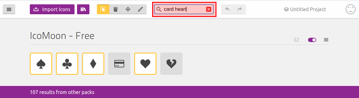
Head over to https://icomoon.io/app/#/select, search for card heart and select the four card suit icons from the free collection:
前往https://icomoon.io/app/#/select ,搜索card heart然后从免费集合中选择四个卡片服图标:
Now, at the bottom of the screen, click on Generate Font and then on the next screen, click on Preferences in the top toolbar. This will open a dialog.
现在,在屏幕底部,单击“ 生成字体” ,然后在下一个屏幕上,单击顶部工具栏中的“首选项” 。 这将打开一个对话框。
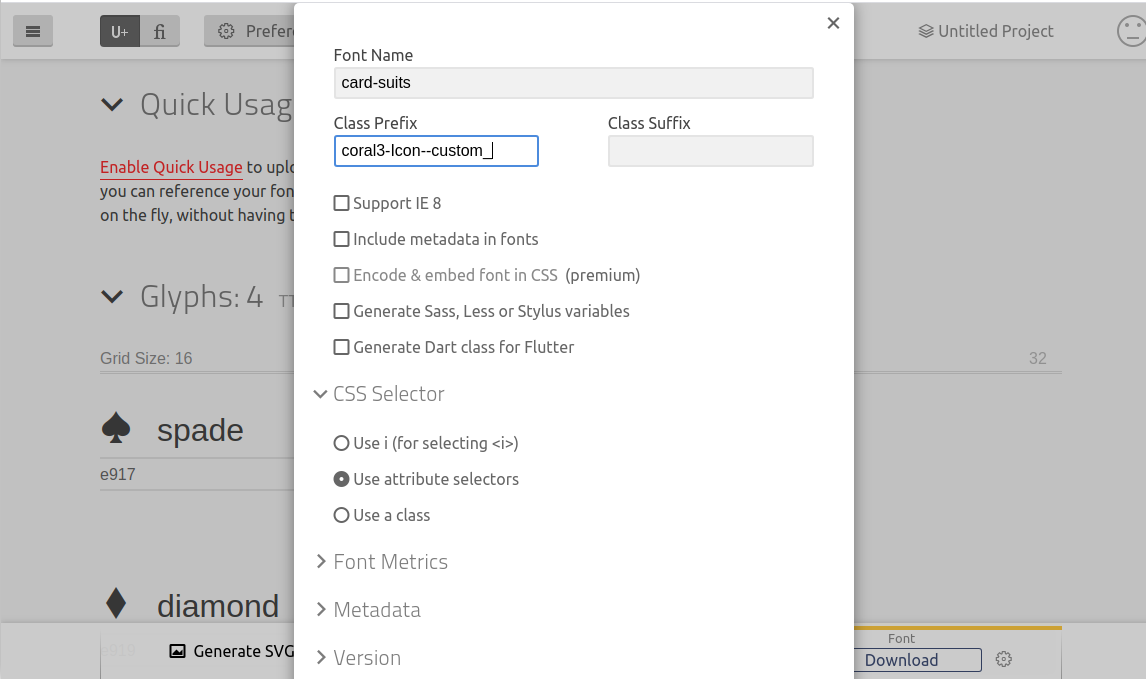
In the dialog, fill in the following fields:
在对话框中,填写以下字段:
Font Name: this will be the name of your font.
字体名称 :这将是您的字体名称。
Class Prefix: this is very important! Icomoon will generate one CSS class per icon with this prefix.
类前缀 :这非常重要! Icomoon将为每个带有此前缀的图标生成一个CSS类。
So why coral3-Icon--custom_? Well the first part, coral3-Icon-- is the same prefix as used by CoralUI, which means it will benefit from all the CSS already included in Coral3. The second part, custom_ is a prefix we use to avoid conflicts. There are hundreds of CoralUI icons, so when we create an icon font it is likely that some icons will have the same name. By adding this prefix (or any other) we are making sure that our icons are distinguished from OOTB ones.
那么,为什么选择coral3-Icon--custom_ ? 第一部分, coral3-Icon--与CoralUI使用的前缀相同,这意味着它将受益于Coral3中已经包含的所有CSS。 第二部分, custom_是我们用来避免冲突的前缀。 有数百个CoralUI图标,因此当我们创建图标字体时,某些图标可能具有相同的名称。 通过添加此前缀(或其他任何前缀),我们确保将我们的图标与OOTB的图标区分开。
For example, we have selected an icon called heart, which will conflict with the OOTB heart icon:
例如,我们选择了一个名为heart的图标,它将与OOTB heart图标冲突:
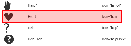
However, for consistency, I will rename heart to hearts:
然而,为了保持一致性,我会重新命名heart到heart s :
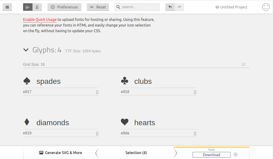
Important!Neither your custom prefix nor the icon names can include a hyphen character, as this will clash with CoralUI’s string splitting algorithms and break the icons. Instead, use underscores. Be careful as icomoon uses hyphens for multi-word icon names, so make sure to rename them if you use them.
重要! 您的自定义前缀和图标名称都不能包含连字符,因为这将与CoralUI的字符串拆分算法冲突并破坏图标。 而是使用下划线。 由于icomoon对多字图标名称使用连字符,因此请务必小心,因此请确保重命名。
You can now click on Download in the bottom right of the screen, which will download a .zip file. Extract the contents and you should have the following:
现在,您可以点击下载在屏幕的右下方,这将下载一个.zip文件。 提取内容,您应该具有以下内容:
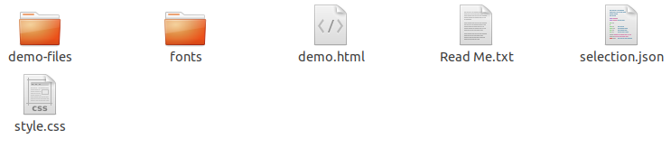
The important files are:
重要文件是:
The files in the
fontsfolder, which are the actual icon web fonts.fonts文件夹中的文件,它们是实际的图标Web字体。The
styles.cssfile, which contains the icon classes.styles.css文件,其中包含图标类。
Now that we have our icon font, we are ready to integrate with AEM and the TouchUI! And just like always, we’ll do it with a clientlib 😁
现在我们有了图标字体,我们可以与AEM和TouchUI集成了! 和往常一样,我们将使用clientlib😁
创建客户端库 (Creating the clientlib)
Create a clientlib under the component node (demo in my case) with the following structure:
使用以下结构在组件节点(在本例中为demo )下创建一个clientlib:
/apps/demo/components/content/demo (cq:Component)
└── clientlibs (nt:folder)
    └── editor(cq:ClientLibraryFolder)
        ├── css (nt:folder)
        │   └── icons.css (nt:file)
        ├── css.txt (nt:file)
        └── fonts (nt:folder)
Copy the contents of the extracted fonts folder into the fonts nt:folder.
将提取的字体文件夹的内容复制到fonts nt:folder中。
Now open the extracted style.css file. You should see the following:
现在打开解压缩的style.css文件。 您应该看到以下内容:
@font-face {
  font-family: 'card-suits';
  src:
    url('fonts/card-suits.ttf?262ep1') format('truetype'),
    url('fonts/card-suits.woff?262ep1') format('woff'),
    url('fonts/card-suits.svg?262ep1#card-suits') format('svg');
  font-weight: normal;
  font-style: normal;
  font-display: block;
}


[class^="coral3-Icon--custom_"], [class*=" coral3-Icon--custom_"] {
  /* use !important to prevent issues with browser extensions that change fonts */
  font-family: 'card-suits' !important;
  speak: none;
  font-style: normal;
  font-weight: normal;
  font-variant: normal;
  text-transform: none;
  line-height: 1;


  /* Better Font Rendering =========== */
  -webkit-font-smoothing: antialiased;
  -moz-osx-font-smoothing: grayscale;
}


.coral3-Icon--custom_spades:before {
  content: "\e917";
}
.coral3-Icon--custom_clubs:before {
  content: "\e918";
}
.coral3-Icon--custom_diamonds:before {
  content: "\e919";
}
.coral3-Icon--custom_hearts:before {
  content: "\e9da";
}
This is already pretty good! It just requires a few tweaks. Copy the content into icons.css and make the following edits:
这已经相当不错了! 它只需要一些调整。 将内容复制到icons.css并进行以下编辑:
The
@font-facerule is now incorrect. The font files are not infonts/but in../fonts.@font-face规则现在不正确。 字体文件不是在fonts/而是在../fonts。Remove all but the
font-familyproperty of the middle rule, as all other properties are already supplied by CoralUI.删除除中间规则的
font-family属性之外的所有属性,因为CoralUI已经提供了所有其他属性。
Here is the result:
结果如下:
@font-face {
    font-family: 'card-suits';
    src: url('../fonts/card-suits.ttf?262ep1') format('truetype'),
    url('../fonts/card-suits.woff?262ep1') format('woff'),
    url('../fonts/card-suits.svg?262ep1#card-suits') format('svg');
    font-weight: normal;
    font-style: normal;
    font-display: block;
}


[class^="coral3-Icon--custom_"], [class*=" coral3-Icon--custom_"] {
    /* Use !important to prevent Coral iverwriting the font-family */
    font-family: 'card-suits' !important;
}


.coral3-Icon--custom_spades:before {
    content: "\e917";
}


.coral3-Icon--custom_clubs:before {
    content: "\e918";
}


.coral3-Icon--custom_diamonds:before {
    content: "\e919";
}


.coral3-Icon--custom_hearts:before {
    content: "\e9da";
}
Note: CoralUI will attempt to overwrite the
font-familyin certain cases, so make sure to keep the!importantrule.注意:在某些情况下,CoralUI会尝试覆盖
font-family,因此请确保保留!important规则。
Now we must make sure our clientlib is loaded at the right moment. It is important to understand that it should be loaded in the context of the TouchUI editor overlay and not in the context of your site’s clientlibs.
现在,我们必须确保在正确的时刻加载了clientlib。 重要的是要了解它应该在TouchUI编辑器覆盖的上下文中而不是在站点的客户端库的上下文中加载。
Therefore, we give it a custom category. Add the following property to the editor node:
因此,我们给它一个自定义类别。 将以下属性添加到editor节点:
categories - String[] - cmp.demo.editorThen add the following property to the cq:dialog node:
然后将以下属性添加到cq:dialog节点:
extraClientlibs - String[] - cmp.demo.editorThis will cause AEM to load your clientlib with the edit dialog.
这将导致AEM使用编辑对话框加载clientlib。
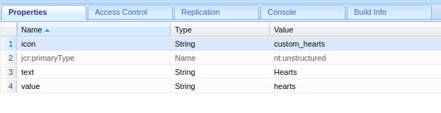
The last thing to do is tell AEM which icon to associate with each option. Revisit the list of items for the select widget of the cq:dialog and add an icon property of type String with the value being the name of the icon (custom prefix included, eg: custom_hearts) to each of the items:
最后要做的是告诉AEM与每个选项关联的图标。 重新访问cq:dialog的select小部件的项目列表,并为每个项目添加String类型的icon属性,其值是图标的名称(包括自定义前缀,例如: custom_hearts ):
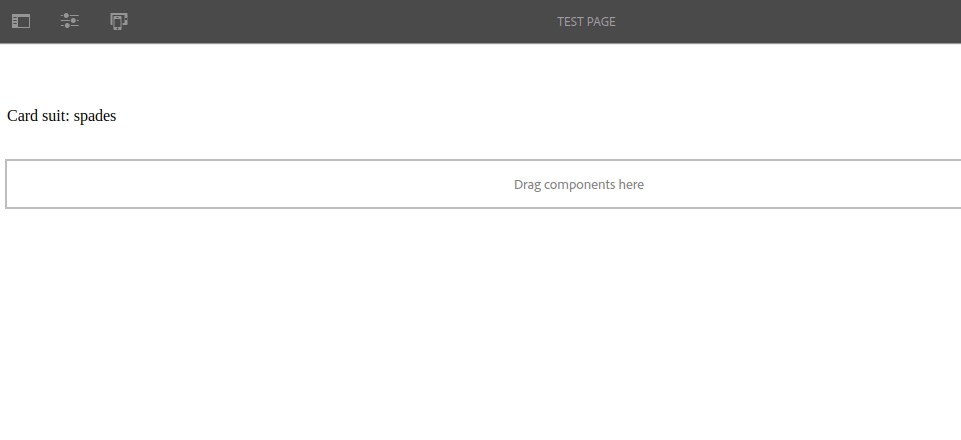
Save your modifications and open a page in Edit mode. Place your component on the page, open the edit dialog and you will see that the drop-down select now contains icons!
保存您的修改并在“编辑”模式下打开一个页面。 将您的组件放在页面上,打开编辑对话框,您将看到下拉选择现在包含图标!
Pretty neat! But that’s not all, with just a few more clicks we could actually use these icons wherever we want in the TouchUI. Let’s see how in the next section.
漂亮整齐! 但这还不是全部,只需点击几下鼠标,我们便可以在TouchUI中的任何位置实际使用这些图标。 让我们在下一节中了解如何。
Note: If you arrived on this tutorial specifically to find a way of creating a visual icon-picker, this example will work fine. However, ACS Commons has a sophisticated (if a bit ugly) icon-picker widget with more advanced features (search, pagination, etc.).
注意 :如果您是专门为找到一种创建可视图标选择器的方法而来到本教程的,则此示例可以正常工作。 但是, ACS Commons具有复杂的(如果有点难看)图标选择器小部件,具有更多高级功能(搜索,分页等)。
走向全球 (Going global)
So what if we didn’t just want to use our new icons for a specific component, but anywhere in the TouchUI? What if we wanted to create a new navigation item on the Home screen for example?
那么,如果我们不只是想将我们的新图标用于特定组件,而是要在TouchUI中的任何地方使用该怎么办? 例如,如果我们想在主屏幕上创建一个新的导航项目怎么办?
更新客户端库 (Updating the clientlib)
Well actually it’s quite easy! Let’s start by moving our newly-created clientlib out of the component and under /apps/yoursite/clientlibs and renaming it from editor to clientlib-icons.
好吧,实际上这很容易! 首先,将新创建的clientlib移出组件,移至/apps/yoursite/clientlibs ,并将其从editor clientlib-icons命名为clientlib-icons 。
You would then have something similar to this:
然后,您将获得类似于以下内容的信息:
apps/demo/clientlibs
├── clientlib-icons
.   ├── css
.   │   └── icons.css
.   ├── css.txt
    └── fonts
        ├── card-suits.svg
        ├── card-suits.ttf
        └── card-suits.woff
Now we need to change the category of the clientlib. It is no longer related to one specific component, instead we want to load it globally with CoralUI 3. So change category property of the clientlib to coralui3.
现在,我们需要更改clientlib的类别。 它不再与一个特定组件相关,而是我们希望通过CoralUI 3全局加载它。因此,将clientlib的category属性更改为coralui3 。
Now remove the extraClientlibs property from the component’s cq:dialog node.
现在,从组件的cq:dialog节点中删除extraClientlibs属性。
Check your component edit dialog, you should not see any change in behavior, its just that the clientlib is globally available in the whole TouchUI now, not just that component’s edit dialog.
检查您的组件编辑对话框,您应该不会看到任何行为上的变化,只是客户端库现在在整个TouchUI中是全局可用的,而不仅仅是该组件的编辑对话框。
创建导航项 (Creating the navigation item)
To create a navigation item, find the /libs/cq/core/content/nav node in CRX DE, right click on it and select Overlay Node to overlay it to /apps/cq/core/content/nav. Then create a child of type nt:unstructured named cards and give it the following properties:
要创建导航项,请在CRX DE中找到/libs/cq/core/content/nav node ,右键单击它,然后选择Overlay Node将其覆盖到/apps/cq/core/content/nav 。 然后创建一个类型为nt:unstructured命名cards的子代,并为其提供以下属性:
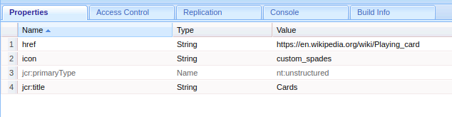
See how we’ve used custom_spades as the icon name?
看看我们如何使用custom_spades作为图标名称?
Now navigate to /aem/start.html in your browser and you should see the homepage you know so well, but with one notable addition!
现在,在浏览器中导航至/aem/start.html ,您应该会看到非常熟悉的主页,但还有一个值得注意的附加功能!
You are now free to use your custom icons anywhere you want 😃
现在,您可以随意在任意位置使用自定义图标😃
奖金 (Bonus)
Making a drop-down select with four icons is no big deal, but what if you wanted to have 100 icons? 500? No problem! Just follow my previous tutorial on creating a data source from a JSON file and use the following JSON structure for your elements (adding an icon field):
使用四个图标进行下拉选择并不重要,但是如果您想拥有100个图标怎么办? 500? 没问题! 只需按照我之前关于从JSON文件创建数据源的教程 ,并为您的元素使用以下JSON结构(添加icon字段)即可:
[
    {
        "text": "Hearts",
        "value": "hearts",
        "icon": "custom_hearts"
    }
    {
        "text": "Diamonds",
        "value": "diamonds",
        "icon": "custom_diamonds"
    },
    {
        "text": "Clubs",
        "value": "clubs",
        "icon": "custom_clubs"
    },
    {
        "text": "Spades",
        "value": "spades",
        "icon": "custom_spades"
    },
...]翻译自: https://levelup.gitconnected.com/aem-add-custom-icons-to-touchui-a270f6f26ed
aem科技


 扫一扫
扫一扫


 被折叠的 条评论
为什么被折叠?
被折叠的 条评论
为什么被折叠?
 到【灌水乐园】发言


