


dev 饼形图
重点(Top highlight)
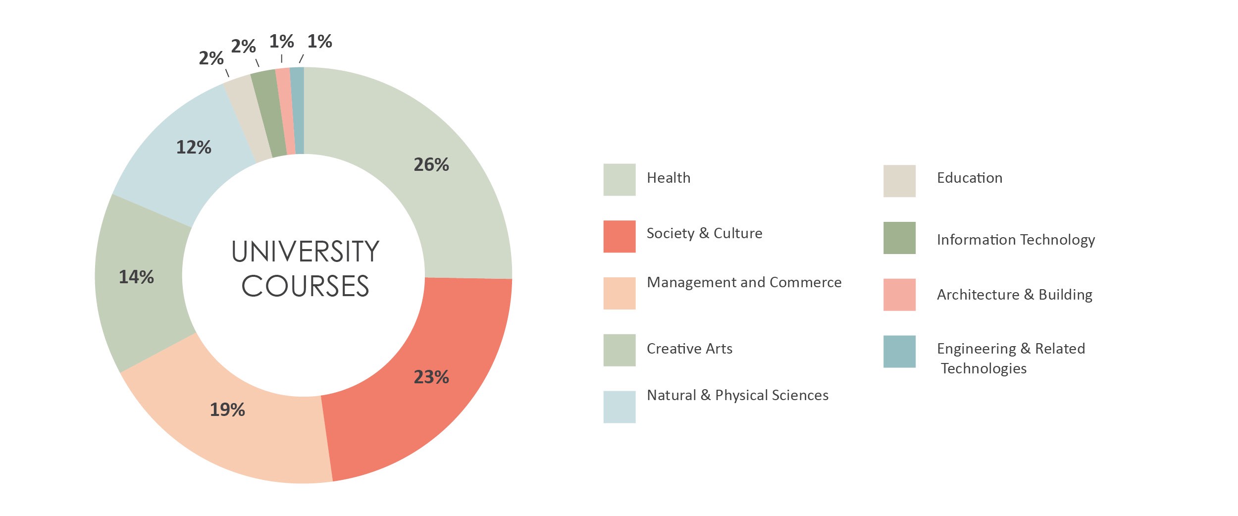
My old high school recently sent out their alumni magazine which featured the VCE (Victorian Certificate of Education) results of the Class of 2018. The report was lovely and well designed, but one thing, in particular, caught my eye. They used a donut chart to display the university courses that the students were accepted into.
我的老高中最近散发了他们的校友杂志,其中刊登了2018届VCE(维多利亚州教育证书)成绩。这份报告很可爱,设计得很好,但特别是一件事引起了我的注意。 他们使用一个甜甜圈图来显示学生被录取的大学课程。
The chart looked a little something like this…
图表看起来像这样……
I have changed the data slightly to deidentify the school.
我已略微更改了数据以取消对学校的识别。
So, what’s wrong with that you ask? Five years ago, I probably would have told you, “nothing, it looks great”, but the more I study data visualisation the more I understand why pie/donut charts are just trouble.
那么,你问什么问题呢? 五年前,我可能会告诉你,“什么都没有,看起来很棒”,但是我对数据可视化的研究越深入,我就越清楚为什么饼图/甜甜圈图只是麻烦。
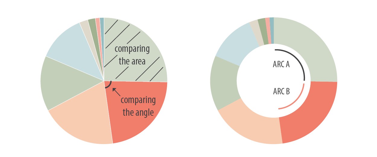
Pie charts rely on our audience to decode the quantitative information by judging and comparing angles and area, which is actually quite difficult to do. Studies have shown us that it is far easier for us to compare length and position (bar and line chart), than area and angle (1,2).
饼图依靠我们的观众通过判断和比较角度和面积来解码定量信息,这实际上是很难做到的。 研究表明,比较长度和位置(条形图和折线图)要比面积和角度(1,2)容易得多。
With a donut chart (which is just a pie chart with a hole in the middle — stay with me, don’t get hungry), we are forced to compare the arc lengths in the middle of the circle (3), which is even more difficult.
使用甜甜圈图(这只是一个饼图,中间有一个Kong-陪着我,别饿了),我们被迫比较圆中间的弧长(3),甚至更加困难。
All of these issues are further compounded when we start adding 3D charts to the mix, which distorts areas and angles. I have said it once and I will say it again, don’t use 3D charts!
当我们开始向混合中添加3D图表时,所有这些问题都变得更加复杂,这会扭曲面积和角度。 我已经说过一次,我会再说一次,请不要使用3D图表!
So, let’s work through this university course donut chart and see how we could improve it. Remember, our job as data visualisation specialists is to present the information in the most effective way so our audience is able to understand and interpret the data with very little effort.
因此,让我们研究这张大学课程的甜甜圈图,看看如何改进它。 请记住,我们作为数据可视化专家的工作是以最有效的方式展示信息,以便我们的听众只需很少的努力就能理解和解释数据。
One solution, I hear you say, is to put the values directly in the donut chart. Let’s see what that looks like.
我听到您说的一种解决方案是将值直接放入甜甜圈图中。 让我们看看它是什么样的。
As with any chart that has the key off to the side, our eyes have to dart back and forth to try and connect the colour to the donut slice. Have you also noticed the colour choices of the donut chart? The different shades of greens and oranges make it that little bit more difficult to match up the key to the slices. So, let’s now add the labels and the values directly to the donut, which is what I normally do.
与任何将钥匙放在侧面的图表一样,我们的眼睛必须来回Dart,以尝试将颜色连接到甜甜圈片上。 您是否也注意到甜甜圈图的颜色选择? 绿色和橙色的深浅不一,使钥匙与切片的匹配变得更加困难。 因此,现在让我们将标签和值直接添加到甜甜圈中,这是我通常所做的。

Now it’s a little easier to read, maybe a little messier too. But the big question is, are we actually looking at the donut, or just reading the labels and values? In his newsletter, “Save the pies for dessert”, Stephen Few comments:
现在,它更容易阅读,也许也更混乱。 但是最大的问题是,我们实际上是在看甜甜圈,还是只是阅读标签和值? Stephen Few在他的时事通讯“将派保存为甜点”中评论:
“Why show a picture of the data if the picture can’t be decoded and doesn’t present the information more meaningfully? The answer is: You shouldn’t. Graphs are useful when a picture of the data makes meaningful relationships visible (patterns, trends, and exceptions) that could not be easily discerned from a table of the same data.”
“如果无法解码图像并且没有更有意义地呈现信息,为什么还要显示数据图像? 答案是:您不应该。 当数据的图片使有意义的关系(模式,趋势和异常)可见,而这些关系很难从同一数据表中辨别出来时,图形很有用。”
He is right, we get no more value from having the data presented as a donut with values directly labeled than as a plain old table.
他是对的,我们将数据显示为带有直接标记值的甜甜圈,没有比普通的旧表更多的价值。
So how would I redo this? A horizontal bar. It might seem boring, but it is easy to understand and make comparisons between each category. As I mentioned before, we are much more capable of comparing length (bar) and position (line) than area and angle. Never underestimate the value of a bar chart.
那么我将如何重做呢? 单杠。 它可能看起来很无聊,但是很容易理解,并且可以在每个类别之间进行比较。 如前所述,我们比区域和角度更能比较长度(条形)和位置(线)。 永远不要低估条形图的价值。
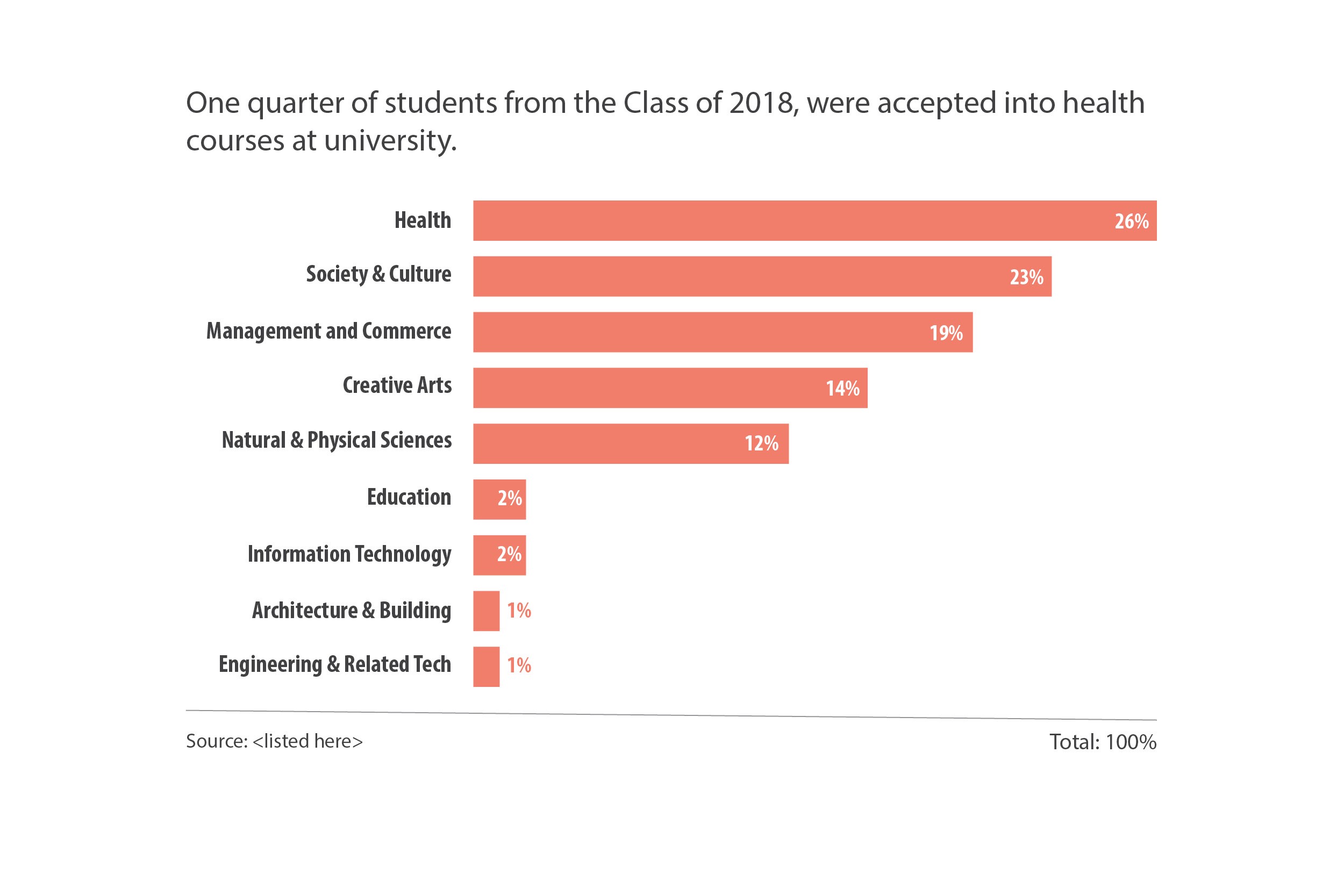
I’ve ordered the data from biggest to smallest. Labeled each bar for easy understanding and got rid of the “noise” by just using the one colour. As the category labels were quite long, a horizontal bar worked better than a vertical one. I’ve also added a descriptive heading and shown the total 100% down the bottom.
我已经从最大到最小订购了数据。 标记每个条形以便于理解,仅使用一种颜色即可消除“噪音”。 由于类别标签很长,因此水平条的效果要好于垂直条。 我还添加了一个描述性标题,并在底部显示了总计100%的标题。
Compare the before and after. Which one is easier to draw meaning from?
比较之前和之后。 哪个更容易得出含义?
Pie charts might be aesthetically pleasing when done well. If you are going to use a pie chart, consider these four simple rules:
如果做得好,饼图在美学上可能会令人愉悦。 如果要使用饼图,请考虑以下四个简单规则:
- no more than 5 categories; 不超过5个类别;
- label the data directly; 直接标记数据;
- use colour sparingly; 谨慎使用颜色;
- not suitable for all types of data. 不适用于所有类型的数据。
As I’ve shown you above, they are may not the most efficient or effective way of displaying data. Think of it with this analogy: it’s like buying a great pair of shoes that look amazing but are horribly uncomfortable, so you never wear them. What’s the point?
如上所示,它们可能不是显示数据的最有效方法。 用这样的类比思考:就像买一双很棒的鞋,看起来很棒,但是非常不舒服,所以您永远不要穿。 重点是什么?
It’s a hard relationship to break up. It’s taken me a lot longer than it should have. I even used a donut in last year’s annual report. But don’t feel bad, even Steve Jobs used one… in 3D!
很难分手。 我花了比应该花的时间长得多的时间。 我什至在去年的年度报告中也使用了甜甜圈。 但是不要感到难过,即使是史蒂夫·乔布斯(Steve Jobs)也在3D中使用了一个……!

翻译自: https://medium.com/nightingale/its-time-to-break-up-with-the-pie-chart-860a9de8a1ec
dev 饼形图


 被折叠的 条评论
为什么被折叠?
被折叠的 条评论
为什么被折叠?
 到【灌水乐园】发言


