


 本文探讨了在医疗保健领域中利用表格数据的重要性。通过分析皮肤黑素瘤数据集,展示了如何利用SPLOM和Box Plot进行数据可视化,揭示年龄、性别和解剖部位与疾病关联。此外,还讨论了数据类型、缺失值处理、编码方法,以及如何应用机器学习和深度学习方法,如决策树、随机森林和神经网络处理表格数据。
These days with the increasing use of well established computer vision methods in healthcare domain, the proper usage of other types such as tabular data is not widely known. The advantage of using this existing data which comes along with the image data is that it might be used to draw better conclusion about the entire scenario. For this tutorial we would be working with skin melanoma dataset, although this is predominantly a computer vision problem the data comes with train and test csv files and as discussed it is always useful to know how to make use of these files apart from using them to prepare the image dataset (labeling images).
如今,随着在医疗保健领域中成熟使用的计算机视觉方法的日益广泛使用,诸如表格数据之类的其他类型的正确用法尚不广泛。 使用与图像数据一起提供的现有数据的优点在于,可以使用它来对整个场景得出更好的结论。 在本教程中,我们将使用皮肤黑素瘤数据集 ,尽管这主要是计算机视觉问题,但数据附带有训练和测试csv文件,并且如所讨论的那样,了解如何充分利用这些文件以及将其用于准备图像数据集( 标记图像 )。
LIVE the data (Load, Inspect, Explore, Visualize)
实时数据(加载,检查,浏览,可视化)
Once you have downloaded the dataset from the link described above you are ready to move to the next step i.e. loading the csv files and start exploring the tabular data for finding additional and interesting relations in the data. Interestingly, later the results from image classifier and this tabular dataset can be combined to form a more robust model. But for the time being let us focus on working with tabular data. Code for loading the data for the first time is as follows:
从上述链接下载数据集后,就可以继续进行下一步,即加载csv文件并开始探索表格数据,以在数据中查找其他有趣的关系。 有趣的是,以后可以将图像分类器的结果和该表格数据集结合起来,以形成更强大的模型。 但是暂时让我们集中精力处理表格数据。 首次加载数据的代码如下:
import pandas as pd
train_path = r''
df_train = pd.read_csv(train_path)
# will print the column names of the dataset
print(df_train.columns)
# will top 10 (can be changed) rows of the dataset, if no value is passed the defaut number of rows returned is 5.
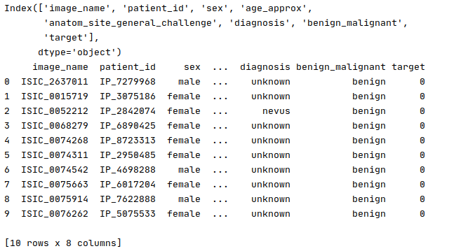
print(df_train.head(10))Output:
输出:
Now that we have loaded the data, it would be interesting to plot some relations between different variables in data. These relations might be useful for modeling the solution later. To start with this process, the first type of plot we would use here is a SPLOM (Scatter Plot Matrix), it is a more convenient form of a scatter plot as here multiple variables can be used at once to plot the data and studying the correlation is easier. Following is a code snippet using plotly a popular library for data visualization in Python.
现在我们已经加载了数据,绘制数据中不同变量之间的一些关系将很有趣。 这些关系对于以后对解决方案建模可能有用。 要开始这个过程,第一种类型的情节,我们将在这里使用的是SPLOM(S catter 普罗米修斯的Tm ATRIX),它是一个散点图更方便的形式,这里的多个变量可以一次绘制数据使用并且研究相关性更加容易。 下面是一个使用plotly在Python中的数据可视化通俗图书馆的代码片断。
import plotly.express as px
fig_scatter = px.scatter_matrix(df_train,
    dimensions=["sex", "age_approx", "anatom_site_general_challenge"],
    color="target")
fig_scatter.update_layout(
    margin=dict(l=30, r=30, t=30, b=30),
)


fig_scatter.show()
Output:
输出:
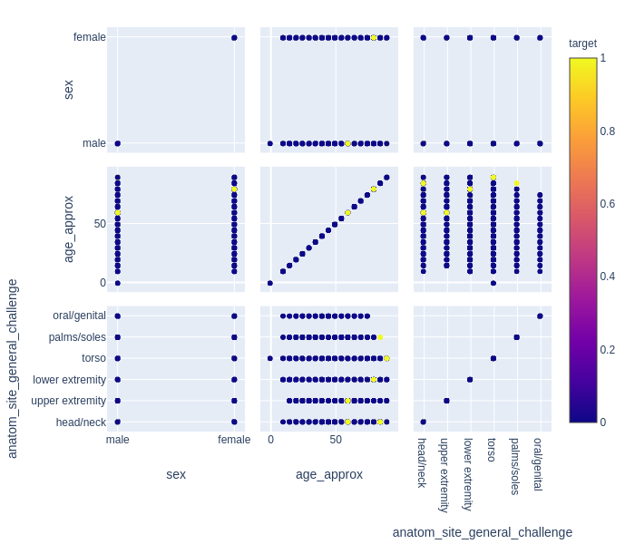
Above we have a SPLOM with three features handpicked from the dataset. Here we have binary target i.e either a person is suffering from melanoma or not, hence the graph shows only two colors, but there can still be a lot which can be inferred from this plot. First thing which becomes clear is in general the age at which melanoma is detected/found in females is higher than males. Now this can stem from a lot of reasons such as genetics or inherent bias in the healthcare system. This observation can come handy while studying these topics in detail. Next interesting relation which is visible lies between anatomical site of suspected patch and age, it is evident that people with suspicious patches on head/neck and age between 50–70 years are more likely to have melanoma, then a person who has a different looking oral or genital skin patch of any age.
上面有一个SPLOM,具有从数据集中精选的三个功能。 在这里,我们有二元目标,即一个人是否患有黑色素瘤,因此该图仅显示两种颜色,但是从该图可以推断出很多。 首先要弄清楚的是,女性中发现/发现黑色素瘤的年龄通常高于男性。 现在,这可能源于许多原因,例如遗传因素或医疗保健系统中的固有偏见。 在详细研究这些主题时,这种观察可能会派上用场。 下一个有趣的关系是可疑斑块的解剖部位与年龄之间的关系,很明显,头/颈部可疑斑块且年龄在50-70岁之间的人更容易患黑色素瘤,而外表不同的人任何年龄的口腔或生殖器皮肤斑块。
After plotting and analyzing SPLOM, we already have a rough idea about the features which might influence each other and hence, we would move on to plot Box Plot. According to mighty Wikipedia ‘boxplot is a method for graphically depicting groups of numerical data through their quartiles’. What are quartiles you ask, quartiles can be imagined as sectioning of data based on it’s median and have five sections namely minimum, first quartile, median, third quartile, and a maximum. Any data point which lies beyond minimum or maximum is termed as an outlier. We found an interesting relation between age of the patient and anatomical location of suspicious patch hence we would use these two columns to plot the boxplot and study this relation in detail. Following is the seaborn based code for plotting and displaying a boxplot.
在对SPLOM进行绘制和分析之后,我们已经对可能相互影响的特征有了一个大概的了解,因此,我们将继续绘制Box Plot 。 根据强大的维基百科,“ 箱形图是一种通过四分位数以图形方式描绘数字数据组的方法 ”。 您要问的四分位数是什么,四分位数可以想象成是根据数据的中位数进行的数据划分,并具有五个部分,即最小 , 第一四分位数 , 中位数 , 第三四分位数和最大值 。 任何超出最小值或最大值的数据点都称为异常值。 我们发现患者年龄与可疑斑块的解剖位置之间存在有趣的关系,因此我们将使用这两列来绘制箱线图并详细研究这种关系。 以下是基于海洋的代码,用于绘制和显示箱线图。
import seaborn as sns
import matplotlib.pyplot as plt
sns.boxplot(x=df_train["anatom_site_general_challenge"],y=df_train["age_approx"],hue=df_train["target"])
plt.xticks(rotation=30,horizontalalignment = 'right')
plt.show()
Output:
输出:
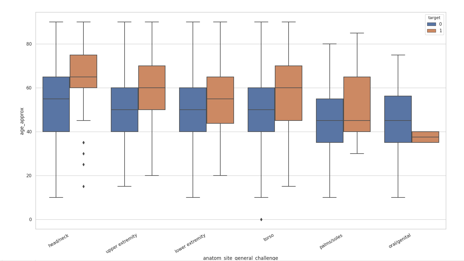
It is evident that certain anatomy has more outliers than the other. We can see relation here which were previously not visible in SPLOM. Some observations include that oral/genital patches are likely to be cancerous only in a very small range of age and people above the age of 60 are more likely to have cancerous head/neck skin patches where as the chances of these patches being dangerous below the age of 40 is highly unlikely. This analysis is only to provide an idea about how bigger questions can be answered if the data is analyzed carefully, and how it can help in shaping a more inclusive system.
显然,某些解剖结构具有比其他解剖结构更多的异常值。 我们可以在这里看到以前在SPLOM中不可见的关系。 一些观察结果包括:口腔/生殖器贴片可能仅在很小的年龄范围内癌变,而60岁以上的人更可能患有癌性的头/颈皮肤贴片,而这些贴片在皮肤下方的危险性很大。 40岁的可能性很小。 这种分析仅是提供一个想法,即如果仔细分析数据可以回答更大的问题,以及它如何帮助形成更具包容性的系统。
Last important topic before we proceed to read about missing values is the different types of data columns which are present in a dataset and how they need to be encoded in order to be used efficiently. The three main types of data columns available are:
在继续阅读缺失值之前,最后一个重要主题是数据集中存在的不同类型的数据列,以及如何对其进行编码才能有效使用。 可用的三种主要数据列类型是:
a. Categorical: these columns are the ones which assume finite values such as the anatomical locations of patches in this dataset. These variables take discrete values and is countable.
一个。 分类 : 这些列是假设为有限值的列,例如此数据集中补丁的解剖位置。 这些变量采用离散值并且是可数的。
b. Ordinal: these variables are the ones which have some order attached to them, for example: grades of a school, such as high school, middle school and primary school. These can be thought of a specialized case of categorical variables.
b。 序数 :这些变量是依序排列的变量,例如:学校的年级,例如高中,中学和小学。 这些可以认为是分类变量的一种特殊情况。
c. Continuous: these are the numerical variable and do not take any definite discrete value, in this dataset one such variable is age. It should be noted that age is variable which can take any real number.
C。 连续的 :这些是数字变量,不带任何确定的离散值,在此数据集中,一个这样的变量是age 。 应当指出,年龄是可变的,可以取任何实数。
It is important to know these types as most of the algorithm by default require numerical values and hence many times we need to encode the non-numeric variables before using them. It is important to keep in mind that encoding does not change the relations different features have with each other, the non-numeric values are simply transformed to a numeric mapping. We will discuss this topic in larger detail in the following section as a part of preparation of data for machine learning algorithms.
重要的是要知道这些类型,因为默认情况下大多数算法都需要数字值,因此很多时候我们需要在使用非数字变量之前对其进行编码。 重要的是要记住,编码不会改变不同要素之间的关系,非数字值会简单地转换为数字映射。 我们将在以下部分中更详细地讨论此主题,这是机器学习算法数据准备的一部分。
2. Working with missing values, data encoding and imputation
2.处理缺失值,数据编码和插补
There might be a lot of data rows where the data for some variables might be missing. The cause of missing data might range from malfunction of measuring instrument, respondents not willing or unavailability of information.Although dropping these data rows with incomplete data seem like an obvious and reasonable choice, it is not good for the performance of the model as it might introduce bias in the data. It makes it necessary to study the data carefully and build unbiased models.
可能有很多数据行,其中某些变量的数据可能会丢失。 丢失数据的原因可能是由于测量仪器故障,被调查者不愿意或没有信息而造成的。尽管将这些数据行与不完整的数据一起丢弃似乎是显而易见的合理选择,但对模型的性能不利,因为它可能在数据中引入偏差。 因此有必要仔细研究数据并建立无偏模型。
Categories of missing data: although finding out the category to which the missing data of a dataset belongs is difficult but it is still useful to know these categories and the types of biases they can introduce:
缺失数据的类别:尽管很难找到数据集缺失数据所属的类别,但是了解这些类别以及它们可能带来的偏差类型仍然很有用:
1. missing completely at random: it means the data is recorded completely at random, i.e. say the data is recording is based on toss of a coin and a data entry is made every time tails shows up in the toss. The data missing after this type of acquisition is completely random and hence does not tend to introduce any bias in the trained model.
1.完全随机丢失:这意味着数据是完全随机记录的,即说正在记录的数据是基于硬币的抛掷,每次抛尾出现时都会进行数据录入。 在这种类型的采集之后丢失的数据是完全随机的,因此不会在训练后的模型中引入任何偏差。
2. missing at random: here the data collection process is not completely at random and has some rules which decide that data has to be collected and the rest of the data collection might still be dependent on a fairly random process such as tossing a coin mentioned above. This is a conditional missing of data, although the factors which cause this data to go missing are the part of the information collected.
2.随机丢失:这里的数据收集过程不是完全随机的,并且有一些规则决定必须收集数据,而其余数据收集可能仍然依赖于相当随机的过程,例如扔掉提到的硬币以上。 这是有条件的数据丢失,尽管导致此数据丢失的因素是所收集信息的一部分。
For example: if a patient comes to the clinic for routine checkup and his age is more than 40 years, his blood sugar levels are checked invariably, but if someone who is less than 40 years of age this data collection might be based on a coin toss or if the patients has other conditions which influence changes in blood sugar level.
例如:如果患者来诊所进行例行检查且年龄超过40岁,则将始终检查其血糖水平,但是如果患者小于40岁,则此数据收集可能基于硬币如果患者有其他情况会影响血糖水平的变化,请选择抛掷。
3. missing not at random: This type of missing data is most difficult to find as it can’t be observed from the data recorded and has more than just random factors influencing the recorded data.
3.并非随机丢失:这种类型的丢失数据最难发现,因为无法从记录的数据中观察到,并且不仅仅是影响记录数据的随机因素。
Now that we know about the missing data it would be interesting to dive into the code for finding and visualizing the columns which have null values.
既然我们知道丢失的数据,那么深入研究代码以查找和可视化具有空值的列将很有趣。
Below we can see a seaborn heatmap where the dark part shows the values which are not null and light colors depict missing values. For example: the column ‘benign_malignant’ has no missing value whereas ‘age_approx’ has some values missing.
在下面,我们可以看到一个深海的热图 ,其中深色部分显示的值不为null,浅色部分显示的值缺失。 例如: “ benign_malignant ”列没有缺失值,而“ age_approx ”缺少一些值。
sns.heatmap(df.isnull(), cbar=True)
plt.show()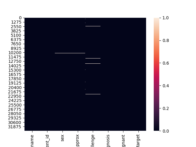
Before we proceed any further let us look at the code which can help us find out rows which have missing data in the dataframe.
在继续进行任何操作之前,让我们看一下可帮助我们找出数据框中缺少数据的行的代码。
rows_with_nan = df_train.isnull().any(axis=1)
print(df_train[rows_with_nan])
print(len(df_train[rows_with_nan]))
The code mentioned above would print the rows with NaN in the dataframe followed by the number of rows which have NaNs. These values are useful when we have to decide whether we should impute (approximate calculation for missing values) the data or simply drop the rows or columns which have missing data. Now if a developer does not want to use data imputation, s/he would simply drop the rows which have NaN/null values in their corresponding columns and would proceed with the model usage.
上面提到的代码将在数据帧中打印具有NaN的行,然后打印具有NaN的行数。 当我们必须决定是应该插补(缺失值的近似计算)数据还是简单地删除具有缺失数据的行或列时,这些值很有用。 现在,如果开发人员不想使用数据插补,他/她将简单地删除其对应列中具有NaN / null值的行,并继续进行模型使用。
Data Imputation: now that we know three categories in which the missing data can be categorized, next step should be to find out what can be done about this missing data. Data imputation means filling-in/imputing missing values by estimating the missing values. One thing to keep in mind is that test and train dataset should use same imputed values. There are two main methods for calculating data to be imputed. They are as follows:
数据归因:现在我们知道可以对丢失的数据进行分类的三个类别,下一步应该是找出可以对丢失的数据执行的操作。 数据插补意味着通过估计缺失值来填充/插补缺失值。 要记住的一件事是, 测试和训练数据集应使用相同的估算值。 有两种主要方法可计算要估算的数据。 它们如下:
mean/median/mode based imputation: as the name suggests this is carried out by calculating the mean/median/mode of values present for a feature in consideration. Although it is easy to calculate it has a problem, i.e. this type of imputation does not necessarily preserve the relation between independent variables. Following is the code where we demonstrate how to use SimpleImputer with replacement strategy as ‘most_frequent’ as it is evident from the name of the strategy it uses most frequently occurring values to replace the missing ones.
基于均值/中位数/众数的插补 :顾名思义,这是通过计算所考虑特征的值的均值/中位数/众数来实现的。 尽管很容易计算,但存在一个问题,即,这种类型的推算不一定保留自变量之间的关系。 下面的代码演示了如何将SimpleImputer与替换策略一起使用为“ most_frequent ”,从该策略的名称可以明显看出,它使用最频繁出现的值来替换丢失的值。
from sklearn.impute import SimpleImputer
imputer = SimpleImputer(missing_values=np.nan,strategy='most_frequent')
# change the dtype of the 'object' type columns in the dataframe, otherwise there will be an error while working with SimpleImputer
df_train = df_train.astype({'image_name': 'category','patient_id':'category','sex':'category','anatom_site_general_challenge':'category',
                                                  'diagnosis':'category','benign_malignant':'category'}, errors='raise')


# fit and transform the dataframe for imputation
df_train = pd.DataFrame(imputer.fit_transform(df_train))
2. regression based imputation: for this method a linear model needs to be learnt, showing relation of the variable with missing values with other independent variables. This method of data imputation is called iterative imputation. All the missing values for different features are calculated sequentially, and these newly calculated values are used for predicting values of subsequent features. As the estimators used are regression algorithms and require all numerical inputs, but our dataset currently contains both numeric and non-numeric values, we will not be using IterativeImputer for our purpose but following is a piece of code which can be used to apply this kind of imputation to the dataset.
2. 基于回归的归因:对于这种方法,需要学习线性模型,以显示具有遗漏值的变量与其他自变量的关系。 这种数据插补方法称为迭代插补。 依次计算不同特征的所有缺失值,并将这些新计算的值用于预测后续特征的值。 由于使用的估计量是回归算法,并且需要所有数字输入,但是我们的数据集当前同时包含数字和非数字值,因此我们不会出于此目的使用IterativeImputer ,但是下面的一段代码可用于应用这种方法归因于数据集。
from sklearn.experimental import enable_iterative_imputer
from sklearn.impute import IterativeImputer
from sklearn.tree import DecisionTreeRegressor
# different values for estimators can be tried and tested for application
iter_imputer = IterativeImputer(estimator =  DecisionTreeRegressor(max_features='sqrt', random_state=0),random_state=10,max_iter=10,initial_strategy='most_frequent')
df_train = pd.DataFrame(iter_imputer.fit_transform(df_train))
Note: more information about this library and functions can be found at this link.
注意:有关此库和函数的更多信息,请参见此 链接 。
Encoding the data: As we already have an understanding of why the data should be encoded (reminder: machine learning algorithms love crunching numbers). We should start by ordinal category encoding plus label encoding, followed by one-hot encoding. But before we start working with encoding let us do some data preparation. Following code snippet will separate the dependent (also known as: target variable or labels )and independent (non-target columns which contribute towards data being categorized) variables in the dataframe so that we can employ label and categorical encoding respectively.
编码数据:由于我们已经了解了为什么应该对数据进行编码( 提醒:机器学习算法喜欢处理数字 )。 我们应该从序数类别编码加上标签编码开始,然后是一键编码。 但是在开始编码之前,让我们做一些数据准备。 下面的代码片段将数据帧中的因变量( 也称为:目标变量或标签 )和独立变量 ( 对数据进行分类的非目标列 )分开,以便我们分别使用标签和分类编码 。
def pre_processing_data(dataframe):
    # retrieve the values from the dataframe
    dataset = dataframe.values
    # separating the input and target columns
    input = dataset[:, :-1]
    target = dataset[:, -1]
    # changing datatype of input data to string to avoid errors due to implicit conversion  and easier encoding
    input = input.astype(str)
    # reshaping the target 2D array
    target.reshape((len(target), 1))
    return input, target


input, target = pre_processing_data(df_train)
Ordinal Category and label encoding: Encoding would be done basically to convert data of all the columns values to numbers (integers). Here we have used encoders from scikit-learn library. OrdinalEncoder is for encoding the independent variables, which mostly comprise of multiple columns. Although there is a possibility of encoding only a few columns which are non-numerical but for the sake of simplicity we have encoded all the columns (we previously converted them to strings for this purpose).There is a separate encoder known as label encoder, it mainly takes one column as input and gives a corresponding output and hence we have used it to encode the target variable even though we are provided with a numerical label for this particular dataset, there might be a case where only strings are used for labels hence it is a handy concept.
顺序类别和标签编码 :基本上将进行编码,以将所有列值的数据转换为数字(整数)。 在这里,我们使用了scikit-learn库中的编码器 。 OrdinalEncoder用于编码自变量,该自变量主要由多个列组成。 尽管有可能只编码少数非数字列,但为简单起见,我们对所有列进行了编码(为此,我们先前将它们转换为字符串) 。 有一个单独的编码器,称为标签编码器,它主要将一列作为输入并给出相应的输出,因此即使为该特定数据集提供了数字标签,我们也使用它来对目标变量进行编码。仅将字符串用于标签的情况,因此这是一个方便的概念。
from sklearn.preprocessing import LabelEncoder
from sklearn.preprocessing import OrdinalEncoder


def encode_input(input):
    oe = OrdinalEncoder()
    oe.fit(input)
    encoded_input = oe.transform(input)
    return encoded_input


def encode_target(target):
    le = LabelEncoder()
    le.fit(target)
    encoded_target = le.transform(target)
    return encoded_target


enc_input = encode_input(input)
enc_target = encode_target(target)
Note: If there are no limited number or repetitive values for a particular variable, such as Patient-Id for this dataset, the OrdinalEncoder assigns a unique integer value to these columns.
注意:如果特定变量(例如此数据集的Patient-Id)没有数量有限或重复的值,则OrdinalEncoder会为这些列分配一个唯一的整数值。
One-hot encoding: This type of encoding does not simply assign an integer value to different categories but rather works by assigning vectors of length depending on how many categories are present in column.
一键式编码 :这种编码类型不只是将整数值分配给不同的类别,而是通过根据列中存在多少个类别来分配长度向量来起作用。
For example: say we have two types of tumors, ‘benign’ and ‘malignant’ then we would encode ‘benign’ as ‘01’ and ‘malignant’ as ‘10’ or vice versa. Here the placement of 1 determines the condition type. To elaborate this example say we have one more type which is labeled as ‘undetermined’ then these categories would be ‘001’,’010’ and ‘100’ for ‘benign’, ‘malignant’ and ‘undetermined’ respectively (or a different order).
例如 :假设我们有两种类型的肿瘤:“良性”和“恶性”,那么我们会将“良性”编码为“ 01”,将“恶性”编码为“ 10”,反之亦然。 这里的位置1确定条件类型。 为了详细说明此示例,我们还有一个类型被标记为“未确定”,那么对于“良性”,“恶性”和“未确定”,这些类别分别是“ 001”,“ 010”和“ 100”(或不同)订购)。
Once again we would be using a built-in function OneHotEncoder from scikit-learn. The above mentioned categorical-encoding code can be updated as follows to use OneHotEncoder instead of OrdinalEncoder:
我们将再次使用scikit-learn的内置函数OneHotEncoder 。 可以按以下方式更新上述分类编码代码,以使用OneHotEncoder代替OrdinalEncoder:
from sklearn.preprocessing import LabelEncoder
from sklearn.preprocessing import OneHotEncoder


def encode_input(input):
    oe = OneHotEncoder()
    oe.fit(input)
    encoded_input = oe.transform(input)
    return encoded_input


def encode_target(target):
    le = LabelEncoder()
    le.fit(target)
    encoded_target = le.transform(target)
    return encoded_target


enc_input = encode_input(input)
enc_target = encode_target(target)
3. Implementing and analyzing different machine learning and deep learning methods
3.实施和分析不同的机器学习和深度学习方法
Now that we have analyzed and prepared the data for machine learning algorithms, it is now time that we move towards the final training step. Although in this field of artificial intelligence the use of neural networks is favored, although this trend is not seen for the tabular data where even today traditional algorithms like Decision tree and Random Forest are preferred. Although we would learn to implement a basic neural architecture to deal with tabular data here we would first implement the above mentioned methods.
现在我们已经为机器学习算法分析并准备了数据,现在是时候迈向最后的训练步骤了。 尽管在人工智能领域中,神经网络的使用受到了青睐,但是对于表格数据却没有看到这种趋势,即使在今天,诸如决策树和随机森林之类的传统算法仍是首选。 尽管在这里我们将学习实现一种基本的神经体系结构来处理表格数据,但我们将首先实现上述方法。
Decision tress: Similar to neural networks, decision trees can also model non-linearity very well. In most cases the tree-based methods are preferred because they have high interpretability and are computationally inexpensive. Following code shows how to do data splitting, use Decision tree classifier and plot the tree. It is always a good idea to keep some hold-out dataset also known as validation set for the initial validation of the trained model. We have only used two attributes from the Decision tree classifier, although there is a possibility of using a lot other combinations, details can be found here.
决策树 :类似于神经网络,决策树也可以很好地建模非线性。 在大多数情况下, 基于树的方法是首选方法,因为它们具有较高的可解释性并且在计算上不昂贵 。 以下代码显示了如何进行数据拆分,使用决策树分类器并绘制树。 保留一些保留的数据集(也称为验证集)始终是一个好主意,用于训练模型的初始验证。 尽管有可能使用很多其他组合,但我们仅使用了决策树分类器中的两个属性,但可以在此处找到详细信息。
from sklearn.model_selection import train_test_split
from sklearn.tree import DecisionTreeClassifier
from sklearn.metrics import accuracy_score
from sklearn.tree import plot_tree


X_train,X_val,y_train,y_val = train_test_split(enc_input,enc_target,test_size = 0.20,random_state=23)


model = DecisionTreeClassifier(criterion = 'entropy',max_depth = 4)
model.fit(X_train,y_train)
plot_tree(model,filled=True,max_depth=4)
plt.show()
pred = model.predict(X_val)
print("Validation score ",accuracy_score(y_val,pred))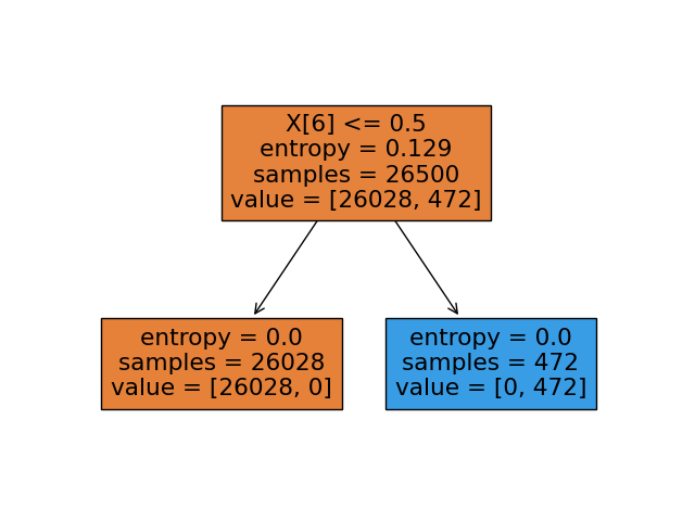
Although decision trees are fast and can model data well, they still suffer from over-fitting (the gap between the training and testing accuracy is huge), this problem is introduced primarily because of the factor max_depth. In order to overcome this problem we would employ Random forests discussed below, they are helpful as the algorithm make multiple decision trees
尽管决策树很快并且可以很好地对数据建模,但它们仍然存在过度拟合(训练和测试准确性之间的差距非常大)的问题,主要是由于max_depth因素而引入此问题。 为了克服这个问题,我们将采用下面讨论的随机森林,它们在算法制作多个决策树时很有用
Random Forest: As discussed above that even though Decision trees have their advantages, they suffer from over-fitting. Hence, to overcome this problem we will now have a look Random Forest. The two main reasons for the better performance of Random Forest are:
随机森林:如上所述,即使决策树具有优势,但它们也会遭受过度拟合的困扰。 因此,为了克服这个问题,我们现在来看一下随机森林。 随机森林性能更好的两个主要原因是:
a) they draw random samples from the entire dataset, with replacement.
a)他们从整个数据集中抽取随机样本,并进行替换。
b) they use a subset of features when deciding the decision tree boundaries.
b)在确定决策树边界时,它们使用要素子集。
The implementation of Random Forest is also as straight forward as Decision tree (shown below), further details about the parameters can be checked here. Apart from changing the model type nothing changes the model would be fitted and used for prediction in the same manner.
随机森林的实现也与决策树(如下所示)一样简单,有关参数的更多详细信息可以在此处进行检查。 除了更改模型类型外,不进行任何更改都将以相同的方式拟合模型并将其用于预测。
from sklearn.ensemble import RandomForestClassifier
model = RandomForestClassifier(criterion = 'entropy')
The output of the model is the aggregate of all the sub-trees which are constructed during the process.
模型的输出是在此过程中构造的所有子树的集合。
Gradient Boosting: As we saw that Random forest is a method to create multiple sub- Decision trees and the result is aggregated before final prediction, there are also other methods known as ‘boosting’ algorithms which essentially are multiple weak classifiers stacked together to form a stronger and more robust classifier. One such example is Gradient Boosting. More information about it’s usage can be found here.
梯度提升 :正如我们所看到的,随机森林是一种创建多个子决策树的方法,并且在最终预测之前对结果进行汇总,还有其他称为“ 提升”算法的方法,这些方法本质上是将多个弱分类器堆叠在一起以形成一个更强大,更强大的分类器。 这样的例子之一就是梯度提升。 可以在此处找到有关其用法的更多信息。
Deep learning for tabular data: Now as we have revisited a plenty of traditional machine learning methods it would be interesting to see if we can use deep learning for such a problem. The answer to the question that can we use deep learning is yes, we can apply deep learning methods to tabular data. Following is a small code snippet which demonstrates the same. One important thing to keep in mind while using the deep learning methods is that One-Hot encoding should be preferred over Categorical encoding preferably.
表格数据的深度学习:现在,当我们重新审视许多传统的机器学习方法时,很有趣的发现是否可以将深度学习用于此类问题。 我们可以使用深度学习的问题的答案是肯定的,我们可以将深度学习方法应用于表格数据。 以下是一个演示相同内容的小代码段。 使用深度学习方法时要牢记的重要一件事是,应首选单热编码 ,而不是分类编码 。
from keras.models import Sequential
from keras.layers import Dense
# model definition: a sequential model with two Linear layers (Ax+B)
model = Sequential()
# defining the output and input size of the layer along with the activation which would follow and the weight initialization method
model.add(Dense(20, input_dim=X_train.shape[1], activation='relu', kernel_initializer='he_normal'))
# final output layer
model.add(Dense(1, activation='sigmoid'))
# compiling the model with loss function and optimizer
model.compile(loss='binary_crossentropy', optimizer='sgd', metrics=['accuracy'])
# fitting the model on the dataset
model.fit(X_train, y_train, epochs=10, batch_size=4, verbose=2)
# evaluating the trained model on the validation set
_, accuracy = model.evaluate(X_val, y_val, verbose=0)
print('Accuracy: %.2f' % (accuracy*100))
With this we come to an end of the post here we have defined a set of steps to be followed when working with tabular data.
至此,我们结束了本文的结尾,在此定义了处理表格数据时要遵循的一组步骤。
4. Conclusion & Future work
4.结论与未来工作
Here we covered a basic pipeline which needs to be followed while working with tabular data, but we have still not discussed how to handle the class-imbalance in data and it’s effect on the outcome of the machine learning methods. But that is something to be covered in next post. Also for future it would be interesting to discuss how to implement multi-modal (dealing with multiple forms of data, such as image and text data) networks.
在这里,我们介绍了处理表格数据时需要遵循的基本流程,但是我们仍未讨论如何处理数据中的类不平衡及其对机器学习方法结果的影响。 但这将在下一篇文章中介绍。 同样对于将来,讨论如何实现多模式( 处理多种形式的数据,例如图像和文本数据 )网络将是有趣的。


 被折叠的 条评论
为什么被折叠?
被折叠的 条评论
为什么被折叠?
 到【灌水乐园】发言


