


 本文介绍了数据驱动的方法在深入理解网络攻击方面的应用,通过数据科学的视角解析攻击行为。
数据驱动式攻击
Protecting the digital systems, applications and networks that allow society to function from intentional and unintentional harm is a problem so complex that it cannot be achieved using human intuition alone.
保护允许社会正常运转的数字系统,应用程序和网络免受故意和非故意的伤害,这个问题是如此复杂,以至于单凭人类的直觉就无法实现。
An awakening is taking place within the Cyber Security domain, one that is fuelled by the same commodity that has led the likes of Amazon, Facebook and Google to become the most powerful private companies in the world: Data.
网络安全领域正在发生一种唤醒,一种由相同商品推动的趋势,导致亚马逊,Facebook和Google等公司成为世界上最强大的私营公司: Data 。
The application of Data Science within the Cyber Security domain offers significant opportunities for organisations to better protect themselves from cyber threats. A common use case being the implementation of machine learning models to monitor for malicious user behaviour, a task not suitable for human analysts to perform- especially for large organisations with thousands of employees.
数据科学在网络安全领域的应用为组织提供了重要的机会,可以更好地保护自己免受网络威胁。 一个常见的用例是实施机器学习模型以监视恶意用户的行为,这是不适合人类分析人员执行的任务,尤其是对于拥有数千名员工的大型组织而言。
In this article, I use Python and Pandas to explore the VERIS Community Data set, a composition of ~8,500 real world cyber incidents to answer a broad research question: “what are the common attributes of a cyber incident?”. By answering this simple question, I hope to show how it’s possible to use data to break down a complex problem into bite-sized and actionable insights.
在本文中,我使用Python和Pandas探索VERIS社区数据集 ,该数据集由大约8,500个现实世界的网络事件组成,回答了一个广泛的研究问题:“网络事件的共同属性是什么?”。 通过回答这个简单的问题,我希望展示如何使用数据将一个复杂的问题分解成一口大小且可行的见解。
导入和配置数据 (Importing and configuring the Data)
I imported the data by cloning the entire VERIS repo on GitHub to my local environment. Because each incident is stored in an individual JSON object, I used the helpful verispy package to extract the thousands of JSON objects into a single pandas dataframe:
我通过将GitHub上的整个VERIS存储库克隆到我的本地环境来导入数据。 因为每个事件都存储在一个单独的JSON对象中,所以我使用了有用的verispy包将数千个JSON对象提取到单个pandas数据框中:
import pandas as pd
from verispy import VERISdata_dir = '/Users/danielharrison/VCDB-master/data/json/validated'
v =  VERIS(json_dir=data_dir) #creates a veris objectFound 8539 json files.veris_df = v.json_to_df(verbose=True) #creates a dataframe from the veris object
Inspecting the dataframe reveals the extent of the VERIS Community Dataset (as of Jan 2020):
检查数据框可了解VERIS社区数据集的范围(截至2020年1月):
veris_df.shape()
(8539, 2347)
1.谁引起网络事件? (1. Who’s causing cyber incidents?)
Understanding who is going to cause potential harm to digital assets, intentionally or unintentionally, is a natural starting point to address the research question and explore the data.
了解谁将有意或无意对数字资产造成潜在损害,是解决研究问题和探索数据的自然起点。
The VERIS database breaks down cyber threat actors into three categories:
VERIS数据库将网络威胁参与者分为三类:
1. External- anyone outside of the organisation e.g. hackers, nation states and former employees
1.外部-组织外部的任何人,例如黑客,民族国家和前雇员
2. Internal- anyone who is entrusted with access to internal systems e.g. full time employees, contractors and interns
2.内部人员-有权访问内部系统的任何人,例如全职员工,承包商和实习生
3. Partner- Third party suppliers to the impacted organisation, who typically have some trusted access to internal systems.
3.合作伙伴-受影响组织的第三方供应商,他们通常可以信任地访问内部系统。
To breakdown the incidents by actor type, I utilised the enum_summary function supplied by the verispy package:
为了按enum_summary类型分解事件,我利用了verispy包提供的enum_summary函数:
df_actors_internal = v.enum_summary(veris_df, 'actor.internal.variety', by='actor')df_actors_external = v.enum_summary(veris_df, 'actor.external.variety', by='actor')N.B. I neglected to include the partner actor type because the total number of incidents caused by partners was low, and it detracted from the visualisation later on.
注意:我忽略了包括合作伙伴参与者类型,因为由合作伙伴引起的事件总数很低,并且从以后的可视化中就没有了。
After some cleaning up of the df_actors_internal and df_actors_external data frames (see my GitHub code for further information), I concatenated them into one data frame df_actors_combined:
在清理了df_actors_internal和df_actors_external数据帧之后(请参阅我的GitHub代码以获取更多信息),我将它们串联到一个数据帧df_actors_combined :
df_actors_combined = pd.concat([df_actors_internal, df_actors_external])df_actors_combined.head()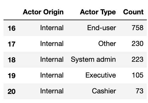
Representing this data in visually stunning and interactive ways was made easy thanks to the Plotly express graphing library. I opted to go with a sunburst chart to show how internal and external actors could be broken down further into their actor types:
借助Plotly express图形库,以视觉上令人惊叹的交互式方式表示此数据变得容易。 我选择了一个朝阳图,以显示内部和外部参与者如何进一步细分为他们的参与者类型:
import plotly.express as pxfig_1 = px.sunburst(df_actors_combined, path=['Actor Origin', 'Actor Type'], values='Count')fig_1.update_layout(uniformtext_minsize=12)plot(fig_1, filename = 'Actor Origin', auto_open=True)For further information on embedding plotly visualisations into your pages, I recommend the following article.
有关将图形可视化内容嵌入到页面中的更多信息,我建议以下 文章 。
What’s immediately obvious is the almost even distribution of incidents caused by internal and external actors — 52% external and 47% internal (~1% partner & unknown).
显而易见的是,内部和外部参与者造成的事件几乎是均匀分布的-52%的外部参与者和47%的内部参与者(〜1%的合作伙伴和未知)。
网络领域深度学习1 (Cyber Domain Deep Dive 1)
Organisations cannot underestimate the risk posed by internal threats, their privileged access to and working knowledge of internal systems makes it easy for them to cause harm- whether they mean to or not.
组织不能低估内部威胁带来的风险,特权访问和对内部系统的了解可以使组织很容易造成损害(无论是否要这样做)。
For the known data on internal actors, a significant proportion can be attributed to ‘end users’, which the VERIS documentation describes as the end user of an application or regular employee. I interpret this to mean an employee who has standard access to a system and uses it in their day to day work.
对于内部参与者的已知数据,很大一部分可归因于“最终用户”,VERIS文档将其描述为应用程序或正式员工的最终用户。 我将其解释为具有对系统的标准访问权限并在日常工作中使用该系统的员工。
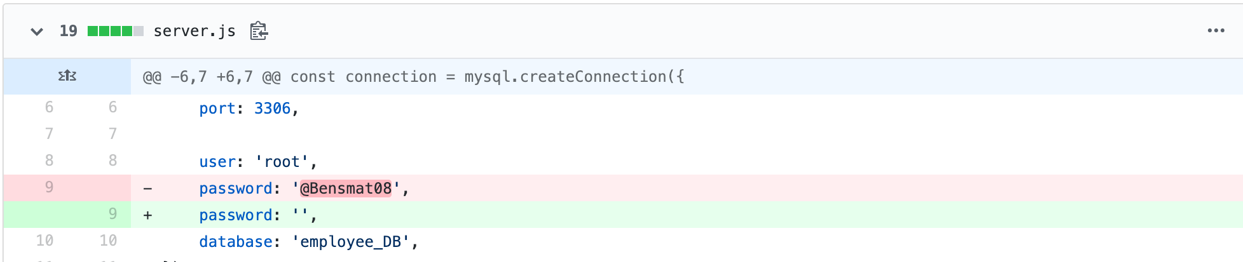
Interestingly, from my experience in DevOps environments, I anticipated the number of incidents caused by software developers to be much higher, given the elevated level of access and working knowledge they posses. For example, a developer could modify the underlying source code of software applications to benefit themselves someway, or simply leave secrets such as passwords and API keys exposed in code on hosted on GitHub:
有趣的是,根据我在DevOps环境中的经验,考虑到他们所拥有的访问权限和工作知识水平的提高,我预计由软件开发人员引起的事件数量将大大增加。 例如,开发人员可以修改软件应用程序的基础源代码以从某种程度上使自己受益,或者只是在GitHub上托管的代码中留下诸如密码和API密钥之类的秘密:
To understand whether developers are acting maliciously or simply making mistakes, I further analysed the data by filtering the veris_df dataframe by internal developers and the actions they committed:
为了了解开发人员是恶意行为还是简单地犯错,我通过内部开发人员过滤veris_df数据veris_df及其执行的操作来进一步分析数据:
df_actors_developers = v.enum_summary(veris_df, 'action', by='actor.internal.variety')df_actors_developers = df_actors_developers[df_actors_developers['by'] == 'actor.internal.variety.Developer']df_actors_developers.plot(kind='bar', x='enum', y='x', legend=False)plt.xticks(rotation=25)
plt.ylabel('Count')
plt.savefig('df_actors_developers')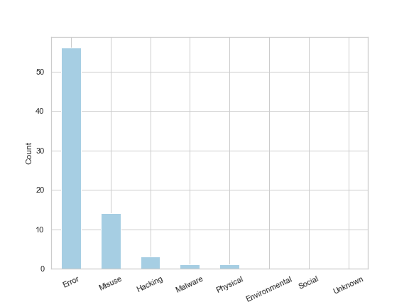
The resulting bar chart shows that of the 73 developer related incidents, 56 were errors (i.e. accidental) and the remaining 17 related to misuse, hacking and malware (i.e. malicious). Helpfully, VERIS provides a summary of the incident which I extracted for the 14 incidents labelled as ‘misuse’ and outputted them to a csv to make it easier to read:
最终的条形图显示,在73个与开发人员相关的事件中,有56个是错误(即意外),其余17个是与滥用,黑客攻击和恶意软件(即恶意)有关。 很有帮助的是,VERIS提供了该事件的摘要,该摘要是我从标记为“滥用”的14个事件中提取出来的,并将它们输出到csv中以便于阅读:
df_actors_developers_misuse = veris_df.loc[(veris_df['actor.internal.variety.Developer'] == True) & (veris_df['action.Misuse'] == True)]df_actors_developers_misuse['summary'].to_csv('developers_misuse_summary.csv', index=False, header=False)One particular incident was caused by a senior IT director in the U.S who was also a developer. This developer:
一个特定的事件是由美国的一位高级IT主管(也是一名开发人员)引起的。 该开发者:
“added a secret code to “random” number-generating computer software in 2005 that allowed him to narrow the drawing-winning odds in multiple games from as great as 5 million-to-1 down to 200-to-1… He hijacked at least five winning drawings totalling more than $24 million in prizes in Colorado, Wisconsin, Iowa, Kansas and Oklahoma”
“在2005年向“随机”生成数字的计算机软件中添加了一个秘密代码,使他能够将多款游戏中的抽奖赔率从500万对1缩小到200对1……他在科罗拉多州,威斯康星州,爱荷华州,堪萨斯州和俄克拉荷马州的至少五份获奖图纸,总奖金超过2400万美元。”
Very naughty indeed. [I’ve uploaded the remaining summaries to my GitHub]
确实很调皮。 [我已将其余摘要上传到我的GitHub ]
What this Cyber Domain Deep Dive shows is how we can go from asking the very general question “who’s causing cyber incidents” all the way through to discovering insights about how valuable the integrity of source code is.
这个“网络域名深度学习”展示的是我们如何从一个普遍的问题“谁造成网络事件”一直到发现有关源代码完整性的价值的见解。
2.什么样的行为会导致网络事件? (2. What sort of actions lead to a cyber incident?)
Having explored how developers typically cause cyber incidents, I take a step back and analyse the likely threat actions for all external, internal and partner actors. This is useful because organisations need to know how their internal and external threats are likely to materialise, so they can put adequate protective controls in place.
在探讨了开发人员通常造成网络事件的方式后,我退后一步,分析了所有外部,内部和合作伙伴可能采取的威胁措施。 这很有用,因为组织需要知道其内部和外部威胁可能如何实现,以便可以采取适当的保护性控制措施。
I wanted to visualise this insight using more of Plotly’s interactive charts, and decided a Sankey diagram would elegantly show the relationship and flows between actor and action. To create a Sankey then, I filtered the veris_df dataframe on actor and action:
我想使用更多Plotly的交互式图表来形象化此见解,并决定使用Sankey图优雅地显示演员与动作之间的关系和流程。 然后,要创建Sankey,我在actor和action上过滤了veris_df数据veris_df :
df_action_actor = v.enum_summary(veris_df, 'action', by='actor')Tidied the resulting dataframe up a bit:
将结果数据帧整理一下:
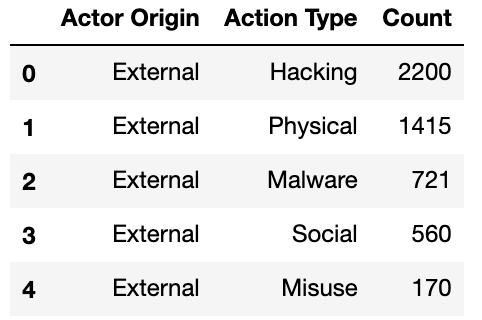
df_action_actor.drop(['n', 'freq'], axis=1, inplace=True)df_action_actor.columns = ['Actor Origin', 'Action Type', 'Count']df_Unknown_3 = df_action_actor[df_action_actor['Actor Origin'] == 'actor.Unknown']df_action_actor.drop(df_Unknown_3.index, inplace=True)And used a mapping function to stop the code outputting ‘actor’ before each word i.e. ‘actor.External, actor.Internal, actor.Partner’:
并使用了映射功能来停止代码在每个单词(即“ actor.External,actor.Internal,actor.Partner”)之前输出“ actor”:
map_origin = {'actor.External':'External', 'actor.Internal':'Internal', 'actor.Partner':'Partner'}df_action_actor['Actor Origin'] = df_action_actor['Actor Origin'].map(map_origin)df_action_actor.head()The resulting dataframe now ready to produce a Sankey diagram looked like this:
现在准备好生成Sankey图的结果数据框如下所示:
I passed the above df_action_actor dataframe to the pre-built function gen_Sankey, specified the columns from which to produce the levels and values within the Sankey diagram, and outputted the resulting diagram by calling plot:
我将上面的df_action_actor数据帧传递给了预先构建的函数 gen_Sankey ,指定了从中生成Sankey图中的电gen_Sankey值的列,并通过调用plot输出了结果图:
fig_4 = genSankey(df_action_actor, cat_cols=['Actor Origin', 'Action Type'], value_cols='Count', title='Sankey Diagram for Veris Community Database')plot(fig_4, filename = 'Cyber Actions Sankey Diagram', auto_open=True)The Sankey diagram suggests that some incidents within the dataset have had multiple action types assigned to them, because the count of internal, external and partner incidents increases slightly in comparison to the previous chart (~12% difference in incidents recorded when cutting the data by action type).
Sankey图表表明,数据集中的某些事件已分配了多种操作类型,因为内部,外部和伙伴事件的计数与上一个图表相比略有增加(将数据切割成约12%的事件差异)。动作类型)。
网络域名深度学习2 (Cyber Domain Deep Dive 2)
The diagram shows that ~90% of incidents related to internal actors are caused by Error or Misuse. This insight tells us that security departments can expect internal threats materialising as user behaviour, rather than malware or hacking activities, which typically require slightly different monitoring techniques. This is why the field of User Behaviour Analytics (UBA) has exploded recently and is enabling organisations to detect when a user is behaving abnormally in comparison to other users or themselves over a period of time.
该图显示,约90%的与内部参与者有关的事件是由错误或滥用引起的。 这种见解告诉我们,安全部门可以预期内部威胁会随着用户行为的发生而发生,而不是通常需要稍微不同的监视技术的恶意软件或黑客活动。 这就是用户行为分析(UBA)领域最近爆炸式增长的原因,它使组织能够检测到一段时间内与其他用户或他们自己相比,用户的异常行为。
Incidents related to external actors are caused by a more diverse set of actions. This makes sense given the actors have to employ more creative ways of obtaining access to a system in order to achieve their outcome. The ‘Hacking’ action seemed a little vague: what exactly does hacking entail? Can we isolate some trends in hacking? To answer these questions I had to add a datetime index to the dataframe and filter on incidents caused by hacking actions (resulting dataframe called combined ). For further information on how I did this please refer to my GitHub because it is too long to include in this article.
与外部行为者有关的事件是由一组更多样化的行为引起的。 鉴于参与者必须采用更多创造性的方法来获取对系统的访问权才能实现其结果,因此这是有道理的。 “黑客”行动似乎有点含糊:黑客到底需要什么? 我们可以隔离一些黑客趋势吗? 为了回答这些问题,我不得不日期时间索引添加到数据框和过滤器引起的黑客攻击行为(导致数据帧称为事件combined )。 有关如何执行此操作的更多信息,请参阅我的GitHub,因为它太长了,无法包含在本文中。
After cleaning the dataset I was able to extract the following plot:
清理数据集后,我可以提取以下图:
ax1 = combined.iloc[:, 2:10].plot(kind='bar', stacked=True, figsize=(10,5))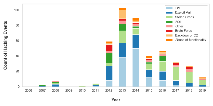
The chart shows more detail about what actions are constituted as ‘Hacking’. Denial of Service (DoS) attacks plagued organisations in 2013 and 2014 but, in recent times, appear to have become less of a threat to the organisations in the dataset. This is possibly because anti-DoS technologies have become more advanced and prevalent in recent years: Web Application Firewalls (WAFs) enable rate limiting on incoming web traffic, and are typically offered as standard by Cloud vendors on Content Distribution Networks (CDNs), Application Load Balancers and API Gateways.
该图表显示了有关哪些行为构成“黑客行为”的更多详细信息。 2013年和2014年,拒绝服务(DoS)攻击困扰着组织,但最近看来,它对数据集中的组织的威胁似乎已减少。 这可能是因为近年来,反DoS技术已经变得更加先进和流行:Web应用防火墙(WAF)可以限制传入Web流量的速率,通常由云供应商在内容分发网络(CDN),应用程序上作为标准提供负载平衡器和API网关。
However, the VERIS dataset is likely going out of fashion right now, because the data suggests there has been a steady decrease in hacking attacks since 2013. There are plenty of other datasets and statistics which indicate this is not the case. Indeed, as someone who works in cyber security and has a view on a variety of organisations, I can say with first hand experience that the number of cyber-attacks is on the rise.
但是,VERIS数据集现在可能会过时,因为数据表明自2013年以来黑客攻击一直在稳定下降。还有许多其他数据集和统计数据表明情况并非如此。 的确,作为从事网络安全工作并且对各种组织有所了解的人,我可以凭第一手经验说网络攻击的数量正在增加。
3.组织检测和响应网络事件需要多长时间? (3. How long does it take for organisations to detect and respond to cyber incidents?)
Being able to detect and respond to cyber incidents in a timely manner can save entire organisations from going under. The longer it takes to detect and respond to a cyber incident, the more risk that organisation faces, and the greater potential for harm.
能够及时检测和响应网络事件可以使整个组织免于倒闭。 检测和响应网络事件花费的时间越长,组织面临的风险就越大,危害的可能性就越大。
VERIS breaks down a cyber incident into 4 stages and records the time units for how long it takes for an organisation to reach that stage:
VERIS将网络事件分为四个阶段,并记录组织达到该阶段所需时间的时间单位:

- Compromise: the point at which the actor has gained access to or compromised an information asset e.g. gained access to a sales database 损害:参与者获得或损害信息资产的位置,例如获得对销售数据库的访问权
- Exfiltration: the point at which the actor takes the non-public data from the victim organisation (not applicable to all incidents) 渗透:参与者从受害组织获取非公开数据的时间(不适用于所有事件)
- Discovery: the point at which the organisation realises an incident has occurred 发现:组织意识到已发生事件的时间点
- Containment: the point at which the organisation stops the incident from occurring or restores to business as usual. 遏制:组织停止事件发生或照常营业的点。
N.B. VERIS only records the time to reach each stage in time units i.e. seconds, minutes, hours, and not the actual time stamp for reasons of confidentiality.
出于保密目的,NB VERIS仅以时间单位(即秒,分钟,小时)记录到达每个阶段的时间,而不记录实际时间戳。
I wanted to understand how long it takes for organisations to detect and respond to cyber incidents, and represent that information using a heat map.
我想了解组织检测和响应网络事件并使用热图表示这些信息所花费的时间。
To do this, I first had to extract the timeline information from the dataset. I wrote a function (get_timeline_df(x, event)) that filters the dataset on a particular stage of incident and formats the resulting dataframe for the next stage of processing. See my GitHub for more details on the get_timeline_df function. I called the function 4 times, one for each stage of the incident:
为此,我首先必须从数据集中提取时间轴信息。 我编写了一个函数( get_timeline_df(x, event) ),该函数在事件的特定阶段过滤数据集,并格式化结果数据框以用于下一阶段的处理。 有关get_timeline_df函数的更多详细信息,请参见我的GitHub 。 我对函数调用了4次,事件的每个阶段调用一次:
compromise_time = get_timeline_df(‘timeline.compromise.unit’, ‘Compromise’)discovery_time = get_timeline_df('timeline.discovery.unit', 'Discovery')exfiltration_time = get_timeline_df('timeline.exfiltration.unit', 'Exfiltration')containment_time = get_timeline_df('timeline.containment.unit', 'Containment')And then concatenated the 4 dataframes into one:
然后将这四个数据帧连接成一个:
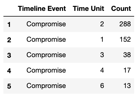
timeline_df = pd.concat([compromise_time, discovery_time, exfiltration_time, containment_time])
timeline_df.head()
The resulting dataframe looked like this:
结果数据帧如下所示:
Within the get_timeline_df function, I map the string time unit to an integer value from 1 to 8 i.e. ‘Seconds’:1,…, ‘Days’:4,…, ‘Never’:8, so I could sort the values from longest to shortest timespan.
在get_timeline_df函数中,我将字符串时间单位映射到1到8的整数值,即'Seconds':1,...,'Days':4,...,'Never':8,所以我可以将最长的值排序最短的时间。
Heat maps can be created in seaborn by passing the data as a matrix. I converted the timeline_df dataframe into a matrix using the pd.pivot() function, reindexed the data against the 4 stages of an incident, and sorted the data from longest time unit to shortest:
通过将数据作为矩阵传递,可以在seaborn中创建热图。 我使用pd.pivot()函数将timeline_df数据帧转换为矩阵,针对事件的4个阶段对数据重新编制了索引,并将数据从最长的时间单位排序为最短的时间单位:
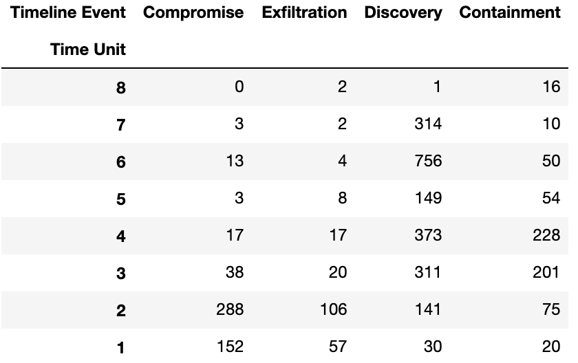
timeline_matrix = timeline_df.pivot('Time Unit', 'Timeline Event', 'Count')timeline_matrix.columnscolumns_matrix_titles = ["Compromise","Exfiltration", "Discovery", "Containment"]timeline_matrix = timeline_matrix.reindex(columns=columns_matrix_titles)timeline_matrix.sort_index(ascending=False, inplace=True)The resulting matrix looked like this:
生成的矩阵如下所示:
Now I simply pass the matrix to seaborn’s heat map function and relabel the time units back to string values so they can be easily understood:
现在,我只需将矩阵传递给Seaborn的热图函数,然后将时间单位重新标记为字符串值,以便可以轻松理解它们:
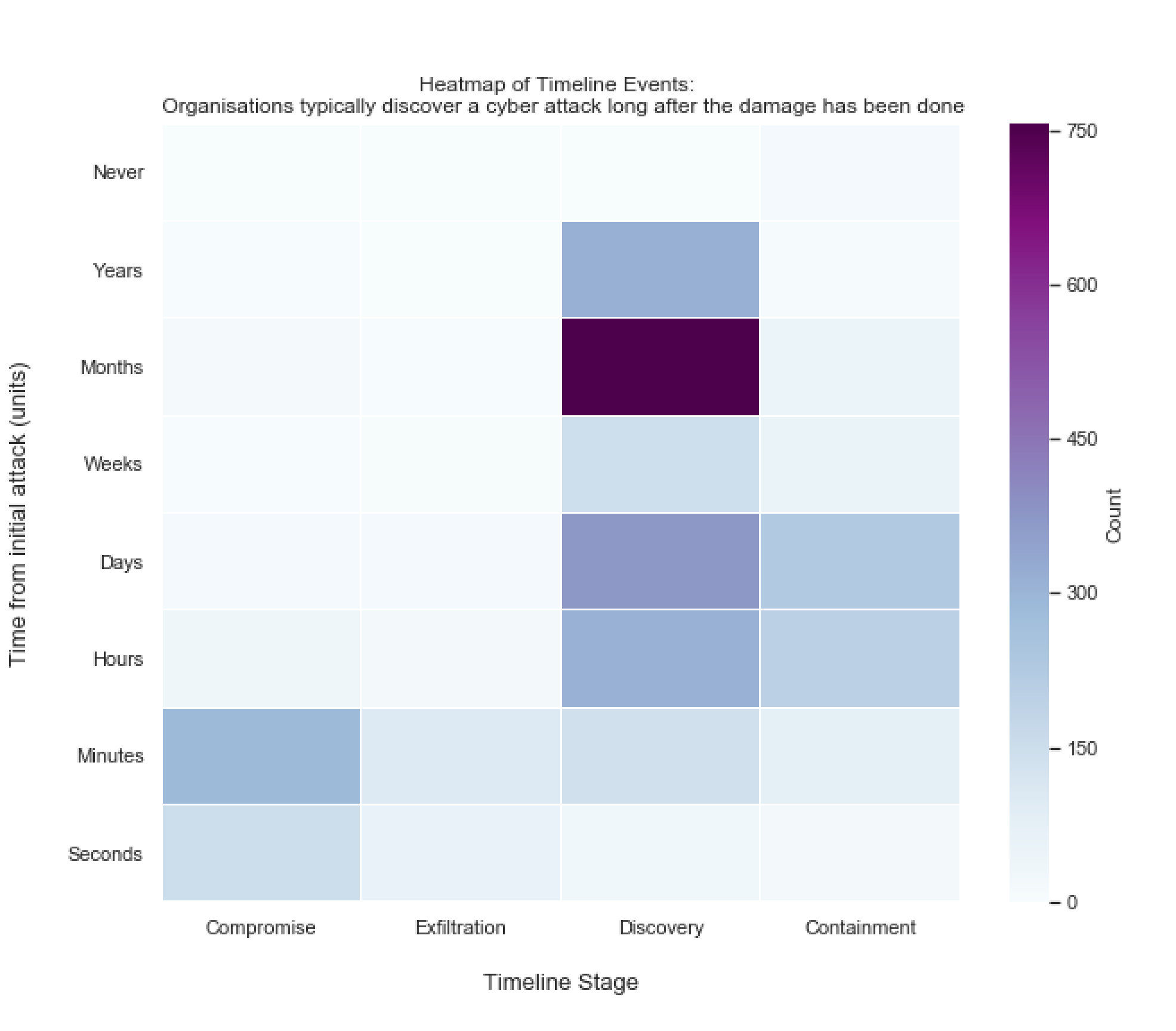
import seaborn as snsfig_heatmap = plt.figure(figsize=(10,8))r = sns.heatmap(timeline_matrix, cmap='BuPu', cbar_kws={'label': 'Count'}, linewidths=.05)plt.yticks([7.5,6.5,5.5,4.5,3.5,2.5,1.5,0.5], ['Seconds', 'Minutes', 'Hours', 'Days', 'Weeks', 'Months', 'Years', 'Never'], rotation=0)The following heat map resulted:
得到以下热图:
网络域名深度学习3 (Cyber Domain Deep Dive 3)
What’s immediately obvious from the heat map is that it takes a shorter amount of time to compromise and exfiltrate data than it does for organisations to even realise anything has happened. The high count of incidents that were discovered months after the initial attack correlates well with the accepted 2017 industry average of 101 days to discover a cyber incident according to FireEye.
从热图中可以立即看出,泄露和泄露数据所需的时间比组织甚至意识到任何事情都需要的时间短。 根据FireEye的数据 ,首次攻击数月后发现的大量事件与2017年公认的发现网络事件的101天行业平均水平高度相关。
Cyber professionals often to refer to the time between initial compromise and discovery the ‘dwell time’. One reason the dwell time figure is so high may be because of a particular subset cyber incidents referred to as ‘Advanced Persistent Threats’ or ‘APTs’. APTs like to remain unnoticed on an organisation’s systems for prolonged periods of time. Staying there helps the threat actor understand how the organisation works in order to achieve their objective e.g. steal data.
网络专业人员通常会指从最初的妥协到发现“停留时间”之间的时间。 驻留时间如此之高的一个原因可能是由于特定的网络事件子集被称为“高级持久威胁”或“ APT”。 APT希望长时间不被组织的系统关注。 呆在那儿有助于威胁者了解组织如何工作以实现其目标,例如窃取数据。
Why does dwell time matter? A recent paper indicates there is a correlation between dwell time and the average cost of a cyber attack. The longer the dwell time the more costly the attack.
为什么停留时间很重要? 最近的一篇论文表明,驻留时间与网络攻击的平均成本之间存在相关性。 停留时间越长,攻击成本就越高。
Organisations can measure the effectiveness of their threat detection controls using their average dwell time as a KPI. Only through measurement can organisations get a true understanding of their cyber risk.
企业可以使用平均停留时间作为KPI来衡量威胁检测控制措施的有效性。 只有通过衡量,组织才能真正了解其网络风险。
网络安全是一个数据问题 (Cyber Security is a Data Problem)
Everything that takes place in the digital world is recorded. A user clicking on a link in their browser, an employee getting their password wrong 3 times, a file transferred from one network location to another, are events recorded in digital format. These digital events can be used to protect organisations from cyber incidents, but only if the mountains of data that users, employees and systems produce each day can be wielded as a tool for good.
记录了数字世界中发生的一切。 用户单击浏览器中的链接,员工错误输入密码3次,文件从一个网络位置传输到另一个网络,都是以数字格式记录的事件。 这些数字事件可以用来保护组织免受网络事件的侵害,但是前提是用户,员工和系统每天产生的海量数据可以作为有益的工具使用。
The VERIS Community Dataset is just one use case of applying data analysis to protect digital systems. Through observing general trends across thousands of incidents, organisations can understand where the threats are most likely to come from and how they’re likely going to try and cause harm.
VERIS社区数据集只是应用数据分析来保护数字系统的一个用例。 通过观察成千上万起事件的总体趋势,组织可以了解威胁最有可能来自何处以及如何尝试造成危害。
As Geoffrey Moore stated-
正如杰弗里·摩尔(Geoffrey Moore)所说:
Without big data analytics, companies are blind and deaf, wandering out onto the Web like deer on a freeway.
如果没有大数据分析,公司就会视而不见,充耳不闻,就像高速公路上的鹿一样徘徊在网络上。
翻译自: https://towardsdatascience.com/a-data-driven-approach-to-understanding-cyber-attacks-5cd8b5f91abe
数据驱动式攻击


 被折叠的 条评论
为什么被折叠?
被折叠的 条评论
为什么被折叠?
 到【灌水乐园】发言


