


 本文深入解析CSS定位模式,包括静态、相对、绝对、固定和粘性定位的特性与使用场景,探讨各模式如何影响元素位置及布局,适用于网页设计与前端开发的学习与实践。
定位
定位的使用
- 浮动可以让多个块级盒子一行没有缝隙排列显示, 经常用于横向排列盒子。
- 定位则是可以让盒子自由的在某个盒子内移动位置或者固定屏幕中某个位置,并且可以压住其他盒子。
定位模式分类
静态定位 static(了解)
静态定位是元素的默认定位方式,无定位的意思。
选择器{ position: static;}
- 静态定位按照标准流特性摆放位置,它没有边偏移
- 静态定位在布局时很少用到
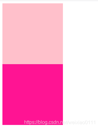
相对定位 relative(重要)
特点:(务必记住)
1. 它是相对于自己原来的位置来移动的(移动位置的时候参照点是自己原来的位置)。
2. 原来在标准流的位置继续占有,后面的盒子仍然以标准流的方式对待它。(不脱标)
案例
<style>
        .box1 {
            position: relative;
            top: 100px;
            left: 100px;
            width: 200px;
            height: 200px;
            background-color: pink;
        }
        .box2 {
            width: 200px;
            height: 200px;
            background-color: deeppink;
        }
</style>

<body>
    <div class="box1"></div>
    <div class="box2"></div>
</body>
示例效果如下:
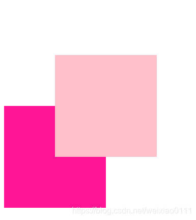
绝对定位 absolute(重要)
绝对定位的特点:(务必记住)
1. 如果没有祖先元素或者祖先元素没有定位,则以浏览器为准定位(Document 文档)。
2. 如果祖先元素有定位(相对、绝对、固定定位),则以最近一级的有定位祖先元素为参考点移动位置。
3. 绝对定位不再占有原先的位置。(脱标)
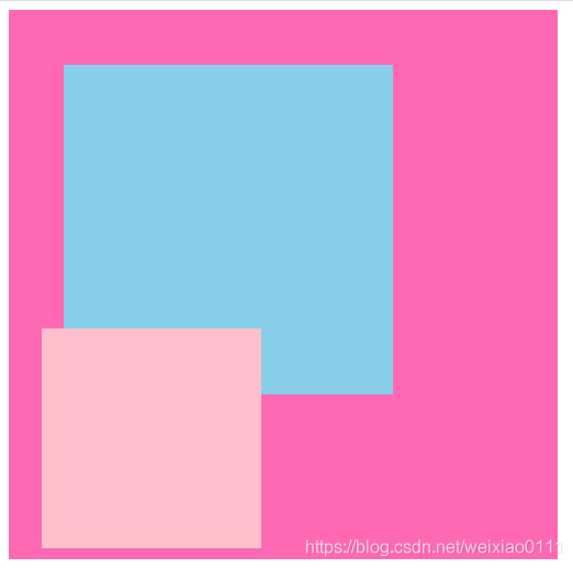
案例(祖父有定位,父亲无定位)
<style>
        .yeye {
            position: relative;
            width: 400px;
            height: 400px;
            background-color: hotpink;
            padding: 50px;
        }
        .father {
            width: 300px;
            height: 300px;
            background-color: skyblue;
        }
        .son {
            position: absolute;
            left: 30px;
            bottom: 10px;
            width: 200px;
            height: 200px;
            background-color: pink;
        }
    </style>
<body>
    <div class="yeye">
            <div class="father">
                    <div class="son"></div>
            </div>
    </div>
</body>
示例效果如下:
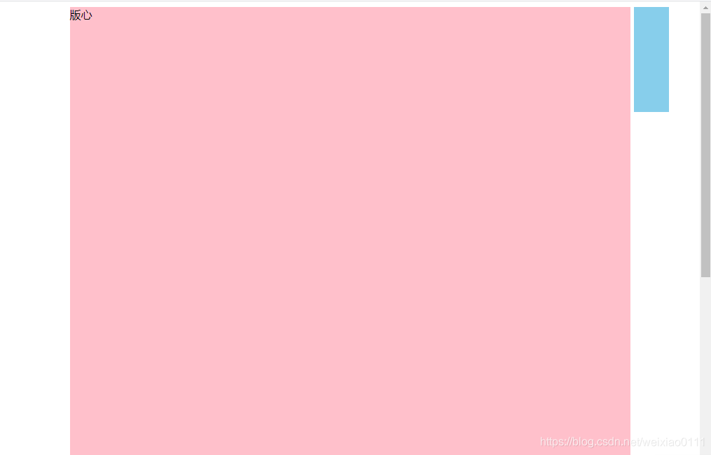
固定定位 fixed (重要)
固定定位的特点:(务必记住)
1. 以浏览器的可视窗口为参照点移动元素。
- 跟父元素没有任何关系
- 不随滚动条滚动。
2. 固定定位不在占有原先的位置。
小算法:(绝对定位居中也可用)
1. 让固定定位的盒子 left: 50%. 走到浏览器可视区(也可以看做版心) 的一半位置。
2. 让固定定位的盒子 margin-left: 版心宽度的一半距离。 多走 版心宽度的一半位置
就可以让固定定位的盒子贴着版心右侧对齐了。
应用场景:两侧固定的广告
案例
<style>
        .w {
            width: 800px;
            height: 1400px;
            background-color: pink;
            margin: 0 auto;
        }
        .fixed {
            position: fixed;
            left: 50%;
            margin-left: 405px;
            width: 50px;
            height: 150px;
            background-color: skyblue;
        }
    </style>
<body>
    <div class="fixed"></div>
    <div class="w">版心</div>
</body>
示例效果如下:
粘性定位 sticky(了解)
粘性定位的特点:
1. 以浏览器的可视窗口为参照点移动元素(固定定位特点)
2. 粘性定位占有原先的位置(相对定位特点)
3. 必须添加 top 、 left、 right、 bottom 其中一个才有效
跟页面滚动搭配使用。 兼容性较差,IE 不支持。
综合案例(子绝父相)
① 子级绝对定位,不会占有位置,可以放到父盒子里面的任何一个地方,不会影响其他的兄弟盒子。
② 父盒子需要加定位限制子盒子在父盒子内显示。
③ 父盒子布局时,需要占有位置,因此父亲只能是相对定位。
应用场景:淘宝焦点图(小箭头浮在盒子上)
<style>
* {
margin: 0;
padding: 0;
}
li {
list-style: none;
}
.tb-promo {
position: relative;
width: 520px;
height: 280px;
margin: 100px auto;
}
.tb-promo img {
width: 520px;
height: 280px;
}
.prev,
.next {
position: absolute;
top: 50%;
margin-top: -15px;
width: 20px;
height: 30px;
background-color: rgba(0,0,0,.3);
line-height: 30px;
text-align: center;
color: #fff;
text-decoration: none;
}
.prev {
left: 0;
border-top-right-radius: 15px;
border-bottom-right-radius: 15px;
}
.next {
right: 0;
border-top-left-radius: 15px;
border-bottom-left-radius: 15px;
}
.promo-nav {
position: absolute;
bottom: 10px;
left: 50%;
margin-left: -35px;
width: 70px;
height: 13px;
background-color: rgba(255,255,255,.3);
border-radius: 7px;
}
.promo-nav li {
float: left;
width: 8px;
height: 8px;
background-color: #fff;
border-radius: 4px;
margin: 3px;
}
.promo-nav .selected {
background-color: #ff5000;
}
</style>
<div class="tb-promo">
<img src="taobao.jpg" alt="">
<a href="#" class="prev"> <</a>
<a href="#" class="next"> ></a>
<ul class="promo-nav">
<li class="selected"></li>
<li></li>
<li></li>
<li></li>
<li></li>
</ul>
</div>
示例效果如下:

定位的总结
| 定位模式 | 是否脱标 | 移动位置 | 是否常用 |
| static 静态定位 | 否 | 不能使用边偏移 | 很少 |
| relative 相对定位 | 否 (占有位置) | 相对于自身位置移 动 | 常用 |
| absolute绝对定位 | 是(不占有位置) | 带有定位的父级 | 常用 |
| fixed 固定定位 | 是(不占有位置) | 浏览器可视区 | 常用 |
| sticky 粘性定位 | 否 (占有位置) | 浏览器可视区 | 当前阶段少 |
定位的拓展
脱标的盒子不会触发外边距塌陷
绝对定位(固定定位)会完全压住盒子
- 浮动元素不同,只会压住它下面标准流的盒子,但是不会压住下面标准流盒子里面的文字(图片)
- 但是绝对定位(固定定位) 会压住下面标准流所有的内容。
- 浮动之所以不会压住文字,因为浮动产生的目的最初是为了做文字环绕效果的。 文字会围绕浮动元素


 扫一扫
扫一扫


 571
571

 被折叠的 条评论
为什么被折叠?
被折叠的 条评论
为什么被折叠?
 到【灌水乐园】发言


