


本文同步发表于我的微信公众号,微信搜索 程语新视界 即可关注,每个工作日都有文章更新
一、Popup 核心概念
1. 功能定位
- 作用:非模态弹窗,用于临时展示附加内容,点击外部可关闭。
- 与Dialog区别:
特性 Popup Dialog 交互方式 点击外部关闭 需主动确认/取消 使用场景 下拉菜单、气泡提示 强交互(如确认框)
2. 弹出方向
支持 8种方向 和 自定义偏移:
PopupPosition.Top         // 上方弹出
PopupPosition.Bottom      // 下方弹出
PopupPosition.Left        // 左侧弹出
PopupPosition.Right       // 右侧弹出
PopupPosition.TopLeft     // 左上弹出
PopupPosition.TopRight    // 右上弹出
PopupPosition.BottomLeft  // 左下弹出
PopupPosition.BottomRight // 右下弹出
二、基础使用与常用API
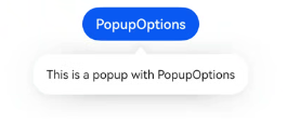
1. 基础弹出窗
import { Popup } from '@kit.ArkUI';

@State isShowPopup: boolean = false;

Button('显示Popup')
  .onClick(() => {
    this.isShowPopup = true;
  })
  .bindPopup({
    builder: this.PopupContent, // 自定义内容
    placement: PopupPosition.Bottom,
    onStateChange: (isVisible) => {
      this.isShowPopup = isVisible; // 同步状态
    }
  })

@Builder
PopupContent() {
  Column() {
    Text('这是Popup内容').fontSize(16)
    Button('关闭').onClick(() => {
      this.isShowPopup = false;
    })
  }
  .padding(12)
}关键API:
bindPopup(config: PopupOptions):绑定弹出窗配置。placement:控制弹出方向。onStateChange:监听显隐状态。
2. 箭头与边框样式
.bindPopup({
  builder: this.PopupContent,
  placement: PopupPosition.Bottom,
  arrow: { // API 12+
    width: 10,
    height: 5,
    color: Color.White
  },
  border: {
    width: 1,
    color: '#ccc',
    radius: 8
  }
})
三、高级功能详解
1. 动态控制显示/隐藏
// 通过状态变量控制
@State isShow: boolean = false;

Button('动态控制')
  .onClick(() => {
    this.isShow = !this.isShow; // 切换状态
  })
  .bindPopup({
    builder: this.PopupContent,
    placement: PopupPosition.Right,
    enableArrow: true,
    showInSubWindow: true // 允许子窗口模式
  })
  .popupVisibility(this.isShow) // 绑定状态
2. 嵌套交互(Popup中再触发Popup)
@Builder
NestedPopup() {
  Column() {
    Button('打开二级Popup')
      .bindPopup({
        builder: () => Text('二级Popup'),
        placement: PopupPosition.Right
      })
  }
}

Button('一级Popup')
  .bindPopup({
    builder: this.NestedPopup,
    placement: PopupPosition.Bottom
})注意:需避免无限嵌套导致性能问题。
3. 自定义动画与蒙层
.bindPopup({
  builder: this.PopupContent,
  placement: PopupPosition.Top,
  animation: { // API 12+
    enter: {
      duration: 300,
      curve: Curve.EaseOut,
      effect: ScaleEffect({ scale: 0.8 })
    },
    exit: {
      duration: 200,
      curve: Curve.EaseIn
    }
  },
  mask: { // 蒙层配置
    color: '#66000000',
    enable: true
  }
})
四、案例:下拉筛选菜单
@Entry
@Component
struct FilterPage {
  @State isShowFilter: boolean = false;
  @State selectedOption: string = '全部';

  @Builder
  FilterPopup() {
    Column() {
      ForEach(['全部', '未完成', '已完成'], (item) => {
        Text(item)
          .fontSize(16)
          .padding(10)
          .width('100%')
          .onClick(() => {
            this.selectedOption = item;
            this.isShowFilter = false;
          })
      })
    }
    .width(120)
  }

  build() {
    Column() {
      Button(this.selectedOption)
        .bindPopup({
          builder: this.FilterPopup.bind(this),
          placement: PopupPosition.Bottom,
          onStateChange: (isVisible) => {
            this.isShowFilter = isVisible;
          }
        })
        .popupVisibility(this.isShowFilter)
    }
  }
}功能扩展:
- 添加搜索框实现动态过滤。
- 使用
@Link实现与父组件数据联动。
五、调试与常见问题
1. 性能优化
- 减少嵌套层级:避免在Popup内嵌套复杂组件。
- 复用Popup实例:对高频弹窗使用单例模式。
2. 常见问题
| 问题 | 解决方案 |
|---|---|
| Popup不显示 | 检查popupVisibility或onStateChange状态同步 |
| 位置偏移异常 | 调整placement或手动设置offset |
| 点击穿透 | 启用蒙层mask: { enable: true } |
六、总结对比
| 功能 | API/方法 | 适用场景 |
|---|---|---|
| 基础Popup | bindPopup + placement | 简单气泡提示、菜单 |
| 动态控制 | popupVisibility绑定状态 | 需要编程控制的场景 |
| 高级动画 | animation配置 | 个性化交互体验 |
通过灵活运用这些功能,可高效实现鸿蒙应用的轻量级弹窗交互


 扫一扫
扫一扫


 1139
1139

 被折叠的 条评论
为什么被折叠?
被折叠的 条评论
为什么被折叠?
 到【灌水乐园】发言


