


2022年2月21日
学习CSS属性书写顺序
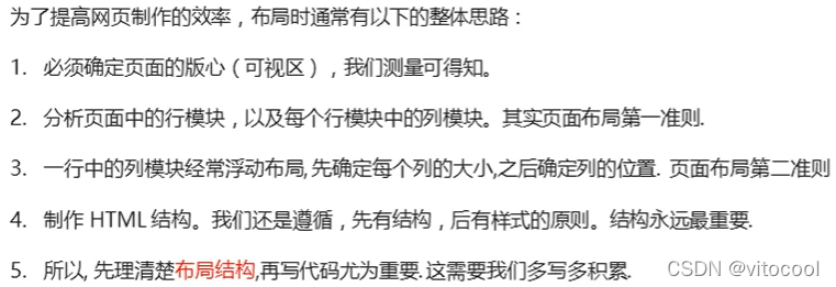
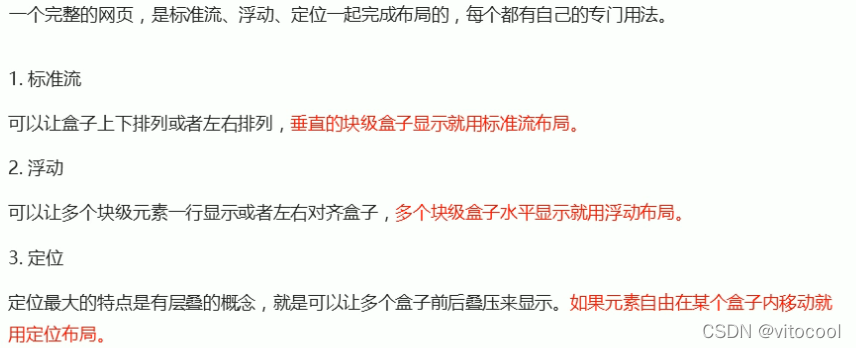
页面布局整体思路
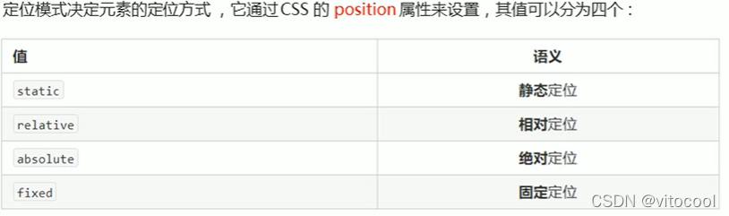
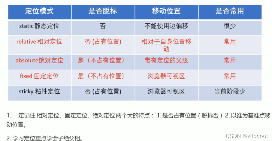
定位:静态定位、相对定位、绝对定位、固定定位
定位的扩展知识
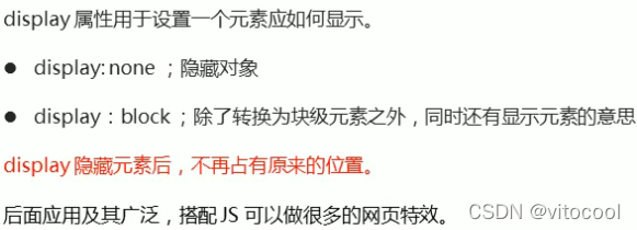
元素的隐藏与显示:display、visibility、overflow
今日学习内容:
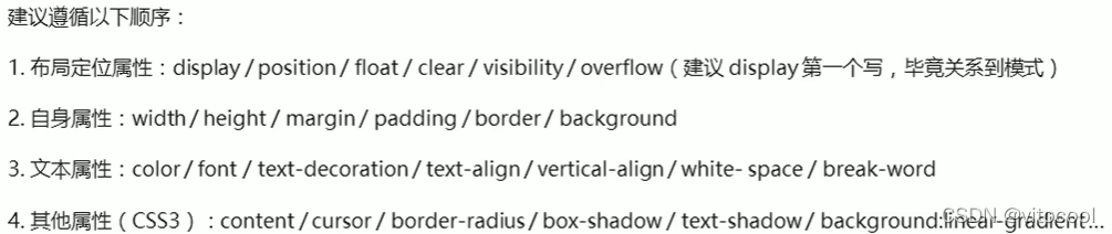
1 CSS属性书写顺序
2 页面布局整体思路
3 定位
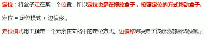
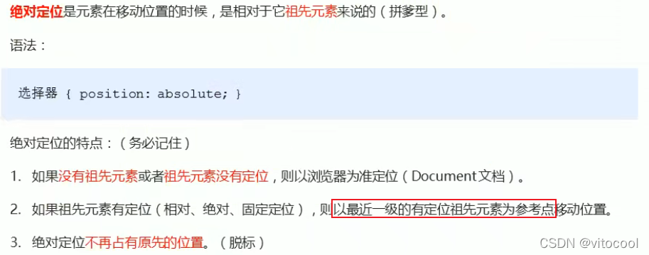
3.1 定位的作用

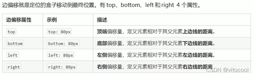
3.2 定位组成
3.2.1 定位模式
3.2.2 边偏移
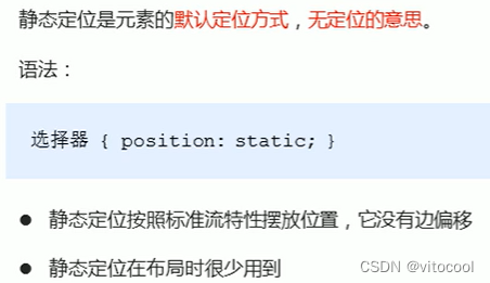
3.3 静态定位 static
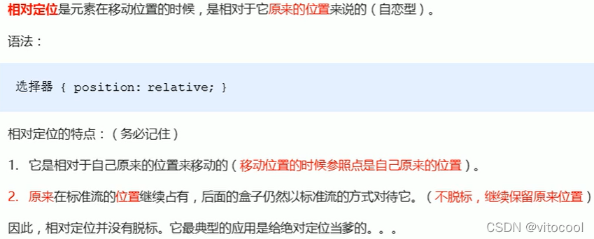
3.4 相对定位 relative
<head>
	<style type="text/css">
		.div1 {
			position: static;
			width: 100px;
			height: 100px;
			background-color: pink;
            color: black;
			line-height: 100px;
			text-align: center;
		}
		.div2 {
			position: relative;
			top: 20px;
			left: 20px;
			width: 100px;
			height: 100px;
			background-color: black;
			color: white;
			line-height: 100px;
			text-align: center;
		}
	</style>
</head>
<body>
	<h3>相对定位</h3>
	<div class="div2">相对定位</div>
	<div class="div1">静态定位</div>
</body>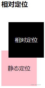
3.5 绝对定位 absolute
<head>
	<style type="text/css">
		.div1 {
			position: static;
			width: 120px;
			height: 100px;
			background-color: pink;
			color: black;
			line-height: 100px;
			text-align: center;
		}
		.div2 {
			position: relative;
			top: 20px;
			left: 20px;
			width: 120px;
			height: 100px;
			background-color: black;
			color: white;
			line-height: 100px;
			text-align: center;
		}
		.div3 {
			position: absolute;
			top: 500px;
			left: 120px;
			width: 120px;
			height: 100px;
			background-color: black;
			color: white;
			line-height: 100px;
			text-align: center;
		}
		.div4 {
			position: absolute;
			top: 10px;
			left: 120px;
			width: 120px;
			height: 100px;
			background-color: black;
			color: white;
			line-height: 100px;
			text-align: center;
		}
	</style>
</head>
<body>
	<h3>绝对定位</h3>
	<div class="div1">
		父元素静态定位
		<div class="div3">子元素绝对定位</div>
	</div>
	<div class="div2">
		父元素相对定位
		<div class="div4">子元素绝对定位</div>
	</div>
</body>
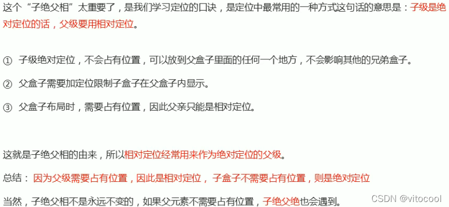
3.6 子绝父相
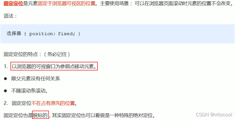
3.7 固定定位 fixed
<head>
	<style type="text/css">
        .div5 {
			position: fixed;
			top: 0;
			width: 100%;
			height: 50px;
			background-color: black;
			color: white;
			line-height: 50px;
			text-align: center;
		}
	</style>
</head>
<body>
    <h3>固定定位</h3>
	<div class="div5">
		固定定位
	</div>
</body>
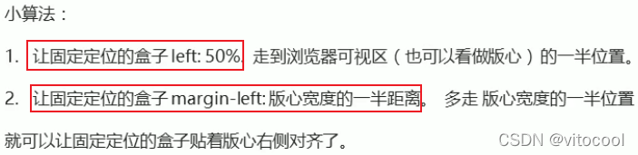
3.7.1 固定定位到版心右侧
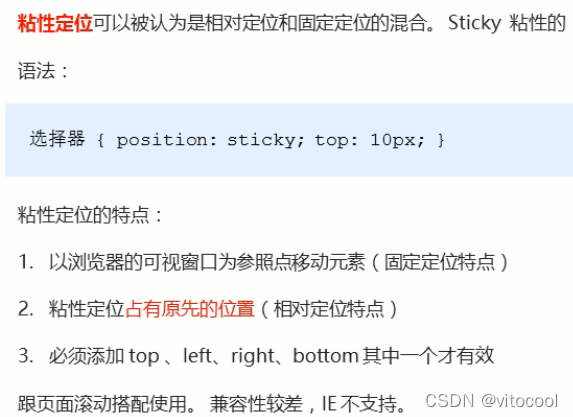
3.8 粘性定位 sticky
3.9 定位总结
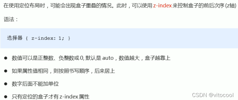
3.10 定位的叠放顺序 z-index
<head>
	<meta charset="UTF-8">
	<title>Document</title>
	<style type="text/css">
        .div2 {
			position: relative;
			top: 20px;
			left: 20px;
			width: 120px;
			height: 100px;
			background-color: black;
			color: white;
			line-height: 100px;
			text-align: center;
			z-index: 10;
		}
        .div7 {
			position: relative;
			top: -10px;
			left: 100px;
			width: 120px;
			height: 100px;
			background-color: pink;
			color: white;
			line-height: 100px;
			text-align: center;
			z-index: -1;
		}
	</style>
</head>
<body>
    <h3>定位叠放次序</h3>
	<div class="div2">
		在上
	</div>
	<div class="div7">
		在下
    </div>
</body>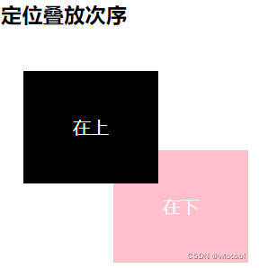
3.11 绝对定位的盒子居中算法
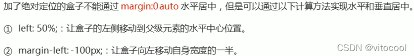
但是相对定位可以通过margin:0 auto实现水平居中,因为相对定位不脱标
<head>
    <style>
        .div8 {
			position: relative;
			height: 200px;
			width: 100%;
			border: 1px solid #000;
		}
		.div9 {
			position: absolute;
			/*水平居中*/
			left: 50%;
			margin-left: -50px;
			/*垂直居中*/
			top: 50%;
			margin-top: -50px;
			width: 100px;
			height: 100px;
			background-color: black;
		}
	</style>
</head>
<body>
    <h3>绝对定位的盒子居中算法</h3>
    <div class="div8">
    	<div class="div9"></div>
    </div>
</body>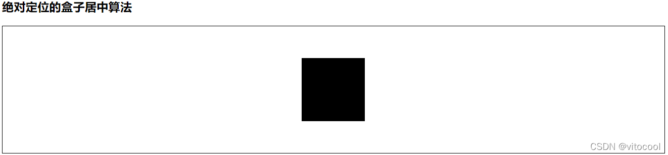
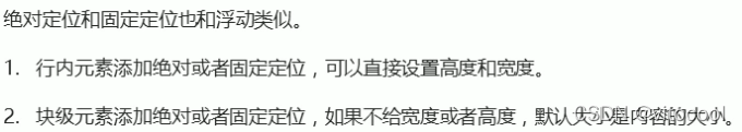
3.12 定位特殊特性
浮动具有行内块元素特性 https://blog.youkuaiyun.com/vitocool/article/details/122617577?spm=1001.2014.3001.5501
3.13 脱标的盒子不会触发外边距塌陷
嵌套块元素垂直外边距的塌陷https://blog.youkuaiyun.com/vitocool/article/details/122573558?spm=1001.2014.3001.5501
3.14 绝对定位(固定定位)会压住下面所有标准流内容

<head>
    <style>
    .div11 {
			position: absolute;
			left: 10px;
			width: 100px;
			height: 100px;
			background-color: #000;
		}
	</style>
</head>
<body>
    <h3>绝对定位(固定定位)会完全压住盒子</h3>
    <div class="div11"></div>
    <p>绝对定位(固定定位)会完全压住盒子</p>
</body>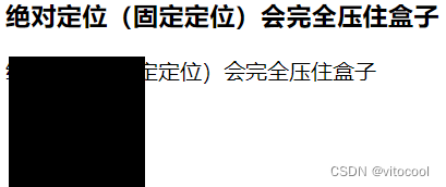
浮动的元素不会压住下面标准流的文字https://blog.youkuaiyun.com/vitocool/article/details/122617577
4 网页布局总结
竖用标准,横用浮动,自由移动用定位
5 元素的显示与隐藏
5.1 display
<head>
    <style>
.div12, .div13 {
			/*隐藏*/
			display: none;
			width: 100px;
			height: 100px;
			background-color: black;
			color: white;
		}
		.div13 {
			/*显示*/
			display: block;
		}
	</style>
</head>
<body>
    <h3>display</h3>
    <div class="div12">隐藏</div>
    <div class="div13">显示</div>
</body>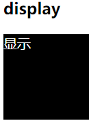
5.2 visibility 可见性
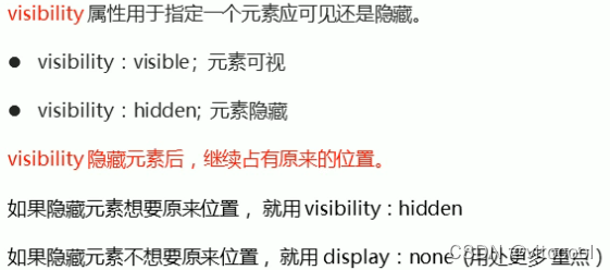
<head>
	<style type="text/css">
        .div14, .div15 {
			/*隐藏*/
			visibility: hidden;
			width: 100px;
			height: 100px;
			background-color: black;
			color: white;
		}
		.div15 {
			/*显示*/
			visibility: visible;
		}
	</style>
</head>
<body>
    <h3>visibility</h3>
    <div class="div14">隐藏</div>
    <div class="div15">显示</div>
</body>
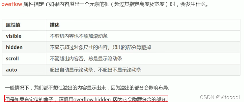
5.3 overflow溢出
<head>
    <style>
        .div16, .div17, .div18, .div19 {
			/*显示*/
			overflow: visible;
			width: 100px;
			height: 50px;
			background-color: pink;
			color: black;
		}
		.div17 {
			/*隐藏溢出*/
			overflow: hidden;
		}
		.div18 {
			/*以滚动条的形式显示溢出*/
			overflow: scroll;
		}
		.div19 {
			/*只有溢出时才用滚动条显示*/
			overflow: auto;
		}
	</style>
</head>
<body>
    <h3>overflow</h3>
    <div class="div16">
    	显<br>示<br>溢<br>出<br>
    </div>
    <br><br><br>
    <div class="div17">
    	隐<br>藏<br>溢<br>出<br>
    </div>
    <br>
    <div class="div18">
    	滚<br>动<br>显<br>示<br>
    </div>
    <br>
    <div class="div19">
    	在需要时<br>滚<br>动<br>显<br>示<br>
    </div>
</body>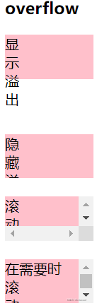
6 总结
<!DOCTYPE html>
<html lang="zh">
<head>
	<meta charset="UTF-8">
	<title>Document</title>
	<style type="text/css">
		.div1 {
			position: static;
			width: 120px;
			height: 100px;
			background-color: pink;
			color: black;
			line-height: 100px;
			text-align: center;
		}
		.div2 {
			position: relative;
			top: 20px;
			left: 20px;
			width: 120px;
			height: 100px;
			background-color: black;
			color: white;
			line-height: 100px;
			text-align: center;
			z-index: 10;
		}
		.div3 {
			position: absolute;
			top: 500px;
			left: 120px;
			width: 120px;
			height: 100px;
			background-color: black;
			color: white;
			line-height: 100px;
			text-align: center;
		}
		.div4 {
			position: absolute;
			top: 10px;
			left: 120px;
			width: 120px;
			height: 100px;
			background-color: black;
			color: white;
			line-height: 100px;
			text-align: center;
		}
		.div5 {
			position: fixed;
			top: 0;
			width: 100%;
			height: 50px;
			background-color: black;
			color: white;
			line-height: 50px;
			text-align: center;
		}
		.div6 {
			position: sticky;
			top: 0;
			width: 120px;
			height: 100px;
			background-color: black;
			color: white;
			line-height: 50px;
			text-align: center;
		}
		.div7 {
			position: relative;
			top: -10px;
			left: 100px;
			width: 120px;
			height: 100px;
			background-color: pink;
			color: white;
			line-height: 100px;
			text-align: center;
			z-index: -1;
		}
		.div8 {
			position: relative;
			height: 200px;
			width: 100%;
			border: 1px solid #000;
		}
		.div9 {
			position: absolute;
			/*水平居中*/
			left: 50%;
			margin-left: -50px;
			/*垂直居中*/
			top: 50%;
			margin-top: -50px;
			width: 100px;
			height: 100px;
			background-color: black;
		}
		.div10 {
			float: left;
			width: 100px;
			height: 100px;
			background-color: black;
		}
		.div11 {
			position: absolute;
			left: 10px;
			width: 100px;
			height: 100px;
			background-color: #000;
		}
		.div12, .div13 {
			/*隐藏*/
			display: none;
			width: 100px;
			height: 100px;
			background-color: black;
			color: white;
		}
		.div13 {
			/*显示*/
			display: block;
		}
		.div14, .div15 {
			/*隐藏*/
			visibility: hidden;
			width: 100px;
			height: 100px;
			background-color: black;
			color: white;
		}
		.div15 {
			/*显示*/
			visibility: visible;
		}
		.div16, .div17, .div18, .div19 {
			/*显示*/
			overflow: visible;
			width: 100px;
			height: 50px;
			background-color: pink;
			color: black;
		}
		.div17 {
			/*隐藏溢出*/
			overflow: hidden;
		}
		.div18 {
			/*以滚动条的形式显示溢出*/
			overflow: scroll;
		}
		.div19 {
			/*只有溢出时才用滚动条显示*/
			overflow: auto;
		}
	</style>
</head>
<body>
	<h3>静态定位</h3>
	<div class="div1"></div>

	<h3>相对定位</h3>
	<div class="div2">相对定位</div>
	<div class="div1">静态定位</div>

	<h3>绝对定位</h3>
	<div class="div1">
		父元素静态定位
		<div class="div3">子元素绝对定位</div>
	</div>
	<div class="div2">
		父元素相对定位
		<div class="div4">子元素绝对定位</div>
	</div>

	<h3>固定定位</h3>
	<div class="div5">
		固定定位
	</div>

	<h3>粘性定位</h3>
	<div class="div6">粘性定位</div>

	<h3>定位叠放次序</h3>
	<div class="div2">
		在上
	</div>
	<div class="div7">
		在下
    </div>
    <h3>绝对定位的盒子居中算法</h3>
    <div class="div8">
    	<div class="div9"></div>
    </div>

    <h3>浮动的元素不会压住下面标准流的文字</h3>
    <div class="div10"></div>
    <p>浮动的元素不会压住下面标准流的文字</p>

    <br><br><br>

    <h3>绝对定位(固定定位)会完全压住盒子</h3>
    <div class="div11"></div>
    <p>绝对定位(固定定位)会完全压住盒子</p>

    <br><br><br>

    <h3>display</h3>
    <div class="div12">隐藏</div>
    <div class="div13">显示</div>

    <h3>visibility</h3>
    <div class="div14">隐藏</div>
    <div class="div15">显示</div>

    <h3>overflow</h3>
    <div class="div16">
    	显<br>示<br>溢<br>出<br>
    </div>
    <br><br><br>
    <div class="div17">
    	隐<br>藏<br>溢<br>出<br>
    </div>
    <br>
    <div class="div18">
    	滚<br>动<br>显<br>示<br>
    </div>
    <br>
    <div class="div19">
    	在需要时<br>滚<br>动<br>显<br>示<br>
    </div>
</body>
</html>


 扫一扫
扫一扫


 359
359

 被折叠的 条评论
为什么被折叠?
被折叠的 条评论
为什么被折叠?
 到【灌水乐园】发言


