


最近在学习css的时候会经常用到左右布局。所以会先建立一个div容器,里面添加图形和文本
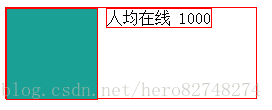
效果图如下。 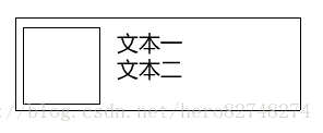
于是第一步会先建立一个div,然后在内部添加两个div。
<div class="item-box"> <div class="item-box-icon"> </div> <div class="item-box-text"> <span>人均在线</span> <span>1000</span> </div></div>
- 1
- 2
- 3
- 4
- 5
- 6
- 7
- 8
- 9
这里说明一下,最外层样式为item-box ,内部两个div,分别为 item-box-icon 和 item-box-text,从字母上也很容易理解,图标和文本。
接下来,我们为每一个div添加样式,为了更加直观一点,我们添加一个边框观察div的情况
<style type="text/css"> .item-box { width: 250px; height: 90px; background-color: white; border: 1px solid red; } .item-box-icon{ display: inline-block; width: 90px; height: 90px; background-color:#1aa094 ; border: 1px solid red; } .item-box-text{ border: 1px solid red; } </style>
- 1
- 2
- 3
- 4
- 5
- 6
- 7
- 8
- 9
- 10
- 11
- 12
- 13
- 14
- 15
- 16
- 17
- 18
- 19
- 20
- 21
- 22
- 23
运行第一次效果查看情况。可以看到文本和我们示意图事宜愿为。发现不行。 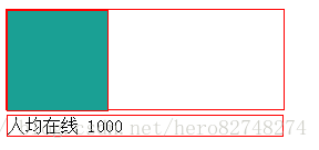
接下来,我们将.item-box-text 样式 改成 内联块 。默认情况下 div的显示方式为block,会占据整一行位置。因此可以看到因为这里我们的文本区域并没有往右边靠。
.item-box-text{ border: 1px solid red; display: inline-block; }
- 1
- 2
- 3
- 4
- 5
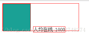
我们设置了inline-block后查看一下效果。虽然我们已经将div变成了内联块,但离我示意图还是有区别。
为了解决这个问题。我们引入position,将其变成绝对定位。
.item-box-text{ border: 1px solid red; display: inline-block; position: absolute; }
- 1
- 2
- 3
- 4
- 5
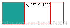
再次运行一下,观察效果 。这个时候,文本会依据我们意愿出现了相应的情况。 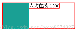
除此方法,还可以配合 vertical-align:top的方式处理文本让其变成右边布局。
.item-box-text{ border: 1px solid red; display: inline-block; vertical-align: top; }
- 1
- 2
- 3
- 4
- 5
目前为此这个问题就通过此方法来解决这个问题。
<!DOCTYPE html><html> <head> <meta charset="UTF-8"> <title>Css 练习</title> </head> <style type="text/css"> .item-box { width: 250px; height: 90px; background-color: white; box-shadow: 0 1px 1px rgba(0,0,0,0.1); border-radius: 2px; margin-bottom: 20px; display: inline-block; } .item-box-icon{ display: inline-block; width: 90px; height: 90px; background-color:#1aa094 ; } .item-box-text{ display: inline-block; position: absolute; padding:5px 10px; } .item-box-number{ display: block; font-size: 30px; font-weight: 600; } .container{ width: 50%; } </style> <body> <div class="container"> <div class="item-box"> <div class="item-box-icon"> </div> <div class="item-box-text"> <span>人均在线</span> <span class="item-box-number">1000</span> </div> </div> <div class="item-box"> <div class="item-box-icon"> </div> <div class="item-box-text"> <span>人均在线</span> <span class="item-box-number">1000</span> </div> </div> <div class="item-box"> <div class="item-box-icon"> </div> <div class="item-box-text"> <span>人均在线</span> <span class="item-box-number">1000</span> </div> </div> <div class="item-box"> <div class="item-box-icon"> </div> <div class="item-box-text"> <span>人均在线</span> <span class="item-box-number">1000</span> </div> </div> </div> </body></html>
- 1
- 2
- 3
- 4
- 5
- 6
- 7
- 8
- 9
- 10
- 11
- 12
- 13
- 14
- 15
- 16
- 17
- 18
- 19
- 20
- 21
- 22
- 23
- 24
- 25
- 26
- 27
- 28
- 29
- 30
- 31
- 32
- 33
- 34
- 35
- 36
- 37
- 38
- 39
- 40
- 41
- 42
- 43
- 44
- 45
- 46
- 47
- 48
- 49
- 50
- 51
- 52
- 53
- 54
- 55
- 56
- 57
- 58
- 59
- 60
- 61
- 62
- 63
- 64
- 65
- 66
- 67
- 68
- 69
- 70
- 71
- 72
- 73
- 74
- 75
- 76
- 77
- 78
- 79
- 80
- 81
- 82
- 83
- 84
- 85
最后我们编辑一个效果 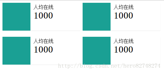
方法二:使用flex高效布局
事实上,仅仅使用flex的方式就可以将两个div实现区域内左右布局。
这里写代码片.item-box 样式下显示方式修改一下display: flex;
查看浏览器的兼容性:http://caniuse.com/#search=flex
display: -webkit-flex; //webkit浏览器加上。
- 1
这种方式布局下,div的大小会呈现大小一致。<style type="text/css"> .item-box { width: 250px; height: 90px; background-color: white; border: 1px solid red; display: flex; } .item-box-icon{ width: 90px; height: 90px; background-color:#1aa094 ; border: 1px solid red; } .item-box-text{ border: 1px solid red; } </style>
- 1
- 2
- 3
- 4
- 5
- 6
- 7
- 8
- 9
- 10
- 11
- 12
- 13
- 14
- 15
- 16
- 17
- 18
- 19
- 20
- 21
- 22
- 23
- 24
- 25
- 26
- 27
<!DOCTYPE html><html> <head> <meta charset="UTF-8"> <title>Css 练习</title> </head> <style type="text/css"> .item-box { width: 250px; height: 90px; background-color: white; border: 1px solid red; display: flex; } .item-box-icon{ width: 90px; height: 90px; background-color:#1aa094 ; border: 1px solid red; } .item-box-text{ border: 1px solid red; } </style> <body> <div class="container"> <div class="item-box"> <div class="item-box-icon"> </div> <div class="item-box-text"> <span>人均在线</span> <span class="item-box-number">1000</span> </div> </div> </div> </body></html>
- 1
- 2
- 3
- 4
- 5
- 6
- 7
- 8
- 9
- 10
- 11
- 12
- 13
- 14
- 15
- 16
- 17
- 18
- 19
- 20
- 21
- 22
- 23
- 24
- 25
- 26
- 27
- 28
- 29
- 30
- 31
- 32
- 33
- 34
- 35
- 36
- 37
- 38
- 39
- 40
- 41
- 42
- 43
- 44
- 45
- 46
再分享一下我老师大神的人工智能教程吧。零基础!通俗易懂!风趣幽默!还带黄段子!希望你也加入到我们人工智能的队伍中来!https://blog.youkuaiyun.com/jiangjunshow


 扫一扫
扫一扫


 1314
1314

 被折叠的 条评论
为什么被折叠?
被折叠的 条评论
为什么被折叠?
 到【灌水乐园】发言


