


目录
前言:为什么 LinearLayout 是 Android 布局的 “入门王牌”?
一、LinearLayout 基础认知:到底什么是 “线性布局”?
二、LinearLayout 核心属性:逐个拆解,用示例说话
2.2 核心属性 2:宽高设置(layout_width/layout_height)
2.3 核心属性 3:权重分配(layout_weight)—— LinearLayout 的灵魂
2.4 核心属性 4:间距控制(margin/padding)
2.5 核心属性 5:对齐方式(gravity/layout_gravity)
三、LinearLayout 实战布局:从简单到复杂,覆盖高频场景
四、LinearLayout 进阶技巧:动态操作、嵌套优化与混合布局
4.1 动态操作 LinearLayout(Java 代码控制)
4.2 嵌套 LinearLayout 优化:减少层级,提升性能
5.3 优化 3:避免 wrap_content 在水平布局中的滥用
5.4 优化 4:使用 include 和 merge 复用布局
5.5 优化 5:避免在 LinearLayout 中使用 wrap_content+match_parent
6.3 坑点 3:垂直方向子 Viewmatch_parent导致后续 View 不显示
6.4 坑点 4:margin 和 padding 混淆导致间距异常
6.5 坑点 5:gravity 和 layout_gravity 效果颠倒

class 卑微码农:
    def __init__(self):
        self.技能 = ['能读懂十年前祖传代码', '擅长用Ctrl+C/V搭建世界', '信奉"能跑就别动"的玄学']
        self.发量 = 100  # 初始发量
        self.咖啡因耐受度 = '极限'

    def 修Bug(self, bug):
        try:
            # 试图用玄学解决问题
            if bug.严重程度 == '离谱':
                print("这一定是环境问题!")
            else:
                print("让我看看是谁又没写注释...哦,是我自己。")
        except Exception as e:
            # 如果try块都救不了,那就...
            print("重启一下试试?")
            self.发量 -= 1  # 每解决一个bug,头发-1


# 实例化一个我
我 = 卑微码农()
前言:为什么 LinearLayout 是 Android 布局的 “入门王牌”?
刚入门 Android 布局时,我曾对着复杂的 UI 设计无从下手 —— 按钮怎么对齐?控件怎么平分屏幕?不同屏幕尺寸怎么适配?直到摸清了 LinearLayout 的用法,才发现它的核心价值:最简单的线性排版,搞定 80% 的页面布局需求。
LinearLayout 就像 “排队管理器”,让控件按水平或垂直方向依次排列,上手成本极低,却能实现灵活的自适应布局。不管是简单的登录页面、列表项,还是复杂的首页多模块组合,它都能轻松应对。但很多开发者只用过它的基础功能,不懂权重的核心逻辑、嵌套优化技巧,导致布局卡顿、适配混乱。
本文会把 LinearLayout 的基础概念、核心属性、实战布局、进阶技巧、性能优化、避坑指南全讲透。全文包含 12 个完整可运行的 XML/Java 示例,从新手入门到进阶优化,让你彻底掌握这个 “万能布局”,少走 90% 的弯路。
建议先收藏,再跟着示例一步步实操,遇到问题可以在评论区交流~
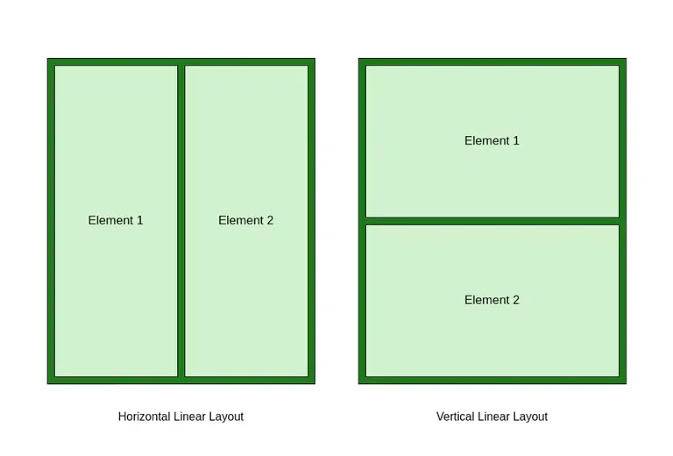
一、LinearLayout 基础认知:到底什么是 “线性布局”?
1.1 一句话搞懂 LinearLayout 的核心作用
LinearLayout(线性布局)是 Android 最基础、最常用的布局容器,核心作用是让子 View 按 “水平或垂直” 方向线性排列,支持灵活的宽高适配、权重分配、对齐方式,是页面排版的 “入门必备”。
简单说:LinearLayout 就像现实中的 “排队”—— 要么让控件 “横向排队”(水平方向),要么 “纵向排队”(垂直方向),每个控件按顺序排列,不重叠、不交叉。比如微信聊天页的消息项、登录页的输入框 + 按钮组合、首页的功能图标栏,本质都是 LinearLayout 实现的。
1.2 必须澄清的 3 个常见误解
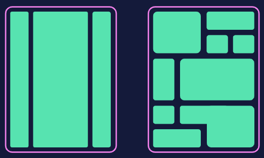
- 误解 1:LinearLayout 只能 “一条线” 排列?—— 错!通过嵌套 LinearLayout(比如垂直布局里套水平布局),能实现复杂的多模块布局;
- 误解 2:权重(weight)用得越多越好?—— 错!权重计算会增加布局测量耗时,滥用会导致性能问题,仅在需要自适应分配空间时使用;
- 误解 3:LinearLayout 不如 ConstraintLayout 灵活?—— 各有优势!LinearLayout 适合简单线性排版,代码简洁、性能更优;ConstraintLayout 适合复杂的多控件关联布局。
1.3 LinearLayout 的核心特性
- 排列方向单一:仅支持
horizontal(水平)和vertical(垂直)两种方向,默认垂直; - 宽高自适应:子 View 的宽高可设置为
match_parent(占满父容器)、wrap_content(包裹内容)或固定值,支持屏幕适配; - 权重分配灵活:通过
layout_weight属性,可按比例分配剩余空间,实现 “平分屏幕”“自适应占比” 等效果; - 嵌套能力强:支持多层嵌套,可组合出复杂的页面结构(但需控制嵌套层级);
- 兼容性好:兼容所有 Android 版本,无适配门槛,是新手入门的最佳选择。
1.4 LinearLayout 的典型适用场景
- 简单表单布局:登录页(输入框 + 按钮垂直排列)、注册页(多输入框垂直排列);
- 横向功能栏:首页顶部标题栏(返回按钮 + 标题 + 更多按钮水平排列)、底部功能图标栏;
- 列表项布局:RecyclerView/ListView 的列表项(图标 + 文字 + 箭头水平排列);
- 自适应布局:需要按比例分配空间的场景(如 2:8 分屏、三栏平分屏幕);
- 多模块组合:通过嵌套实现 “标题栏 + 内容区 + 底部栏” 的完整页面结构。
二、LinearLayout 核心属性:逐个拆解,用示例说话
LinearLayout 的核心能力全靠属性配置,下面按 “排列方向、宽高设置、权重分配、间距控制、对齐方式”5 个模块,结合示例详细讲解每个属性的用法和效果。
2.1 核心属性 1:排列方向(orientation)
这是 LinearLayout 最基础的属性,决定子 View 的排列方向,仅支持两个值:
| 属性值 | 含义 | 特点 | 注意事项 |
|---|---|---|---|
| vertical(默认) | 纵向排列 | 子 View 从上到下依次排列 | 水平方向的layout_gravity(子 View 对齐)生效,垂直方向的gravity(父容器对齐)生效 |
| horizontal | 横向排列 | 子 View 从左到右依次排列 | 垂直方向的layout_gravity生效,水平方向的gravity生效;子 View 总宽度不能超过父容器(否则会溢出) |
示例 1:垂直排列(默认方向)
效果:3 个按钮沿垂直方向居中排列(因父容器gravity默认start,子 Viewwrap_content宽度),上下间距默认 0(后续讲间距控制)。
示例 2:水平排列
<!-- 水平排列:3个按钮从左到右依次排列 -->
<LinearLayout
    xmlns:android="http://schemas.android.com/apk/res/android"
    android:layout_width="match_parent"
    android:layout_height="wrap_content"
    android:orientation="horizontal" <!-- 水平方向 -->
    android:padding="16dp">

    <Button
        android:layout_width="wrap_content"
        android:layout_height="wrap_content"
        android:text="按钮1" />

    <Button
        android:layout_width="wrap_content"
        android:layout_height="wrap_content"
        android:text="按钮2" />

    <Button
        android:layout_width="wrap_content"
        android:layout_height="wrap_content"
        android:text="按钮3" />

</LinearLayout>
效果:3 个按钮沿水平方向排列,若按钮总宽度超过父容器(如屏幕宽度),右侧按钮会溢出屏幕(后续讲解决方案)。
2.2 核心属性 2:宽高设置(layout_width/layout_height)
所有 View(包括 LinearLayout 本身)都必须设置layout_width和layout_height,LinearLayout 的子 View 宽高设置直接影响排列效果,核心取值有 3 种:
| 取值 | 含义 | 适用场景 |
|---|---|---|
| match_parent(fill_parent) | 宽 / 高占满父容器(LinearLayout) | 需占满父容器空间的控件(如背景 View、填充布局) |
| wrap_content | 宽 / 高包裹自身内容(控件大小由内容决定) | 按钮、文本、图标等内容固定的控件 |
| 固定值(如 100dp、200px) | 宽 / 高为固定尺寸 | 需固定大小的控件(如图标、分割线) |
关键注意事项:
- 尽量使用
dp(密度无关像素)而非px(像素),确保不同分辨率屏幕显示一致; - 水平方向的 LinearLayout 中,子 View 的
layout_width若设为match_parent,只会显示第一个 View(后续 View 被挤压); - 垂直方向的 LinearLayout 中,子 View 的
layout_height若设为match_parent,只会显示第一个 View(同理)。
示例 3:宽高设置实战(登录页输入框布局)
<!-- 垂直排列:输入框占满水平空间,按钮居中 -->
<LinearLayout
    xmlns:android="http://schemas.android.com/apk/res/android"
    android:layout_width="match_parent"
    android:layout_height="match_parent"
    android:orientation="vertical"
    android:padding="20dp"
    android:gravity="center_horizontal"> <!-- 子View水平居中 -->

    <!-- 用户名输入框:水平占满,垂直包裹内容 -->
    <EditText
        android:layout_width="match_parent" <!-- 占满父容器水平空间 -->
        android:layout_height="wrap_content" <!-- 包裹输入内容 -->
        android:hint="请输入用户名"
        android:padding="12dp"
        android:layout_marginBottom="16dp"
        android:background="@android:drawable/editbox_background_normal" />

    <!-- 密码输入框:同上 -->
    <EditText
        android:layout_width="match_parent"
        android:layout_height="wrap_content"
        android:hint="请输入密码"
        android:inputType="textPassword"
        android:padding="12dp"
        android:layout_marginBottom="24dp"
        android:background="@android:drawable/editbox_background_normal" />

    <!-- 登录按钮:宽度包裹,高度固定 -->
    <Button
        android:layout_width="wrap_content"
        android:layout_height="48dp" <!-- 固定高度 -->
        android:text="登录"
        android:paddingHorizontal="48dp" />

</LinearLayout>
效果:两个输入框水平占满屏幕(match_parent),垂直包裹内容;登录按钮水平包裹文字、垂直固定高度,整体水平居中(父容器gravity="center_horizontal")。
2.3 核心属性 3:权重分配(layout_weight)—— LinearLayout 的灵魂
layout_weight(权重)是 LinearLayout 的核心特性,用于按比例分配父容器的 “剩余空间”,是实现自适应布局的关键。很多新手只会用它平分屏幕,却不懂其底层计算逻辑,导致布局异常。
1. 权重的核心计算规则
剩余空间 = 父容器可用空间 - 所有子 View 的固定宽高(或wrap_content占用的空间)每个子 View 最终宽高 = 自身宽高 + 剩余空间 ×(自身权重 / 所有子 View 权重之和)
2. 权重的两种核心用法
用法 1:平分剩余空间(子 View 宽高设为0dp)
这是最推荐的用法,让子 View 完全按权重分配空间,避免自身宽高影响比例:
示例 4:三栏平分屏幕(水平方向)
<!-- 水平方向:3个View按1:1:1平分屏幕 -->
<LinearLayout
    xmlns:android="http://schemas.android.com/apk/res/android"
    android:layout_width="match_parent"
    android:layout_height="200dp"
    android:orientation="horizontal">

    <!-- 红色View:权重1,宽设为0dp -->
    <View
        android:layout_width="0dp" <!-- 关键:让权重完全控制宽度 -->
        android:layout_height="match_parent"
        android:layout_weight="1" <!-- 权重1 -->
        android:background="#FF0000" />

    <!-- 绿色View:权重1 -->
    <View
        android:layout_width="0dp"
        android:layout_height="match_parent"
        android:layout_weight="1"
        android:background="#00FF00" />

    <!-- 蓝色View:权重1 -->
    <View
        android:layout_width="0dp"
        android:layout_height="match_parent"
        android:layout_weight="1"
        android:background="#0000FF" />

</LinearLayout>
效果:3 个 View 水平平分父容器(200dp 高),各占 1/3 宽度,与屏幕尺寸无关,完美适配。
用法 2:按比例分配(子 View 宽高设为wrap_content)
子 View 先占用自身内容所需空间,剩余空间再按权重分配,适合 “固定内容 + 自适应” 场景:
示例 5:固定按钮 + 自适应文本(水平方向)
<!-- 水平方向:按钮固定宽度,文本占满剩余空间 -->
<LinearLayout
    xmlns:android="http://schemas.android.com/apk/res/android"
    android:layout_width="match_parent"
    android:layout_height="wrap_content"
    android:orientation="horizontal"
    android:padding="16dp">

    <!-- 按钮:固定宽度,无权重 -->
    <Button
        android:layout_width="100dp" <!-- 固定宽度 -->
        android:layout_height="48dp"
        android:text="提交" />

    <!-- 文本:权重1,宽设为wrap_content -->
    <TextView
        android:layout_width="wrap_content"
        android:layout_height="match_parent"
        android:layout_weight="1" <!-- 占用剩余空间 -->
        android:gravity="center_vertical"
        android:layout_marginStart="16dp"
        android:text="这是一段自适应文本,会占满按钮右侧的所有剩余空间,适配不同屏幕尺寸" />

</LinearLayout>
效果:按钮固定 100dp 宽度,TextView 先包裹自身文本,再占满剩余水平空间,屏幕变窄时文本自动换行(需确保layout_height为wrap_content或match_parent)。
3. 权重的进阶用法:非等比例分配
权重之和不一定为 1 或 3,可任意设置,比例按 “自身权重 / 总权重” 计算:
示例 6:2:8 分屏布局(垂直方向)
<!-- 垂直方向:上半部分20%,下半部分80% -->
<LinearLayout
    xmlns:android="http://schemas.android.com/apk/res/android"
    android:layout_width="match_parent"
    android:layout_height="match_parent"
    android:orientation="vertical">

    <!-- 上半部分:权重2,高设为0dp -->
    <LinearLayout
        android:layout_width="match_parent"
        android:layout_height="0dp"
        android:layout_weight="2" <!-- 总权重10,占2份 -->
        android:background="#FFFF00"
        android:gravity="center"
        android:orientation="vertical">

        <TextView
            android:layout_width="wrap_content"
            android:layout_height="wrap_content"
            android:text="上半部分(20%)"
            android:textSize="18sp" />

    </LinearLayout>

    <!-- 下半部分:权重8 -->
    <LinearLayout
        android:layout_width="match_parent"
        android:layout_height="0dp"
        android:layout_weight="8" <!-- 占8份 -->
        android:background="#00FFFF"
        android:gravity="center"
        android:orientation="vertical">

        <TextView
            android:layout_width="wrap_content"
            android:layout_height="wrap_content"
            android:text="下半部分(80%)"
            android:textSize="18sp" />

    </LinearLayout>

</LinearLayout>
效果:屏幕垂直分为两部分,上半部分占 20%(2/(2+8)),下半部分占 80%,适配所有屏幕尺寸。
2.4 核心属性 4:间距控制(margin/padding)
间距是布局美观的关键,LinearLayout 支持两种间距设置:margin(控件与外部的间距)和padding(控件内部的间距),两者作用范围完全不同。
1. margin vs padding 区别
- margin:控件与父容器或其他控件的 “外部间距”,不影响控件自身大小;
- padding:控件内部内容与控件边界的 “内部间距”,会增加控件的实际大小。
示例 7:间距控制实战(列表项布局)
<!-- 水平排列:图标+文本+箭头,带间距 -->
<LinearLayout
    xmlns:android="http://schemas.android.com/apk/res/android"
    android:layout_width="match_parent"
    android:layout_height="80dp"
    android:orientation="horizontal"
    android:padding="16dp" <!-- 父容器内部间距:上下左右16dp -->
    android:background="#FFFFFF">

    <!-- 图标:marginRight=16dp(与文本间距) -->
    <ImageView
        android:layout_width="48dp"
        android:layout_height="48dp"
        android:layout_marginEnd="16dp" <!-- 右侧外部间距16dp -->
        android:src="@android:drawable/ic_menu_call"
        android:scaleType="centerCrop" />

    <!-- 文本:垂直居中,占满剩余空间 -->
    <TextView
        android:layout_width="0dp"
        android:layout_height="match_parent"
        android:layout_weight="1"
        android:gravity="center_vertical" <!-- 文本垂直居中 -->
        android:text="联系人名称"
        android:textSize="18sp" />

    <!-- 箭头:marginStart=16dp(与文本间距) -->
    <ImageView
        android:layout_width="24dp"
        android:layout_height="24dp"
        android:layout_marginStart="16dp" <!-- 左侧外部间距16dp -->
        android:layout_gravity="center_vertical" <!-- 箭头垂直居中 -->
        android:src="@android:drawable/ic_menu_arrow_right" />

</LinearLayout>
效果:列表项整体上下左右有 16dp 内边距(padding),图标与文本间距 16dp(marginEnd),文本与箭头间距 16dp(marginStart),布局整洁美观。
2. 常用间距属性
| 属性 | 含义 |
|---|---|
| layout_margin | 上下左右统一间距 |
| layout_marginStart/layout_marginLeft | 左侧间距(Start 适配 RTL 布局,推荐使用) |
| layout_marginEnd/layout_marginRight | 右侧间距 |
| layout_marginTop | 顶部间距 |
| layout_marginBottom | 底部间距 |
| padding | 上下左右统一内边距 |
| paddingStart/paddingLeft | 左侧内边距 |
| paddingEnd/paddingRight | 右侧内边距 |
| paddingTop | 顶部内边距 |
| paddingBottom | 底部内边距 |
2.5 核心属性 5:对齐方式(gravity/layout_gravity)
对齐方式控制 View 的位置,LinearLayout 有两个核心对齐属性,新手容易混淆:
| 属性 | 作用对象 | 含义 | 适用场景 |
|---|---|---|---|
| gravity | 父容器(LinearLayout) | 控制所有子 View 在父容器中的对齐方式 | 让所有子 View 整体居中、靠左、靠右等 |
| layout_gravity | 子 View | 控制当前子 View 在父容器中的对齐方式 | 单个子 View 与其他子 View 对齐方式不同时 |
示例 8:对齐方式实战(混合对齐)
<!-- 垂直方向:整体水平居中,单个按钮靠右 -->
<LinearLayout
    xmlns:android="http://schemas.android.com/apk/res/android"
    android:layout_width="match_parent"
    android:layout_height="match_parent"
    android:orientation="vertical"
    android:gravity="center_horizontal" <!-- 所有子View水平居中 -->
    android:padding="20dp">

    <!-- 标题:水平居中(继承父容器gravity) -->
    <TextView
        android:layout_width="wrap_content"
        android:layout_height="wrap_content"
        android:text="标题"
        android:textSize="24sp"
        android:layout_marginBottom="32dp" />

    <!-- 输入框:水平占满(match_parent) -->
    <EditText
        android:layout_width="match_parent"
        android:layout_height="wrap_content"
        android:hint="请输入内容"
        android:padding="12dp"
        android:layout_marginBottom="16dp" />

    <!-- 按钮:靠右对齐(layout_gravity覆盖父容器gravity) -->
    <Button
        android:layout_width="wrap_content"
        android:layout_height="48dp"
        android:text="确认"
        android:layout_gravity="end" <!-- 单个子View靠右 -->
        android:paddingHorizontal="32dp" />

</LinearLayout>
效果:标题和输入框水平居中(父容器gravity="center_horizontal"),确认按钮靠右对齐(自身layout_gravity="end"),实现混合对齐效果。
常用对齐值
| 对齐值 | 含义 | 适用方向 |
|---|---|---|
| start/left | 靠左对齐 | 水平方向 |
| end/right | 靠右对齐 | 水平方向 |
| top | 靠上对齐 | 垂直方向 |
| bottom | 靠下对齐 | 垂直方向 |
| center | 居中对齐(水平 + 垂直) | 任意方向 |
| center_horizontal | 水平居中 | 任意方向 |
| center_vertical | 垂直居中 | 任意方向 |
三、LinearLayout 实战布局:从简单到复杂,覆盖高频场景
掌握核心属性后,我们结合实际开发中的高频场景,实现从简单到复杂的布局案例,让你直接复用代码。
3.1 场景 1:登录页面(垂直布局 + 权重适配)
<!-- 登录页:垂直排列,输入框占满,按钮居中,适配所有屏幕 -->
<LinearLayout
    xmlns:android="http://schemas.android.com/apk/res/android"
    android:layout_width="match_parent"
    android:layout_height="match_parent"
    android:orientation="vertical"
    android:padding="24dp"
    android:background="#F5F5F5">

    <!--  LOGO:水平居中,marginBottom=48dp -->
    <ImageView
        android:layout_width="120dp"
        android:layout_height="120dp"
        android:src="@android:drawable/ic_launcher"
        android:layout_gravity="center_horizontal"
        android:layout_marginBottom="48dp"
        android:scaleType="centerCrop" />

    <!-- 用户名输入框:占满水平,wrap_content高度 -->
    <EditText
        android:layout_width="match_parent"
        android:layout_height="wrap_content"
        android:hint="用户名/手机号"
        android:padding="16dp"
        android:layout_marginBottom="12dp"
        android:background="@drawable/edittext_bg" <!-- 自定义背景(圆角) -->
        android:inputType="textPhone" />

    <!-- 密码输入框:同上 -->
    <EditText
        android:layout_width="match_parent"
        android:layout_height="wrap_content"
        android:hint="密码"
        android:padding="16dp"
        android:layout_marginBottom="24dp"
        android:background="@drawable/edittext_bg"
        android:inputType="textPassword" />

    <!-- 登录按钮:占满水平,固定高度 -->
    <Button
        android:layout_width="match_parent"
        android:layout_height="56dp"
        android:text="登录"
        android:textSize="18sp"
        android:background="#FF678D"
        android:textColor="#FFFFFF"
        android:layout_marginBottom="16dp" />

    <!-- 辅助选项:水平排列(记住密码+忘记密码) -->
    <LinearLayout
        android:layout_width="match_parent"
        android:layout_height="wrap_content"
        android:orientation="horizontal"
        android:gravity="space-between"> <!-- 两端对齐 -->

        <!-- 记住密码:复选框+文本 -->
        <LinearLayout
            android:layout_width="wrap_content"
            android:layout_height="wrap_content"
            android:orientation="horizontal"
            android:gravity="center_vertical">

            <CheckBox
                android:layout_width="wrap_content"
                android:layout_height="wrap_content"
                android:id="@+id/cb_remember" />

            <TextView
                android:layout_width="wrap_content"
                android:layout_height="wrap_content"
                android:text="记住密码"
                android:textSize="14sp"
                android:layout_marginStart="8dp" />

        </LinearLayout>

        <!-- 忘记密码:文本 -->
        <TextView
            android:layout_width="wrap_content"
            android:layout_height="wrap_content"
            android:text="忘记密码?"
            android:textSize="14sp"
            android:textColor="#FF678D" />

    </LinearLayout>

</LinearLayout>
配套自定义背景(edittext_bg.xml):
xml
<!-- 输入框圆角背景 -->
<shape xmlns:android="http://schemas.android.com/apk/res/android"
    android:shape="rectangle">
    <solid android:color="#FFFFFF" />
    <corners android:radius="8dp" /> <!-- 圆角8dp -->
    <stroke android:width="1dp" android:color="#E0E0E0" /> <!-- 边框 -->
</shape>
效果:适配手机、平板等所有屏幕尺寸,输入框占满水平空间,按钮居中,辅助选项两端对齐,符合主流 App 登录页设计。
3.2 场景 2:首页顶部栏(水平布局 + 对齐控制)
<!-- 首页顶部栏:返回按钮+标题+更多按钮,水平排列 -->
<LinearLayout
    xmlns:android="http://schemas.android.com/apk/res/android"
    android:layout_width="match_parent"
    android:layout_height="56dp"
    android:orientation="horizontal"
    android:background="#FFFFFF"
    android:paddingStart="16dp"
    android:paddingEnd="16dp"
    android:gravity="center_vertical"> <!-- 垂直居中 -->

    <!-- 返回按钮:图标+文本 -->
    <LinearLayout
        android:layout_width="wrap_content"
        android:layout_height="match_parent"
        android:orientation="horizontal"
        android:gravity="center_vertical">

        <ImageView
            android:layout_width="24dp"
            android:layout_height="24dp"
            android:src="@android:drawable/ic_menu_back" />

        <TextView
            android:layout_width="wrap_content"
            android:layout_height="wrap_content"
            android:text="返回"
            android:textSize="16sp"
            android:layout_marginStart="8dp" />

    </LinearLayout>

    <!-- 标题:占满剩余空间,水平居中 -->
    <TextView
        android:layout_width="0dp"
        android:layout_height="wrap_content"
        android:layout_weight="1" <!-- 关键:占满中间剩余空间 -->
        android:text="首页标题"
        android:textSize="18sp"
        android:gravity="center"
        android:maxLines="1"
        android:ellipsize="end" /> <!-- 文本过长时省略 -->

    <!-- 更多按钮:图标 -->
    <ImageView
        android:layout_width="24dp"
        android:layout_height="24dp"
        android:src="@android:drawable/ic_menu_more" />

</LinearLayout>
效果:返回按钮居左,标题水平居中且占满中间剩余空间(文本过长自动省略),更多按钮居右,适配所有屏幕宽度,是 App 顶部栏的标准实现。
3.3 场景 3:列表项布局(水平布局 + 间距控制)
<!-- RecyclerView列表项:图标+文本+描述+箭头 -->
<LinearLayout
    xmlns:android="http://schemas.android.com/apk/res/android"
    android:layout_width="match_parent"
    android:layout_height="100dp"
    android:orientation="horizontal"
    android:padding="16dp"
    android:background="#FFFFFF">

    <!-- 商品图标:固定大小 -->
    <ImageView
        android:layout_width="68dp"
        android:layout_height="68dp"
        android:src="@android:drawable/ic_menu_gallery"
        android:scaleType="centerCrop"
        android:layout_marginEnd="16dp" />

    <!-- 文本区域:垂直排列,占满剩余空间 -->
    <LinearLayout
        android:layout_width="0dp"
        android:layout_height="match_parent"
        android:layout_weight="1"
        android:orientation="vertical"
        android:gravity="center_vertical"> <!-- 垂直居中 -->

        <!-- 商品名称:单行省略 -->
        <TextView
            android:layout_width="match_parent"
            android:layout_height="wrap_content"
            android:text="这是一款高性能智能手机,拍照清晰,续航持久"
            android:textSize="18sp"
            android:maxLines="1"
            android:ellipsize="end" />

        <!-- 商品描述:灰色文本,两行省略 -->
        <TextView
            android:layout_width="match_parent"
            android:layout_height="wrap_content"
            android:text="6GB+128GB 全网通 骁龙888处理器 5000mAh电池"
            android:textSize="14sp"
            android:textColor="#888888"
            android:layout_marginTop="4dp"
            android:maxLines="2"
            android:ellipsize="end" />

    </LinearLayout>

    <!-- 箭头:垂直居中 -->
    <ImageView
        android:layout_width="24dp"
        android:layout_height="24dp"
        android:src="@android:drawable/ic_menu_arrow_right"
        android:layout_gravity="center_vertical" />

</LinearLayout>
效果:商品图标固定大小,文本区域占满剩余空间(名称单行省略、描述两行省略),箭头垂直居中,符合电商 App 列表项的经典设计。
3.4 场景 4:复杂嵌套布局(首页多模块组合)
<!-- 首页复杂布局:垂直嵌套水平布局,实现多模块组合 -->
<LinearLayout
    xmlns:android="http://schemas.android.com/apk/res/android"
    android:layout_width="match_parent"
    android:layout_height="match_parent"
    android:orientation="vertical"
    android:background="#F5F5F5">

    <!-- 顶部栏:复用场景2的顶部栏布局 -->
    <include layout="@layout/layout_title_bar" />

    <!-- 搜索栏:水平布局 -->
    <LinearLayout
        android:layout_width="match_parent"
        android:layout_height="56dp"
        android:orientation="horizontal"
        android:padding="12dp"
        android:background="#FFFFFF">

        <EditText
            android:layout_width="0dp"
            android:layout_height="match_parent"
            android:layout_weight="1"
            android:hint="搜索商品、店铺"
            android:padding="12dp"
            android:background="@drawable/search_bg"
            android:drawableStart="@android:drawable/ic_search_category_default"
            android:drawablePadding="8dp"
            android:singleLine="true" />

        <Button
            android:layout_width="wrap_content"
            android:layout_height="match_parent"
            android:text="筛选"
            android:layout_marginStart="12dp"
            android:background="#FF678D"
            android:textColor="#FFFFFF"
            android:paddingHorizontal="16dp" />

    </LinearLayout>

    <!-- 功能图标栏:水平布局,4个图标平分 -->
    <LinearLayout
        android:layout_width="match_parent"
        android:layout_height="wrap_content"
        android:orientation="horizontal"
        android:padding="16dp"
        android:background="#FFFFFF"
        android:layout_marginTop="8dp">

        <!-- 图标1:垂直排列(图标+文本) -->
        <LinearLayout
            android:layout_width="0dp"
            android:layout_height="wrap_content"
            android:layout_weight="1"
            android:orientation="vertical"
            android:gravity="center_horizontal">

            <ImageView
                android:layout_width="48dp"
                android:layout_height="48dp"
                android:src="@android:drawable/ic_menu_camera" />

            <TextView
                android:layout_width="wrap_content"
                android:layout_height="wrap_content"
                android:text="拍照"
                android:textSize="14sp"
                android:layout_marginTop="8dp" />

        </LinearLayout>

        <!-- 图标2:同上 -->
        <LinearLayout
            android:layout_width="0dp"
            android:layout_height="wrap_content"
            android:layout_weight="1"
            android:orientation="vertical"
            android:gravity="center_horizontal">

            <ImageView
                android:layout_width="48dp"
                android:layout_height="48dp"
                android:src="@android:drawable/ic_menu_gallery" />

            <TextView
                android:layout_width="wrap_content"
                android:layout_height="wrap_content"
                android:text="相册"
                android:textSize="14sp"
                android:layout_marginTop="8dp" />

        </LinearLayout>

        <!-- 图标3:同上 -->
        <LinearLayout
            android:layout_width="0dp"
            android:layout_height="wrap_content"
            android:layout_weight="1"
            android:orientation="vertical"
            android:gravity="center_horizontal">

            <ImageView
                android:layout_width="48dp"
                android:layout_height="48dp"
                android:src="@android:drawable/ic_menu_share" />

            <TextView
                android:layout_width="wrap_content"
                android:layout_height="wrap_content"
                android:text="分享"
                android:textSize="14sp"
                android:layout_marginTop="8dp" />

        </LinearLayout>

        <!-- 图标4:同上 -->
        <LinearLayout
            android:layout_width="0dp"
            android:layout_height="wrap_content"
            android:layout_weight="1"
            android:orientation="vertical"
            android:gravity="center_horizontal">

            <ImageView
                android:layout_width="48dp"
                android:layout_height="48dp"
                android:src="@android:drawable/ic_menu_settings" />

            <TextView
                android:layout_width="wrap_content"
                android:layout_height="wrap_content"
                android:text="设置"
                android:textSize="14sp"
                android:layout_marginTop="8dp" />

        </LinearLayout>

    </LinearLayout>

    <!-- 内容区:占满剩余空间(可放RecyclerView) -->
    <LinearLayout
        android:layout_width="match_parent"
        android:layout_height="0dp"
        android:layout_weight="1"
        android:orientation="vertical"
        android:padding="16dp"
        android:layout_marginTop="8dp"
        android:background="#FFFFFF">

        <TextView
            android:layout_width="wrap_content"
            android:layout_height="wrap_content"
            android:text="推荐内容"
            android:textSize="20sp"
            android:textStyle="bold"
            android:layout_marginBottom="16dp" />

        <!-- 此处可添加RecyclerView或其他内容 -->
        <TextView
            android:layout_width="wrap_content"
            android:layout_height="wrap_content"
            android:text="内容区域..."
            android:textSize="16sp" />

    </LinearLayout>

</LinearLayout>
效果:实现了 “顶部栏 + 搜索栏 + 功能图标栏 + 内容区” 的完整首页布局,通过多层嵌套 LinearLayout,组合出复杂的多模块结构,适配所有屏幕尺寸。
四、LinearLayout 进阶技巧:动态操作、嵌套优化与混合布局
基础布局满足静态需求,实际开发中还需要动态修改布局、优化嵌套性能、与其他布局组合,下面讲解进阶技巧。
4.1 动态操作 LinearLayout(Java 代码控制)
通过 Java 代码可动态添加 View、修改布局属性(方向、权重、间距),实现灵活的交互效果。
示例 9:动态添加子 View(水平布局添加按钮)
public class DynamicLinearLayoutActivity extends AppCompatActivity {
    @Override
    protected void onCreate(Bundle savedInstanceState) {
        super.onCreate(savedInstanceState);
        setContentView(R.layout.activity_dynamic);

        // 获取布局容器(水平LinearLayout)
        LinearLayout linearLayout = findViewById(R.id.dynamic_container);
        // 设置布局方向(可选,XML已设置可省略)
        linearLayout.setOrientation(LinearLayout.HORIZONTAL);

        // 动态添加3个按钮
        for (int i = 0; i < 3; i++) {
            // 1. 创建按钮
            Button button = new Button(this);
            button.setText("动态按钮" + (i + 1));

            // 2. 设置按钮布局参数(LinearLayout.LayoutParams)
            LinearLayout.LayoutParams params = new LinearLayout.LayoutParams(
                    0, // 宽度:0dp(权重控制)
                    LinearLayout.LayoutParams.WRAP_CONTENT, // 高度:包裹内容
                    1.0f // 权重:1(平分空间)
            );

            // 设置按钮间距(margin)
            int margin = dp2px(8); // dp转px
            params.setMargins(margin, margin, margin, margin);

            // 3. 给按钮设置布局参数
            button.setLayoutParams(params);

            // 4. 添加按钮到LinearLayout
            linearLayout.addView(button);

            // 5. 设置按钮点击事件
            int finalI = i;
            button.setOnClickListener(v -> {
                Toast.makeText(this, "点击了动态按钮" + (finalI + 1), Toast.LENGTH_SHORT).show();
            });
        }
    }

    // dp转px工具方法
    private int dp2px(int dp) {
        return (int) (dp * getResources().getDisplayMetrics().density + 0.5f);
    }
}
配套 XML 布局(activity_dynamic.xml):
<LinearLayout
    xmlns:android="http://schemas.android.com/apk/res/android"
    android:layout_width="match_parent"
    android:layout_height="match_parent"
    android:orientation="vertical"
    android:padding="16dp">

    <!-- 动态添加View的容器 -->
    <LinearLayout
        android:id="@+id/dynamic_container"
        android:layout_width="match_parent"
        android:layout_height="wrap_content"
        android:orientation="horizontal" />

</LinearLayout>
效果:Java 代码动态创建 3 个按钮,按 1:1:1 平分水平空间,带 8dp 间距,点击有 Toast 提示,实现动态布局效果。
常用动态操作方法
| 方法 | 作用 |
|---|---|
| setOrientation(int orientation) | 修改布局方向(LinearLayout.HORIZONTAL/VERTICAL) |
| addView(View child) | 添加子 View |
| removeView(View child) | 移除子 View |
| setLayoutParams(LayoutParams params) | 设置布局参数(宽高、权重、间距) |
| setGravity(int gravity) | 修改父容器对齐方式 |
| setPadding(int left, int top, int right, int bottom) | 修改父容器内边距 |
4.2 嵌套 LinearLayout 优化:减少层级,提升性能
LinearLayout 嵌套过多(如超过 3 层)会导致布局测量和绘制耗时增加,引发卡顿,需通过以下技巧优化:
优化技巧 1:扁平化布局,减少嵌套层级
将多层嵌套的 LinearLayout 合并为单层或两层,比如 “垂直布局套水平布局套垂直布局” 可简化为 “垂直布局套水平布局”。
优化技巧 2:合理使用权重,避免冗余布局
用权重分配空间,替代 “嵌套 LinearLayout+match_parent” 的写法,减少层级。
优化技巧 3:使用 merge 标签复用布局,减少根节点
复用布局时用<merge>替代<LinearLayout>,避免增加额外的根节点层级:
<!-- 复用布局(layout_merge.xml):用merge替代LinearLayout -->
<merge xmlns:android="http://schemas.android.com/apk/res/android">

    <TextView
        android:layout_width="wrap_content"
        android:layout_height="wrap_content"
        android:text="复用的文本" />

    <Button
        android:layout_width="wrap_content"
        android:layout_height="wrap_content"
        android:text="复用的按钮" />

</merge>

<!-- 引用复用布局:无额外层级 -->
<LinearLayout
    xmlns:android="http://schemas.android.com/apk/res/android"
    android:layout_width="match_parent"
    android:layout_height="wrap_content"
    android:orientation="vertical">

    <include layout="@layout/layout_merge" />

</LinearLayout>
优化技巧 4:避免过度使用 wrap_content
水平方向的 LinearLayout 中,子 View 的layout_width设为wrap_content会增加布局测量次数,若用权重分配,建议设为0dp。
4.3 混合布局:LinearLayout 与其他布局组合
LinearLayout 适合线性排版,与其他布局(如 ConstraintLayout、ScrollView)组合,可实现更复杂的布局需求。
示例 10:LinearLayout + ScrollView(滚动布局)
当垂直布局的内容超过屏幕高度时,用 ScrollView 包裹 LinearLayout,实现滚动效果:
<!-- 滚动布局:LinearLayout+ScrollView -->
<ScrollView
    xmlns:android="http://schemas.android.com/apk/res/android"
    android:layout_width="match_parent"
    android:layout_height="match_parent"
    android:background="#F5F5F5">

    <!-- 垂直LinearLayout:内容超过屏幕时可滚动 -->
    <LinearLayout
        android:layout_width="match_parent"
        android:layout_height="wrap_content"
        android:orientation="vertical"
        android:padding="16dp">

        <!-- 多个子View(内容足够长) -->
        <TextView
            android:layout_width="match_parent"
            android:layout_height="wrap_content"
            android:text="滚动内容1"
            android:textSize="20sp"
            android:layout_marginBottom="16dp" />

        <TextView
            android:layout_width="match_parent"
            android:layout_height="wrap_content"
            android:text="滚动内容2"
            android:textSize="20sp"
            android:layout_marginBottom="16dp" />

        <!-- 省略更多子View... -->

    </LinearLayout>

</ScrollView>
示例 11:LinearLayout + ConstraintLayout(复杂关联布局)
LinearLayout 负责线性排版,ConstraintLayout 负责复杂的控件关联,组合使用效率更高:
<!-- 混合布局:ConstraintLayout+LinearLayout -->
<androidx.constraintlayout.widget.ConstraintLayout
    xmlns:android="http://schemas.android.com/apk/res/android"
    xmlns:app="http://schemas.android.com/apk/res-auto"
    android:layout_width="match_parent"
    android:layout_height="match_parent"
    android:padding="16dp">

    <!-- 标题:约束到顶部 -->
    <TextView
        android:id="@+id/tv_title"
        android:layout_width="wrap_content"
        android:layout_height="wrap_content"
        android:text="混合布局示例"
        android:textSize="24sp"
        app:layout_constraintTop_toTopOf="parent"
        app:layout_constraintStart_toStartOf="parent" />

    <!-- LinearLayout:约束到标题下方,水平排列3个按钮 -->
    <LinearLayout
        android:layout_width="match_parent"
        android:layout_height="wrap_content"
        android:orientation="horizontal"
        android:gravity="space-between"
        app:layout_constraintTop_toBottomOf="@id/tv_title"
        app:layout_constraintStart_toStartOf="parent"
        app:layout_constraintEnd_toEndOf="parent"
        android:layout_marginTop="16dp">

        <Button
            android:layout_width="wrap_content"
            android:layout_height="48dp"
            android:text="按钮1" />

        <Button
            android:layout_width="wrap_content"
            android:layout_height="48dp"
            android:text="按钮2" />

        <Button
            android:layout_width="wrap_content"
            android:layout_height="48dp"
            android:text="按钮3" />

    </LinearLayout>

</androidx.constraintlayout.widget.ConstraintLayout>
五、LinearLayout 性能优化:避开卡顿,提升体验
LinearLayout 看似简单,但使用不当会导致布局性能问题,下面总结 4 个核心优化点,让布局更流畅。
5.1 优化 1:控制嵌套层级(≤3 层)
Android 布局的测量和绘制是递归进行的,嵌套层级越多,耗时越长。LinearLayout 的嵌套层级建议控制在 3 层以内,超过则需扁平化或改用 ConstraintLayout。
反例(bad):4 层嵌套(垂直→水平→垂直→水平),测量耗时高;正例(good):简化为 2 层嵌套(垂直→水平),通过权重和对齐方式实现相同效果。
5.2 优化 2:合理使用权重,避免滥用
权重计算需要额外的测量步骤,过多权重(如超过 5 个)会增加耗时,优化建议:
- 仅在需要自适应分配空间时使用权重;
- 子 View 宽高设为
0dp(而非wrap_content),减少测量次数; - 避免在 ScrollView 中使用权重(会导致多次测量)。
5.3 优化 3:避免 wrap_content 在水平布局中的滥用
水平方向的 LinearLayout 中,子 View 的layout_width设为wrap_content时,系统需要先测量每个子 View 的实际宽度,再计算排列,耗时比match_parent或0dp更高。
优化方案:
- 固定宽度的控件直接设为固定值(如
100dp); - 需自适应的控件设为
0dp+ 权重; - 必须用
wrap_content时,尽量减少子 View 数量。
5.4 优化 4:使用 include 和 merge 复用布局
重复的布局(如顶部栏、底部栏)通过<include>复用,避免代码冗余;复用布局的根节点用<merge>替代 LinearLayout,减少额外层级。
5.5 优化 5:避免在 LinearLayout 中使用 wrap_content+match_parent
垂直方向的 LinearLayout 中,子 View 的layout_height设为match_parent会导致后续 View 无法显示,且测量时会多次计算父容器高度,优化方案:
- 需占满剩余空间的子 View 用
0dp+ 权重; - 仅一个子 View 时,可直接设为
match_parent(无后续 View)。
六、LinearLayout 常见坑点与避坑指南
6.1 坑点 1:水平方向子 View 溢出屏幕
- 现象:水平 LinearLayout 的子 View 总宽度超过父容器,右侧 View 溢出;
- 原因:子 View 宽高设置不当(如多个
wrap_content按钮),或未限制最大宽度; - 解决方案:
- 用权重分配空间(子 View
layout_width="0dp"+layout_weight); - 给子 View 设置
maxWidth限制最大宽度; - 文本类 View 设置
maxLines和ellipsize,避免文本过长。
- 用权重分配空间(子 View
6.2 坑点 2:权重分配效果不符合预期
- 现象:设置权重后,子 View 占比不是预期比例;
- 原因:
- 子 View 宽高未设为
0dp(水平方向layout_width,垂直方向layout_height); - 父容器没有剩余空间(如父容器
layout_height="wrap_content",垂直方向权重无效);
- 子 View 宽高未设为
- 解决方案:
- 权重分配时,子 View 对应方向的宽高设为
0dp; - 父容器对应方向的宽高设为
match_parent或固定值(确保有剩余空间)。
- 权重分配时,子 View 对应方向的宽高设为
6.3 坑点 3:垂直方向子 Viewmatch_parent导致后续 View 不显示
- 现象:垂直 LinearLayout 中,第一个子 View
layout_height="match_parent",后续 View 无法显示; - 原因:第一个子 View 占满了父容器所有垂直空间,挤压了后续 View;
- 解决方案:
- 需占满剩余空间的子 View 用
0dp+ 权重; - 仅保留一个
match_parent的子 View(无后续 View)。
- 需占满剩余空间的子 View 用
6.4 坑点 4:margin 和 padding 混淆导致间距异常
- 现象:设置间距后,效果与预期不符(如内部间距变外部间距);
- 原因:混淆了
margin(外部间距)和padding(内部间距); - 解决方案:
- 控件与其他控件的间距用
margin; - 控件内部内容与边界的间距用
padding; - 用布局预览实时查看间距效果,避免设置错误。
- 控件与其他控件的间距用
6.5 坑点 5:gravity 和 layout_gravity 效果颠倒
- 现象:设置
gravity后子 View 未对齐,设置layout_gravity无效果; - 原因:混淆了作用对象(
gravity作用于子 View,layout_gravity作用于自身); - 解决方案:
- 让所有子 View 统一对齐,给父容器设置
gravity; - 单个子 View 单独对齐,给子 View 设置
layout_gravity; - 水平方向的 LinearLayout 中,子 View 的
layout_gravity仅垂直方向生效(如center_vertical)。
- 让所有子 View 统一对齐,给父容器设置
6.6 坑点 6:动态添加 View 后间距异常
- 现象:Java 代码动态添加的 View,间距与 XML 布局不一致;
- 原因:动态添加时未设置
LayoutParams的margin,或margin单位用了px而非dp; - 解决方案:
- 动态设置
LayoutParams的setMargins(),参数用dp2px转换后的 px 值; - 统一 XML 和动态添加的间距单位(均用 dp)。
- 动态设置
七、总结:LinearLayout 核心知识点图谱

到这里,LinearLayout 的核心内容已经全部讲完,我们用一张图谱梳理重点:
LinearLayout核心知识点
├── 基础认知:线性排列(水平/垂直)、核心特性、典型场景
├── 核心属性:
│   - 排列方向(orientation):horizontal/vertical
│   - 宽高设置(layout_width/layout_height):match_parent/wrap_content/固定值
│   - 权重分配(layout_weight):剩余空间按比例分配,0dp+权重推荐
│   - 间距控制(margin/padding):外部间距/内部间距
│   - 对齐方式(gravity/layout_gravity):父容器对齐/子View对齐
├── 实战布局:登录页、顶部栏、列表项、复杂嵌套布局
├── 进阶技巧:
│   - 动态操作:Java代码添加View、修改属性
│   - 嵌套优化:控制层级≤3层、扁平化布局
│   - 混合布局:与ScrollView/ConstraintLayout组合
│   - 布局复用:include+merge
├── 性能优化:控制嵌套、合理用权重、避免wrap_content滥用
├── 避坑指南:溢出屏幕、权重异常、对齐错误、间距混淆
其实 LinearLayout 的学习关键是 “理解线性排列逻辑 + 掌握核心属性用法”—— 它不适合所有场景,但在线性排版、自适应布局、简单页面中,是效率最高、代码最简洁的选择。
把文中的示例逐个敲一遍,结合布局预览实时查看效果,很快就能熟练掌握。如果遇到具体问题,比如 “权重分配不符合预期”“动态添加 View 间距异常”,可以在评论区留言,我会第一时间回复~


 扫一扫
扫一扫


 被折叠的 条评论
为什么被折叠?
被折叠的 条评论
为什么被折叠?
 到【灌水乐园】发言


