


 本文通过四个实例介绍了如何使用CSS实现动画效果,包括元素宽度变化、风车旋转、加载条波动及人物行走动画,展示了@keyframes规则及animation属性的运用。
<!DOCTYPE html>
<html lang="en">
<head>
	<meta charset="UTF-8">
	<title>动画</title>
	<style type="text/css">

	/*       定义动画  */
	@keyframes moving{
		from{
			width: 100px;
		}
		to{
			width: 500px;
		}
	}

	.box{
		width: 100px;
		height: 100px;
		background-color: gold;

		animation:moving 500ms ease infinite alternate;
	}

	.box:hover{
		animation-play-state:paused;
	}

	</style>
</head>
<body>
	<div class="box"></div>
</body>
</html>
1.
<!DOCTYPE html>
<html lang="en">
<head>
	<meta charset="UTF-8">
	<title>风车旋转</title>
	<style type="text/css">
		@keyframes rotating{
			from{
				transform:rotate(0deg);
			}
			to{
				transform:rotate(360deg);
			}
		}


		.fengche{
			display: block;
			width: 400px;
			height: 400px;
			margin:50px auto 0;

			animation:rotating 2s linear infinite ;
		}

	</style>
</head>
<body>
	<img src="images/fengche.png"  alt='风车图片'  class='fengche'>
</body>
</html>
<!DOCTYPE html>
<html lang="en">
<head>
<meta charset="UTF-8">
<title>loading</title>
<style type="text/css">
@keyframes loading{
from{
transform:scale(1,1);
}
to{
transform:scale(1,0.5);
}
}
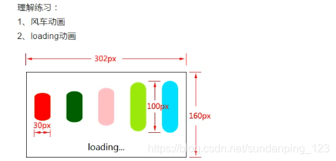
.box{
width: 300px;
height: 158px;
border: 1px solid #000;
margin:150px auto 0;
}
.box div{
width: 30px;
height: 100px;
/*background-color: gold;*/
float: left;
margin:15px;
border-radius: 15px;
animation:loading 500ms ease infinite alternate;
}
.box p{
text-align: center;
}
.box div:nth-child(1){
background-color: red;
}
.box div:nth-child(2){
background-color: blue;
animation-delay:100ms;
}
.box div:nth-child(3){
background-color: green;
animation-delay:200ms;
}
.box div:nth-child(4){
background-color: gold;
animation-delay:300ms;
}
.box div:nth-child(5){
background-color: pink;
animation-delay:400ms;
}
</style>
</head>
<body>
<div class="box">
<div></div>
<div></div>
<div></div>
<div></div>
<div></div>
<p>下载中...</p>
</div>
</body>
</html>
<!DOCTYPE html>
<html lang="en">
<head>
<meta charset="UTF-8">
<title>走路动画</title>
<style type="text/css">
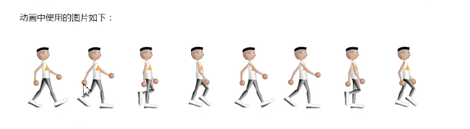
@keyframes walking{
from{
left:0px;
}
to{
left: -960px;
}
}
.box{
width: 120px;
height: 180px;
border: 1px solid #ddd;
margin:50px auto 0;
position: relative;
overflow: hidden;
}
.box img{
position: absolute;
left: 0;
top: 0;
animation:walking 1s steps(8) infinite;
}
</style>
</head>
<body>
<div class="box">
<img src="images/walking.png" alt='走路图片'>
</div>
</body>
</html>


 扫一扫
扫一扫


 1019
1019

 被折叠的 条评论
为什么被折叠?
被折叠的 条评论
为什么被折叠?
 到【灌水乐园】发言


