


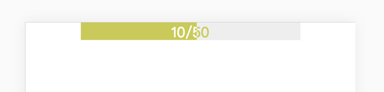
 本文详细介绍了一种使用HTML和CSS实现的加载进度条样式设计方法,通过精巧的布局和动画效果,展示了如何创建一个既实用又美观的进度指示器。
<!DOCTYPE html>
<html lang="en">
<head>
    <meta charset="UTF-8">
    <meta name="viewport" content="width=device-width, initial-scale=1.0">
    <meta http-equiv="X-UA-Compatible" content="ie=edge">
    <title>loading</title>
    <style>
        * {
            margin: 0 auto;
        }
        .box {
            width: 250px;
            height: 20px;
            overflow: hidden;
        }
        .progress {
            position: relative;
            width: 100%;
        }
        .progress-1 {
            position: absolute;
            top: 0;
            height: 20px;
            width: 100%;
            color: #c7cb41;
            text-align: center;
            background: #eee;
        }
        .progress-2 {
            position: relative;
            top: 0;
            left: -50%;
            height: 20px;
            width: 100%;
            z-index: 2;
            overflow: hidden;
        }
        .progress-2-inner {
            position: absolute;
            top: 0;
            left: 50%;
            height: 20px;
            width: 100%;
            color: #fff;
            background: #c7cb41;
            text-align: center;
        }
    </style>
</head>
<body>
    <div class="box">
        <div class="progress">
            <div class="progress-1">10/50</div>
            <div class="progress-2">
                <div class="progress-2-inner">10/50</div>
            </div>
        </div>
    </div>
</body>
</html>
实现效果


 扫一扫
扫一扫


 365
365

 被折叠的 条评论
为什么被折叠?
被折叠的 条评论
为什么被折叠?
 到【灌水乐园】发言


