


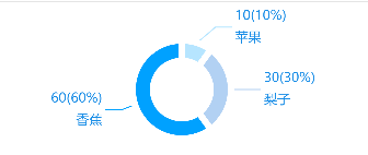
 本文详细介绍如何使用ECharts库创建一个动态的饼图。通过设置颜色、触发器、系列类型、半径、标签样式及数据,展示了如何配置饼图以展示不同类型的水果占比。代码示例中包含了饼图的基本属性设置,如扇形点击提示、文字样式等。
效果图:
代码:
//饼图
  initPieECharts() {
    let _this = this;
    let charts: any = _this.$echarts.init(document.getElementById("mainPie"));
    charts.setOption({
      color: ["#b6e5ff", "#b2d1f3", "#00a1ff"],
      // 点击扇形 显示提示
      tooltip: {
        trigger: "item"
      },
      series: [
        {
          name: "水果",
          type: "pie",
          radius: ["35%", "60%"],
          label: {
            normal: {
              formatter: "{c}({d}%)\n{b}",
              textStyle: {
                fontWeight: "normal",
                fontSize: 12,
                color: "#178CE6"
              },
              lineHeight: 20
            }
          },
          itemStyle: {
            normal: {
              borderColor: "#ffffff",
              borderWidth: 6
            }
          },
          data: [
            {
              value: 10,
              name: "苹果"
            },
            {
              value: 30,
              name: "梨子"
            },
            {
              value: 60,
              name: "香蕉"
            }
          ]
        }
      ]
    });
  }


 1305
1305

 被折叠的 条评论
为什么被折叠?
被折叠的 条评论
为什么被折叠?
 到【灌水乐园】发言


