


 <view class='space'>
      <view class="stars ">
        <view class="star "></view>
        <view class="star pink "></view>
        <view class="star blue "></view>
        <view class="star yellow "></view>
      </view>
    </view>
<style>
.star {
  display: block;
  width: 5px;
  height: 5px;
  border-radius: 50%;
  background: #FFF;
  top: 100px;
  left: 400px;
  position: relative;
  transform-origin: 100% 0;
  animation: star-ani 6s infinite ease-out;
  box-shadow: 0 0 5px 5px rgba(255, 255, 255, .3);
  opacity: 0;
  z-index: 2;
}

.star:after {
  content: '';
  display: block;
  top: 0px;
  left: 4px;
  border: 0px solid #fff;
  border-width: 0px 90px 2px 90px;
  border-color: transparent transparent transparent rgba(255, 255, 255, .3);
  transform: rotate(-45deg) translate3d(1px, 3px, 0);
  box-shadow: 0 0 1px 0 rgba(255, 255, 255, .1);
  transform-origin: 0% 100%;
  animation: shooting-ani 3s infinite ease-out;
}

.pink {
  top: 30px;
  left: 395px;
  background: #ff5a99;
  animation-delay: 5s;
  -webkit-animation-delay: 5s;
  -moz-animation-delay: 5s;
}

.pink:after {
  border-color: transparent transparent transparent #ff5a99;
  animation-delay: 5s;
  -webkit-animation-delay: 5s;
  -moz-animation-delay: 5s;
}

.blue {
  top: 35px;
  left: 432px;
  background: cyan;
  animation-delay: 7s;
  -webkit-animation-delay: 7s;
  -moz-animation-delay: 7s;
}

.blue:after {
  /* border-color: transpareanimation-delay: 12s; */
  -webkit-animation-delay: 7s;
  -moz-animation-delay: 7s;
  animation-delay: 7s;
}

.yellow {
  top: 50px;
  left: 600px;
  background: #ffcd5c;
  animation-delay: 5.8s;
}

.yellow:after {
  border-color: transparent transparent transparent #ffcd5c;
  animation-delay: 5.8s;
}

@keyframes star-ani {
  0% {
    opacity: 0;
    transform: scale(0) rotate(0) translate3d(0, 0, 0);
    -webkit-transform: scale(0) rotate(0) translate3d(0, 0, 0);
    -moz-transform: scale(0) rotate(0) translate3d(0, 0, 0);
  }

  50% {
    opacity: 1;
    transform: scale(1) rotate(0) translate3d(-200px, 200px, 0);
    -webkit-transform: scale(1) rotate(0) translate3d(-200px, 200px, 0);
    -moz-transform: scale(1) rotate(0) translate3d(-200px, 200px, 0);
  }

  100% {
    opacity: 0;
    transform: scale(1) rotate(0) translate3d(-300px, 300px, 0);
    -webkit-transform: scale(1) rotate(0) translate3d(-300px, 300px, 0);
    -moz-transform: scale(1) rotate(0) translate3d(-300px, 300px, 0);
  }
}
</style>
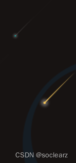
效果


 扫一扫
扫一扫


 978
978

 被折叠的 条评论
为什么被折叠?
被折叠的 条评论
为什么被折叠?
 到【灌水乐园】发言


